Customizing template guideline
Here is the steps that you should follow when customizing template.
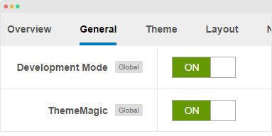
1. Enable Development mode
Uber template is developed with LESS. When you enable development mode, your site is running on LESS so that it's easy to debug to customize template style.
2. Create "local" folder
Template customization should be implemented in the local folder, this is to prevent from losing customization from upgrading. By default, the local folder is not included, you have to add it by yourselves. The local folder is located in templates/uber/.
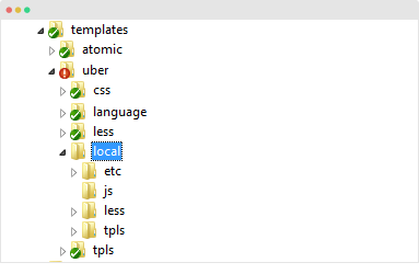
The folder structure is almost the same with the Uber template folder structure.
templates/t3_bs3_blank/local/
+--less/         		// extended and new .less files
¦    +-- template.less
¦    +-- rtl/ 			//.less files of customized style of right to left
¦    +-- themes/          	// .less files of theme customized style
+-- css/                   	 // compiled css files
¦    +-- rtl/              	// compiled css files of right to left
¦    +-- themes/             	 // compiled css files of theme
¦    +-- template.css
+-- js/
¦    +-- scripts.js
+-- tpls/             		// override layout files
¦    +-- default.php
¦    +-- home-1.php
¦    +-- blocks/        	// override block files
¦    ¦    +-- header.php
¦    ¦    +-- footer.php
+-- html/  			// override Joomla default layouts
¦    +-- com_content/
¦    +-- mod_footer/
+-- images/
¦    +-- logo.png 		// override default logo image
+-- etc/
¦    +-- assets.php  		// override/extend template parameters
2.1 Layout settings
When customers configure layouts, the user's layout settings are stored in folder:
templates/uber/local/etc/layouts
2.2 Override layouts
Default layout files provided by Template provider are stored in folder:
templates/uber/tpls
If you want to override layout files or block files, copy the files and paste to such folder:
templates/uber/local/tpls
For example, to customize layout "home", please copy file:
templates/uber/tpls/home.php
to:
templates/uber/local/tpls
Do the same with block file. For example, to customize "footer" block, please copy file:
/templates/uber/tpls/blocks/footer.php
to:
templates/uber/local/tpls/blocks/
2.3 Override Joomla core layout
Joomla core layouts are stored in:
/templates/uber/local/html
2.4 Override / Extend less
Create a less file in folder: /templates/uber/local/less with same name of the file in template less folder to override/extend. In this file, add LESS/CSS rule, it's not necessary to import file that has variables or mixins.
For example, you can create file: local/less/template.less, the style in the file will auto compiled.
When you compile LESS to CSS, the compiled .css files will be stored in local/css folder.
2.5 Override JS file
Copy the JS file from folder: templates/uber/js to templates/uber/local/js.
2.6 Add new CSS/JS file
To add new CSS or JS file, add the file to folder:
- CSS file:
templates/uber/local/css - JS file:
templates/uber/local/js
Next, copy file: templates/uber/etc/assets.xml to folder: templates/uber/local/etc then define the JS and CSS file.
// Define JS file
<scripts>

    <file>js/custom/your-script.js</file>

</scripts>

// Define CSS file
<stylesheets>

    <file>css/custom/your-style.css</file>

</stylesheets>
2.7 Override/Extend template parameters
To override/extend template parameters, please implement in local/etc/assets.xml file. For example, in the following file, param snippet_open_head is overridden to be non-global setting, it means, the setting is only applied for current template style.
<?xml version="1.0" encoding="utf-8"?>

<assets>

    <config>

        <fields name="params" addfieldpath="/plugins/system/t3/includes/depend">

            <fieldset name="injection_params" label="T3_INJECTION_LABEL" description="T3_INJECTION_DESC">

                <field name="snippet_open_head" type="textarea" class="t3-admin-textarea" global="0" filter="raw" default="" label="T3_INJECTION_OPEN_HEAD_LABEL" description="T3_INJECTION_OPEN_HEAD_DESC" />

            </fieldset>

        </fields>

    </config>

</assets>
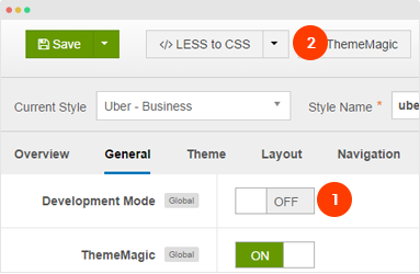
3. Disable Dev mode and compile LESS to CSS
After customizing your template, please disable Development mode, save the settings and compile LESS to CSS so that your customization will be compiled to CSS.
You should optimize JS and CSS to improve performance of your site. The optimization is only applied for non-development mode >> Detail documentation
Customize template with CSS
If you are not familiar with LESS, you can customize your template with CSS. Add the customization style to the templates/uber/css/custom.css. The file is not overridden when compiling LESS to CSS and it works on both Development mode status: enabled and disabled.
Customizing layout width
To customize the width of layout, open the file templates\uber\less\variables.less, find the following code.
// Media queries breakpoints
// --------------------------------------------------

// Extra small screen / phone
// Note: Deprecated @screen-xs and @screen-phone as of v3.0.1
@screen-xs:                  480px;
@screen-xs-min:              @screen-xs;
@screen-phone:               @screen-xs-min;

// Small screen / tablet
// Note: Deprecated @screen-sm and @screen-tablet as of v3.0.1
@screen-sm:                  768px;
@screen-sm-min:              @screen-sm;
@screen-tablet:              @screen-sm-min;

// Medium screen / desktop
// Note: Deprecated @screen-md and @screen-desktop as of v3.0.1
@screen-md:                  992px;
@screen-md-min:              @screen-md;
@screen-desktop:             @screen-md-min;

// Large screen / wide desktop
// Note: Deprecated @screen-lg and @screen-lg-desktop as of v3.0.1
@screen-lg:                  1200px;
@screen-lg-min:              @screen-lg;
@screen-lg-desktop:          @screen-lg-min;

// So media queries don't overlap when required, provide a maximum
@screen-xs-max:              (@screen-sm-min - 1);
@screen-sm-max:              (@screen-md-min - 1);
@screen-md-max:              (@screen-lg-min - 1);
Now, customize the with of each layout, save the file then compile LESS to CSS so that the changes will be applied when you turn off Development mode.
Customizing width of "container" class
To customize the width of class container, open the file templates\uber\less\variables.less, find the following code.
// Container sizes
// --------------------------------------------------

// Small screen / tablet
@container-tablet:             ((720px + @grid-gutter-width));
@container-sm:                 @container-tablet;

// Medium screen / desktop
@container-desktop:            ((940px + @grid-gutter-width));
@container-md:                 @container-desktop;

// Large screen / wide desktop
@container-large-desktop:      ((1120px + @grid-gutter-width));
@container-lg:                 @container-large-desktop;
Now, customize the with of "container" class, save the file then compile LESS to CSS so that the changes will be applied when you turn off Development mode.
Customizing Copyrights Info
The copyrights of UBER is located in the file: templates\uber\html\mod_footer\default.php, open the file and change the info below:
<small><?php echo $lineone; ?> Designed by <a href="http://www.joomlart.com/" title="Visit Joomlart.com!" <?php echo method_exists('T3', 'isHome') && T3::isHome() ? '' : 'rel="nofollow"' ?>>JoomlArt.com</a>.</small>
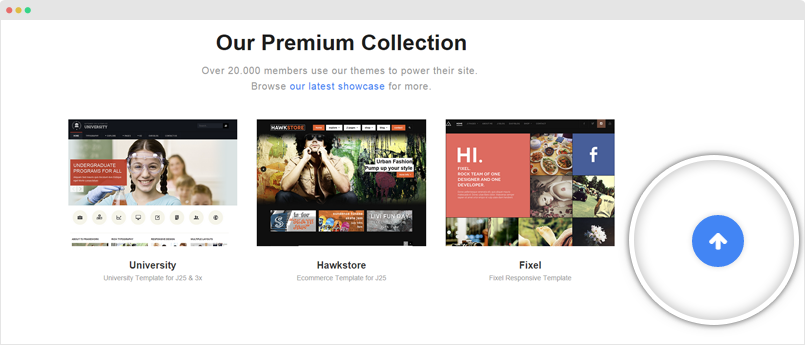
Customize "back-to-top" button
The "Back to top" button allows you to quickly navigate to the top of your site. In Uber, it's supported by default and you can customize it like changing icon, changing style, etc.
To customize the Back To Top button, please open the templates/uber/tpls/blocks/footer.php and find the following code:
<!-- BACK TOP TOP BUTTON -->

<div id="back-to-top" data-spy="affix" data-offset-top="300" class="back-to-top hidden-xs hidden-sm affix-top">

  <button class="btn btn-primary" title="Back to Top"><i class="fa fa-arrow-up"></i></button>

</div>


<script type="text/javascript">

(function($) {

	// Back to top

	$('#back-to-top').on('click', function(){

		$("html, body").animate({scrollTop: 0}, 500);

		return false;

	});

})(jQuery);

</script>

<!-- BACK TO TOP BUTTON -->
Remove the code above to delete the Back To Top button in your site.
You can change the Back To Top icon with any Font awesome 4 icon, just replace the icon class with fa fa-angle-up.
To customize style of the Back To Top button, please open the templates/uber/less/style.less file and find the style rule:
// Back to top
// ------------
#back-to-top {
  position: fixed;
  right: @t3-global-margin;
  top: auto;
  z-index: 999;
  display: none;
  bottom: -60px;

  @media (min-width: @screen-sm-min) {
    display: block;
  }

  .btn {
    background: @gray-lighter;
    background: rgba(255, 255, 255, 0.9);
    border: 0;
    color: @brand-primary;
    height: 52px;
    width: 52px;
    border-radius: 50%;
    line-height: 1;
    padding: 0;
    text-align: center;
    font-size: 22px;
    .box-shadow(0 0 7px rgba(0, 0, 0, 0.15));
    .opacity(0.7);
    .transition(0.2s);

    &:hover, &:active, &:focus {
      background: @brand-primary;
      color: @white;
      outline: none;
      .opacity(1);
    }
  }

  &.affix {
    bottom: @t3-global-margin * 3;
  }

  a {
    outline: none;
  }

  i {
    font-size: @font-size-large;
    line-height: 16px;
  }
}
Customize the style as you wish then save the file and compile LESS to CSS.