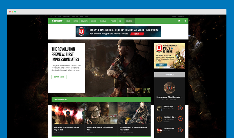
Template style override
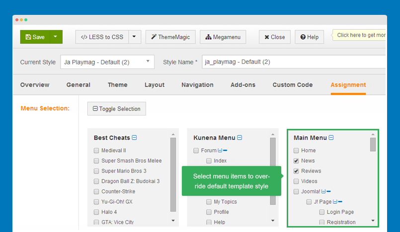
Template style feature (version 2.5 and above) is to assign different template styles to individual menu items. The default template style can be partially or completely overridden by assigning different template styles to the desired menu items in order to obtain a different look for their respective pages.
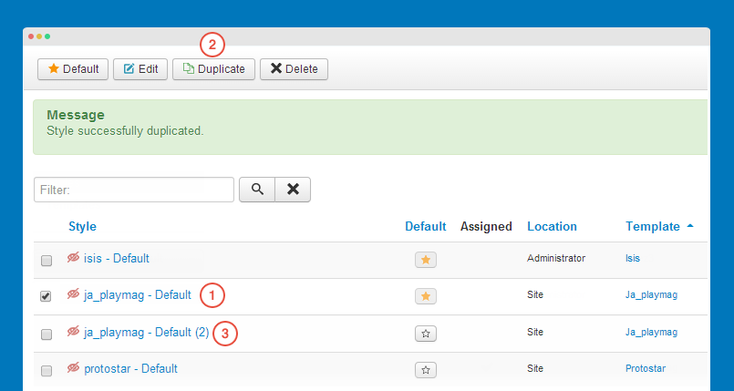
Duplicate the default template style
From back-end setting, go to: Extensions >> Template manager. Select the "ja_playmag - Default" template style then hit the "Duplicate" button to clone the template style.
Next, open the template style, configure theme, layout, etc then assign the template style to the menu items. Those menu items will have template style overridden the default template style.
Theme configuration
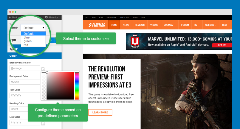
JA Playmag template supports multiple themes: default, green, blue and red. You can view live demo of each theme:
- Default theme live demo
- Green theme live demo
- Blue theme live demo
- Red theme live demo
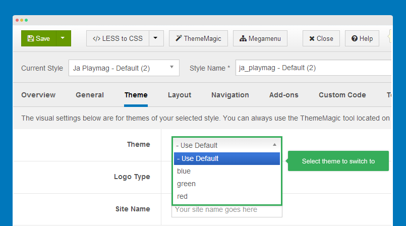
Switch theme for a template style
You can use multiple themes simultaneously in a site by creating template styles, each template style is assigned for a theme.
Open template style you want to change theme, in the "Theme" tab, select the theme you want to switch to.
Layout configuration
The template has only one layout by default. However, you can create new layout, configure it as you wish.
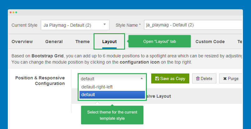
Layout configuration
Open the template style you want to configure layout then go to "Layout" tab.
1. Switch layout for any template style
Open any template style, go to "Layout" tab, assign layout.
The layout is applied for the template style only.
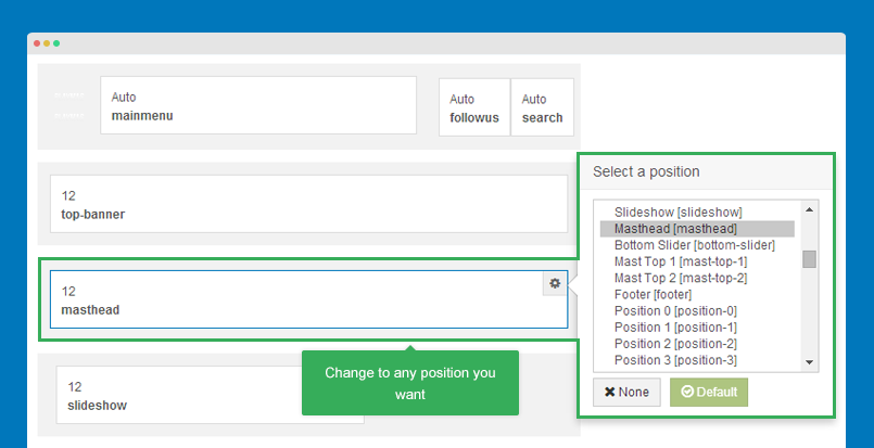
2. Change module position
Hover the position you want to change, hit the setting icon then select the position you want to change to.
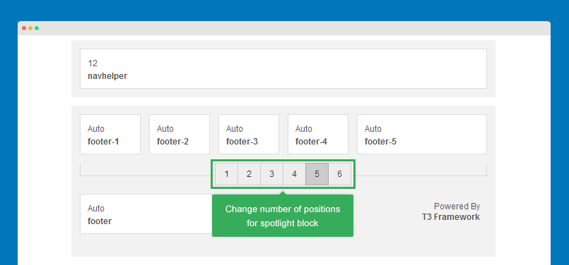
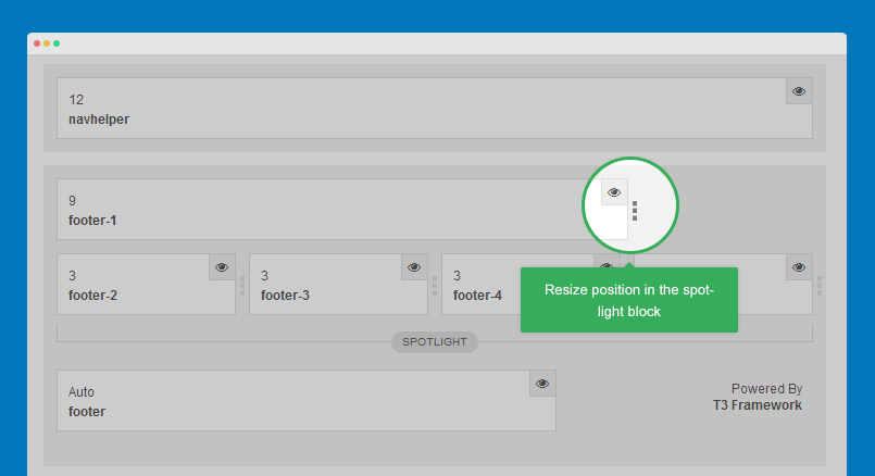
3. Change number of positions in spotlight block
This feature is only applied for spotlight block.
4. Configure layout for responsive layouts
The responsive layout configuration allows you to enable, disable positions in specific layouts (Large, medium, small, etc).
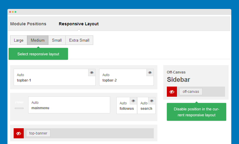
You can also resize positions in spotlight blocks.
Layout customization
JA Playmag template is built with T3 Framework, so you can refer to T3 documentation. Let's check the references:
ThemeMagic configuration
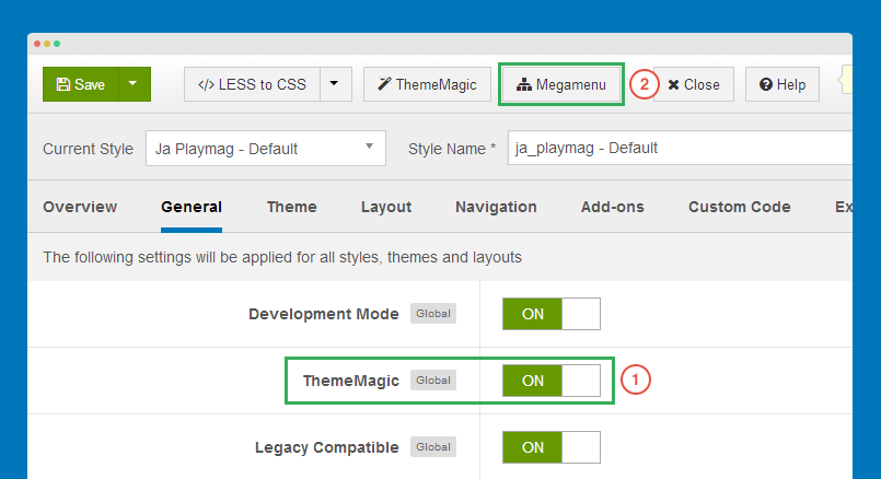
ThemeMagic is to customize your theme based on pre-defined parameters so that you don't need to touch any file.
Firstly, you have to enable the "ThemeMagic" feature. Open any template style manager, in the General tab, enable the ThemeMagic option. Next, hit the "ThemeMagic" button on the top bar list to open the ThemeMagic working panel.
In the setting bar, open the parameter group you want to configure, change value for the pre-defined parameters then hit the "Preview" button to see how front-page changes. If you satisfy with the customization, please save it.
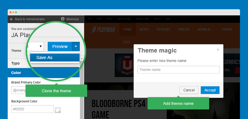
For safe, you can save as the theme.
Adding new group and parameters to ThemeMagic
If you want to add new group and parameters to ThemeMagic to customize theme, please refer to T3 documentation.
Feature layout and body background
JA Playmag template has 2 extended options: Feature layout configuration and body background. Please note that these options are implemented in JA Playmag template only.
Feature layout
There are 3 feature layouts: Grid, big list and small list.
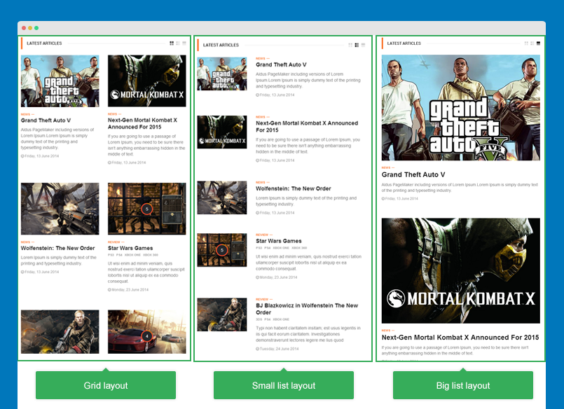
To configure the feature layouts, open template style you want to change the layout. In the "Template config" tab, select layouts you want to display and don't forget to choose the default layout.
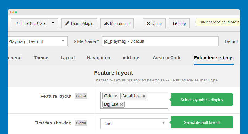
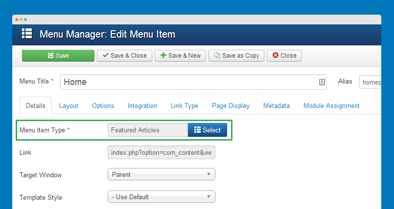
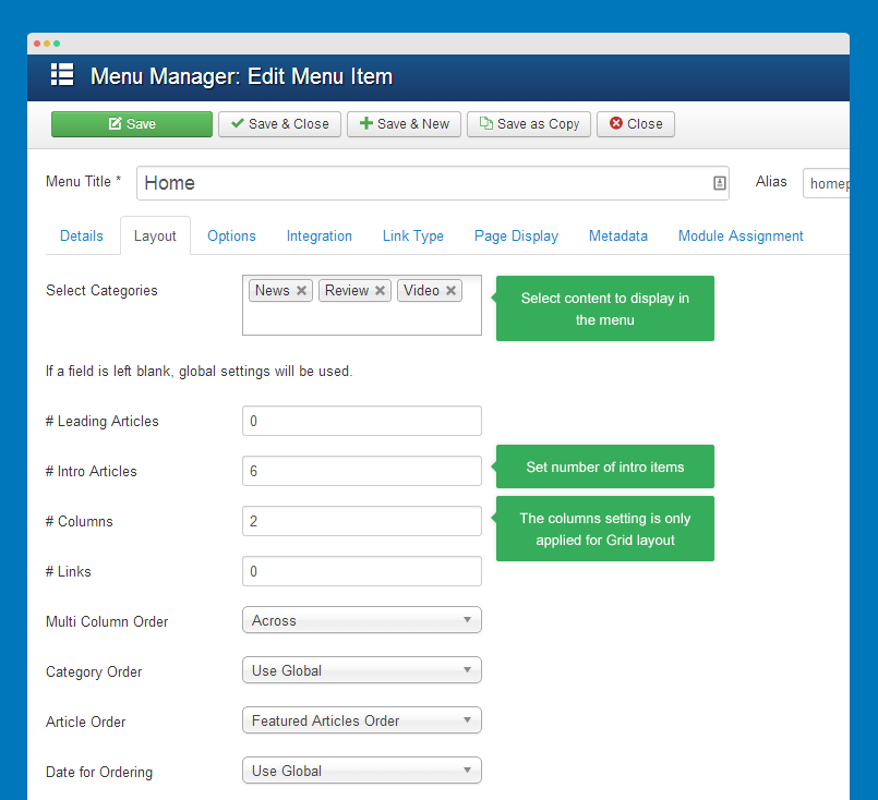
The feature layouts are applied for "Articles >> Featured Articles" menu type only.
The layout option in the menu settings
Customize feature layout
If you want to add new feature layout or customize any layout, this guideline will help you.
The feature layouts are defined in the file: templates\ja_playmag\html\com_content\featured\default.php. Open the file and you would see:
<!-- Button change grid -->

<?php if(count($feature_layout) > 1) : ?>

    <!-- does not change class of div -->

    <div class="tpl_change_layout">

      <?php $i=0;

            foreach($feature_layout AS $f){

                $sclass ='';

                if($f == $feature_layout_first) $sclass.=' active ';

                //You can change class but does not changed mockup and content html in mockup

                switch($f){

                    case 'grid':

                        $sclass .= 'view-grid';

                        break;

                    case 'small-list':

                        $sclass .= 'view-small-list';

                        break;

                    case 'big-list':

                        $sclass .= 'view-big-list';

                        break;

                }

          ?>

                <span class="<?php echo $sclass;?>"><?php echo $f;?></span>

      <?php   } ?>

    </div>

<?php endif;?>
Each layout has its own class. Its HTML mockup is the same. You can check the style of the classes in the file: templates\ja_playmag\html\com_content\featured\default.php.
// Article Layout Actions
// ------------------------
.tpl_change_layout {
  position: absolute;
  right: 0;
  top: 50%;
  margin-top: -6px;
  background: @white;
  padding: 0 0 0 @t3-global-padding/2;
  height: 12px;
  line-height: 12px;
  display: none;

  @media (min-width: @screen-sm-min) {
    display: block;
  }

  span {
    width: 12px;
    height: 12px;
    display: inline-block;
    overflow: hidden;
    text-indent: -999em;
    cursor: pointer;
    margin-left: @t3-global-margin/4;
    .opacity(0.2);

    &.active {
      cursor: default;
      .opacity(1);
    }
  }

  .view-grid {
    background: url("@{t3-image-path}/ico/grid.png") no-repeat;
  }

  .view-small-list {
    background: url("@{t3-image-path}/ico/small-list.png") no-repeat;
  }

  .view-big-list {
    background: url("@{t3-image-path}/ico/big-list.png") no-repeat;
  }
}

.big-list,
.small-list,
.grid {
  .clearboth {
    clear: both;
  }
}

.big-list {
  .items {
    float: none;
    width: 100%;
    padding: 0;
    .clearfix();
  }

  .item-image-wrap {
    float: none !important;
    width: 100%;
    margin-bottom: @t3-global-margin;
  }

  .pull-left.item-image,
  .pull-right.item-image,
  .pull-none.item-image {
    float: none !important;
    width: 100%;
  }

  .item-intro {
    width: 100%;
    float: none;
  }

  .video-thumbnail {
    overflow: hidden;
  }

  .article-title, .article-header h1 {
    font-size: @font-size-h3;
  }
}

.small-list {
  .items {
    float: none;
    width: 100%;
    padding: 0;
    .clearfix();
  }

  .video-thumbnail {
    overflow: hidden;

    img {
      width: 165px;
      height: 170px;
      margin: -30px 0px;
    }
  }
}

.grid {
  .items-wrap {
    margin-right: -@grid-gutter-width/2;
    margin-left: -@grid-gutter-width/2;
  }

  &.multi-layout {
    .items-row {
      float: left;
      width: 100%;
      margin-left: 0;
      margin-right: 0;
      padding-left: @grid-gutter-width/2;
      padding-right: @grid-gutter-width/2;

      @media (min-width: @screen-sm-min) {
        width: 50%;
      }

      .item {
        padding-right: 0;
        padding-left: 0;
      }
    }
  }

  .item-image-wrap {
    float: none !important;
    width: 100%;
    margin-bottom: @t3-global-margin;
  }

  .item-intro {
    width: 100%;
    float: none;
  }
}
Body background
You can change background for any page. In the "Body Background Image" tab, there are 3 background image options. Browse image you want to display as background.
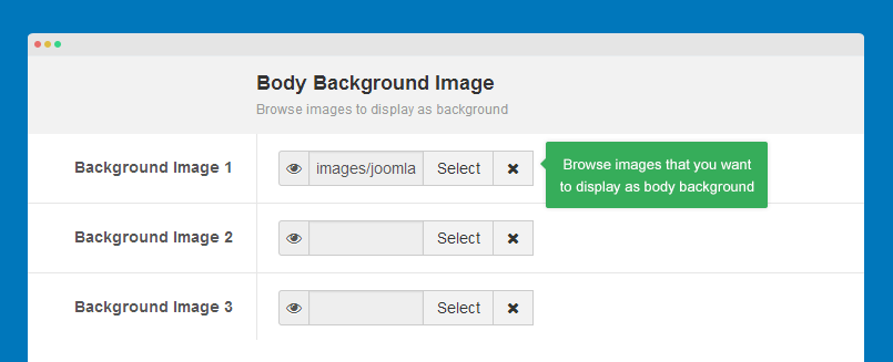
If you choose 3 background images. In front-page, each time you refresh, it will randomly display the background image.