Overview
Responsive Web Design References
JA Elastica Template Overview
JA Elastica Template is developed in T3v2 Framework. This template uses responsive web design technology. So what's new in the template?
- Supports 5 layouts including Extra-wide, Wide, Normal, Tablet and Mobile. Sites using JA Elastica template can change into respective layouts automatically to fit the screen size of devices viewers are using.
- Using Grid as the unit to define width for elements in the template (content block, modules, etc.). For Mobile, we use % as the unit to define width. Tablet and Mobile (as default): support 2 modes, portrait and landscape.
- Easy customization: easy to define the width of content blocks, the width for each module and so on.
- New module position definition: this template does not use default module positions of T3, it is re-defined for the convenience with the responsive web design technology).
- Responsive media Typo, font-size, image, logo, etc.
- Different colors, styles of badge for all modules.
Browsers support
- Support all modern, standard-compliant browsers such as Firefox, Opera, Safari, Chrome and IE 7, 8, 9.
- Do not support responsive in IE 6. In the browser, only Wide layout is displayed.
Main aspects in the documents
- Template Installation on your Joomla system
- Grid and layout positions
- Module Position and Module Configuration
- Responsive Menu and Media
System requirement
JA Elastica is compatible with Joomla 3 and Joomla 2.5. Please make sure your system meets the following requirements:
Joomla 3 System requirement
Software
- PHP (Magic Quotes GPC off): 5.3.1 + (5.4+ recommended)
Databases
- MySQL(InnoDB support required): 5.1+
- MSSQL 10.50.1600.1+
- PostgreSQL 8.3.18+
Web Severs
- Apache 2.x+
- Microsoft IIS 7
- Nginx 1.0 (1.1 recommended)
Joomla 2.5+ system requirement
Software
- PHP 5.2.4+ (5.4+ recommended)
- MySQL: 5.0.4+
Web Sever
- Apache: 2.x+
- Microsoft: IIS 7
- Nginx: 1.0 (1.1 recommended)
Browser requirement
The requirements are the same with both Joomla 2.5 and Joomla 3
- Firefox 4+
- IE (Internet Explorer) 8+
- Google Chrome 10+
- Opera 10+
- Safari 5+
Development Environment
The requirements are the same with both Joomla 2.5 and Joomla 3
During development process, Localhost is preferred. You can use the following servers on your PC to develop your site.
Windows
- WAMPSEVER
- XAMPP for Windows
Linux
- LAMP Bubdle
- XAMPP for Linux
Mac OS
- MAMP & MAMP Pro
- XAMPP for Mac OS
Installation Guide
Installing the Template
Browse and Download: Go to the Download page of JA Elastica and download the Template zip file. Refer to this screenshot for the overview of the download folder.
Install the Template: Now install the template on your Joomla 1.7 system. Follow this guide if you are not familiar with the installation procedure.
Template Configuration
Elastica template will be installed with the settings used on the demo website, so you can postpone the configuration until you complete the setup (install other modules / plugins used in the demo website).
Once you complete the setup, you can come back to the template back-end and check the various options for customizing your template. Refer to the Universal T3 V2 Back-end Config Guide for options on how to customize your installed template.
Note: T3v2 template configurations are the same in Joomla 1.5 and Joomla 1.7, so the above guide link is valid for both.
Links to resources on T3v2 Framework templates and advanced configurations.
- Overview
- Developer Guides
- Customization FAQs
- Mega Menu - A missing menu system for Joomla
- Video Tutorials (valid for Joomla 1.5, 1.7 and 2.5)
Error? - I see “Missing T3” error on the website front-end?
T3v2 Framework based templates need the T3 Framework Plugin to install and enable.
Installing T3v2 Framework Plugin (T3 system plugin)
Download and install T3v2 Framework Plugin (aka T3 System plugin). Follow this guide if you are not familiar with the installation procedure. After the plugin is installed, enable it.
Grid and Layout
Grid structure
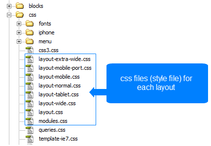
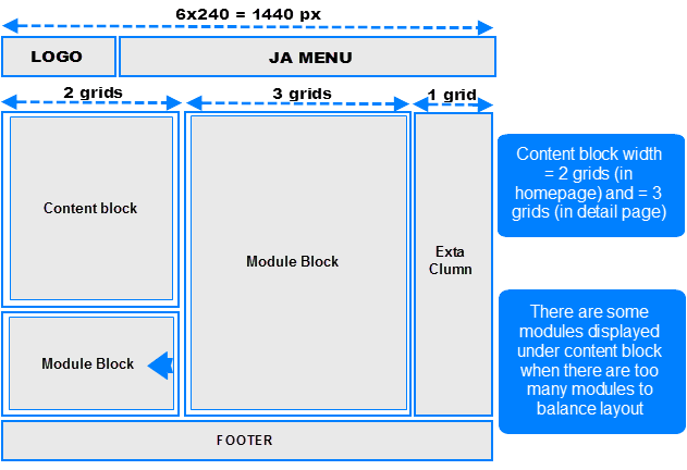
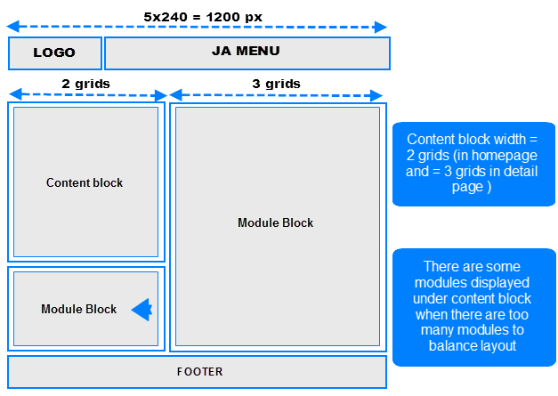
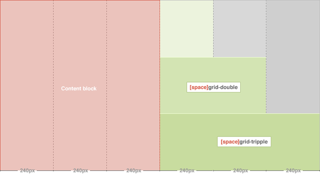
JA Elastica uses grid as the unit to define width for each layout (except Mobile layout). Each grid is defined = 240 pixel. There are a maximum of 5 grids being used. That means the maximum layout should be 5x240 = 1200 pixel. Actually, the Extra-wide layout has maximum width = 1440 pixel, so how can we do that? For the Extra-wide layout, we add an extra-column that is also considered as a grid and the width of the extra-column = width of one grid = 240 pixel.
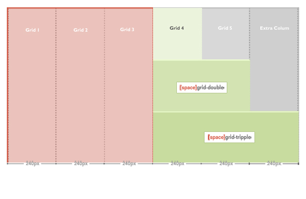
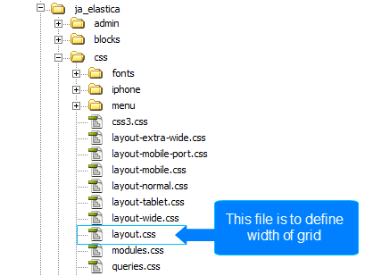
Now, the maximum width is 1440 pixel. One grid is defined = 240 pixel. From the defined grid, you can define width for grid-double and grid-triple, please navigate to: your_site/templates/ja_elastica/css/layout.css. The layout.css file is to define the width of grid-double, grid-triple.
.ja-masonry {
 width: 240px;
}
.grid-double {
 width: 480px;
}
.grid-tripple {
 width: 720px;
}
As defined here, the grid-double is defined as 480 px (= 2 grids) and grid-triple is defined as 720 px (= 3 grids). The grid-double and grid-triple will be used to configure for the width of content blocks and modules.
Layout
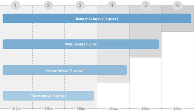
There are 5 layouts (Extra-wide, Wide, Normal, Tablet, Mobile) defined in the template.
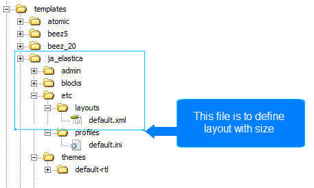
The file your_site/templates/ja_elastica/core/etc/layouts/default.xml is to define the width of each layout.
As default, the lines 5 --> 12 are to define the width size for each layout and css file that is loaded as style of the layout. For example, if the layout is wide with minimum width = 1236 and maximum < 1440 pixel, then the layout will use the style defined in the file layout-wide.css.
HTML Code:<stylesheets> <file media="all">css/layout.css</file> <file media="all">css/template.css</file> <file media="all">css/modules.css</file> <file media="only screen and (max-width:719px)">css/layout-mobile.css</file> <file media="only screen and (max-width:479px)">css/layout-mobile-port.css</file> <file media="only screen and (min-width:720px) and (max-width: 985px)">css/layout-tablet.css</file> <file media="only screen and (min-width:986px) and (max-width: 1235px)">css/layout-normal.css</file> <file media="only screen and (min-width:1236px)">css/layout-wide.css</file> </stylesheets>
- The wide layout has minimum width = 1236 and maximum < 1440 pixel.
- The normal layout has minimum width = 986 and maximum = 1235 pixel.
- The tablet layout has minimum width = 720 and maximum = 985 pixel.
- The mobile portrait layout has maximum width = 479 pixel.
- The mobile landscape layout has maximum width = 719 pixel.
Extra-wide layout
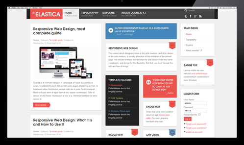
JA Elastica Template layout overview:
Front-end Appearance
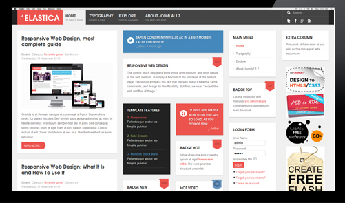
There are 2 width size modes of the content block: in Homepage (considered as list page mode) and in Detail page mode. In the Homepage, the width of the content block is 2 grids while in the detail page mode, the width of the content block is 3 grids. The above image shows you the layout of homepage of our template in which the content block = 2 grids.
To configure for the width of content in homepage and content page (detail page mode), navigate to: your_site/templates/ja_elastica/css/layout.css. The code for this configuration is located in the line from 86 to 93, you can change the width here.
Note:
- If there are too many modules, some modules will be moved automatically to display under the content block so that your layout will always be nice.
- The settings are the same for 3 layout types (Extra-wide, Wide and Normal).
ja-content {
 width: 720px; /* 3 grids */
}
.ja-frontpage #ja-content {
 width: 480px; /* Frontpage Content 2 grids */
}
The width of the layout is not defined as the way shown in the section above. The width of the layout = 5 grids + extra-column, so we need to know where the extra-column is defined and how it works. The Extra column uses Ajax to load.
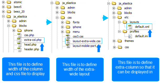
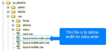
Step 1: You need to note some important information in the file your_site/templates/ja_elastica/blocks/extra-col.php. This file is to define the width of the extra column, select css file to display when satisfying defined condition.
<?php // Add css for this extra-wide layout $this->addCSS ('css/layout-extra-wide.css', 'only screen and (min-width:1440px)');
This code is to add css file (css/layout-extra-wide.css) for the extra-wide layout. See more at: http://wiki.joomlart.com/wiki/JA_Elastica/Grid_and_Layout#sthash.SOwrdbcn.dpuf
<style type="text/css"> /* hide by default */

ja-extra-col {
display: none; width: 240px; }

ja-extra-col-loading {
display: none; } </style>
This code is to define the width and the style of the extra-column.
Step 2: Define the width of the extra-wide layout. Navigate to your_site/templates/ja_elastica/core/etc/layout-extra-wide.css.
.main { max-width: 1440px !important; width: 1440px !important; }
Step 3: You need to define the extra-col module position so that you can assign modules to display in the position. The file for defining the extra-column is your_site/templates/ja_elastica/core/etc/layouts/default.xml file (the line 26 as default).
</blocks> <blocks name="middle"> <block name="right1">position-7, position-5</block> <block name="right2" type="extra-col">extra-col</block> </blocks>
Wide layout
JA Elastica Template layout overview for Wide layout:
Front-end Appearance
This layout is exactly same with the extra-wide layout, except the extra-column is removed.
The file your_site/templates/ja_elastica/core/etc/layouts/default.xml is to define the width of the layout.
<file media="only screen and (min-width:1236px)">css/layout-wide.css</file>
As defined here, the layout has minimum width = 1236 px and maximum < 1440 px. And with the condition, the layout will use the file layout-wide.css under the folder your_site/templates/ja_elastica/css to be the style of the template.
Normal layout
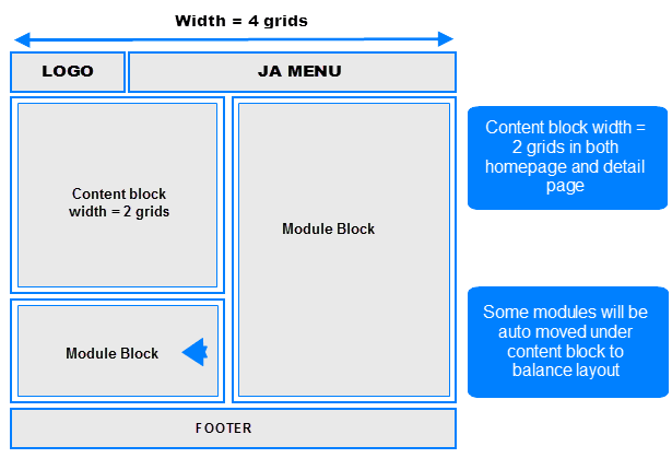
The normal layout uses 4 grids. The content block's width = 2 grids.
How the modules are changed when layout is changed from Wide layout to Normal layout?
The modules in the grids that are enabled in Wide and Extra-Wide layout but not in Normal layout will be moved to available grids in Normal layout (grid 3 and 4 or under the content block) in the order from left to right.
Modules in Normal layout:
Front-end Appearance
To define the width of the layout, please navigate to your_site/templates/ja_elastica/core/etc/layouts/default.xml. The file default.xml is to define the width range of each layout.
<file media="only screen and (min-width:986px) and (max-width: 1235px)">css/layout-normal.css</file>
As defined here, the layout has minimum width = 1236 px and maximum < 1440 px. And with the condition, the layout will use the file layout-wide.css under the folder your_site/templates/ja_elastica/css to be the style of the template.
Tablet layout
There are 2 layout types for tablets. The first one is Tablet Portrait layout and Tablet Landscape layout (the Landscape layout is the Normal layout).
The Portrait layout uses 3 grids. The content block has the width = 3 grids in both Homepage and detail page so all modules will be displayed under the content block.
- Portrait layout
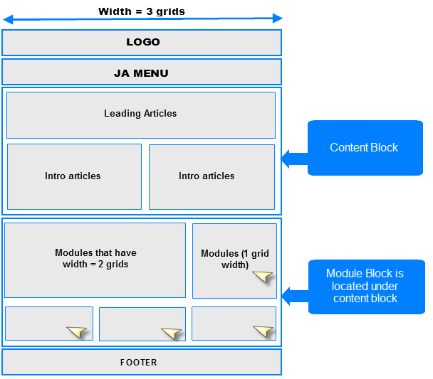
Front-end Appearance
To define width of the layout, please navigate to your_site/templates/ja_elastica/core/etc/layouts/default.xml. The file default.xml is to define the width range of each layout.
<file media="only screen and (min-width:720px) and (max-width: 985px)">css/layout-tablet.css</file>
As defined here, the layout width has minimum = 720px and maximum = 985 px. And with the condition, the layout will use the file layout-tablet.css under the folder your_site/templates/ja_elastica/css to be the style of the template.
Mobile layout
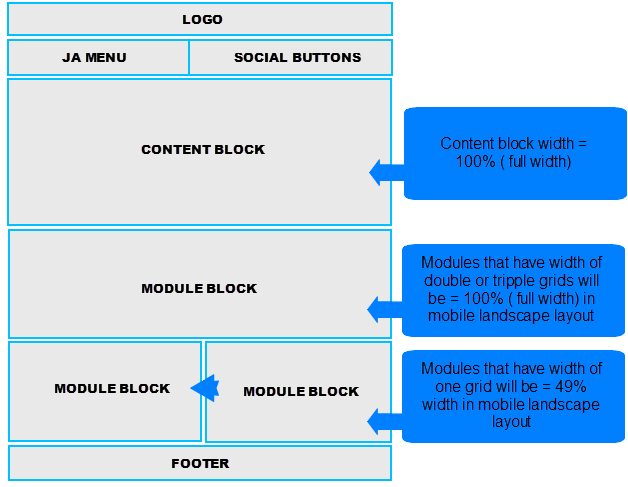
There are 2 layout types for mobile. The first one is Tablet Portrait layout and Tablet Landscape layout (the Landscape layout is the Normal Layout). The mobile layout uses percentage (%) as the unit to define the width of the layout. The full width of the layout is 100%, from that, you can define the width for each element in the template.
- Mobile Landscape layout
Front-end Appearance

To define width of the layout, please navigate to your_site/templates/ja_elastica/core/etc/layouts/default.xml. The file default.xml is to define the width range of each layout.
<file media="only screen and (max-width:719px)">css/layout-mobile.css</file>
As defined here, the layout has the maximum width = 719 px. And with the condition, the layout will use the file layout-mobile.css under the folder your_site/templates/ja_elastica/css to be the style of the layout (the css file contains configuration for style of the layout including width, font size, logo size and so on).
.main {
 width: 100%;
}
.column {
 float: none;
 width: 100% !important;
}
/* MASONRY PRESETS (240px*5 Grids)
*/
/* Sizes---*/ .ja-masonry {
 width: 49%;
}
.grid-double, .grid-tripple {

 width: 100%;

}
As defined in the code above, the width is re-defined. In Mobile Landscape layout, ja-masonry (grid) is converted to percentage (%). One grid is now = 49% width in Mobile Landscape layout, and the grid-double, the grid-triple are now = 100% width (full width). You can change the rate here.
- Mobile Portrait layout
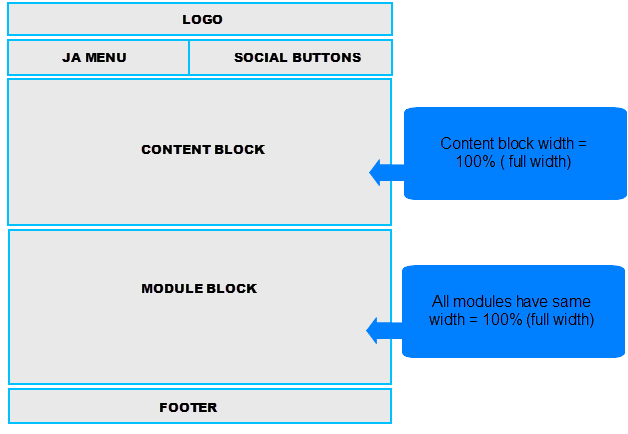
Front-end Appearance

To define the width of the layout, please navigate to your_site/templates/ja_elastica/core/etc/layouts/default.xml. The file default.xml is to define the width range of each layout.
<file media="only screen and (max-width:479px)">css/layout-mobile-port.css</file>
As defined here, the layout has the maximum width = 479 px. And with the condition, the layout will use the file layout-mobile-port.css under the folder your_site/templates/ja_elastica/css to be the style of the layout (the css file contains configuration for style of the layout including: width, font size, logo size and so on).
/* MASONRY PRESETS (240px*5 Grids)
*/
/* Sizes---*/ .ja-masonry, .grid-double, .grid-tripple,
    ja-header .main,
    ja-content,
.item {
 float: none !important;
 width: 100% !important;

}
- See more at: http://wiki.joomlart.com/wiki/JA_Elastica/Grid_and_Layout#sthash.Vncix4J5.dpuf
Module Configuration
Module position
JA Elastica Template is developed in T3 Framework V1.6 but it does not use default module position of T3 Framework, the module positions are re-defined.
<blocks name="top" style="xhtml"> <block name="header" type="header" main-inner="1"></block> </blocks> <blocks name="middle"> <block name="right1">position-7, position-5</block> <block name="right2" type="extra-col">extra-col</block> </blocks> <blocks name="bottom" style="xhtml"> <block name="footer" type="footer"></block> <block name="masonry" type="masonry" no-wrap="1" no-main="1"></block> </blocks>
The above code defines all positions used in JA Elastica Template, there will be 3 enabled positions that modules can be assigned to display in front-end (position-5, position-7 and extra-col). The extra-col position is only enabled in Extra-wide layout.
Note: Most of the modules used in the template are custom HTML modules.
Module Width Config
The default width of module is one grid (240 px). If you want the width of one module (240 px, 1 grid) then you don't need to configure. To set the width of module (2/3 grids), you need to configure it in the module class suffix.
For the content of module, create it as usual.
Note: Once you enter the class suffix, leave a space character at the beginning, this is to enable some space between modules. There can be more than 1 class suffix so each class suffix will be separated to each other with a space character.
grid-double mod-contrast contrast-blue
Front-end Appearance:

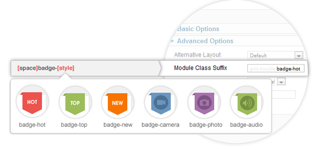
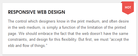
Module Badge Style config
JA Elastica supports 6 styles of badge. Each module can be configured to use one of the 6 styles. This is configured in the Module class suffix field.
Example:
grid-double badge-hot
Front-end Appearance
Module Color Config
The default color for module is: normal (white). If you want to use the contrast color then you need to configure in the Module class suffix field.
JA Elastica supports 5 colors of contrast. Each module can be configured to use one within the 5 colors.
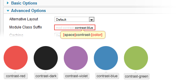
Example:
grid-double mod-contrast contrast-blue
Front-end Appearance
Responsive Media
Responsive Menu
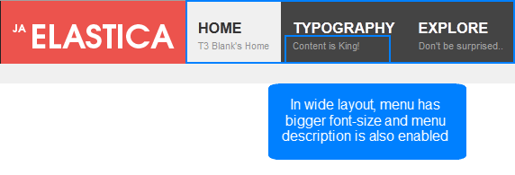
This template only supports Mega Menu. The menu will be changed due to each type of layout.Menu in Extra-Wide, Wide layout
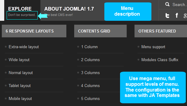
The Extra-wide and Wide layout has Mega Menu style and fully supports levels of menu. Supports displaying menu description.
Menu in Normal layout
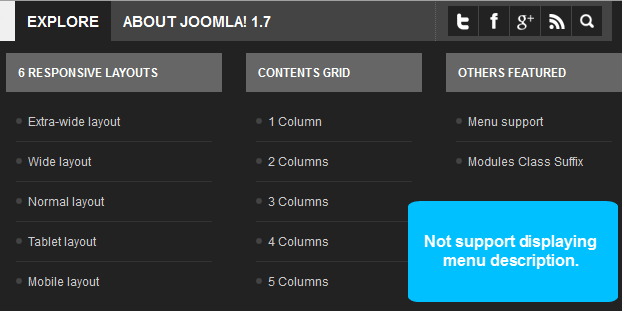
The Normal layout has Mega Menu style and fully supports levels of menu. It does not support displaying menu description.
Menu in Tablet Portrait layout
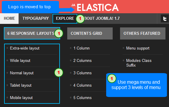
The Tablet Portrait layout has Mega menu style and fully supports 3 levels of menu (level 0 level 1 and level 2). In the Tablet Portrait layout, the Logo is moved to the top while the menu goes behind to leave more space for menus. This layout does not support hovering option (you will have to click on the parent menu to enable the child menu). Does not support displaying menu description as well.
Menu in Mobile layout
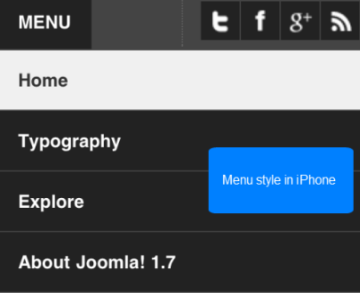
Mobile Portrait layout uses Mega Menu style and fully supports 3 levels of menu (level 0 level 1 and level 2). In the Mobile Portrait layout, the logo is moved to the top while the menu goes behind to have more space for menus. In this layout, it does not support hovering option (you will have to click on the parent menu to enable the child menu). Does not support displaying menu description.
Responsive Objects
JA Elastica Templates supports responsive typography and font-size. In each layout, the typo and font-size will have different out-looks. This will make your layout look nice and balanced.
The font-size is defined in the css file of each layout in the folder your_site/templates/ja_elastica/css.
Note: We reset default font-size to 10 px (default is 16 px). 1 em is set = 10 px then 1.3 em = 13 px.
body.fs1 #ja-wrapper {
 font-size: 1.1em !important;
}
body.fs2 #ja-wrapper {
 font-size: 1.2em !important;
}
body.fs3 #ja-wrapper {
 font-size: 1.3em !important;
}
body.fs4 #ja-wrapper {
 font-size: 1.4em !important;
}
body.fs5 #ja-wrapper {
 font-size: 1.5em !important;
}
body.fs6 #ja-wrapper {

 font-size: 1.6em !important;
}
For example:
In Wide layout, the menu has a bigger font-size and the menu description is enabled.
Responsive Image
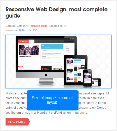
JA Elastica Template supports responsive images. In each layout, the image will have different size to fit the layout. This will make your layout look nice and balanced.
For example:
In Wide, Extra-wide or Normal layout, the width of the leading article is 2 grids while in the tablet portrait layout, the width of leading articles is 3 grids. The size of image in tablet portrait layout must be bigger to fit the layout.
In Tablet layout, the image of leading article has the bigger size than in Normal layout.
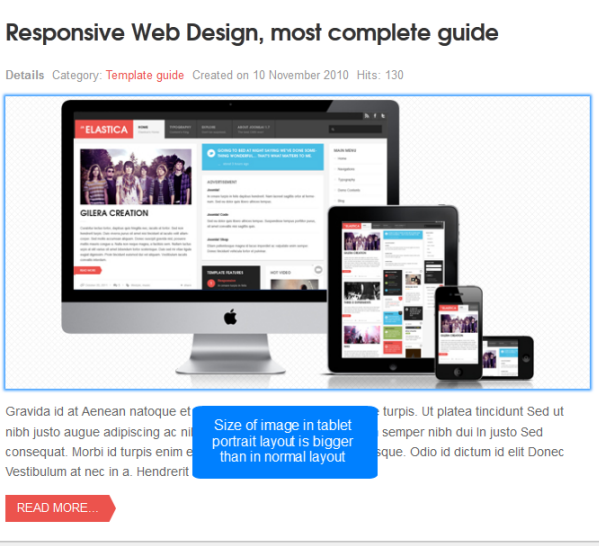
Note: For image, we use one image for all layouts.