Responsive Menu
This template is only support Mega menu.
The menu is changed due to each type of layout.
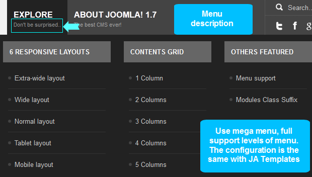
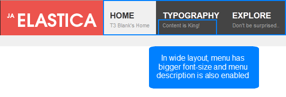
Menu in Extra-Wide, Wide layout
The Extra-wide and Wide layout have [B]mega menu style, full support levels of menu, ... [/B]. Support displaying menu description.
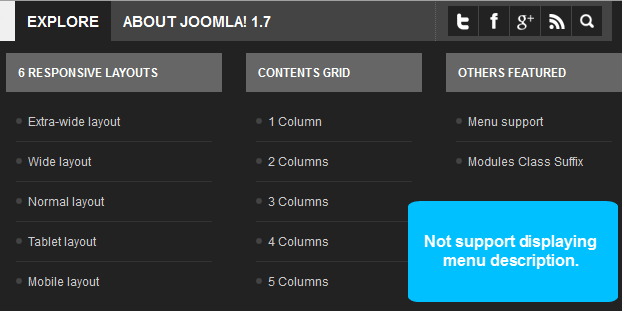
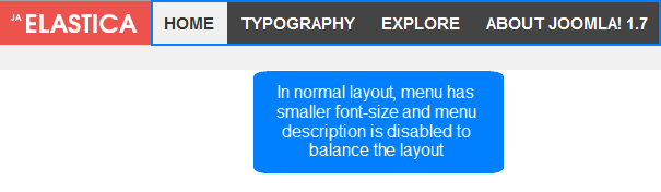
Menu in Normal layout
The Normal layout has [B]mega menu style, full support levels of menu, ... Does not support displaying menu description.
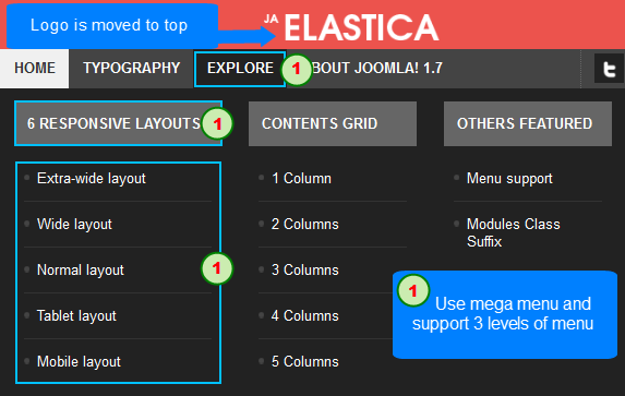
Menu in Tablet Portrait layout
Tablet Portrait layout: uses mega menu style, support 3 levels of menu (level 0 level 1 and level 2). In the Tablet Portrait layout, the [B]Logo is moved to the top[/B], the menu goes behind --> space for menus. In this layout, it does not support hovering option (you have to click on parent menu to enable child menu). Does not support displaying menu description.
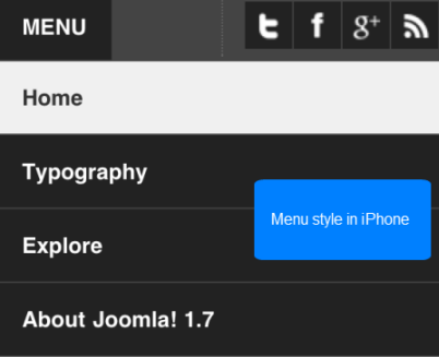
Menu in Mobile layout
Mobile Portrait layout: uses mega menu style, support 3 levels of menu (level 0 level 1 and level 2). In the mobile Portrait layout, the Logo is moved to the top, the menu goes behind --> space for menus. In this layout, it does not support hovering option (you have to click on parent menu to enable child menu). Does not support displaying menu description.
Responsive Objects
JA Elastica Templates support responsive typography and font-size. In each layout, the typo and font-size will have different out-look. This will make your layout be nice and balanced.
The font-size is defined in the css file of each layout in the: your_site/templates/ja_elastica/css folder.
Note:
we reset default font-size to 10 px (default is 16 px). 1 em is set = 10 px then 1.3 em = 13 px
body.fs1 #ja-wrapper {

 font-size: 1.1em !important;

}
body.fs2 #ja-wrapper {

font-size: 1.2em !important;

}
body.fs3 #ja-wrapper {

font-size: 1.3em !important;

}
body.fs4 #ja-wrapper {

font-size: 1.4em !important;

}
body.fs5 #ja-wrapper {

font-size: 1.5em !important;

}
body.fs6 #ja-wrapper {

font-size: 1.6em !important;

}
For example:
In Wide layout, the menu has bigger font-size and menu description is enabled.
In Normal layout, the menu has smaller font-size and menu description is disabled.
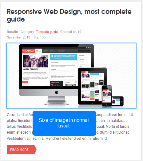
Responsive Image
JA Elastica Templates support responsive image. In each layout, the image will have different size to fit the layout. This will make your layout be nice and balanced.
For example:
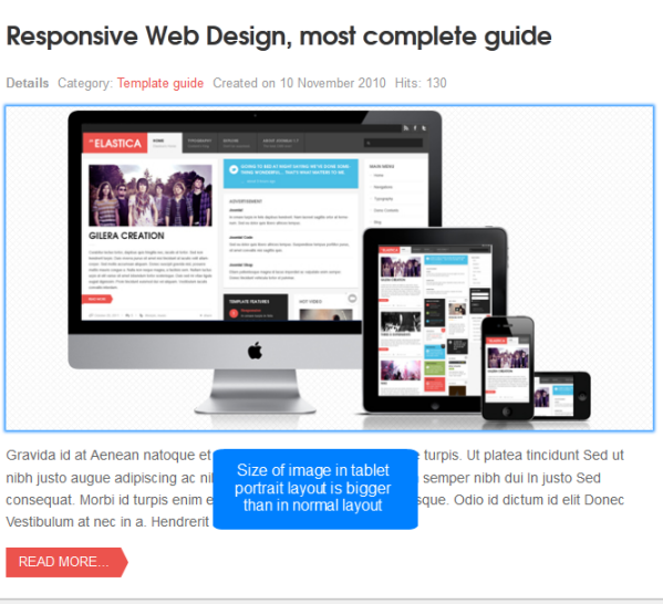
In Wide, extra-wide or normal layout, the width of leading article is 2 grids while in the tablet portrait layout, the width of leading articles is 3 grids --> the size of image in tablet portrait layout must be bigger to fit the layout .
In Tablet layout, the image of leading article has bigger size than its in normal layout.
Note: For image, we use one image for all layouts.