Grid and layout
Grid structure
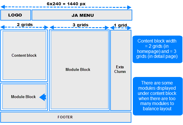
JA Elastica uses grid as unit to define width for each layout (except mobile layout). Each grid is defined = 240 pixel. There are maximum 5 grids used. That means the maximum layout should be 5x240 = 1200 pixel. Actually, the extra-wide layout has maximum width = 1440 pixel, so how can we do that?
For the extra-wide layout, we add an extra-column that is also condisdered as a grid and the width of the extra-column = width of one grid = 240 pixel.
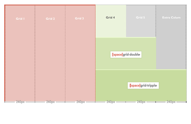
Now, the maximum width is 1440 pixel
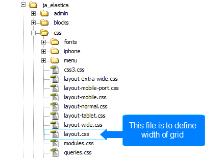
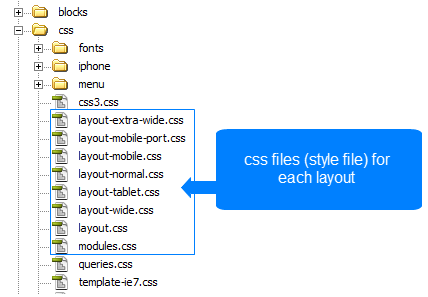
One grid is defined = 240 pixel. From the defined grid, you can define width for grid-double and grid-tripple, please navigate to: your_site/templates/ja_elastica/css/layout.css . The layout.css file is to define width of grid-double, grid-tripple.
.ja-masonry {

 width: 240px;

}
.grid-double {

 width: 480px;

}
.grid-tripple {

 width: 720px;

}
Note: ja-masonry here is a grid.
As defined here, the grid-double is defined = 480 px (= 2 grids) and grid-tripple is defined = 720 px ( = 3 grids). The grid-double and grid-tripple will be used to configured for width of content block and modules.
Layout
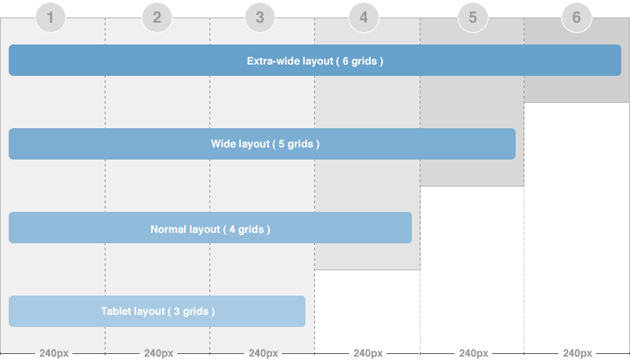
There are 5 layouts (Extra-wide, wide, normal, tablet, mobile) are defined in the template.
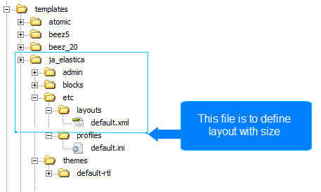
The file: your_site/templates/ja_elastica/core/etc/layouts/default.xml is to define width of each layout.
As default, the lines 5 --> 12 are to define the width size for each layout and css file that is loaded as style of the layout. For example, if the layout is wide (minimum width = 1236 and maximum < 1440 pixel) then the layout will use the style defined in the layout-wide.css file.
<stylesheets>

	<file media="all">css/layout.css</file>

	<file media="all">css/template.css</file>

	<file media="all">css/modules.css</file>

	<file media="only screen and (max-width:719px)">css/layout-mobile.css</file>

	<file media="only screen and (max-width:479px)">css/layout-mobile-port.css</file>

	<file media="only screen and (min-width:720px) and (max-width: 985px)">css/layout-tablet.css</file>

	<file media="only screen and (min-width:986px) and (max-width: 1235px)">css/layout-normal.css</file>

	<file media="only screen and (min-width:1236px)">css/layout-wide.css</file>

</stylesheets>
- The wide layout has minimum width = 1236 and maximum < 1440 pixel
- The normal layout has minimum width = 986 and maximum = 1235 pixel
- The tablet layout has minimum width = 720 and maximum = 985 pixel.
- The mobile port trait layout has maximum width = 479 pixel.
- The Mobile landscape layout has maximum width = 719 pixel.
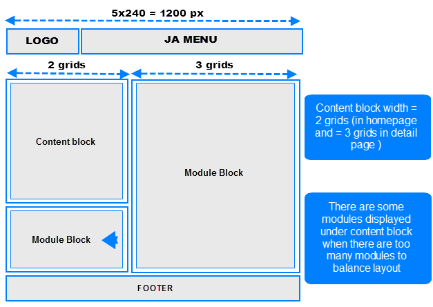
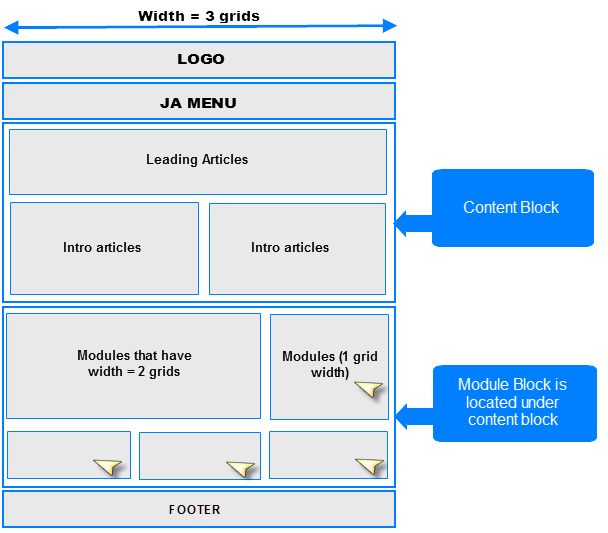
Extra-wide layout
JA Elastica Template layout overview
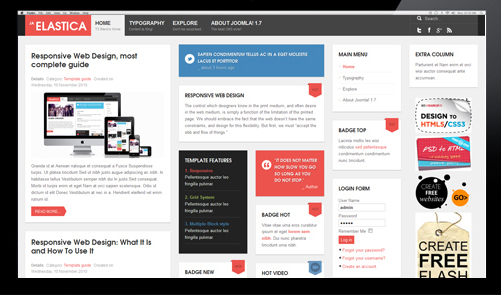
There are 2 width size modes of the content block: in Homepage (considered as list page mode) and in Detail page mode. In the Homepage, the width of the content block = 2 grids while in the detail page mode, the width of content block is 3 grids. The above image shows you the layout of homepage of our template --> content block = 2 grids.
To configure for the width of content in homepage and content page (detail page mode), navigate to: your_site/templates/ja_elastica/css/layout.css. The code for this configuration is located in the line from 86->93, you can change the width here.
Note:
- If there are too many modules, some modules will be auto moved to display under the content block so that your layout will always be nice.
- The settings is the same for 3 layout types (extra-wide, wide and normal)
ja-content {

 width: 720px; /* 3 grids */

}
.ja-frontpage #ja-content {

 width: 480px; /* Frontpage Content 2 grids */

}
The width of the layout is not defined as the way shown in the section above. The width of the layout = 5 grids + extra-column, so we need to know where the extra-column is defined and how it works. The Extra column uses Ajax to load].
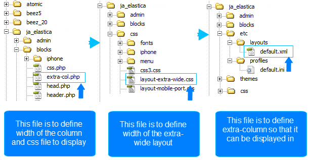
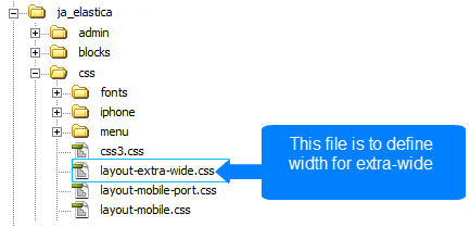
- Step 1, you need to note some important information in the file: your_site/templates/ja_elastica/blocks/extra-col.php. This file is to define width of the extra column, select css file to display when satisfying defined condition.
<?php
// Add css for this extra-wide layout
$this->addCSS ('css/layout-extra-wide.css', 'only screen and (min-width:1440px)');
This code is to add css file (css/layout-extra-wide.css) for the extra-wide layout.
<style type="text/css">
/* hide by default */

ja-extra-col {

display: none;
	width: 240px;
}

ja-extra-col-loading {

display: none;
}
</style>
This code is to define width and style of the extra-column.
- Step 2, define the width of the extra-wide layout. Navigate to: your_site/templates/ja_elastica/core/etc/layout-extra-wide.css
.main {
	max-width: 1440px !important;
	width: 1440px !important;
}

ja-main {

width: 1200px ;
	float: left;
}
- Step 3, you need to define the extra-col module position so that you can assign modules to display in the position ( the file to define the extra-column is: your_site/templates/ja_elastica/core/etc/layouts/default.xml file ( the line 26 as default)).
</blocks>
<blocks name="middle">
	<block name="right1">position-7, position-5</block>
	<block name="right2" type="extra-col">extra-col</block>
</blocks>
Wide layout
JA Elastica Template layout overview for Wide layout
This layout is exactly same with the extra-wide layout, except the extra-column is removed.
The file: [B][I]your_site/templates/ja_elastica/core/etc/layouts/default.xml[/I][/B] is to define width of the layout.
<file media="only screen and (min-width:1236px)">css/layout-wide.css</file>
As defined here, the layout has minimum width = 1236 px and maximum < 1440 px. And with the condition, the layout will use the layout-wide.css file under the your_site/templates/ja_elastica/css folder to be the style of the template.
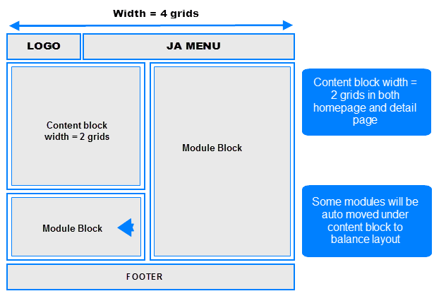
Normal layout
The normal layout uses 4 grids. The content block width = 2 grids.
How the modules are changed when layout is changed from Wide layout to Normal layout?
The modules in the grids that are enabled in Wide and Extra-Wide layout but not in Normal layout will be moved to available grids in Normal layout (grid 3 and 4 or under the content block) in the order from left to right.
Modules in Normal layout
To define width of the layout, please navigate to: your_site/templates/ja_elastica/core/etc/layouts/default.xml. The file default.xml is to define width range of each layout.
<file media="only screen and (min-width:986px) and (max-width: 1235px)">css/layout-normal.css</file>
As defined here, the layout has minimum width = 1236 px and maximum < 1440 px. And with the condition, the layout will use the layout-wide.css file under the your_site/templates/ja_elastica/css folder to be the style of the template.
Tablet layout
There are 2 layout types for tablet. The first one is [B]Tablet Portrait[/B] layout and [B]Tablet Lanscape[/B] layout ( the Landscape layout is the Normal Layout).
The Portrait layout uses 3 grids.The content block has width of 3 grids in both homepage and detail page so all modules will be displayed under the content block.
- Portrait layout
To define width of the layout, please navigate to: your_site/templates/ja_elastica/core/etc/layouts/default.xml. The file default.xml is to define width range of each layout.
<file media="only screen and (min-width:720px) and (max-width: 985px)">css/layout-tablet.css</file>
As defined here, the layout has minimum width = 720px and maximum = 985 px. And with the condition, the layout will use the layout-tablet.css file under the your_site/templates/ja_elastica/css folder to be the style of the template.
Mobile layout
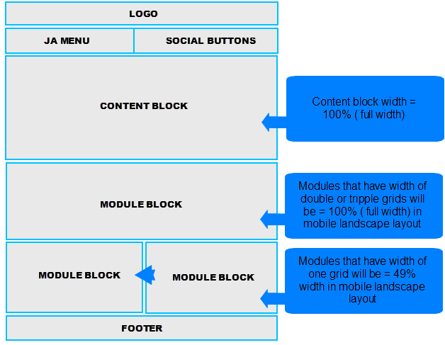
There are 2 layout types for mobile. The first one is Tablet Portrait layout and Tablet Lanscape layout ( the Landscape layout is the Normal Layout). The mobile layout uses percentage (%) as unit to define width of the layout. The full width of the layout is 100%, from that, you can define width for each element in the template.
- Mobile Landscape layout

To define width of the layout, please navigate to: your_site/templates/ja_elastica/core/etc/layouts/default.xml. The file default.xml is to define width range of each layout.
<file media="only screen and (max-width:719px)">css/layout-mobile.css</file>
As defined here, the layout has maximum width = 719 px. And with the condition, the layout will use the layout-mobile.css file under the your_site/templates/ja_elastica/css folder to be the style of the layout ( the Css file contains configuration for style of the layout including: width, font size, logo size, ... )
.main {

 width: 100%;

}
.column {

 float: none;
 width: 100% !important;

}
/* MASONRY PRESETS (240px*5 Grids)

 */
/* Sizes---*/
.ja-masonry {

 width: 49%;

}
.grid-double,
.grid-tripple {

 width: 100%;

}
As defined in the code above, the width is re-defined. In mobile landscape layout, the ja-masonry (grid) is converted to percentage (%). One grid is now = 49% width in mobile landscape layout, and grid-double, grid-tripple are now = 100% width (full width). You can change the rate here.
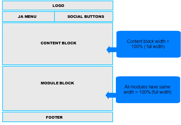
- Mobile Portrait layout

To define width of the layout, please navigate to: your_site/templates/ja_elastica/core/etc/layouts/default.xml. The file default.xml is to define width range of each layout.
<file media="only screen and (max-width:479px)">css/layout-mobile-port.css</file>
As defined here, the layout has maximum width = 479 px. And with the condition, the layout will use the layout-mobile-port.css file under the your_site/templates/ja_elastica/css folder to be the style of the layout ( the Css file contains configuration for style of the layout including: width, font size, logo size, ... )
/* MASONRY PRESETS (240px*5 Grids)

*/
/* Sizes---*/
.ja-masonry,
.grid-double,
.grid-tripple,

ja-header .main,
ja-content,

.item {

float: none !important;
 width: 100% !important;

}