Supported Menu system
Purity III supports 3 menu systems including Megamenu, Off-canvas sidebar and default Bootstrap menu on small screen like mobiles.

Megamenu
Off-canvas sidebar
Default Bootstrap menu
Menu configuration in Purity III is quite easy. You can enable or disable any of those menu systems on your site. In the next sections, we will guide you through how to work with Purity III menu.
Megamenu configuration
The image below shows the sample megamenu menu in Purity III demo. In fact you can do much more with what Megamenu supports.
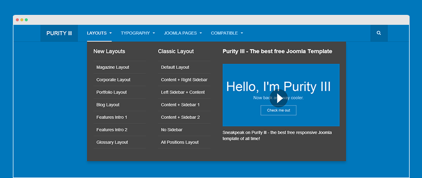
Megamenu is a highlight feature of T3 Framework. The visual configuration (what you configure is what you see in front-page) of Megamenu helps you configure it at ease.
Megamenu or Default Joomla menu ?
On one site, you can use the default Joomla menu in a template style and use Megamenu in other template styles. In each template style, you can configure which menu system it uses. If you disable the Megamenu feature, the template style will then use the default Joomla menu (drop down menu).
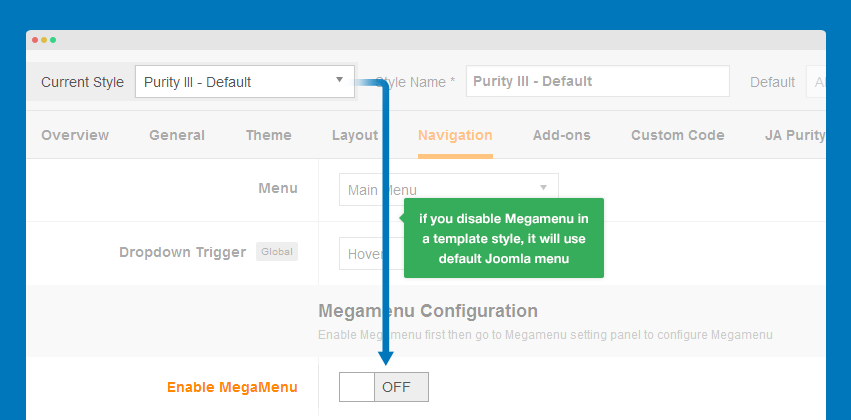
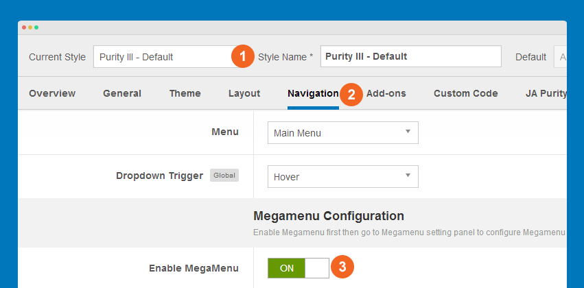
Enable Megamenu
Open the template style that you want to enable Megamenu, go to Navigation tab then enable the Megamenu option.
Configure Megamenu
Megamenu configuration is a global setting so it's the same for all template styles. On the top of template style, hit the Megamenu button.
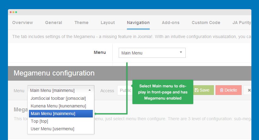
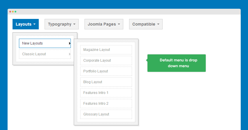
Select menu to be displayed in front-page
You can select any menu to configure for Megamenu. But it's not the menu to be displayed in your front-page. The menu to be displayed in your front-page is the menu you assign in the Template style setting, under the Navigation tab.
Megamenu configuration level
There are 3 configurations level in Megamenu: Menu item, column and sub-menu
Menu item configuration
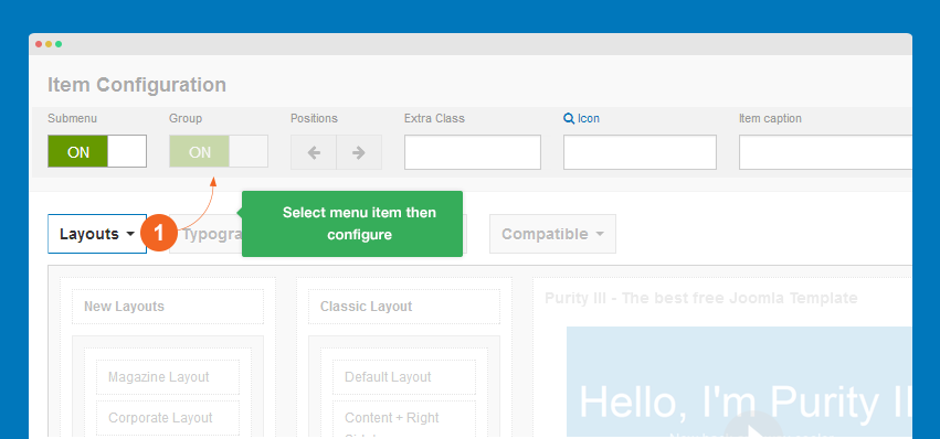
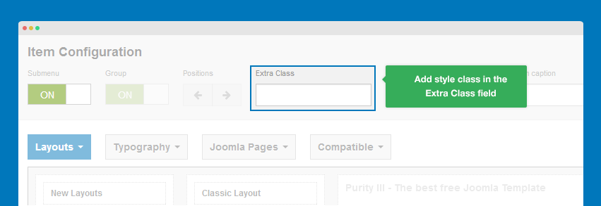
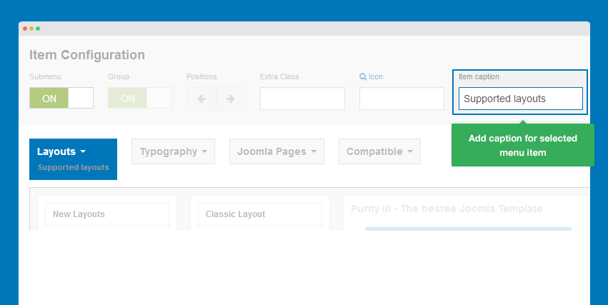
The menu item setting allows you to enable/disable its sub-menu, add extra class to style the menu item, add icon and caption for the menu item.
Sub-menu configuration
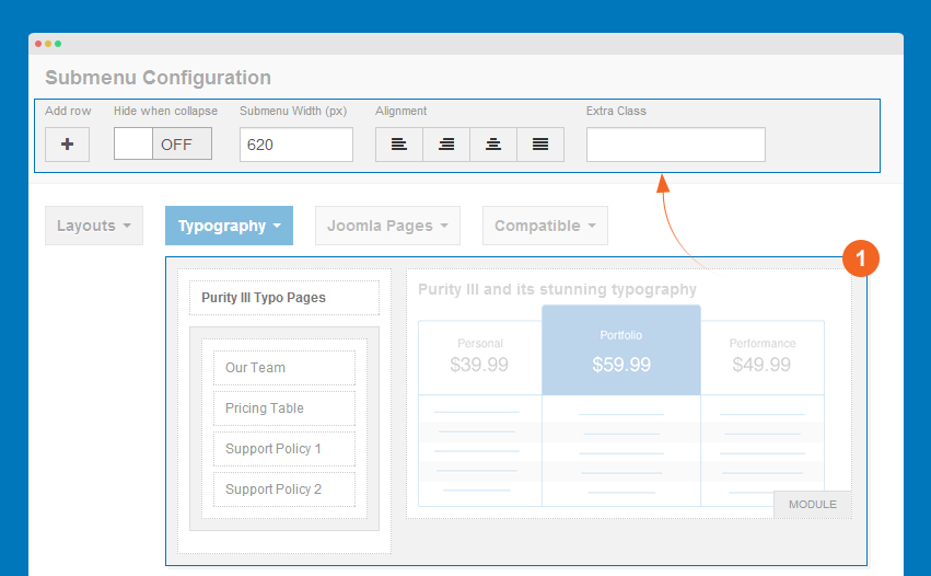
The sub-menu configuration allows you to add/delete a row under the sub-menu, show or hide the sub-menu on small screens like mobile, align the sub-menu to left, right, center or make it justify, add extra class to style for the sub-menu.
Column configuration
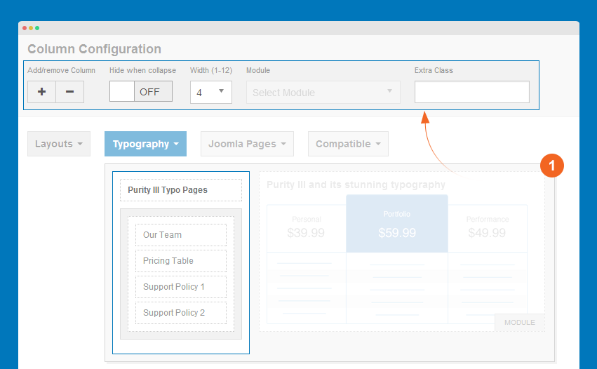
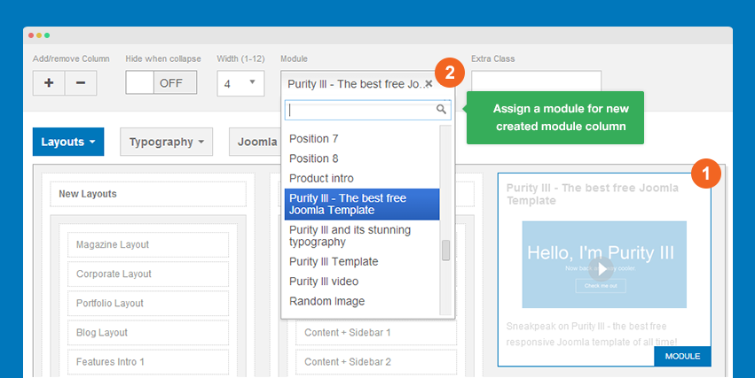
You can add/remove a column, show or hide the column in small screens like mobile, set width size of the column, assign a module if it is module menu and add extra class to style for the column.
5 steps to have Megamenu like demo
Let go through this step-by-step instruction on how to make a Megamenu like Purity III demo. Below is the default menu before configuration.
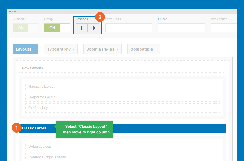
Step 1: Enable Group option for menu: New Layouts and Classic Layout
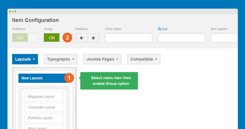
First select the menu item then enable Group option, which will group sub-menu items of one parent menu.
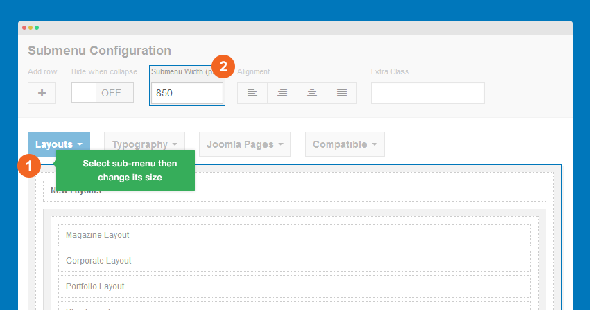
Step 2: Change sub-menu size
Select the sub-menu you need to change its size then fill in your desired width. It's 850 pixel on demo site.
Step 3: Move "Classic Layout" menu to new column
Select the Classic layout then move it to the right column using the Position button on the configuration bar.
Step 4: Create new module column
To create new module column, select "Classic layout" column then hit "+" button on the configuration bar.
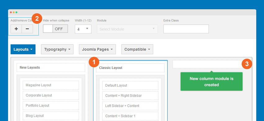
No assign content - any module for the new created column module.
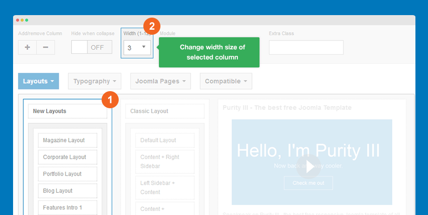
Step 5: Change column size
You can change the width size of each column to adjust your Megamenu based on the content displayed. On Purity III demo, the size of each column is 3-3-6.
Style, icon and item caption in Megamenu
Style Megamenu
You can style for Megamenu from menu item, sub-menu and column by adding style class to the field Extra Class. On Purity III demo, we don't use any extra class.
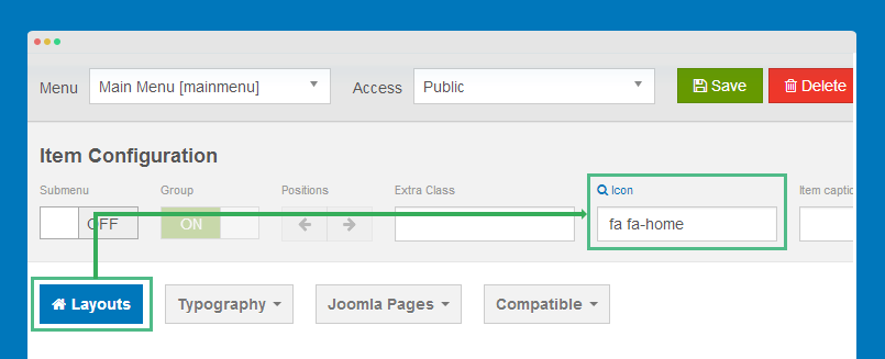
Add icon for menu item
You can add icon for any menu item in your Megamenu. It can be default Bootstrap 3 icons, Font Awesome 3 icons or your own styled ones. Select the menu item you want to add icon then paste the icon class to the Icon field.
Bootstrap 3 icon Font Awesome 3 icon
Add caption for menu item
Purity III doesn't have style for menu caption by default. Yet you can still customize your desired style for Megamenu.
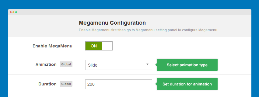
Configure effect/animation for Megamenu
Megamenu supports a number of animation types. To configure this feature, open any template style, go to Navigation tab then select your animation type and duration.
References:
With Purity III, you can build a multilingual site with multi-language Megamenu and multi instance Megamenu. Just refer to the T3 framework documentation below.
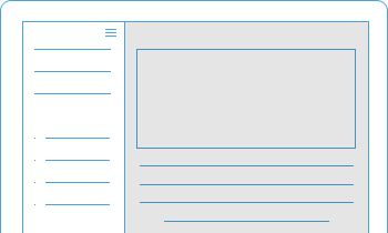
Off-canvas sidebar
The first idea of Off-canvas is for mobile menu system, but now it's much more flexible. Off-canvas is considered as a position so that you can add any content to it apart from menu. You can also select to enable/disable it in specific layouts.
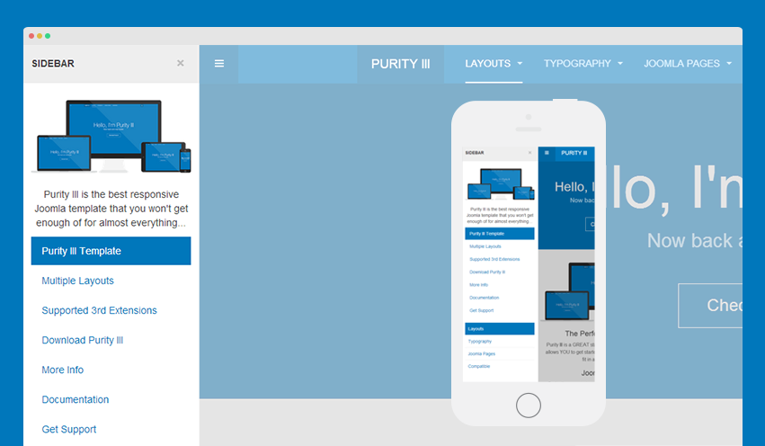
How to add content to Off-canvas sidebar?
All default layouts in Purity III includes Off-canvas position by default. You can check by opening any layout.
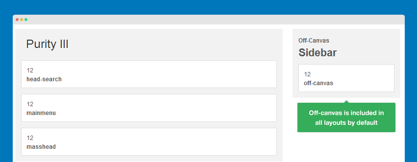
The content in Off-canvas sidebar is from the modules assigned to the position off-canvas. So if you want to add content to Off-canvas sidebar, just put the content to a module then assign that module to position off-canvas.
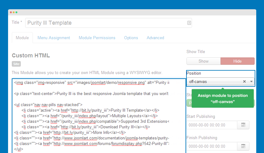
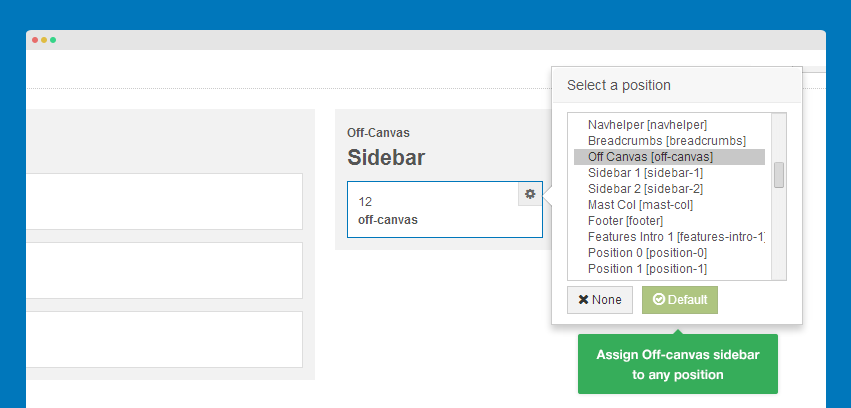
You can set Off-canvas sidebar to get content from any position. In the layout configuration panel, assign Off-canvas sidebar to the position you want it to get content from.
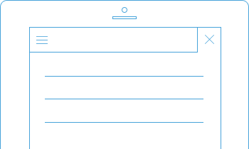
How to use Off-canvas as Main menu on mobile?
Off-canvas sidebar can be used as your main menu on mobile through the 3 steps below.
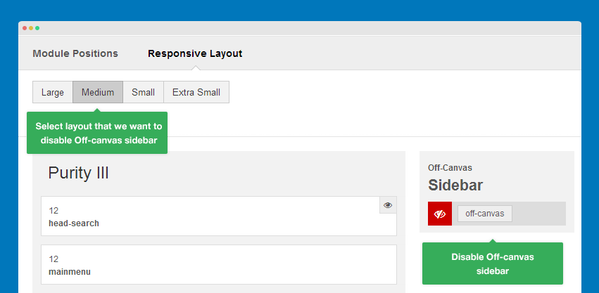
Step 1: Disable Off-canvas sidebar in all responsive layouts except mobile.
To use Off-canvas sidebar as mobile menu system, we should enable it in mobile layout only. Go to template style, then select Layout >> Responsive layout >> Extra Small layout.
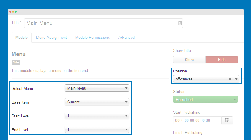
Step 2: Create menu module
Create menu module then assign to position off-canvas.
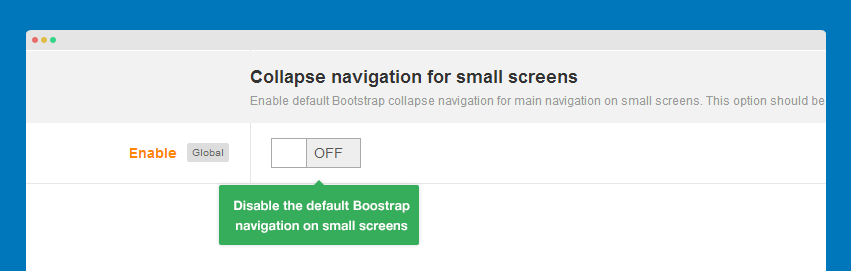
Step 3: Disable default Bootstrap navigation on small screens
If you don't disable the default Bootstrap navigation on small screens, you will have 2 menu systems on mobile layout.
How to disable Off-canvas sidebar
Disable Off-canvas sidebar in any layout
Off-canvas sidebar position is included in all layouts by default. There are 2 ways to disable/remove this in any layout.
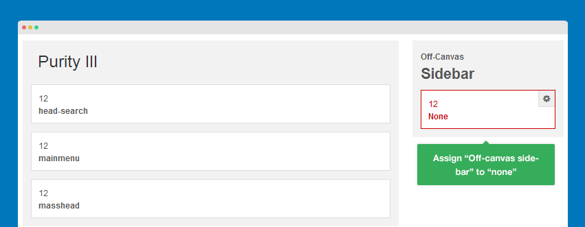
#1: In layout back-end
Open the template style with layout you want to disable Off-canvas sidebar then assign it to "none".
#2: In header.php file.
Open header.php file in templates/purity_iii/tpls/blocks then find the following code:
<!-- OFF-CANVAS -->
	<?php if ($this->getParam('addon_offcanvas_enable')) : ?>
		<?php $this->loadBlock ('off-canvas') ?>
	<?php endif ?>
	<!-- //OFF-CANVAS -->
What you need to do is remove this part:
<?php $this->loadBlock ('off-canvas') ?>
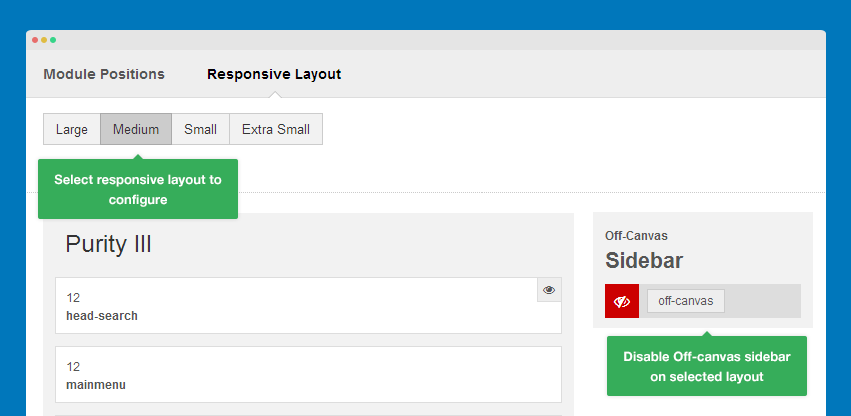
Disable Off-canvas sidebar in any responsive layout
Purity III is the responsive template that support multiple responsive layouts. You can enable/disable Off-canvas sidebar in any responsive layout by selecting the responsive layout to configure then disable off-canvas sidebar on selected layout.
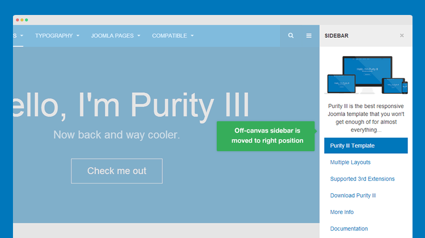
How to move Off-canvas sidebar to right side
By default, Off-canvas sidebar is located in left side but it is possible to move it to the right side.
Step 1: Move sidebar to the right side
Open of-canvas.php file in templates/purity_iii/tpls/blocks, find the code:
data-pos="left"
Change it to:
data-pos="right"
Step 2: Move button to the right side
Open off-canvas.less file in templates/purity_iii/less, find the following style:
// Toggle Button
// -------------------
.off-canvas-toggle {
  border-radius: 0;
  border: 0;
  background: transparent;
  color: @navbar-default-color;
  padding: 0;
  width: @navbar-height;
  height: @navbar-height;
  line-height: @navbar-height;
  position: absolute;
  top: 0;
  left: 0;
  // States
  &:hover, &:active, &:focus {
    outline: none;
    .box-shadow(none);
    background: @navbar-default-border;
    color: @navbar-default-link-hover-color;
  }
}
Replace the code:
left: 0;
with:
right: 0;
Front-end Appearance
off-canvas.less file. Therefore, if you want to customize the style, just use this file.Default Bootstrap navigation
Purity III integrates Bootstrap at core. Therefore it also supports default Boostrap navigation on small screens like mobile.
To enable/disable default Boostrap navigation on small screens, open the template style you want to enable/disable default bootstrap navigation then go to Navigation tab. Slide between the button On/Off.
The front-page would look like this when Boostrap navigation on small screens is enabled.