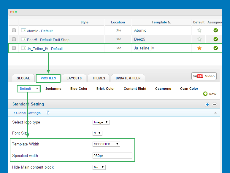
Change layout width
Question:
How to customize layout width for templates developed with JA T3v2 framework and T3 framework.
Solutions:
For templates developed with T3v2 framework
For templates developed with T3v2 framework
From back-end of your site, go to: Extensions >> Template Manager >> JA Template >> Profiles Tabs >> specified width as you wish.
For templates developed with T3 framework
#1: For templates developed with T3 Framework version 1.4.x- and integrated Bootstrap 2
Here is the list of templates developed with T3 Framework version 1.4.x- and integrated Bootstrap 2.
- JA Magz
- JA Muzic
- JA Fixel
- JA Beranis
- JA Smashboard
- JA Hawkstore
- JA Fubix
- JA Argo
- JA Mitius
- JA Onepage
- JA Mero
- JA Brisk
Open the templates/ja_template/less/variables.less file, then find the code like this:
// Default 940px grid
// -------------------------
@T3gridWidth:             980px;  // T3 add. For non-responsive layout.
@gridColumns:             12;
@gridGutterWidth:         4px;
@gridColumnWidth:     	  floor((@T3gridWidth - @gridGutterWidth * (@gridColumns - 1)) / @gridColumns);
@gridRowWidth:            (@gridColumns * @gridColumnWidth) + (@gridGutterWidth * (@gridColumns - 1));

// 1200px min
@T3gridWidth1200:         980px;  // T3 add
@gridGutterWidth1200:     4px;
@gridColumnWidth1200:     floor((@T3gridWidth1200 - @gridGutterWidth1200 * (@gridColumns - 1)) / @gridColumns);
@gridRowWidth1200:        (@gridColumns * @gridColumnWidth1200) + (@gridGutterWidth1200 * (@gridColumns - 1));

// 980px-1199px
@T3gridWidth980:          980px;  // T3 add
@gridGutterWidth980:      4px;
@gridColumnWidth980:      floor((@T3gridWidth980 - @gridGutterWidth980 * (@gridColumns - 1)) / @gridColumns);
@gridRowWidth980:         (@gridColumns * @gridColumnWidth980) + (@gridGutterWidth980 * (@gridColumns - 1));

// T3 Add: 768px-979px
@T3gridWidth768:          740px;  // T3 add
@gridGutterWidth768:      4px;
@gridColumnWidth768:      floor((@T3gridWidth768 - @gridGutterWidth768 * (@gridColumns - 1)) / @gridColumns);
@gridRowWidth768:         (@gridColumns * @gridColumnWidth768) + (@gridGutterWidth768 * (@gridColumns - 1));
Now customize size for responsive layouts as you wish.
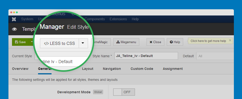
Next, compile LESS to CSS. From back-end of your site, go to: Extensions >> Template Manager >> JA Template then click Compile LESS to CSS button so that the changes will be compiled to CSS file.
#2: For templates developed with T3 Framework version 2.x+ and integrated Bootstrap 3
Here is the list of templates developed with T3 Framework version 1.4.x- and integrated Bootstrap 2.
- JA Sugite
- JA Decor
- JA Biz
- Purity III
- JA Bookshop
- JA Appolio
- JA Obelisk
- JA University (T3 version)
Open the templates/ja_template/less/variables.less file, then find the code like this:
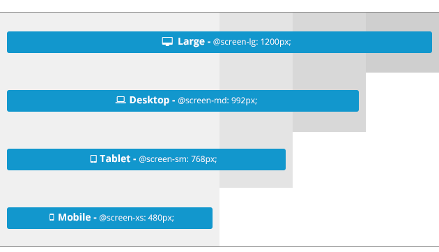
// Media queries breakpoints
// --------------------------------------------------

// Extra small screen / phone
// Note: Deprecated @screen-xs and @screen-phone as of v3.0.1
@screen-xs:                  480px;
@screen-xs-min:              @screen-xs;
@screen-phone:               @screen-xs-min;

// Small screen / tablet
// Note: Deprecated @screen-sm and @screen-tablet as of v3.0.1
@screen-sm:                  768px;
@screen-sm-min:              @screen-sm;
@screen-tablet:              @screen-sm-min;

// Medium screen / desktop
// Note: Deprecated @screen-md and @screen-desktop as of v3.0.1
@screen-md:                  992px;
@screen-md-min:              @screen-md;
@screen-desktop:             @screen-md-min;

// Large screen / wide desktop
// Note: Deprecated @screen-lg and @screen-lg-desktop as of v3.0.1
@screen-lg:                  1200px;
@screen-lg-min:              @screen-lg;
@screen-lg-desktop:          @screen-lg-min;
Now customize the size for responsive layouts as you wish.
Next, compile LESS to CSS. From back-end of your site, go to: Extensions >> Template Manager >> JA Template then click Compile LESS to CSS button so that the changes will be compiled to CSS file.
Resize position in blocks
Question:
I want to change size of a position (sidebar, main content) in templates developed with T3 Framework.
Solutions:
#1: Bootstrap 2 and T3 Framework version 1.4.x-
This docs is for templates that developed with T3 Framework version 1.4.x- and integrated Bootstrap 2.
Open the block file that you want to customize size of positions. By default, the block files are located in: templates/t3_bs3_blank/tpls/blocks/.
<!-- SPOTLIGHT TOP -->

	<?php if ($this->checkSpotlight('spl-top', 'top-1, top-2')) : ?>

	<div class="wrap top-header">

		<div class="container t3-sl spl-top">

		  <?php

		  $this->spotlight ('spl-top', 'top-1, top-2', array(

			'top-1' => array(

				'default' => 'span10',

				'tablet'  => 'span8'

			  ),


			'top-2' => array(

				'default' => 'span2',

				'tablet'  => 'span4'

			  )

		  ))

		  ?>

		</div>

	</div>

	<?php endif ?>

	<!-- //SPOTLIGHT TOP -->
We use the span grid of Boostrap 2 to arrange width of positions in each block. You can customize size of position by changing the span width for position, just make sure that the total span width of all sections in the block is 12 span.
You can customize size of positions in responsive layouts such as tablet layout.
#3: Bootstrap 3 and T3 Framework version 2.x+
This docs is for templates that developed with T3 Framework version 2.x+ and integrated Bootstrap 3.
We use grid system of Bootstrap 3 to arrange size of positions in each block.
col-lg-: size on large devices Desktopscol-md-: size on medium devices Desktopcol-xs-: size on extra small devices Phonescol-sm-: size on small devices Tablets
Know more about Bootstrap 3 grid system: http://getbootstrap.com/css/#grid
Open the block file that you want to customize size of positions. By default, the block files are located in: templates/t3_bs3_blank/tpls/blocks/.
<!-- MAIN CONTENT -->

	<div id="t3-content" class="t3-content col-xs-12 col-md-6  col-md-push-3">

		<?php if($this->hasMessage()) : ?>

		<jdoc:include type="message" />

		<?php endif ?>

		<jdoc:include type="component" />

	</div>

	<!-- //MAIN CONTENT -->


	<!-- SIDEBAR 1 -->

	<div class="t3-sidebar t3-sidebar-1 col-xs-6  col-md-3  col-md-pull-6 <?php $this->_c($vars['sidebar1']) ?>">

		<jdoc:include type="modules" name="<?php $this->_p($vars['sidebar1']) ?>" style="T3Xhtml" />

	</div>

	<!-- //SIDEBAR 1 -->


	<!-- SIDEBAR 2 -->

	<div class="t3-sidebar t3-sidebar-2 col-xs-6  col-md-3 <?php $this->_c($vars['sidebar2']) ?>">

		<jdoc:include type="modules" name="<?php $this->_p($vars['sidebar2']) ?>" style="T3Xhtml" />

	</div>

	<!-- //SIDEBAR 2 -->
In the sample above, we have main content position, sidebar 1 and sidebar 2. The total grids is 12. In Medium devices, main content size is col-md-6, sidebar 1 and sidebar 2 is col-md-3. In extra small devices, main content size is col-xs-12, sizebar1 and sidebar 2 is col-xs-6.
To change size of the positions, just change the grids for devices.
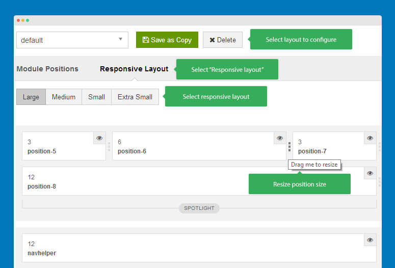
Change module width from Template manager
Question:
I want to change module size from the Joomla template manager
Solution:
In back-end of Purity III template or any template developed with the new T3 framework, you can change the position of module and the number of position in spotlight block and resize the positions.
Widen module width using Class Suffix
Question:
Is it possible to get the "Side News-module" to show 3-4 news horizontally on JA Bookshop Template
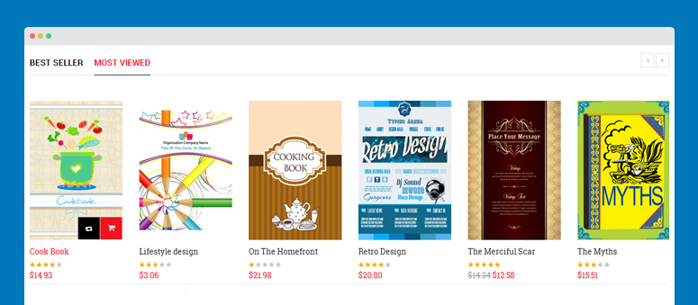
Solution:
Open the back-end of JA SideNews module, add a Module Class suffix for the module - col-5.
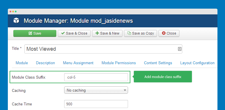
Now add style class rule to the custom.css file in templates/ja-template/css. Create such new file if it doesn't exist.
.col-5 .ja-sidenews-list,
.col-4 .ja-sidenews-list,
.col-3 .ja-sidenews-list,
.col-2 .ja-sidenews-list {
  margin: 0 -15px;
}

.col-5 .ja-slidenews-item,
.col-4 .ja-slidenews-item,
.col-3 .ja-slidenews-item,
.col-2 .ja-slidenews-item {
    clear: none;
    padding: 0 15px;
}

.col-5 .ja-slidenews-item {
    width: 20%;
}

.col-4 .ja-slidenews-item {
    width: 25%;
}

.col-3 .ja-slidenews-item {
    width: 33.33%;
}

.col-2 .ja-slidenews-item {
    width: 50%;
}
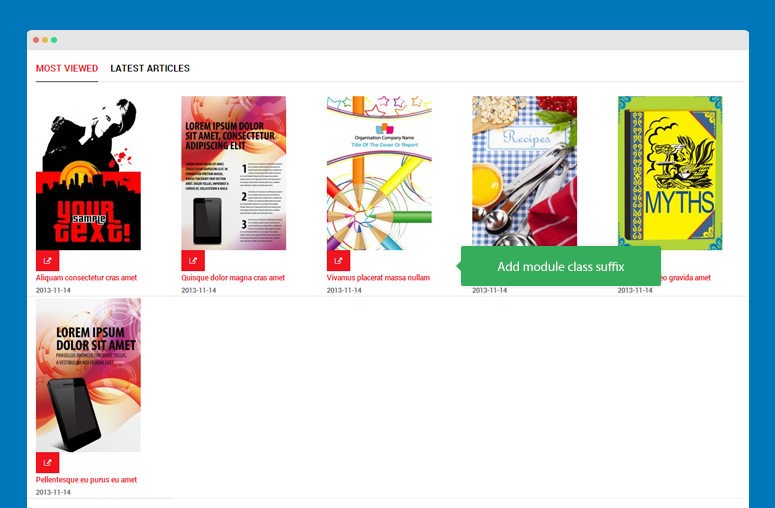
Check front-page
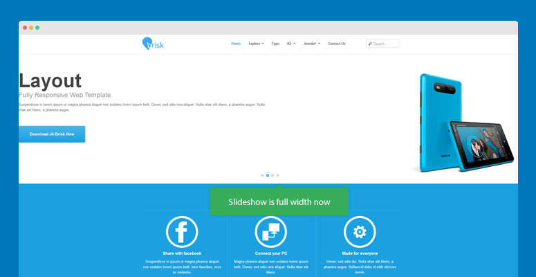
Full width Slideshow in JA Brisk
Problem:
Is it possible to have full width slideshow with JA Brisk template
Solution:
Add the CSS rule into this file: /templates/ja_brisk/css/custom.css
.ja-slideshow .container {
padding: 60px 10px 0 10px;
width: auto;
}
Swap full-width to boxed layout via Admin
Question:
Does t3/Purity III have the ability to easily swap from full-width to boxed layout?
Solution:
With new T3 or Purity III template, it supports various layouts. And in admin panel of T3/Purity III, you can easily assign position to part of layout you want and change the number of module position in spotlight block. We implement Bootstrap into our framework, so with a bit knowledge of LESS / Css you can easily change to layout as you wish.
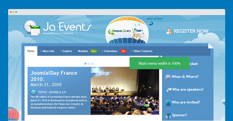
100% width main menu
Question:
How to modify the main menu width 100% in JA Event template?
Solution:
Open the ex-header.php in the templates\ja_events\blocks folder, find and remove the code:
<style type="text/css">

#ja-mainnav .main-inner2 {width: <?php echo $this->getColumnWidth('mw') ?>%;}

</style>
Front-page after changing