Internet Explorer limits CSS files
Internet Explorer (IE) supports a maximum limit of 32 individual stylesheet only so if a page in your site loads more than the limit, it will not work properly.
How to fix the problem?
What you have to do is compress your CSS files to reduce number of CSS files to be loaded. If you use JA T3v2 or T3 framework, please turn the optimize CSS option from back-end panel.
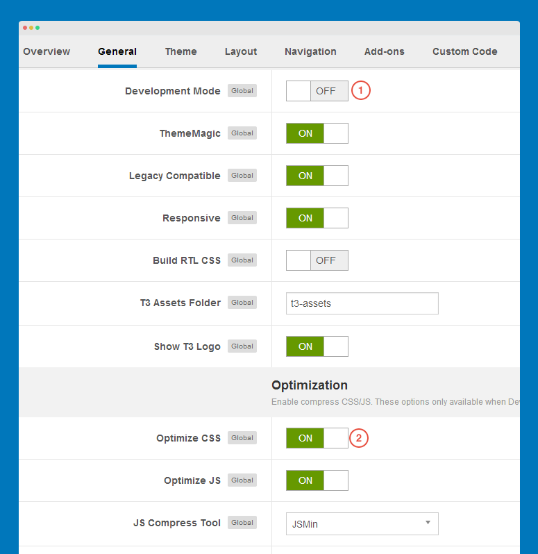
1. For T3 template, open its template manager, in the General tab, disable dev mode then enable CSS Optimize option.
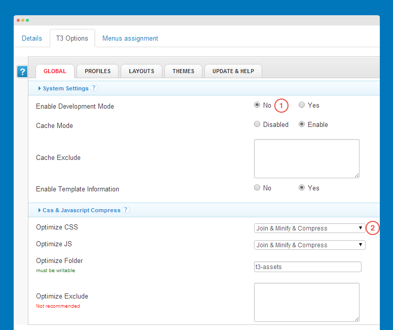
2. For JA T3v2 template, open its template manager, in the Global tab, disable dev mode, select Join & Minify & Compress option.
3. If your site is not developed with JA T3v2 or T3 framework, you can use extensions that support you to optimize CSS.
Hide a module in mobile with CSS
This docs is for templates developed with T3 Framework - the new T3 framework
Here is the how-to steps to hide a module in mobile.
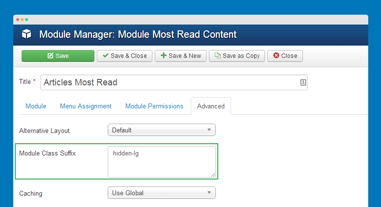
#1: add class suffix
Open the templates/ja_template/css/custom.css (create such file if you don't see it) then add a class suffix. In this docs, we create class suffix hidden-lg (you can change to whatever you want):
@media  (max-width: 768px){
    .t3-module.module hidden-lg {
	display: none;
    }
}
Do the same way if you want to add class suffix to hide module in specific layout, just change class suffix name and the value of @media (max-width: 768px). You can check how media queries are defined in the templates/ja_template/less/variables.less file.
/ Media queries breakpoints
// --------------------------------------------------

// Extra small screen / phone
// Note: Deprecated @screen-xs and @screen-phone as of v3.0.1
@screen-xs:                  480px;
@screen-xs-min:              @screen-xs;
@screen-phone:               @screen-xs-min;

// Small screen / tablet
// Note: Deprecated @screen-sm and @screen-tablet as of v3.0.1
@screen-sm:                  768px;
@screen-sm-min:              @screen-sm;
@screen-tablet:              @screen-sm-min;

// Medium screen / desktop
// Note: Deprecated @screen-md and @screen-desktop as of v3.0.1
@screen-md:                  992px;
@screen-md-min:              @screen-md;
@screen-desktop:             @screen-md-min;

// Large screen / wide desktop
// Note: Deprecated @screen-lg and @screen-lg-desktop as of v3.0.1
@screen-lg:                  1200px;
@screen-lg-min:              @screen-lg;
@screen-lg-desktop:          @screen-lg-min;
Based on the media queries, you can add class suffix to hide module in any layout.
#2: add class suffix to module
Now open the setting panel of the module you want to hide in mobile then add the hidden-lg class suffix.
Change background image with class suffix
This docs is for templates developed with T3 Framework - the new T3 framework.
You can add background image or color for specific menu. Follow the how-to steps.
#1: Add class suffix for menu
Open the back-end setting of menu item that you want to add backgroun color or image for. In the Page Display tab, add class suffix in the Page Class field.
#2: Add style for class suffix
Open the templates/ja_template/css/custom.css file (create such file if you don't see it) then add the following css rule.
/ Background color
// --------------------------------------------------
.body-background body {
  background-color: #0077bb;
}

/ Override background of t3-wrapper
// --------------------------------------------------
.body-background body .t3-wrapper {
background: transparent;
}
/ Background image
// --------------------------------------------------
.body-background body {
  background-image: url("../images/body-bg.jpg");
}

/ Override background of t3-wrapper
// --------------------------------------------------
.body-background body .t3-wrapper {
background: transparent;
}
Keep footer at the bottom of page
This docs is for templates developed with T3 Framework - the new T3 framework.
By default, the footer block can move up if the content in the page is not full filled. The docs is to help you to keep the footer block in the bottom of your page no matter how content is full filled in the page or not.
#1: Keep footer block in bottom of your page
Open the templates/ja_template/css/custom.css (create such file if you don't see it) then add the following css rule.
html, body{
  height: 100%;
}

.t3-wrapper {
  height: 100%;
}

.t3-footer {
   position:absolute;
   bottom:0;
   width:100%;
   height:200px;   /* Height of the footer */
}
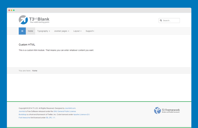
Here is what we have
You can change the value of height:200px; base on your footer block height.
#2: Keep navhelper block in bottom of your page
In the custom.css file, add the css rule:
.t3-navhelper {
	position: absolute;
	width: 100%;
	bottom: 199px;
}
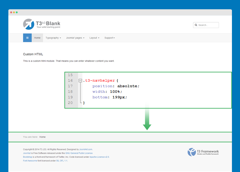
You can change the value of bottom: 199px; base on the footer block height.