
As you know, at the end of June we completely relaunched our site in Joomla 1.5 and redesigned the look and feel. We have been receiving great feedback and thought we should share our case study with the community. We will describe in short the process our team went through. But don't be scared, we do not write screeds about how to upgrade Joomla1.0 to 1.5x. Rather we will tell you why we completely revamped our website – what are the main objectives are we trying to achieve.
Introduction Website Upgrade & Redesign Process - JoomlArt.com Case Study
The most important stakeholder of a community site is always the USER. Before changing anything on your site you should better reflect about goals you would like to achieve. Poor understanding of how visitors interact with your site in the past can make your updated site end up performing worse. Tons of bugs, unhappy visitors, conversions are dropping and the traffic goes south.
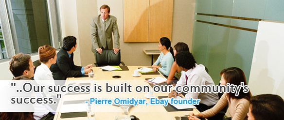
… Our success is built on our community's success.
Upgrade or Not to Upgrade ?
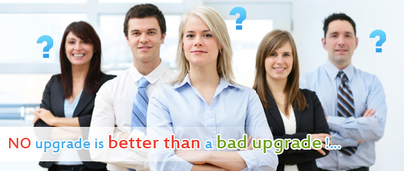
The obvious is: NO upgrade is better than a bad upgrade. With upgrading I mean changes in the code of either Joomla engine or extensions. It happens mainly under the hood so in most cases visitors hardly notice any visual changes.
BUT this doesn't mean you should not make changes to your site. You should consider upgrading your site to current Joomla versions for the following reasons:
- Each time the system evolves into a higher version it includes bug fixes and patches to provide your website with more security. The same holds for extensions.
- Smart developers from Joomla rewrite code and never stop adding functionality and improving user friendliness. Examples could be: In the newer version content is easier to manage for editors. The back-end system is more intuitive to use for admins.
Why Redesign ?
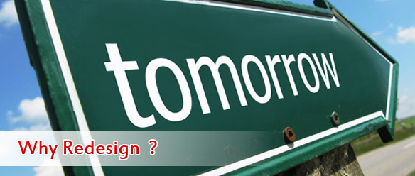
A redesign of you site will definitely have a greater impact on user behavior then security updates. Reasons you want to redesign your site are:
- To systematically improve conversion rate. This is actually the single most important driver whenever you think about changing only a small element on your pages
- To counteract "visual inertia" with constant freshness adding new graphics/videos and sometimes even a complete theme overhaul. A sound revamp proves creative vitality of the team and keep users interested
- To provide a better user experience by changing navigation, modifying buttons or information structure and other elements.
- If you are about to integrate a new major section into the site. In our case we prepared to launch the Drupal theme club and need to find a smart way to get it under one new design.
Understanding The User
First step to do before upgrading and redesigning Joomlart's site is to dig deep into analytics and study user behavior to get the big picture. By listening to our users and understanding web analytics we have the chance achieve some fundamental goals:
- To improve product quality and provide better support.
- To enhance website usability and conversion rates.
- Acquire new pro members. Keep existing ones happy.
Therefore it's crucial to keep an eye on important information such as:
- Hot topics: What are the categories people clicked the most? What are hottest discussions in the forums?
- Critical feedback: What are things they don't like or need to get fixed?
- Which are pages with highest bounce rate? Why?
- Is there a correlation between forum activity and pro membership?
- Typical browsing patterns. How do they get to a target page and what are they doing next?
- Demographic breakdown of opt-in users: Where are pro-members from?
Brainstorming New Ideas

After pulling all this data together the team members suggested solutions on how to improve aspects they are proficient in. The design team likes to get a more Web2.0 look. Server admin and developers can't wait for new improved features implemented in Joomla1.5, especially powerful 3rd party extensions like K2. Marketing and usability experts constantly come up with new strategies to improve opt-in rates and maximize goals completion.
Brainstorming and discussing new ideas with other stakeholders of the team are vital to effective collaboration. Likewise it's important the management board has a clear business concept and can lead the team with decidedness to achieve optimal results for everyone.
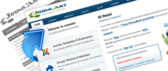
Top Header Menu
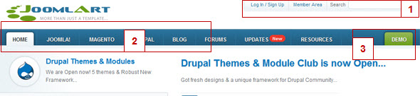
1: In the upper right corner you can find the login and member area for registered users. This is established standard and people expect this area to be found quickly so they can interact within the community or download files with no delay.
2: Our main menu helps people to easy navigate to the core sections of our site. It contains the links to our three product categories. Behind a clean dropdown menu we provide links to product demo and membership information.
3: It is of particular importance for us that users take a look at the demo as they will be able to compare the design quality with those from other sources. For this reason we placed a demo button in a distance on the right with a prominent color for grabbing attention.
Main Body Section
This is the area draws by far the most attention from visitors. So we really need to get creative on every pixel in here. Main goal is to get users to the product membership pages via Sign up button
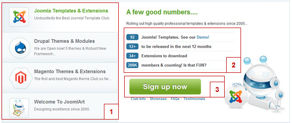
1: We combined the functionality of a big slideshow with button navigation on the left, big enough to house logo icons for each product category. It works pretty well. People recognize the Joomla icon faster than reading any word.
2: All our hard work condensed in some nice stats -- showing industry authority with wide range of products and a great community. These facts are for real and help people to make decisions. At least those numbers will be associated with the brand and reinforce our position in our peer group.
3: The UBER-GOAL is obviously to click the sign up button and then complete the membership application.
Bottom Menu
This is an overlay menu which appears on the bottom of your browser on each page which leads users to demos of newest Joomlart products. As pointed out above demo-ing our products is very important in our goals funnel, in which people get to see what's on offer before purchasing exclusive membership.
Once more we added a featured button for sign up within the bottom menu. You can always hide this bottom menu if you deem it distracting with just one simple click on the right end.
What Powers The New Site?
Our site is powered by our proprietary JA T3 Framework. Besides deploying in-house plugins like JA Amazon S3 Cloud or JA Content Slider 2 we also give special thanks to important 3rd party extensions: K2 component, which manages all our articles, SH404SEF extension to make our URLs look human and the very handy QuickFAQ plugin. Read more about which components are behind Joomlart site.
Going Live
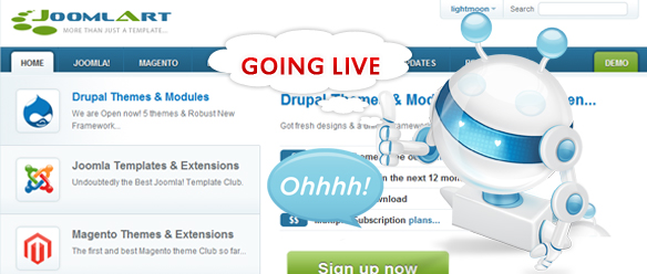
Before we go live with the new design and a new Joomla1.5 core, there is a strict quality control procedure. We really want to make sure our design to look great and at the same provide visitors with a better user experience. Here are the steps our team went through which might be a valuable good practice process for some of you as well:
A/B Testing
Before putting up the new design, we did some intensive A/B testing of certain areas to verify the usability is great. There is no point in implementing your superb design but then users fail to take desirable actions.
Cross Browser Check
We try our best to make sure all elements are rendered correctly across major browsers and our mobi-version works smoothly on mobile devices.
301 Redirects
Visitors can land on an old page via a bookmark on their browser or online services such as Delicious, Digg etc. They could have clicked on any link on your own site that points to this old URL, it could be a discussion in the Joomlart forum for example. It could also be an external link from someone's blog. Without a permanent 301 redirect visitors will receive an error message (404 page not found). So we always strongly recommend to 301 your old but juicy traffic pages to the new URL. This will pass on the high PR juice to the new page.
Custom 404 Error Page
A 404 error pages shows up whenever there is an error in the requested URL. Imagine a user enters a typo in the URL field of a browser. By default you will see a very boring and sometimes annoying "Page Not Found" message. There are two things we want to do with our custom error page. First is to provide a more friendly looking message that is not as frustrating as the default one. Second is to provide a user friendly search tool, that allows the user to find content he wants per keyword search. Also we provide some main links to make it easy for users to get back to the home page or main sections.
Offline Page
Once in a while you have to do major site maintenance for upgrades. During this time you want to let users know that your site is temporarily off and will be back soon. If you can give a precise date time it's even better. We created a rather simple offline page with a short and clear message.
Announcing The Update
After all the preparation is done and things are tested you will need to let your users know when your server is off to implement the upgrades. Use all popular channels to get the message to the users. In our case we announced 1 week (5 days) prior to updates in forums, news flash on the home page and send out an email.
Bug Fixing
Then we hope that things will be working out well, but as you know it will never be 100% bug-free. Aahh me headaches… fixing bugs is something our team will enjoy doing for at least a month after going live. No matter how carefully you prepare the process there will be some bugs. "Nothing is certain but taxes and bugs!"
If our members -- in a significant quantity – find bugs or don't like the way things are arranged we will respond with fixes, new designs and testing.