-
AuthorPosts
-
moody Friend
moody
- Join date:
- April 2017
- Posts:
- 186
- Downloads:
- 45
- Uploads:
- 40
- Thanks:
- 1
- Thanked:
- 1 times in 1 posts
October 15, 2017 at 6:09 pm #1067974The slideshow disappear in mobile device. How to enable it ?
 timtecsa
Friend
timtecsa
Friend
timtecsa
- Join date:
- October 2009
- Posts:
- 1382
- Downloads:
- 86
- Uploads:
- 327
- Thanks:
- 197
- Thanked:
- 132 times in 34 posts
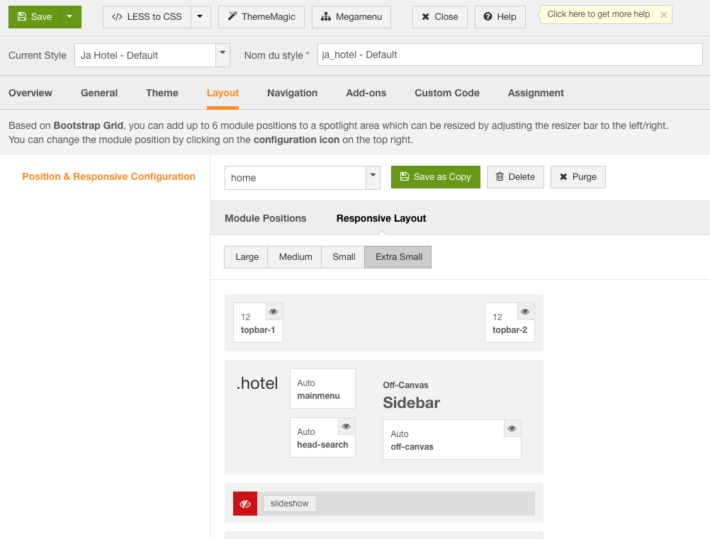
October 15, 2017 at 8:26 pm #1067997Take a look to see if it is turned OFF in layout for extra small screen.
Tim
 Pankaj Sharma
Moderator
Pankaj Sharma
Moderator
Pankaj Sharma
- Join date:
- February 2015
- Posts:
- 24589
- Downloads:
- 144
- Uploads:
- 202
- Thanks:
- 127
- Thanked:
- 4196 times in 4019 posts
moody
- Join date:
- April 2017
- Posts:
- 186
- Downloads:
- 45
- Uploads:
- 40
- Thanks:
- 1
- Thanked:
- 1 times in 1 posts
October 16, 2017 at 1:42 pm #1068140This reply has been marked as private.Pankaj Sharma
Moderator
Pankaj Sharma
- Join date:
- February 2015
- Posts:
- 24589
- Downloads:
- 144
- Uploads:
- 202
- Thanks:
- 127
- Thanked:
- 4196 times in 4019 posts
October 17, 2017 at 12:16 am #1068235after i enable the slideshow, on the mobile device, the image looks cropped..not showing the whole image…..anyway to adjust it?
thanks a lot.The image used as background as there is text and description on it. Also, ti does not fit well, this is why it was hidden.
If image using 100% width the text will not come over the bg image and it breaks the style.Regards
moody
- Join date:
- April 2017
- Posts:
- 186
- Downloads:
- 45
- Uploads:
- 40
- Thanks:
- 1
- Thanked:
- 1 times in 1 posts
October 20, 2017 at 11:30 am #1069112i can remove the text, as long as the image shows in 100% width on all devices.
any suggestion?Pankaj Sharma
Moderator
Pankaj Sharma
- Join date:
- February 2015
- Posts:
- 24589
- Downloads:
- 144
- Uploads:
- 202
- Thanks:
- 127
- Thanked:
- 4196 times in 4019 posts
October 23, 2017 at 1:32 am #1069389Hi
Add below code in custom.css file to hide slideshow content in mobile@media(max-width:468px) { .block-slideshow-item.fade-style.active .slideshow-content {display:none;}}Regards
moody
- Join date:
- April 2017
- Posts:
- 186
- Downloads:
- 45
- Uploads:
- 40
- Thanks:
- 1
- Thanked:
- 1 times in 1 posts
October 23, 2017 at 3:19 pm #1069604hi there, text is not show on the mobile device. but the image is not showing 100% width.
any solution?Pankaj Sharma
Moderator
Pankaj Sharma
- Join date:
- February 2015
- Posts:
- 24589
- Downloads:
- 144
- Uploads:
- 202
- Thanks:
- 127
- Thanked:
- 4196 times in 4019 posts
October 24, 2017 at 12:51 am #1069663Hi
Add this code in custom.css file to make image 100% size@media screen and (max-width: 767px) { .block-slideshow-item .block-bg { background-size: 100%; } .block-slideshow.full-screen { padding: 0; max-height: 300px; } }Regards
moody
- Join date:
- April 2017
- Posts:
- 186
- Downloads:
- 45
- Uploads:
- 40
- Thanks:
- 1
- Thanked:
- 1 times in 1 posts
October 24, 2017 at 12:20 pm #1069781hi there,
i have put the coding you mentioned in custom.css. but the background image is still not showing in 100% width. can you check for me? thanks a lotPankaj Sharma
Moderator
Pankaj Sharma
- Join date:
- February 2015
- Posts:
- 24589
- Downloads:
- 144
- Uploads:
- 202
- Thanks:
- 127
- Thanked:
- 4196 times in 4019 posts
October 25, 2017 at 1:41 am #1069896Hi
Add !important in the code and it will work for sure
example:@media screen and (max-width: 767px) { .block-slideshow-item .block-bg { background-size: 100%!important; }}Regards
moody
- Join date:
- April 2017
- Posts:
- 186
- Downloads:
- 45
- Uploads:
- 40
- Thanks:
- 1
- Thanked:
- 1 times in 1 posts
October 25, 2017 at 6:04 pm #1070071This reply has been marked as private.Pankaj Sharma
Moderator
Pankaj Sharma
- Join date:
- February 2015
- Posts:
- 24589
- Downloads:
- 144
- Uploads:
- 202
- Thanks:
- 127
- Thanked:
- 4196 times in 4019 posts
October 26, 2017 at 1:30 am #1070112but on mobile device, there’s a gray color gap below the slide-show.
how to remove this gap?Change the height value from the code i shared to set it for mobile.
Regards
AuthorPostsViewing 13 posts - 1 through 13 (of 13 total)This topic contains 12 replies, has 3 voices, and was last updated by
Pankaj Sharma 7 years, 3 months ago.We moved to new unified forum. Please post all new support queries in our New Forum
Slideshow disappear in mobile device
Viewing 13 posts - 1 through 13 (of 13 total)