-
AuthorPosts
-
 TomC
Moderator
TomC
Moderator
TomC
- Join date:
- October 2014
- Posts:
- 14077
- Downloads:
- 58
- Uploads:
- 137
- Thanks:
- 948
- Thanked:
- 3155 times in 2495 posts
July 16, 2015 at 3:39 pm #577678<em>@jm1100 483309 wrote:</em><blockquote>Hi, I have the same issue. Could you tell me how to customize/modify css or less to change the padding only for this module (hero) ?
Furthermore, it would be perfect to modify it in a responsive way (eg : 260px -> 130 px for medium screen, 104px -> 52px for small screen).
thanks !</blockquote>
It would be most helpful if you could provide the url of the site you’re working on,
as well as temporarily set “Optimize CSS” to “Off/No” within your Template Manager–General settingsTomC
Moderator
TomC
- Join date:
- October 2014
- Posts:
- 14077
- Downloads:
- 58
- Uploads:
- 137
- Thanks:
- 948
- Thanked:
- 3155 times in 2495 posts
July 16, 2015 at 4:35 pm #577680jm1100 . . .
Try This . . . .
Within file path —> /templates/uber/local/acm/hero/css/themes/averim_particulier/style.css
at line 12, reduce the pixel value for the padding-top property (i.e. currently set at 260px)
.acm-hero {

    background-position: center center;

    background-size: cover;

    padding: 260px 0;

}
Hope That Helps 😎
1 user says Thank You to TomC for this useful post
supa Friend
supa
- Join date:
- September 2010
- Posts:
- 43
- Downloads:
- 46
- Uploads:
- 2
- Thanks:
- 14
- Thanked:
- 1 times in 1 posts
September 19, 2016 at 5:23 pm #969210TomC can you assist me with the same issue? I have been trying for a few days and can’t seem to get it right….
yourentattycom.ipower.com/main2 Ninja Lead
Moderator
Ninja Lead
Moderator
Ninja Lead
- Join date:
- November 2014
- Posts:
- 16064
- Downloads:
- 310
- Uploads:
- 2864
- Thanks:
- 341
- Thanked:
- 3854 times in 3563 posts
September 21, 2016 at 7:54 am #969755TomC can you assist me with the same issue? I have been trying for a few days and can’t seem to get it right….
yourentattycom.ipower.com/main2Could you give me the screenshot and description on that? It will help to understand of your request and I will help you out
supa
- Join date:
- September 2010
- Posts:
- 43
- Downloads:
- 46
- Uploads:
- 2
- Thanks:
- 14
- Thanked:
- 1 times in 1 posts
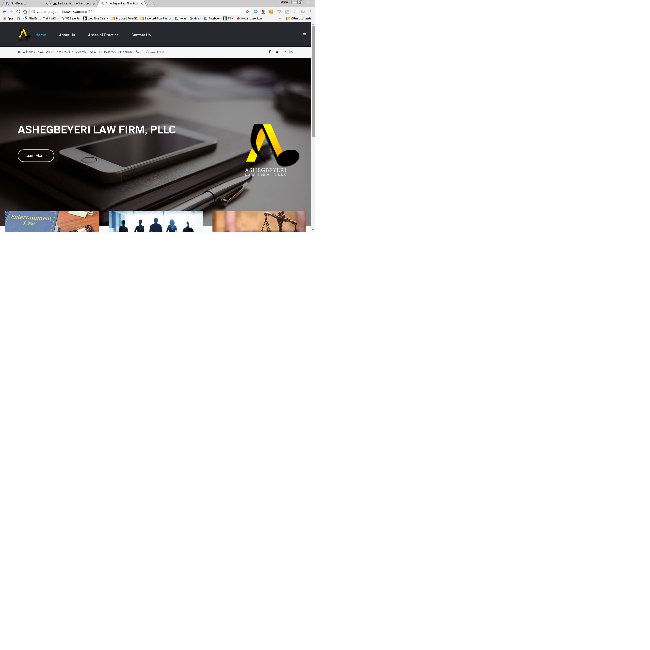
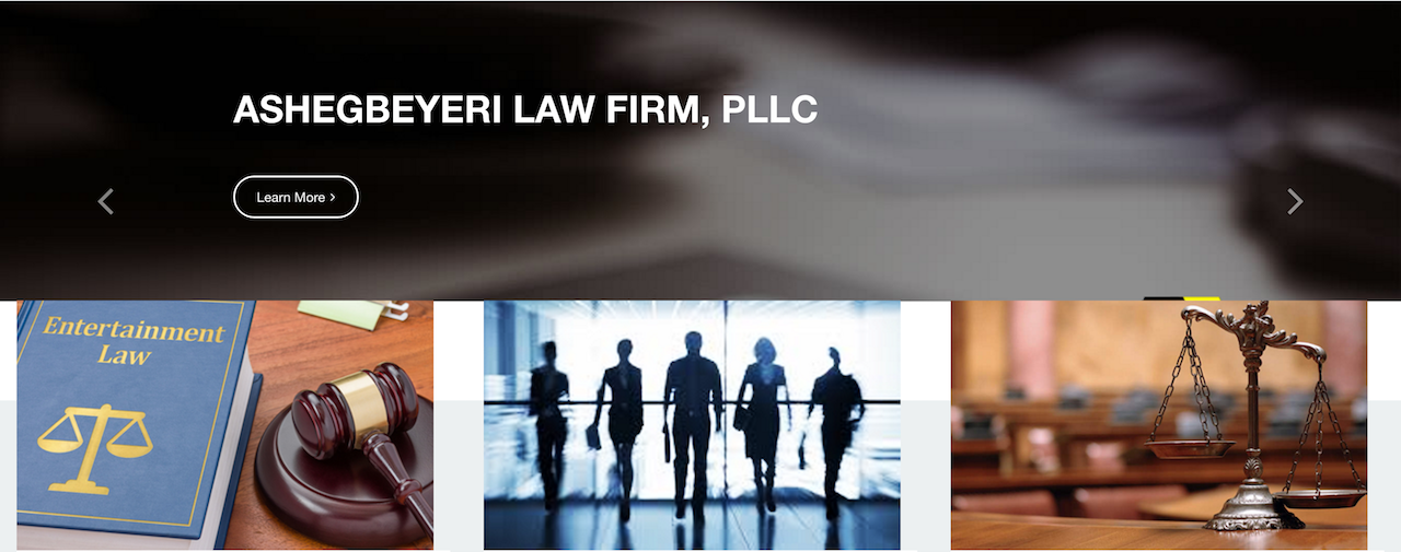
September 22, 2016 at 5:27 pm #970285pic is attached. They don’t want to see a full screen of image, so I was thinking to make the image only half of the height, and to have the rest of the page slide up.
Thanks for your help.Ninja Lead
Moderator
Ninja Lead
- Join date:
- November 2014
- Posts:
- 16064
- Downloads:
- 310
- Uploads:
- 2864
- Thanks:
- 341
- Thanked:
- 3854 times in 3563 posts
September 23, 2016 at 7:29 am #970425@supa: Applying my solution below to fix the problem on your site
Create templates/uber/css/custom.css file and add new rule
@media screen and (min-width: 992px) {
    .acm-hero.style-5 {
        padding: 230px 0;
    }
}
1 user says Thank You to Ninja Lead for this useful post
supa
- Join date:
- September 2010
- Posts:
- 43
- Downloads:
- 46
- Uploads:
- 2
- Thanks:
- 14
- Thanked:
- 1 times in 1 posts
September 24, 2016 at 12:14 pm #970669@supa: Applying my solution below to fix the problem on your site
Create templates/uber/css/custom.css file and add new rule
<pre class="prettyprint linenums:1 prettyprinted">
- <span class="lit">@media <span class="pln">screen <span class="kwd">and <span class="pln"> <span class="pun">(<span class="pln">min<span class="pun">-<span class="pln">width<span class="pun">: <span class="pln"> <span class="lit">992px<span class="pun">) <span class="pln"> <span class="pun">{
- <span class="pln"> <span class="pun">.<span class="pln">acm<span class="pun">-<span class="pln">hero<span class="pun">.<span class="pln">style<span class="pun">-<span class="lit">5 <span class="pln"> <span class="pun">{
- <span class="pln">padding<span class="pun">: <span class="pln"> <span class="lit">230px <span class="pln"> <span class="lit">0<span class="pun">;
- <span class="pln"> <span class="pun">} <span class="pln">
- <span class="pun">}
Thanks for your response, but this does not appear to fix my height issue. No matter what height image I use, the image just displays full screen. I want a responsive image, I just need the slide container to restrict the height without an empty white space. I’ve added the custom css, but it does not appear to fix my height issue.
Ninja Lead
Moderator
Ninja Lead
- Join date:
- November 2014
- Posts:
- 16064
- Downloads:
- 310
- Uploads:
- 2864
- Thanks:
- 341
- Thanked:
- 3854 times in 3563 posts
September 26, 2016 at 2:57 am #970857@supa: Try to use the CSS style below and add it into templates/uber/css/custom.css file
.sections-wrap .section .acm-container-slide .carousel .carousel-inner { height: 480px !important; }greatway Friend
greatway
- Join date:
- June 2007
- Posts:
- 52
- Downloads:
- 420
- Uploads:
- 3
- Thanks:
- 4
- Thanked:
- 5 times in 1 posts
November 21, 2016 at 4:40 pm #988266This reply has been marked as private.Ninja Lead
Moderator
Ninja Lead
- Join date:
- November 2014
- Posts:
- 16064
- Downloads:
- 310
- Uploads:
- 2864
- Thanks:
- 341
- Thanked:
- 3854 times in 3563 posts
November 22, 2016 at 7:48 am #988471@greatway: Are you mentioning about this issue: http://prntscr.com/daa701?
If yes, you can fix this way
Open templates/uber/local/acm/hero/css/themes/quince/style.css file
find and change
@media (min-width: 768px) and (max-width: 1199px) {
  .item:nth-child(3) .acm-hero.style-5 .hero-content .hero-intro {
    display: block;
    background: #ffffff;
    background: rgba(255, 255, 255, 0.91);
    padding: 10px;
  }
}
to
@media (min-width: 768px) and (max-width: 1199px) {
  .item:nth-child(3) .acm-hero.style-5 .hero-content .hero-intro {
    display: block;
    background: transparent;
    padding: 10px;
  }
}
greatway
- Join date:
- June 2007
- Posts:
- 52
- Downloads:
- 420
- Uploads:
- 3
- Thanks:
- 4
- Thanked:
- 5 times in 1 posts
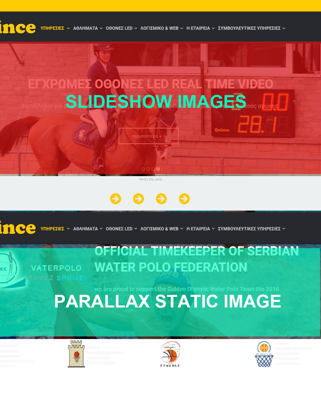
November 22, 2016 at 9:11 pm #988713dear ninha lead thank you for your time,
but no i was not refering to this printscreen you posted at all.
i will try to explain this as better as I can
I used this code that i found in a previous comment from you September 23, 2016 at 7:29 am #970425
@media screen and (min-width: 992px) {
.acm-hero.style-5 {
padding: 230px 0;
}

}
( i only changed the padding to 100px )
and i managed to reduce as i wanted the height of the parallax image , but also the slideshow images lost their original heightBut I did not want to reduce the height of the slideshow image.
How can I only reduce the height of the parallax image and not affect the slideshow images.
I post a picture for better undestanding this with the parallax image and the slideshow image
thank you
Ninja Lead
Moderator
Ninja Lead
- Join date:
- November 2014
- Posts:
- 16064
- Downloads:
- 310
- Uploads:
- 2864
- Thanks:
- 341
- Thanked:
- 3854 times in 3563 posts
November 24, 2016 at 1:05 am #989125@greatway: I see padding: 100px; is working as well with the image on your site but I’m afraid you will not able to work with the height original image because you can see the CSS style to work with responsive from templates/uber/local/acm/hero/css/themes/quince/style.css file
.acm-hero.style-5 {
  background-size: cover !important;
}
and it always covers the image with the main div contain on your site
AuthorPostsThis topic contains 26 replies, has 6 voices, and was last updated by
Ninja Lead 7 years, 5 months ago.We moved to new unified forum. Please post all new support queries in our New Forum
Jump to forum