-
AuthorPosts
-
July 14, 2017 at 3:55 pm #1048720
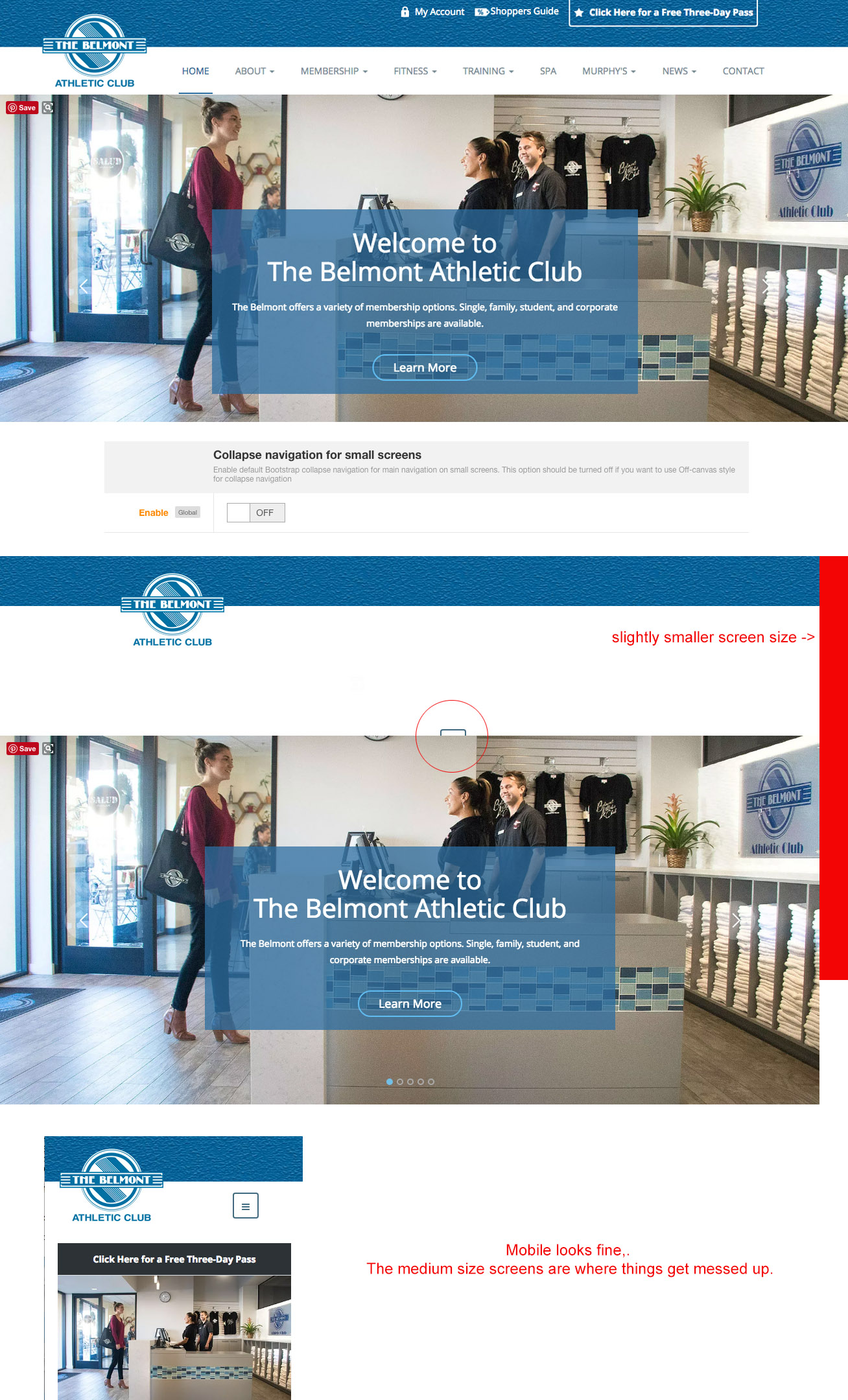
I am having a similar issue. When a smaller screen views the site at 1280 resolution the menu and other header items disappear and the mobile menu icon shows half hidden behind the slider. I want the regular menu to show on all resolutions except for Mobile.
A weird thing that is happening is that if I reduce the screen size on my web browser to 90% the menu shows back up.
None of the settings in the template manager seem to change anything.
 Pankaj Sharma
Moderator
Pankaj Sharma
Moderator
Pankaj Sharma
- Join date:
- February 2015
- Posts:
- 24589
- Downloads:
- 144
- Uploads:
- 202
- Thanks:
- 127
- Thanked:
- 4196 times in 4019 posts
July 17, 2017 at 3:08 am #1048987Hi
In the lower resolution the menu does not fit and break the layout this is why collapse navigation is present.
If you want to customise the breakpoint value you can do it from
template folder/less/variable.less
Find// Point at which the navbar stops collapsing @grid-float-breakpoint: @screen-sm-max;Replace @screen-sm-max with the screen size value (980px) too set a value.
Compile Less to CSS after changes.
Take a backup of the site before applying Less to CSS.
It will override the custom changes if you did in the CSS files.Regards
AuthorPostsViewing 2 posts - 1 through 2 (of 2 total)This topic contains 1 reply, has 2 voices, and was last updated by
Pankaj Sharma 7 years, 6 months ago.We moved to new unified forum. Please post all new support queries in our New Forum
menu
Viewing 2 posts - 1 through 2 (of 2 total)