-
AuthorPosts
-
July 5, 2014 at 6:03 pm #199442
Using Purity III and trying to prevent collapse of the top navigation menu when browser is resized. In the backend template manager, use megamenu is off and collapse menu navigation for small screens is off.
But it continues to collapse when I resize my desktop browser. Want to prevent this. I have only 4 top menu items and the ones that would be covered on a tablet or phone are not that important.
How?
Roger
Adam M Moderator
Adam M
- Join date:
- May 2014
- Posts:
- 5159
- Downloads:
- 33
- Uploads:
- 66
- Thanks:
- 95
- Thanked:
- 1271 times in 1235 posts
July 7, 2014 at 9:11 am #541368Hi,
Please make sure you disabled option Collapse navigation for small screens in the right template style. By default, the default style of Purity III is Portfolio.
July 8, 2014 at 2:13 am #541459Even with Collapse navigation for small screens disabled, I notice that the menu still collapses. I’m resizing the browser window from my desktop, and the menu still collapses.
What I want is for the menu to NEVER collapse…under NO circumstances should the menu EVER collapse. How?
Adam M
- Join date:
- May 2014
- Posts:
- 5159
- Downloads:
- 33
- Uploads:
- 66
- Thanks:
- 95
- Thanked:
- 1271 times in 1235 posts
July 8, 2014 at 3:21 am #541465Hi Roger,
Do you mean you want to use the same Main menu style as in desktop for mobile layout ? This is a part of responsive feature and you will have to customize current CSS code to achieve your goal.
July 8, 2014 at 12:25 pm #541544I have three menu items…they don’t take up much horizontal space, and the last one isn’t that important. So for the menu to collapse is kind of crazy for my site.
In my opinion, responsive sites mean we have to redesign our sites so that menus are much smaller. I’ve done that, but now I can’t prevent the collapse of the menu.
Roger
Adam M
- Join date:
- May 2014
- Posts:
- 5159
- Downloads:
- 33
- Uploads:
- 66
- Thanks:
- 95
- Thanked:
- 1271 times in 1235 posts
July 9, 2014 at 7:21 am #541689Hi,
No it’s not. Basically, our templates are built within Bootstrap and menu will be collapsed automatically in mobile layout as you can see here.
To unload this function, you need to modify the code but you must be a licensed member if you want to request such adjustment.
Best regards,
Adam.
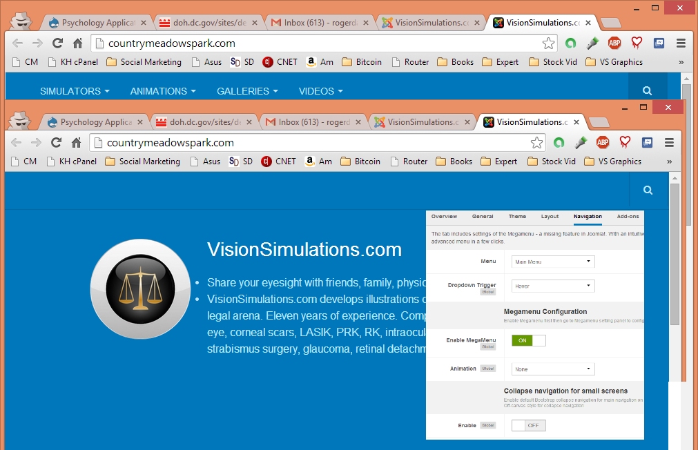
July 10, 2014 at 5:29 pm #541890Yes, the menu collapses automatically in mobile layout. But the point I’m making is that the menu also collapses in a narrow browser window when viewed on the desktop.
Check the attachment… Notice that the’s no reason for the menu to collapse, because the right side of the browser is nowhere close to the right side of the menu, as shown in the top picture.
Then notice that I made the window just a little narrower, and the menu is collapsed. Why??? How to stop it??? I don’t want the menu to collapse EVER, because it’s not necessary.
Notice the settings. Megamenu is on, but collapsing is Off. Even when Megamenu is off and collapsing is off, it still collapses, maybe because I’m viewing it on my desktop, not mobile…I don’t know.
The ultimate solution to this problem is to collapse the menu based on whether the width of the window is less than the width of the menu, and then the user should be able to disable this behavior. Purity III is doing something else…it appears to be collapsing the menu based on the POTENTIAL width of the menu, not on it’s actual width. But it doesn’t matter to me…my menu is small enough that I just want to disabling ALL collapsing on ANY screen.
Roger
<em>@Adam M 435863 wrote:</em><blockquote>Hi,
No it’s not. Basically, our templates are built within Bootstrap and menu will be collapsed automatically in mobile layout as you can see here.
To unload this function, you need to modify the code but you must be a licensed member if you want to request such adjustment.
Best regards,
Adam.</blockquote>
Adam M
- Join date:
- May 2014
- Posts:
- 5159
- Downloads:
- 33
- Uploads:
- 66
- Thanks:
- 95
- Thanked:
- 1271 times in 1235 posts
July 11, 2014 at 10:09 am #541965Hi,
If you could provide your site url, it would help to determine if there’s a problem with your site. By default, the Main Menu will be hidden if your viewport is smaller than 991px and the template option ‘Collapse navigation for small screens‘ is used to show / hide menu toggle button in tablet / mobile layout (you will see the toggle button on the top right of page).
Normally, we can assist you in general question or provide you bug fix in public forum. But if you want to modify the way Purity works, in this case normal behavior is menu will be collapsed automatically in 991px view port and you want to adjust this to suite your need, so it might beyond support scope in public forum.
July 13, 2014 at 12:55 pm #542139Use these steps to duplicate the bug:
1) Build yourself a Purity iii demo at the Joomlart site.
2) Log into the back end of your demo.
3) Go to Templates, select the Default Purity iii template.
4) Disable Megamenu and disable collapsing on small screens.
5) Save your choices.
6) View the demo purity iii site on the desktop screen.7) Notice that there are only three menu items. So horizontally, the menu is not very wide. Notice that the menu collapses at some fixed width, I guess it’s 991 pixels, I don’t know.
My idea was to gain space on the menu bar by hiding the logo…I can just put my logo into a Jumbotron below the menu. Now if I have three items, I have plenty of space for them on a small tablet. I don’t need to collapse them. Yay! 🙂 But Purity iii still collapses them.
So……I guess LESS needs to be recompiled somehow???? Am just guessing that some variable(s) in LESS control where the collapse occurs. That means I need to recompile LESS based on the width of my menu…which I don’t mind doing…if I knew what the required variables and how to set them.
In my opinion, this needs to be a lesson in the Purity iii documentation. In the past, menus have been the major navigational features of websites. The fact is, responsive design calls for us to rethink our layouts so that menus are used more sparingly. Menus need to be horizontally short so that they don’t need to collapse. The solution is not to make menus collapse regardless of their length, the way Purity iii does it. In fact, this what Joomlart and RocketTheme are both doing. The solution is to rethink your layouts and reorganize your site so that menus are short, and collapse only on phone screens, but not 7″ or greater tablet screens.
Roger
Adam M
- Join date:
- May 2014
- Posts:
- 5159
- Downloads:
- 33
- Uploads:
- 66
- Thanks:
- 95
- Thanked:
- 1271 times in 1235 posts
July 14, 2014 at 3:11 pm #542269Hi Roger,
Thanks for your suggestion. I will pass your idea to development team so they can improve navigation in our future product. If you still have any question, please feel free to let us know.
Best regards,
Adam.
1 user says Thank You to Adam M for this useful post
AuthorPostsViewing 10 posts - 1 through 10 (of 10 total)This topic contains 9 replies, has 2 voices, and was last updated by
Adam M 10 years, 6 months ago.
We moved to new unified forum. Please post all new support queries in our New Forum
Prevent menu collapse
Viewing 10 posts - 1 through 10 (of 10 total)