-
AuthorPosts
-
toloekka Friend
toloekka
- Join date:
- September 2007
- Posts:
- 117
- Downloads:
- 168
- Uploads:
- 35
- Thanks:
- 6
- Thanked:
- 7 times in 1 posts
November 27, 2014 at 8:55 pm #203124Hi.
I am trying Medicare Template and I have some questions I hope someone can help me with. The URL is: http://elvesus.com/
1)
I got this blue box in the upper right corner and when I click on that blue box I got «MAIN MENU» in a black field outside canvas when doing so on my Mac.On my mobilephone I got the same blue box and a grey box beside that that give me the menues. What is the purpose of the blue box, can I just hide it in the Template/Layout/Responsive Layout clicking on the eye for Large/Medium/SMall/Extra Small or will give my problem some how?
2)
I would like to have a large logo/header-image that fills the entire width (like it is now) of the webpage but the image won’t scale down on the mobilephone. How can I achive this?Kind Regards
Tom Løkkachavan Friend
chavan
- Join date:
- October 2014
- Posts:
- 4612
- Downloads:
- 0
- Uploads:
- 110
- Thanked:
- 1440 times in 1290 posts
November 28, 2014 at 6:10 am #556899Add this code to template.css
@media (max-width: 700px) {.logo-image img {
max-width:100%;
}}
@media (min-width: 701px) {.logo{
overflow:hidden;
}}
toloekka
- Join date:
- September 2007
- Posts:
- 117
- Downloads:
- 168
- Uploads:
- 35
- Thanks:
- 6
- Thanked:
- 7 times in 1 posts
November 28, 2014 at 8:43 am #556912Hi and thanks for helping Chavan 🙂
Now my logo/header-image gets cut on the right side and is about 280 px wide on my Mac G5 (Firefox). See http://www.elvesus.com
On my mobilephone (Android) I now can see the same image about 80% of the width of the webpage (before this code, much much wider). That is almost OK on the mobilephone but I like if the header-image could be a little wider and it is now.
Kind Regards
Tom Løkka<em>@Chavan 455249 wrote:</em><blockquote>Add this code to template.css
@media (max-width: 700px) {.logo-image img {
max-width:100%;
}}
@media (min-width: 701px) {.logo{
overflow:hidden;
}}
</blockquote>chavan
- Join date:
- October 2014
- Posts:
- 4612
- Downloads:
- 0
- Uploads:
- 110
- Thanked:
- 1440 times in 1290 posts
November 28, 2014 at 9:53 am #556920can you please post me your admin details via private message.
toloekka
- Join date:
- September 2007
- Posts:
- 117
- Downloads:
- 168
- Uploads:
- 35
- Thanks:
- 6
- Thanked:
- 7 times in 1 posts
November 28, 2014 at 1:19 pm #556942I hope you got my PM Chavan 🙂
Kind regards
Tom Løkka<em>@Chavan 455276 wrote:</em><blockquote>can you please post me your admin details via private message.</blockquote>
chavan
- Join date:
- October 2014
- Posts:
- 4612
- Downloads:
- 0
- Uploads:
- 110
- Thanked:
- 1440 times in 1290 posts
November 28, 2014 at 3:35 pm #556950i have made some changes in tpls/header.php and a small css tweak in template.css file, can you please check and confirm, if everything is good
toloekka
- Join date:
- September 2007
- Posts:
- 117
- Downloads:
- 168
- Uploads:
- 35
- Thanks:
- 6
- Thanked:
- 7 times in 1 posts
November 28, 2014 at 4:20 pm #556952Hi again and thanks for helping! 🙂
The header-image is better now on my Mac but still it is not wide enough. It should be like this, see attachment.
Om my Android mobilephone the header-image is still about 75-80% of the site so it should be a litte wider. The header-image is responsive though, it is about 75-80% wide both horizontal and vertical.
Kind Regards
Tom Løkkatoloekka
- Join date:
- September 2007
- Posts:
- 117
- Downloads:
- 168
- Uploads:
- 35
- Thanks:
- 6
- Thanked:
- 7 times in 1 posts
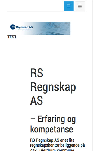
November 28, 2014 at 6:28 pm #556960Here is how it loks like on my Android mobilephone.
I checked the website here http://www.responsinator.com/ and got the same result as with my mobilephone.
Kind Regards
Tom Løkkatoloekka
- Join date:
- September 2007
- Posts:
- 117
- Downloads:
- 168
- Uploads:
- 35
- Thanks:
- 6
- Thanked:
- 7 times in 1 posts
November 28, 2014 at 6:42 pm #556962Is it so that I am making to much trouble when I use such a big header-image in the place where it normaly should be a smaller logo and hope that it would be responsive (responsive so it fits on my mobilephone)?
Kind Regards
Tom Løkkatoloekka
- Join date:
- September 2007
- Posts:
- 117
- Downloads:
- 168
- Uploads:
- 35
- Thanks:
- 6
- Thanked:
- 7 times in 1 posts
November 28, 2014 at 7:31 pm #556963I now inserted a Slideshow in the slideshow position and those images works fine (are responsive) on both my Mac an my mobilephone. So that maybe shows that having the big header-image in the position where the logo normaly should be is a bad idea?
Kind Regards
Tom Løkkachavan
- Join date:
- October 2014
- Posts:
- 4612
- Downloads:
- 0
- Uploads:
- 110
- Thanked:
- 1440 times in 1290 posts
December 1, 2014 at 1:39 am #557090you still have some issues? please post me a screenshot.
toloekka
- Join date:
- September 2007
- Posts:
- 117
- Downloads:
- 168
- Uploads:
- 35
- Thanks:
- 6
- Thanked:
- 7 times in 1 posts
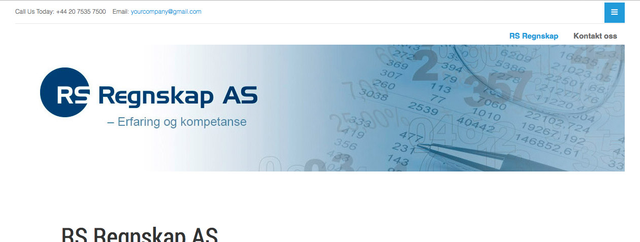
December 1, 2014 at 7:59 am #557154It’s still the same Chavan. I was only testing something with that slideshow to see if that was responsive. The header-image/logo should be a little wider. See this attachment.
Like this.
And the same on my Android mobilephone. Should also be a little wider.
Kind Regards
Tom Løkka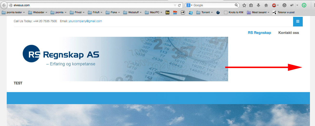
chavan
- Join date:
- October 2014
- Posts:
- 4612
- Downloads:
- 0
- Uploads:
- 110
- Thanked:
- 1440 times in 1290 posts
December 1, 2014 at 10:09 am #557179I have fixed it as you showed in screenshot, please check and confirm
toloekka
- Join date:
- September 2007
- Posts:
- 117
- Downloads:
- 168
- Uploads:
- 35
- Thanks:
- 6
- Thanked:
- 7 times in 1 posts
December 1, 2014 at 10:45 am #557183WOW – thanks a lot Chavan 🙂 Now it is just like I wanted (should be default to this logo position).
Can you give me the code that is the solution (I can look for it myself though) and don’t you think that that code should be in a custom.css file so it won’t be overwritten in an template upgrade?
(I will do some more small changes to the template but using a custom.css file for that).Kind Regards
Tom LøkkaAuthorPostsThis topic contains 22 replies, has 2 voices, and was last updated by
toloekka 10 years, 2 months ago.
We moved to new unified forum. Please post all new support queries in our New Forum
Jump to forum
melih


