

-
AuthorPosts
-
Hung Dinh Friend
Hung Dinh
- Join date:
- September 2014
- Posts:
- 4408
- Downloads:
- 11
- Uploads:
- 189
- Thanks:
- 309
- Thanked:
- 3310 times in 3 posts
May 11, 2012 at 9:29 am #176937Joomla! 2.5 Userguide – JA Lens Template
IMPORTANT NOTES :- JA Lens does not use T3 framework and is a responsive template.
- JA Lens does not support IE6, IE7 and RTL languages.
- JA Lens comes with responsive slideshow Lite Module, please note it is not supported to be used with other templates
- New modules as JA K2 Timeline and LazyLoad plugin are again specific for JA Lens. Use of these with other templates is user discretion but no customization support will be provided for such usage, as these are not tested to work with other templates.
- Responsive templates demand all extensions to be responsive too, otherwise the layout shall break, if your extension does not support responsive, there would be little we would be able to do. So please choose wisely.
I. Template configuration
1. Get to Know Your Template- Everyone should read the Template’s Overview Article! This is a quick and complete overview of the template, from the colors included, to all of the powerful Joomlart complimentary extensions that come with it. You’ll also find links to the LIVE Demo Site, the Download area, as well as the Forum where you can ask questions.
- Need Help Getting Around Joomlart.com? We’ve created a QUICK ACCESS GUIDE for helping you to become a Joomlart Power User. This is a wonderful reference, full of tips on how to quickly find the template info, demo sites, module position guides and more. We don’t want you to miss a thing!
2. Download Template and Extensions :
Check download folder for the Quickstart, Template zip and other complimentary extensions zip files.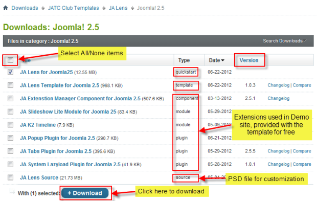
Plan your site Development
- Making a New Website? – If you are planning to make a new website, then use our Quickstart package to clone the demo site and replace the demo content with yours. Check How to install Quickstart Package.
- Installing on your live website? – If you are planning to use this template on your already live website, you should follow How to make your site look like demo site guide first to learn about the steps involved. Then you can follow the userguide below.
The user guide covers the following aspects:
- Installing Template on your Joomla system
- Installing complimentary / included extensions
- Custom HTML Modules
- K2 Configuration
- Responsive Design
System Requirement:
This template’s requirement is similar to that of Joomla! requirements and PHP 5.3.Hung Dinh
- Join date:
- September 2014
- Posts:
- 4408
- Downloads:
- 11
- Uploads:
- 189
- Thanks:
- 309
- Thanked:
- 3310 times in 3 posts
May 11, 2012 at 9:29 am #4525621. Installing the Template on your Joomla system
- Browse and Download: Go to the Download page of JA Lens and download the Template zip file.
- Install the Template: Now install the Template on your Joomla 2.5 system. Follow This Guide if you are not familiar with the installation procedure.
Template Configuration:
JA Lens template will install with default settings. It is advised not to change the template backend settings before setting up and installing other extensions and menu item configuration.Once, you have completed the setup, you can come back to the template backend and check the various options for customizing your template.
2. Installing complimentary / included extensions and Demo configurations :
- Free Extensions: (aka complimentary / included extensions). We use many extensions on our demo site to provide greater flexibility and features. These are provided for free to our members but can have limited functions specific for each template. Not all the settings for each complimentary extension can be optimized to work, as these extensions are also used with other templates too, so disabling specific feature is not possible.
- Custom HTML Module: To match the design of the template, we also style (CSS) for Custom HTML modules using different div classes. You will need to check the HTML codes and make sure to use the recommended HTML markup to get correct display. We provide the HTML code in this userguide.
Know your Module Positions :
- View Module Position image (used only).
- Use Module Position Overlay in Template (used & empty module positions).
Installing and Configuring Included Extensions :
List of Supported Extension in JA Lens Template Demo :
- JA Extensions manager.
- JA Slide Show Lite Module
- JA Tabs Plugin
- JA Popup Plugin
- JA Lazy Load Plugin (new plugin)
- JA K2 Timeline Module (new module specific for JA Lens only)
Note: This template does not support IE7 and RTL language styles.
IMPORTANT: We provide the screenshot of the settings used on our demo website. Make sure you configure your modules / plugins in the same manner to achieve demo site alike style / functions.Hung Dinh
- Join date:
- September 2014
- Posts:
- 4408
- Downloads:
- 11
- Uploads:
- 189
- Thanks:
- 309
- Thanked:
- 3310 times in 3 posts
May 11, 2012 at 9:30 am #452565II. Responsive Web DesignReferences for Responsive Web Design
JA Lens Template is a responsive template. Layout changes when screen size changes, each layout bring you different and impressive outlook.
- Support 6 layouts (HD, Extra Wide, Wide, Normal, tablet, mobile). The layout of template will be changed coresponding to its defined screen size.
- Tablet and Mobile: support 2 modes, portrait and landscape.
- Easy customization (You can define, style each layout …)
- Responsive media: Typo, font-size, image, logo, …
- …
Browsers support:
- Support all modern, standard-compliant browsers (Firefox, Opera, Safari, Chrome) and IE 8, 9.
- Do not support responsive in IE 6. In the browser, only display wide layout.
- IE7 is not supported by this template., no bug fixes will be provided for IE7.
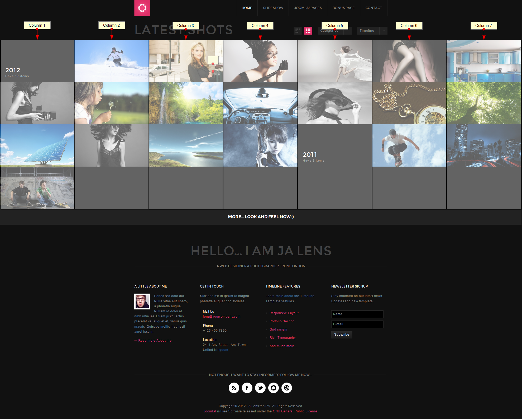
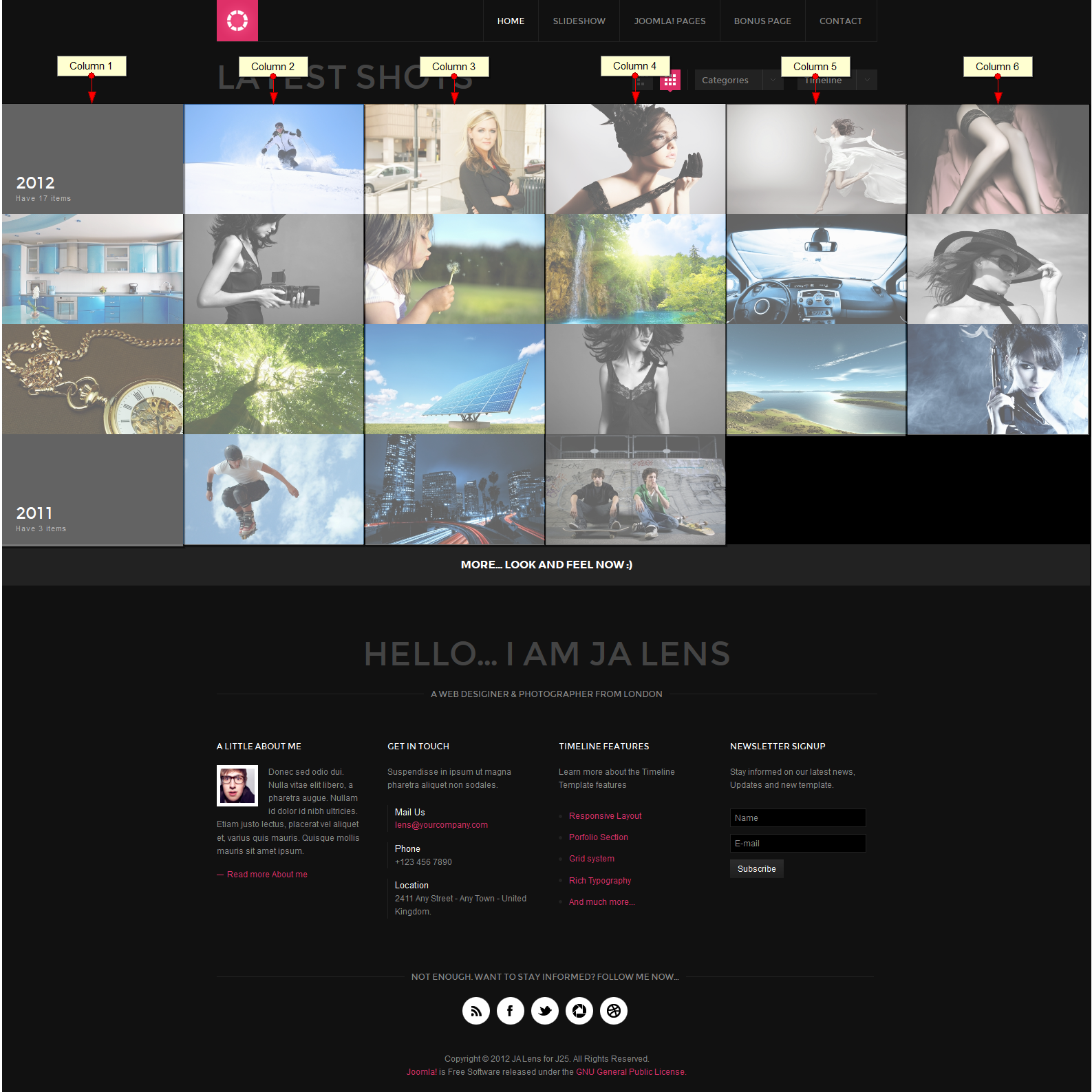
1. Layout
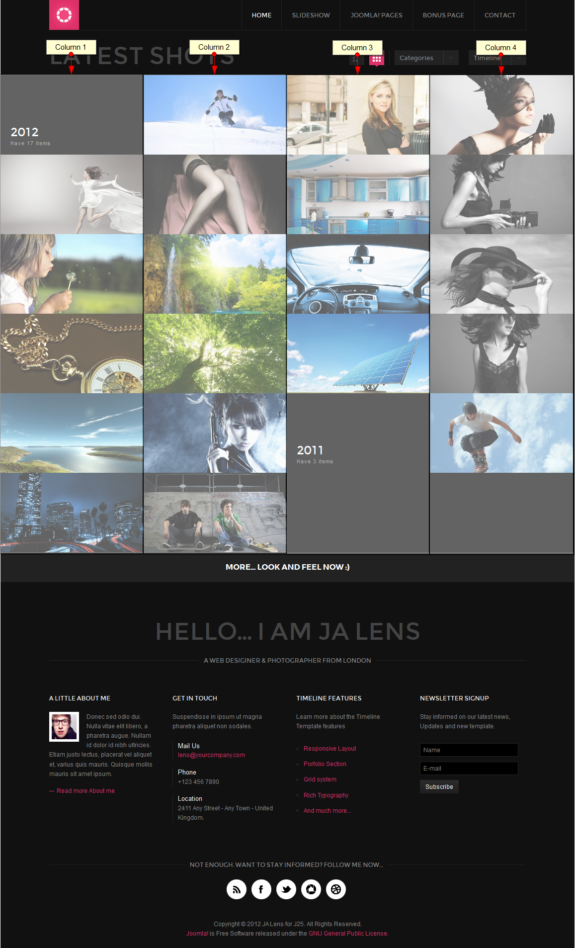
As mentioned in the above section, this template supports 6 layouts, each layout has its own css style file. The index.php file located in the: your_site/templates/ja_lens/ is to define which css style file that each layout will use.
The css style file for each layout are located in : your_site/templates/ja_lens/css.
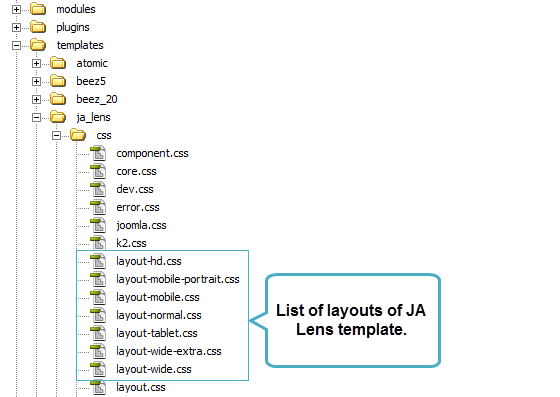
The file: your_site/templates/ja_lens/index.php is to define width of each layout.
<link rel=”stylesheet” type=”text/css” href=”<?php echo $this->baseurl ?>/templates/<?php echo $this->template; ?>/css/layout-mobile.css” media=”only screen and (max-width:719px)” />
<link rel=”stylesheet” type=”text/css” href=”<?php echo $this->baseurl ?>/templates/<?php echo $this->template; ?>/css/layout-mobile-portrait.css” media=”only screen and (max-width:479px)” />
<link rel=”stylesheet” type=”text/css” href=”<?php echo $this->baseurl ?>/templates/<?php echo $this->template; ?>/css/layout-tablet.css” media=”only screen and (min-width:720px) and (max-width: 985px)” />
<link rel=”stylesheet” type=”text/css” href=”<?php echo $this->baseurl ?>/templates/<?php echo $this->template; ?>/css/layout-normal.css” media=”only screen and (min-width:986px) and (max-width: 1235px)” />
<link rel=”stylesheet” type=”text/css” href=”<?php echo $this->baseurl ?>/templates/<?php echo $this->template; ?>/css/layout-wide.css” media=”only screen and (min-width:1236px) and (max-width: 1585px)” />
<link rel=”stylesheet” type=”text/css” href=”<?php echo $this->baseurl ?>/templates/<?php echo $this->template; ?>/css/layout-wide-extra.css” media=”only screen and (min-width:1586px) and (max-width: 1890px)” />
<link rel=”stylesheet” type=”text/css” href=”<?php echo $this->baseurl ?>/templates/<?php echo $this->template; ?>/css/layout-hd.css” media=”only screen and (min-width:1891px)” />- The HD layout has minimum width = 1891px
- The Extra Wide layout has minimum width = 1586px and maximum width = 1890px
- The Wide layout has minimum width = 1236px and maximum width = 1585px
- The Normal layout has minimum width = 986 px and maximum width = 1235 px
- The Tablet layout has minimum width = 736 px and maximum width = 985 px
- The Mobile Landscape layout has maximum width = 735 px
- The Mobile Portrait layout has maximum width = 479 px
Item size in each layout is defined differently. In the layout.css file, the base grid in each view is defined as following:
/* MASONRY PRESETS
——————————————————— */
/* Percentage width reference:
– 100% ~ 1 col
– 50% ~ 2 cols
– 33.3% ~ 3 cols
– 25% ~ 4 cols
– 20% ~ 5 cols
– 16.6% ~ 6 cols
– 14.2% ~ 7 cols
– 12.5% ~ 8 cols
– 11.1% ~ 9 cols
– 10% ~ 10 cols
*/Each layout has specific number of columns. Then the width size is defined based on the screen size.
1.1 HD Layout
When user’s screen size min = 1891 pixel, the template uses layout-hd.css as the style file.
/* MASONRY PRESETS

--------------------------------------------------------- */

/* Default (Medium) ----*/

.masonry .item {

  width: 14.2%; /* 7 cols */

}
.masonry .grid-double {
width: 28.4%;
}.masonry .grid-triple {
width: 42.6%;
}
This layout uses 7 columns. One default item has width size = 1 column = 1 grid. Width size of column in pixel = screen width size / number of columns.
For example, if the screen size = 1995 pixel –> HD layout –> 7 columns –> width of 1 column = 1995/7 =285 pixel.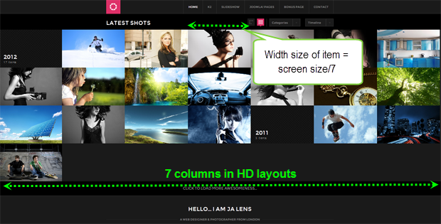
1.2 Extra Wide Layout
When user’s screen size has minimum width = 1586px and maximum width = 1890px, the template uses layout-wide-extra.css as the style file.
/* MASONRY PRESETS

--------------------------------------------------------- */

/* Default (Medium) ----*/

.masonry .item {

  width: 16.6%; /* 6 cols */

}
.masonry .grid-double {
width: 33.2%;
}.masonry .grid-triple {
width: 49.8%;
}
This layout uses 6 columns. One default item has width size = 1 column = 1 grid = 16.6%. Width size of column in pixel = screen width size / number of columns.
For example, if the screen size = 1890 pixel –> Extra Wide layout –> 6 columns –> width of 1 column = 1890/6 =315 pixel.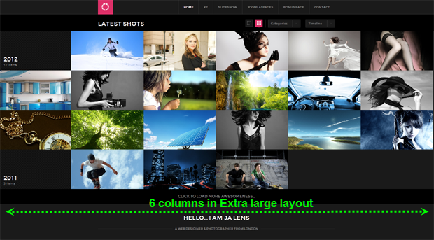
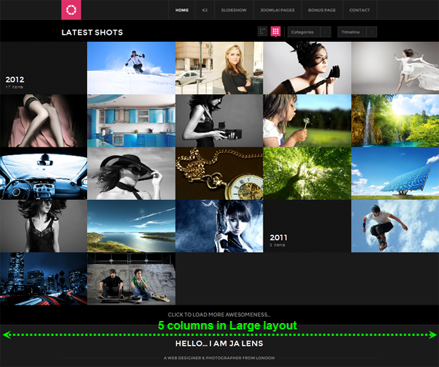
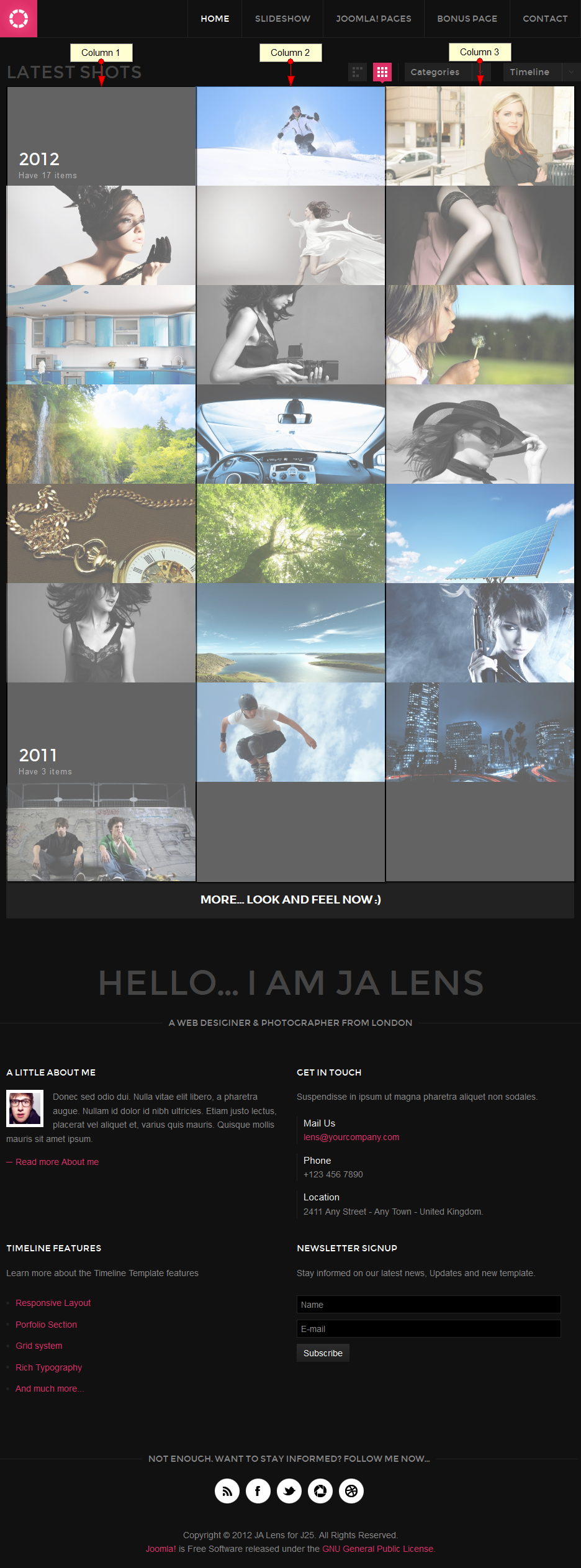
1.3 Wide Layout
When user’s screen size has minimum width = 1236px and maximum width = 1585px, the template uses layout-wide.css as the style file.
/* MASONRY PRESETS
——————————————————— */
/* Default (Medium) —-*/
.masonry .item {
width: 20%; /* 5 cols */
}.masonry .grid-double {
width: 40%;
}.masonry .grid-triple {
width: 60%;This layout uses 5 columns. One default item has width size = 1 column = 1 grid = 20%. Width size of column in pixel = screen width size / number of columns.
For example, if the screen size = 1500 pixel –> Extra Wide layout –> 5 columns –> width of 1 column = 1500/5 =300 pixel.1.4 Normal Layout
When user’s screen size has minimum width = 986 px and maximum width = 1235 px, the template uses layout.css as the style file.
/* Default (Medium) —-*/
.masonry .item {
display: block;
float: left;
width: 25%; /* 4 cols */
max-width: 100%
}This layout uses 4 columns. One default item has width size = 1 column = 1 grid = 25%. Width size of column in pixel = screen width size / number of columns.
For example, if the screen size = 1000 pixel –> Extra Wide layout –> 4 columns –> width of 1 column = 1000/4 = 250 pixel.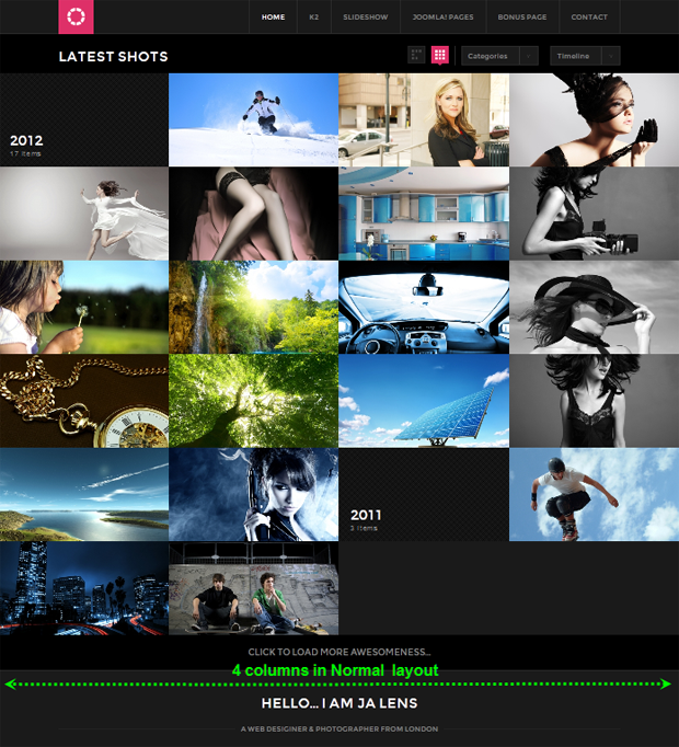
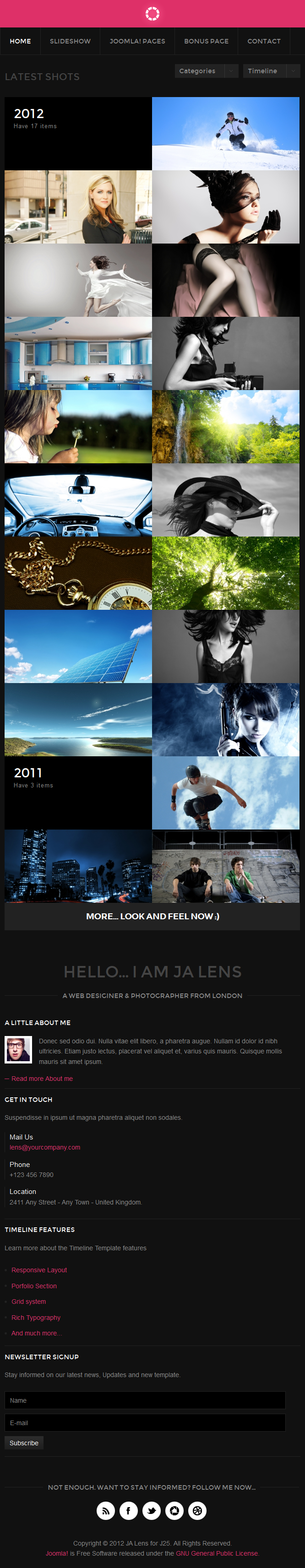
1.5 Tablet Layout
When user’s screen size has minimum width = 736 px and maximum width = 985 px, the template uses layout-tablet.css as the style file.
/* MASONRY PRESETS (layout : 60px)
——————————————————— */
/* Default (Medium) —-*/
.masonry .item {
width: 33.3%; /* 3 cols */
}.masonry .grid-double {
width: 66.6%;
}.masonry .grid-triple {
width: 100%;
}This layout uses 3 columns. One default item has width size = 1 column = 1 grid = 33.3%. Width size of column in pixel = screen width size / number of columns.
For example, if the screen size = 900 pixel –> Extra Wide layout –>3 columns –> width of 1 column = 900/3 = 300 pixel.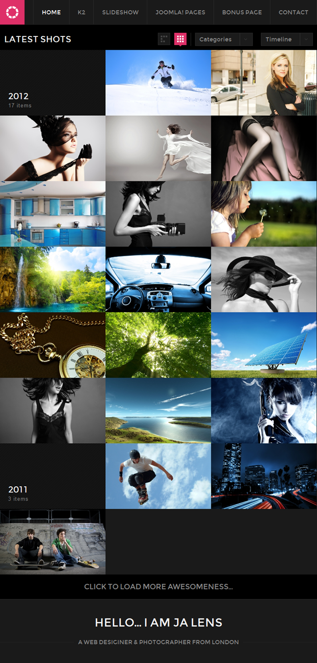
1.6 Mobile Landscape Layout
When user’s screen size has maximum width = 735 px, the template uses mobile.css as the style file.
/* MASONRY PRESETS (Basegrid : 60px)

--------------------------------------------------------- */

/* Default (Medium) ----*/

.masonry .item {

  width: 50%; /* 2 cols */

}
.masonry .grid-double {
width: 100%;
}.masonry .grid-triple {
width: 100%;
}
This layout uses 2 columns. One default item has width size = 1 column = 1 grid = 50%. Width size of column in pixel = screen width size / number of columns.1.7 Mobile Portrait Layout
When user’s screen size has maximum width = 479 px, the template uses layout-mobile-portrait.css as the style file.
/* MASONRY PRESETS (Basegrid : 60px)

--------------------------------------------------------- */

/* Default (Medium) ----*/

.masonry .item {

  width: 100%; /* 1 col */

}
.masonry .grid-double {
width: 100%;
}.masonry .grid-triple {
width: 100%;
}
This layout uses 1 columns. One default item has width size = 1 column = 1 grid = 100%. Width size of column in pixel = screen width size / number of columns.Hung Dinh
- Join date:
- September 2014
- Posts:
- 4408
- Downloads:
- 11
- Uploads:
- 189
- Thanks:
- 309
- Thanked:
- 3310 times in 3 posts
May 11, 2012 at 9:31 am #452566Configurations for Modules / Plugins as used on JA Lens Demo site.
Note: Below given configs are the best possible / optimized settings for each of the extension used. Changing the options may break the layout. Please note NOT all the backend options can be supported at one time by extensions.
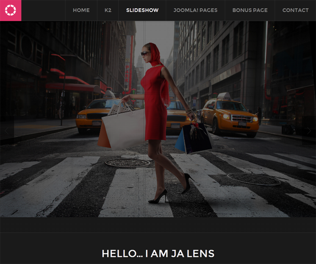
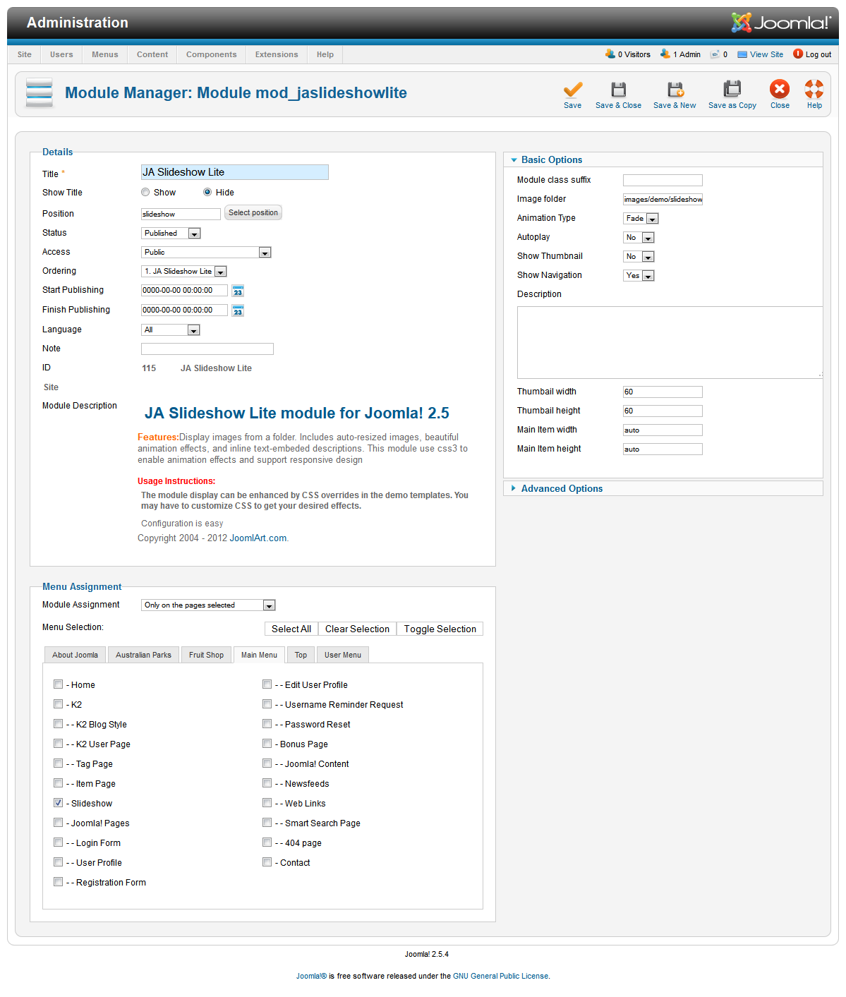
1. JA Slide Show Lite Module
Slidehsow Lite module is developed especially for JA Lens and the important feature of this module is that it is responsive. Thumbnail support has been added in the stable release but Item description is not supported.
You are free to use this module in other templates too, but one would need to do the customization for styles on his/her own, we shall not provide any customization support for this module if used in other templates.Module Position: slideshow
Module Suffix: NOT USED
Does not support : Image Descriptions
Backend SettingsFront-end appearance
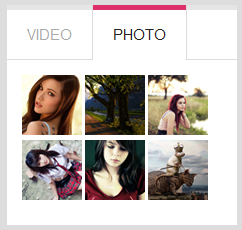
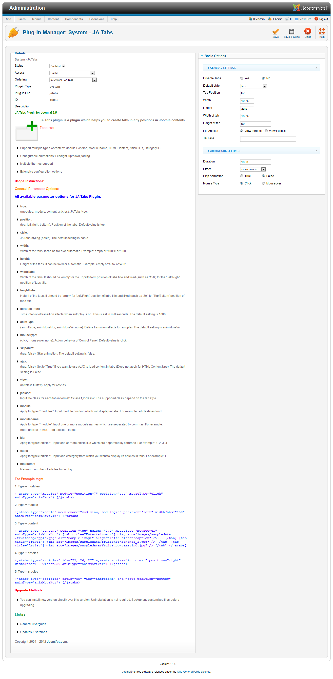
2. JA Tabs Plugin
To enable tabs, please follow the basic three steps.
Note : In JA Lens the Tabs are supported for Top and Bottom placement position only. Left and Right placement are not supported.
Step 1: Configure the plugin
Install and enable the JA Tabs plugin, configure the same as per the screenshot below:
Front-end appearance
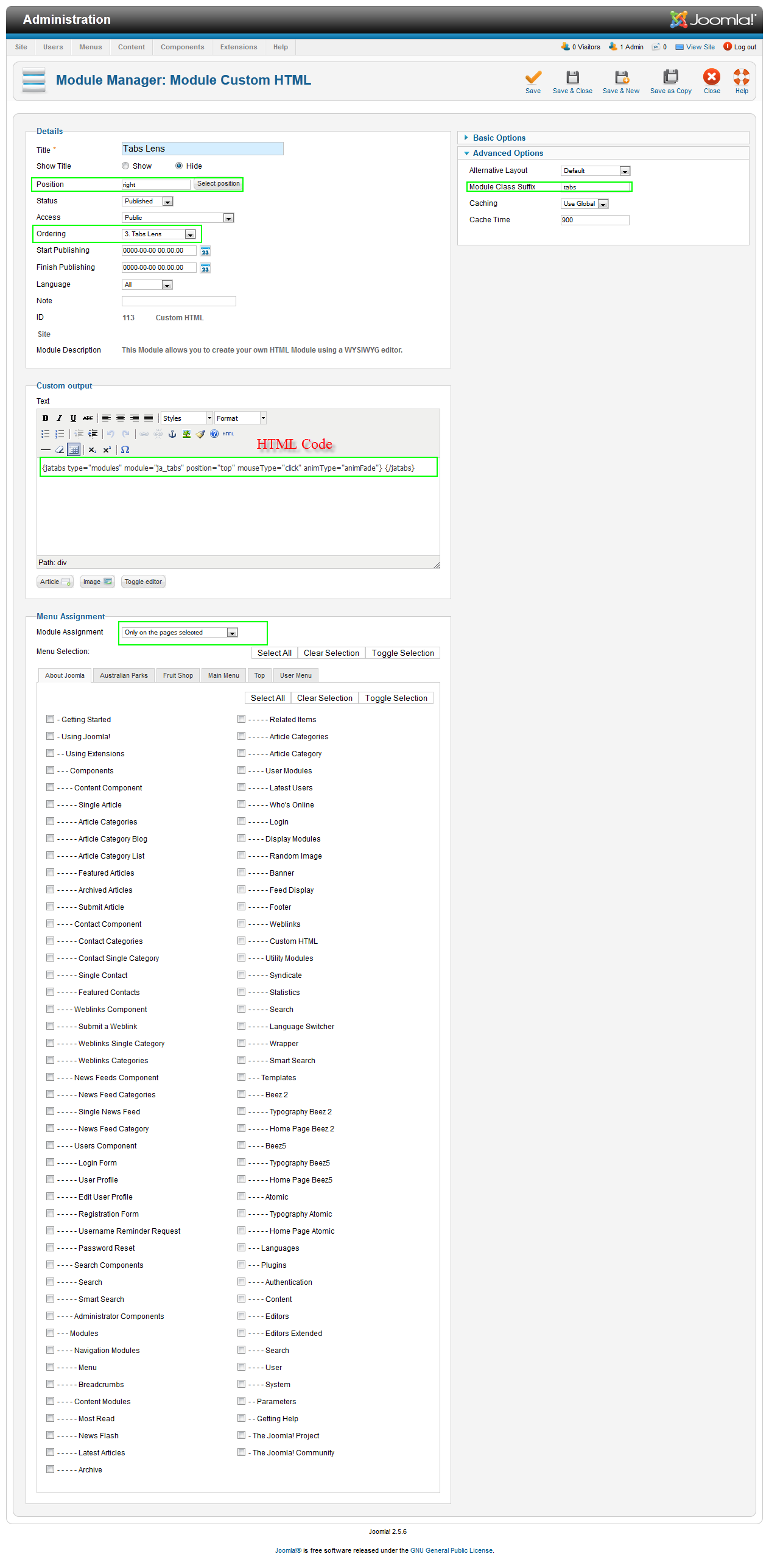
Step 2: Create a Custom HTML Module to load tabs – Named as Tabs Lens
Module Position: right

Module Suffix:   tabs
<div>{jatabs type=”modules” module=”ja_tabs” position=”top” mouseType=”click” animType=”animFade”} {/jatabs}</div>
Backend Settings
Note : In above HTML code parameter position=” ” supports top & bottom only. Using left or right position will break the layout of tabs module.Step 3: Assign contents to display in Tabs
For demo, we have used 2 custom modules to display in Tabs.
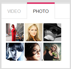
2.1 Custom HTML Module: Photo
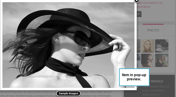
Note : JA Popup plugin is required for generating thumbnails and popup effect for this custom module.
Module Position: ja-tabs

Module Suffix:  NOT USED
<div class=”img-photo clearfix”><span class=”highslide-img”> {japopup type=”image” title=”Sample Images” content=”images/demo/gallery/gl-1.jpg” width=”594″ height=”386″} <img src=”images/demo/gallery/thumb-1.jpg” border=”0″ alt=”Sample Image” /> {/japopup} </span> <span class=”highslide-img”> {japopup type=”image” title=”Sample Images” content=”images/demo/gallery/gl-2.jpg” width=”594″ height=”386″} <img src=”images/demo/gallery/thumb-2.jpg” border=”0″ alt=”Sample Images” /> {/japopup} </span> <span class=”highslide-img”> {japopup type=”image” title=”Sample Images” content=”images/demo/gallery/gl-3.jpg” width=”594″ height=”386″} <img src=”images/demo/gallery/thumb-3.jpg” border=”0″ alt=”Sample Images” /> {/japopup} </span> <span class=”highslide-img”> {japopup type=”image” title=”Sample Images” content=”images/demo/gallery/gl-4.jpg” width=”594″ height=”386″} <img src=”images/demo/gallery/thumb-4.jpg” border=”0″ alt=”Sample Images” /> {/japopup} </span> <span class=”highslide-img”> {japopup type=”image” title=”Sample Images” content=”images/demo/gallery/gl-5.jpg” width=”594″ height=”386″} <img src=”images/demo/gallery/thumb-5.jpg” border=”0″ alt=”Sample Images” /> {/japopup} </span> <span class=”highslide-img”> {japopup type=”image” title=”Sample Images” content=”images/demo/gallery/gl-6.jpg” width=”594″ height=”386″} <img src=”images/demo/gallery/thumb-6.jpg” border=”0″ alt=”Sample Images” /> {/japopup} </span></div>Note: the usage of different div classes, these are special css classes defined in the css file for the best layout. The layout will break if the above classes are not used the way they are used in demo site.
Front-end appearance
2.2. Custom HTML module: Video
Module position: ja_tabs

Module Suffix : NOT USED
<p><a class=”video” href=”http://www.youtube.com/watch?v=aBvyc5P7Fsg” title=”JA Elastica – Web Responsive Design Template for Joomla! “><img src=”images/demo/vimeo.jpg” border=”0″ alt=”Sample video” title=”Sample video” /></a> <span>Quis eros Aliquam et diam ac a dolor nec nunc accumsan. Vitae velit tortor nunc dolor turpis.</span></p>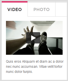
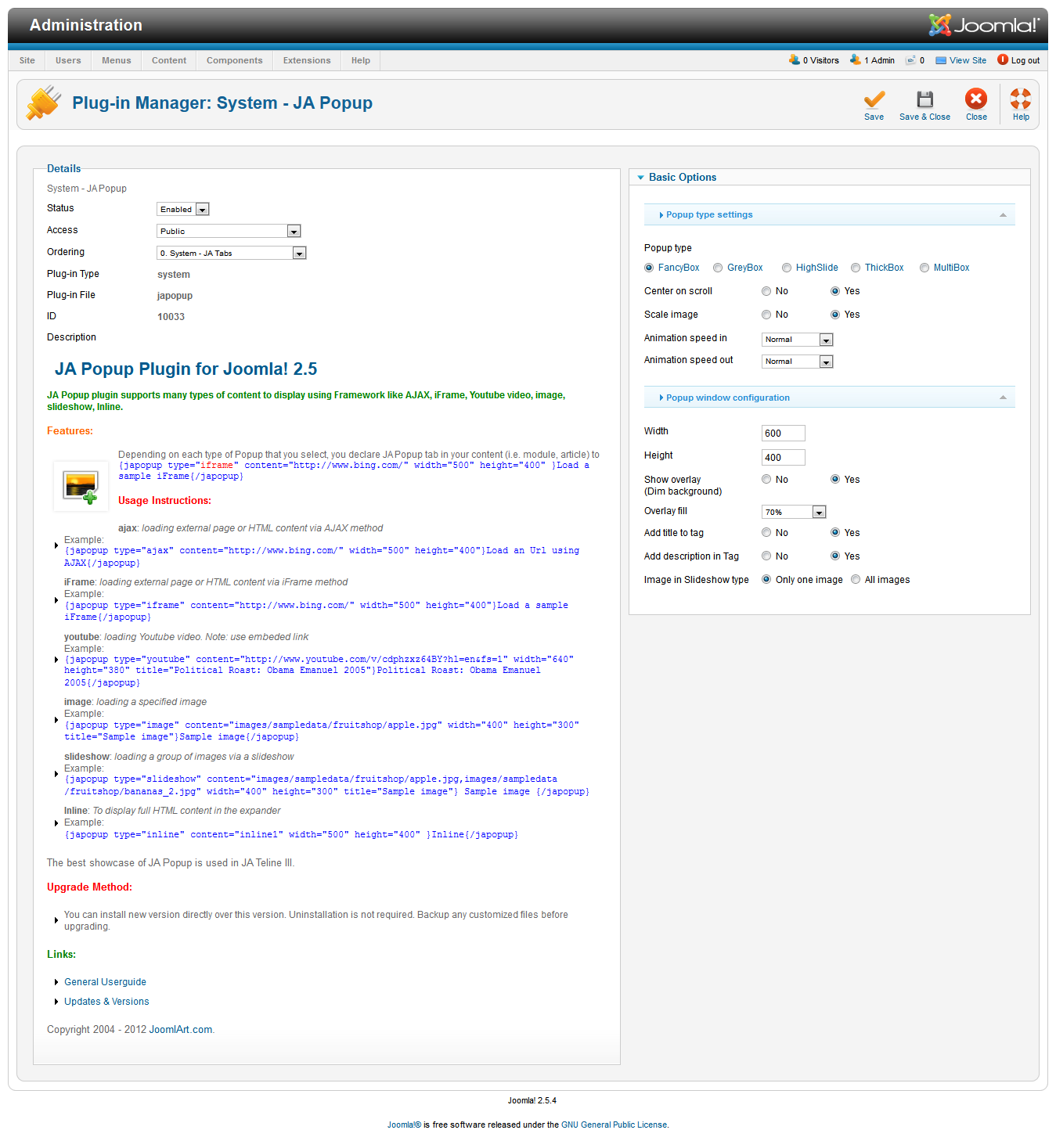
3. JA Popup Plugin
Install and enable the plugin, configure it same as the backend setting screenshot linked below.
For JA lens the popup plugin supports only Fancy Box popup type. Greybox, Highslide, ThickBox and MultiBox type are not supported.
Front-end appearance
Popup plugin is used in conjuction with the Tabs modules described above. If you are not using tabs on your site, you can disable / uninstall JA Popup Plugin.
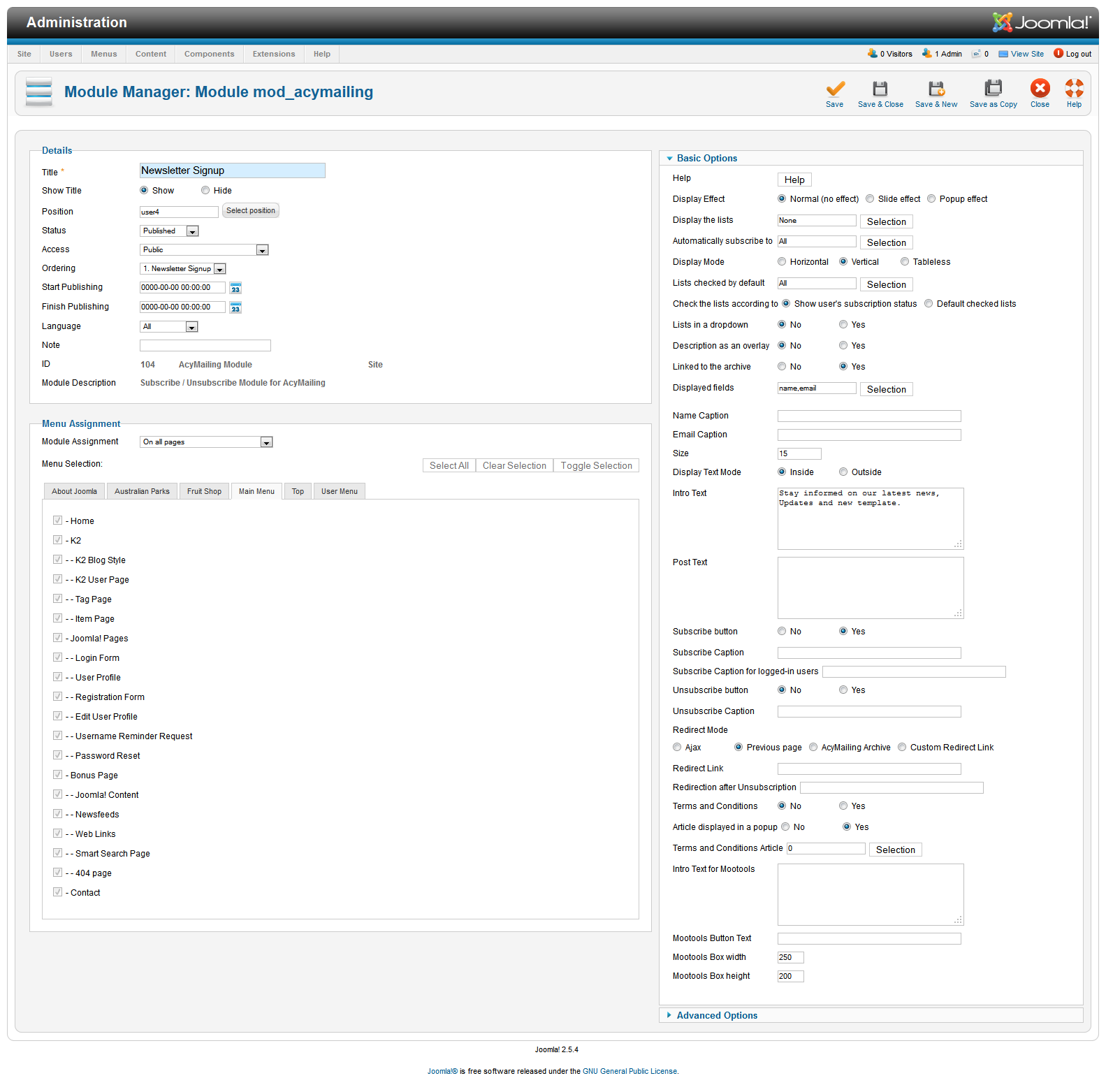
4. AcyMailing Module
Lens provide limited support for AcyMailing Component. The module has been styled to match the template concept.
Module Position: user4

Module Suffix:  NOT USED
Backend SettingsFront-end appearance
Please note, you have to configure the acymailing component to get this module working.
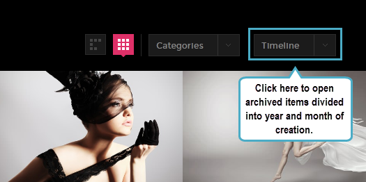
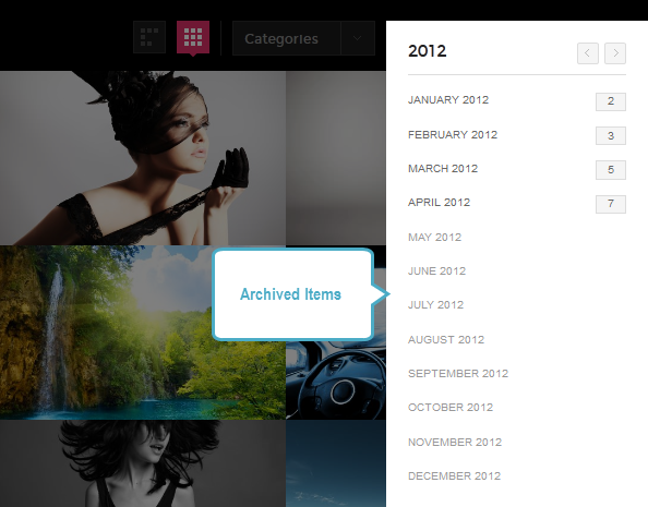
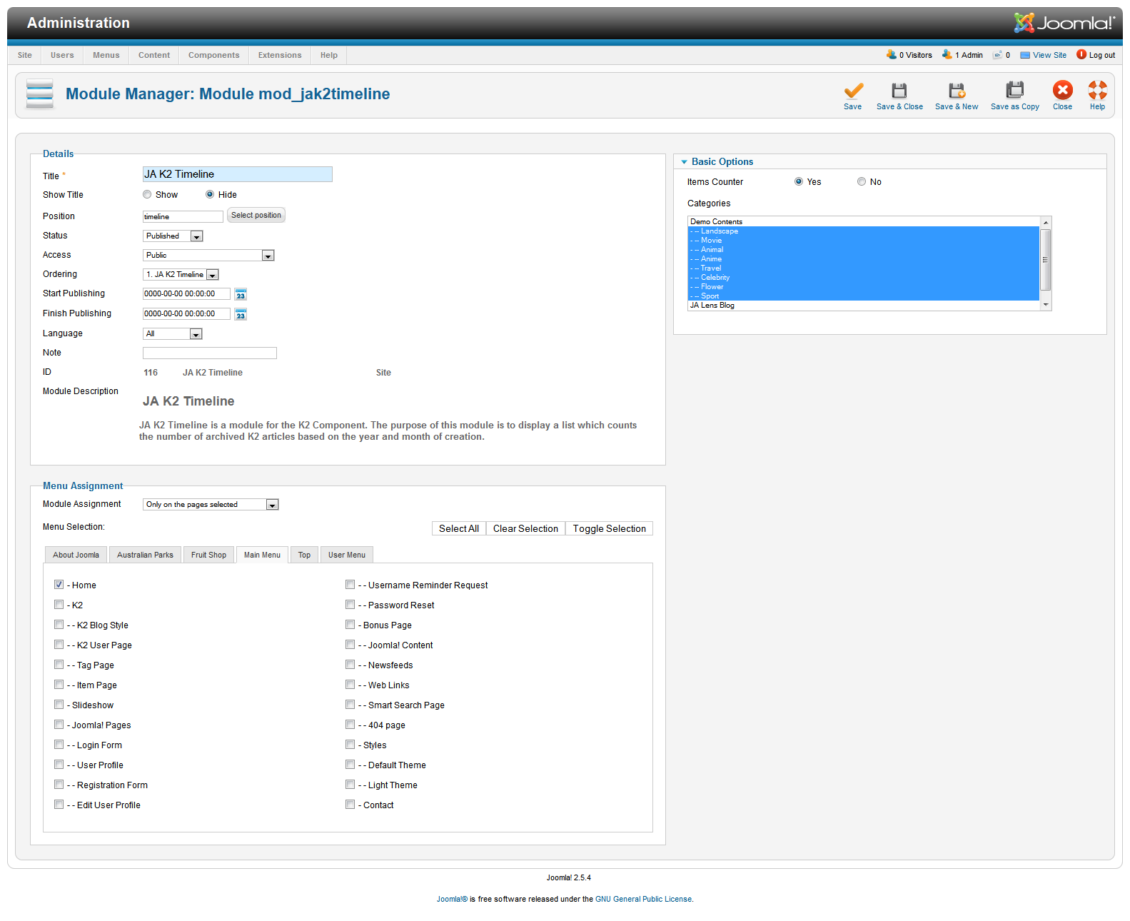
5. JA K2 Timeline Module
Note : This module has been developed and styled to use with JA Lens only. You are free to use this module with other templates too, but we shall not provide the style customization for such usage.
Module Position: timeline

Module Suffix:  NOT USED
Backend SettingsFront-end appearance
6. JA Lazy Load Plugin
Lazy Load is a jQuery Script. It delays loading of images in long web pages. Images outside of viewport (visible part of web page) wont be loaded before user scrolls to them, making the browsing faster. This is opposite of image preloading. Browser will be in ready state after loading visible images.
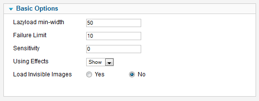
Install and enable the plugin and configure the plugin as per the screenshot above. Please note these are the best optimized settings, you can read the tooltip description of each param in the plugin backend.
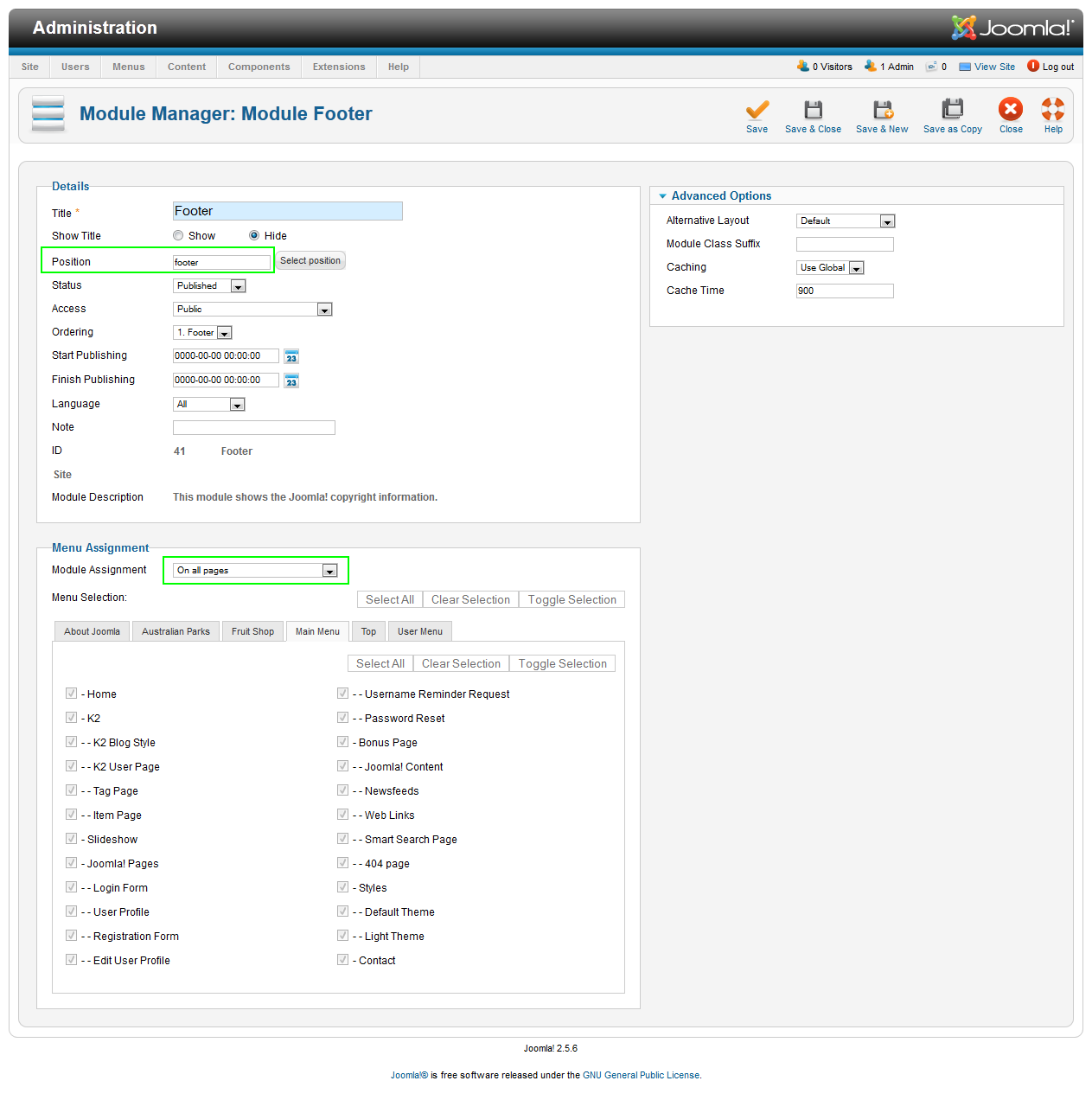
7. Footer Module
Module Position: footer

Module Suffix:  NOT USED
Backend SettingsFront-end appearance:
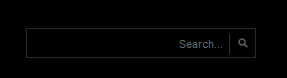
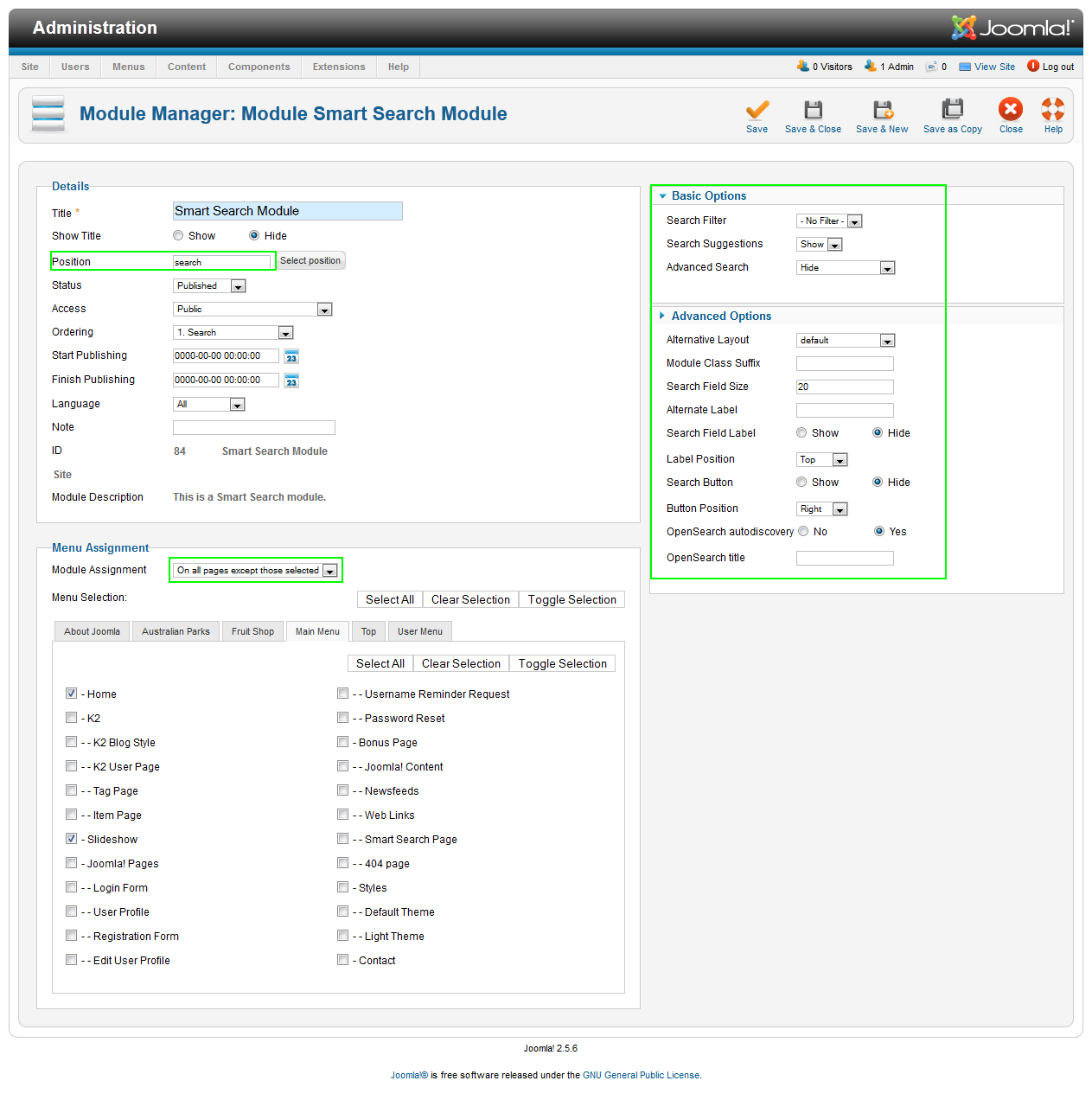
8. Search Module
Module Position: search

Module Suffix:  NOT USED
Backend SettingsFront-end appearance:
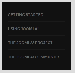
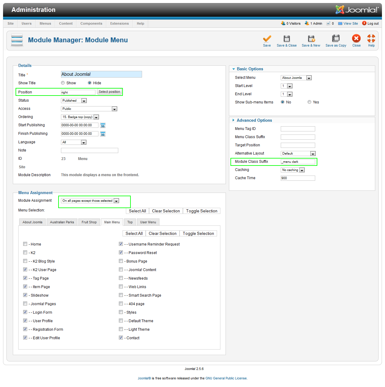
9. About Joomla! Module
Module Position: right

Module Suffix: _menu dark
Backend SettingsFront-end appearance:
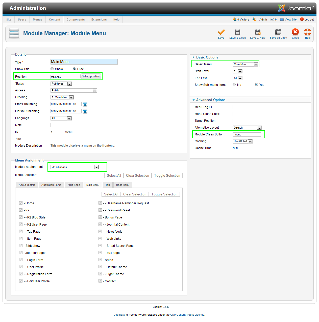
10. Main Menu Module
Module Position: mainnav

Module Suffix: _menu
Backend SettingsFront-end appearance:

Hung Dinh
- Join date:
- September 2014
- Posts:
- 4408
- Downloads:
- 11
- Uploads:
- 189
- Thanks:
- 309
- Thanked:
- 3310 times in 3 posts
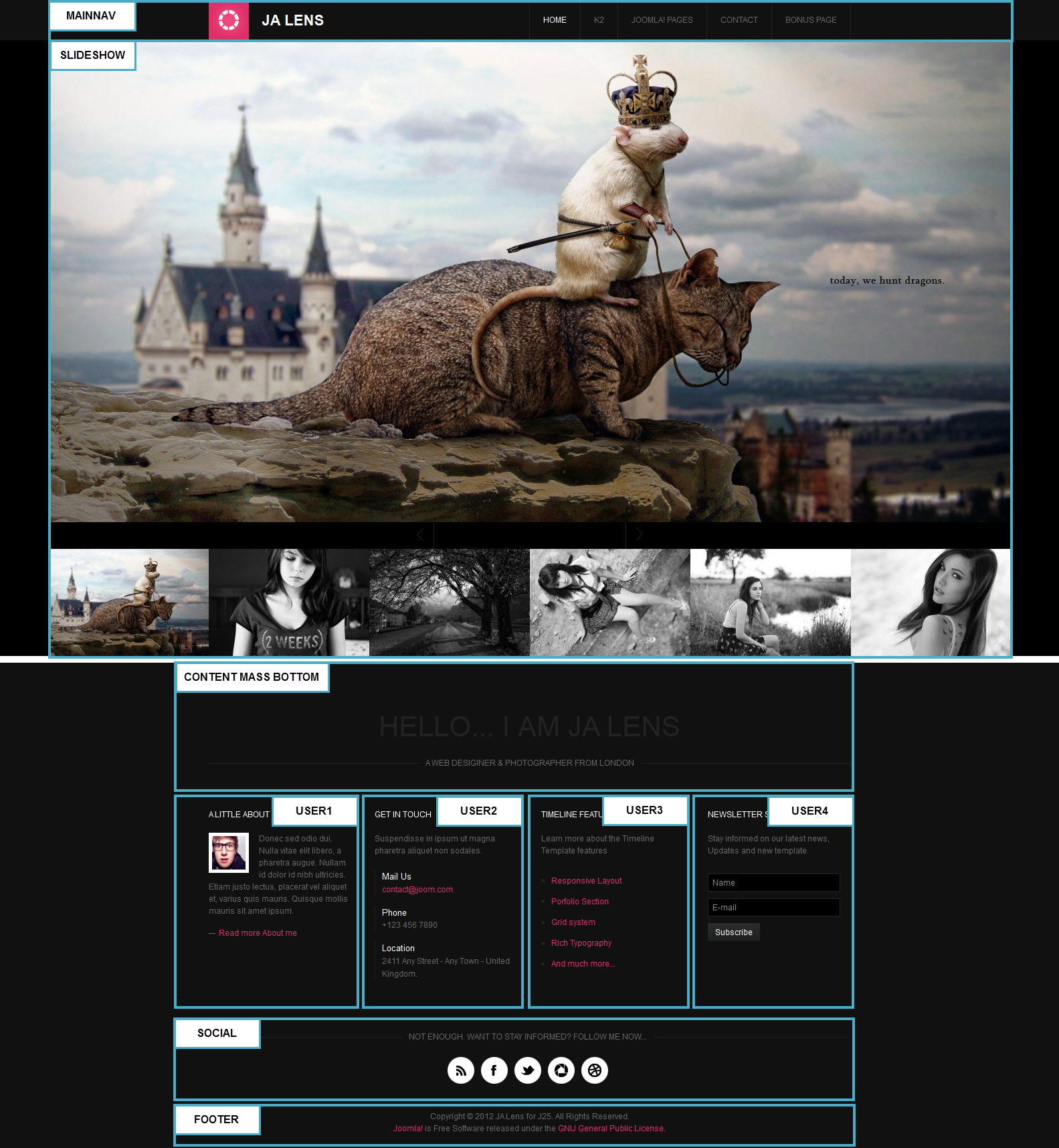
May 11, 2012 at 9:31 am #452567Custom HTML Modules
We use many custom HTML modules in our demo for layout and concept. You can replace the content of the same to your taste or replace them with other modules.
If you are not sure how to use Custom HTML Modules or accessing HTML Editor view. Read this Guide.
We will provide you with the HTML Code (markup) for reference below, you will need to replicate exactly and then change your content. Remember HTML code has special div classes, which are required for demo alike display.
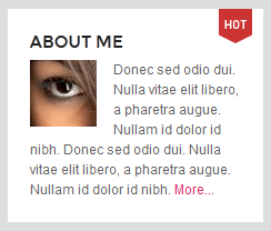
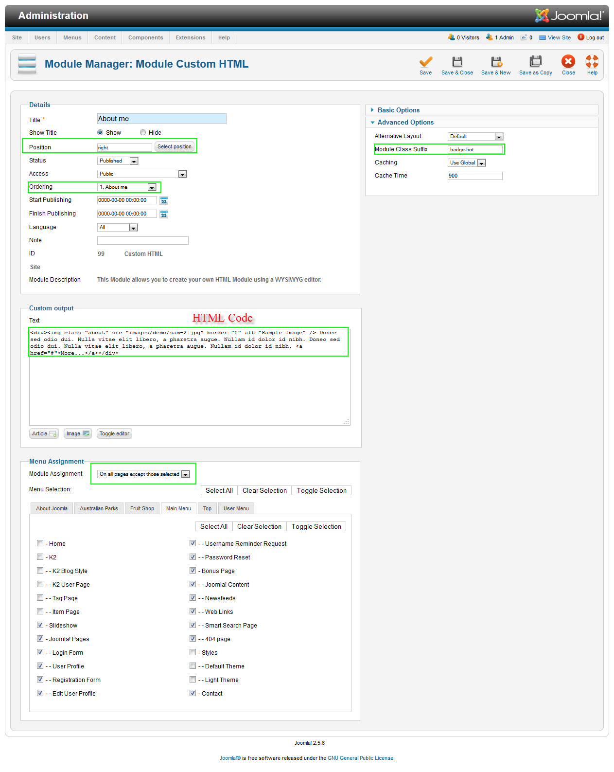
1. About me
Module position: right

Module Suffix :  badge-hot
<div><img class=”about” src=”images/demo/sam-2.jpg” border=”0″ alt=”Sample Image” /> Donec sed odio dui. Nulla vitae elit libero, a pharetra augue. Nullam id dolor id nibh. Donec sed odio dui. Nulla vitae elit libero, a pharetra augue. Nullam id dolor id nibh. <a href=”#”>More…</a></div>
Backend SettingsFront-end appearance:
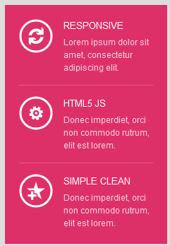
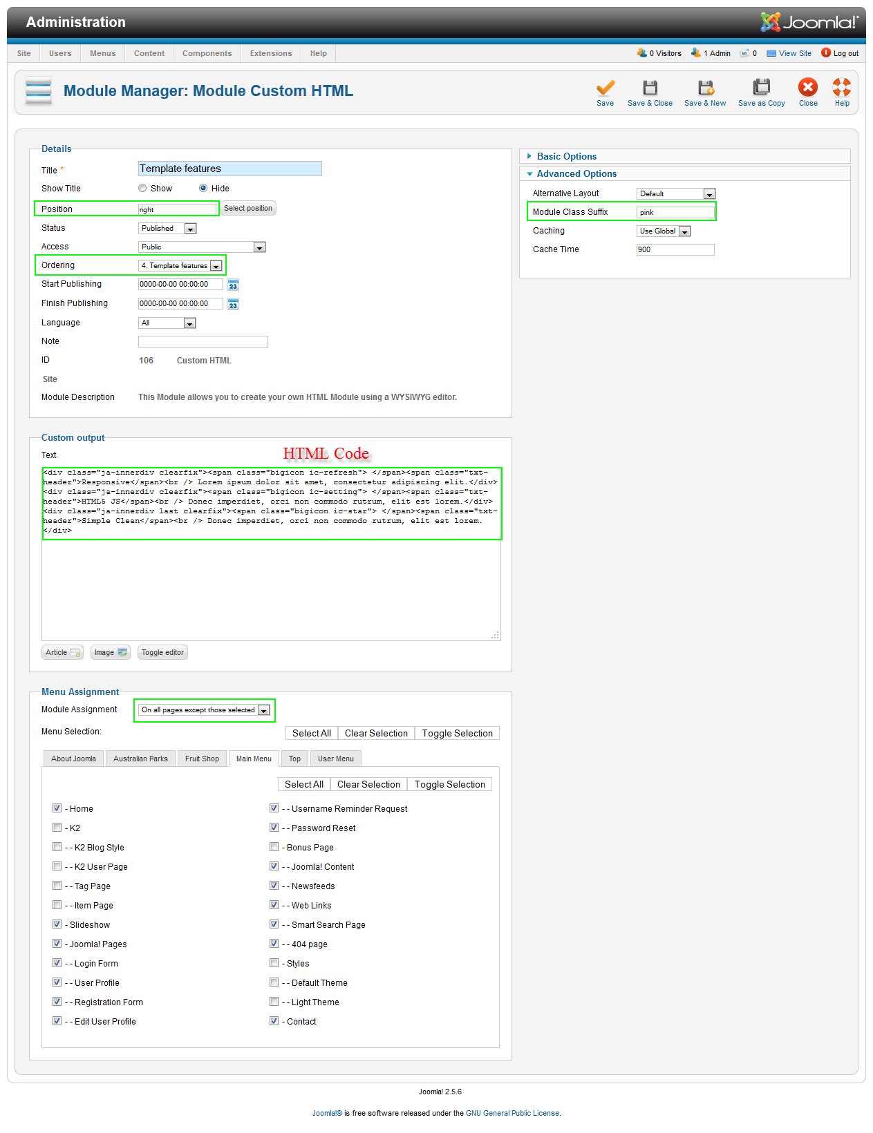
2. Template features
Module position: right

Module Suffix :  pink
<div class=”ja-innerdiv clearfix”><span class=”bigicon ic-refresh”> </span><span class=”txt-header”>Responsive</span><br /> Lorem ipsum dolor sit amet, consectetur adipiscing elit.</div>
<div class=”ja-innerdiv clearfix”><span class=”bigicon ic-setting”> </span><span class=”txt-header”>HTML5 JS</span><br /> Donec imperdiet, orci non commodo rutrum, elit est lorem.</div>
<div class=”ja-innerdiv last clearfix”><span class=”bigicon ic-star”> </span><span class=”txt-header”>Simple Clean</span><br /> Donec imperdiet, orci non commodo rutrum, elit est lorem.</div>
Backend SettingsFront-end appearance:
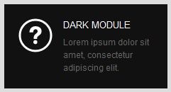
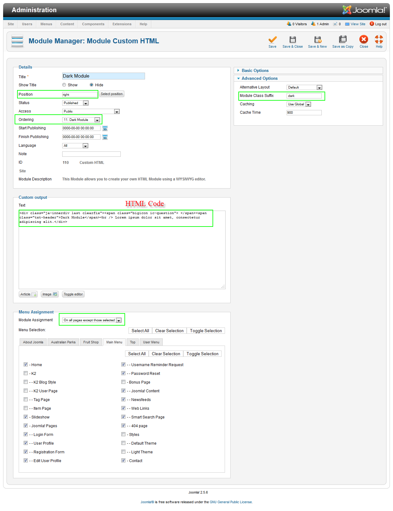
3. Dark Module
Module position: right

Module Suffix :  dark
<div class=”ja-innerdiv last clearfix”><span class=”bigicon ic-question”> </span><span class=”txt-header”>Dark Module</span><br /> Lorem ipsum dolor sit amet, consectetur adipiscing elit.</div>
Backend SettingsFront-end appearance:
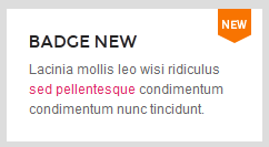
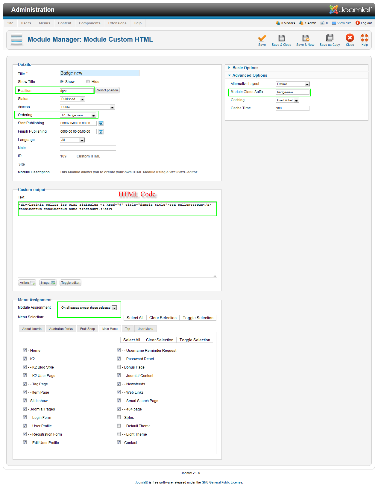
4. Badge new
Module position: right

Module Suffix :   badge-new
<div>Lacinia mollis leo wisi ridiculus <a href=”#” title=”Sample title”>sed pellentesque</a> condimentum condimentum nunc tincidunt.</div>
Backend SettingsFront-end appearance:
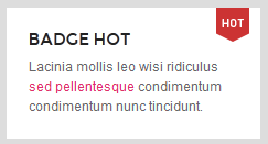
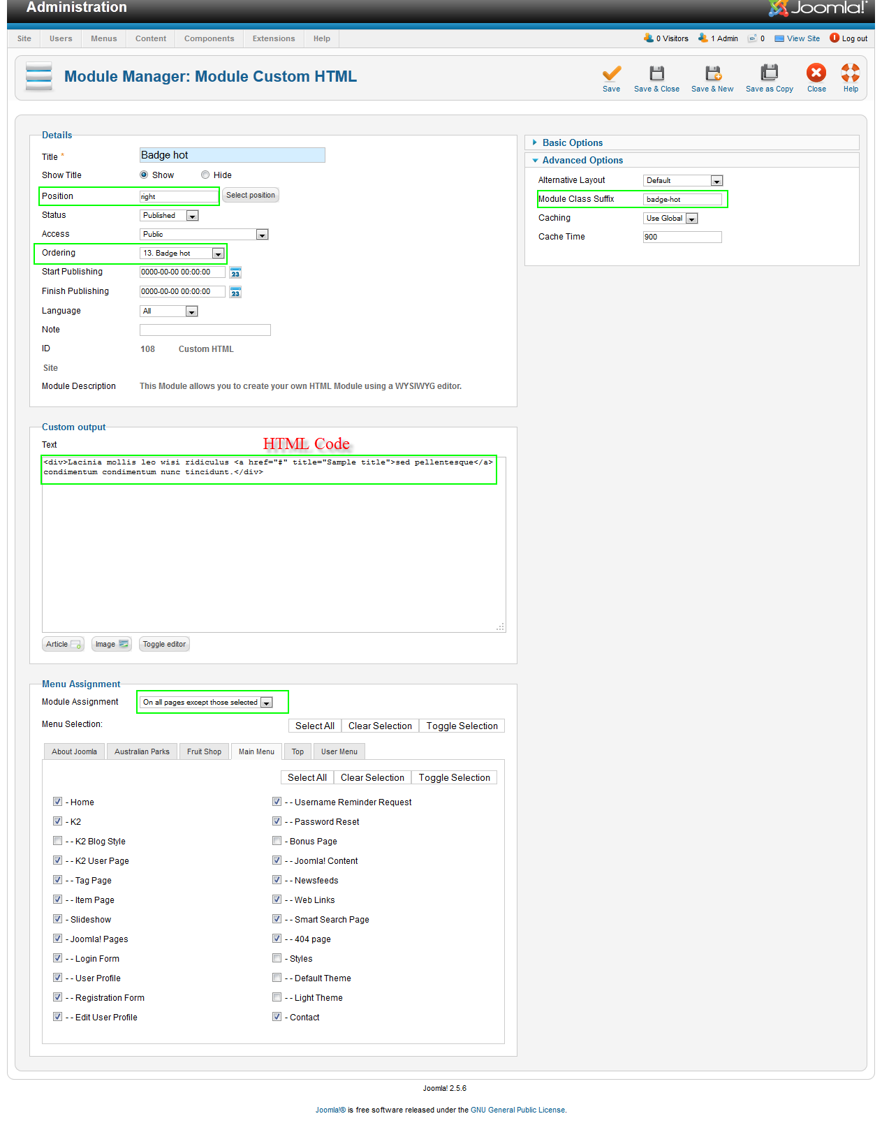
5. Badge hot
Module position: right

Module Suffix :   badge-hot
<div>Lacinia mollis leo wisi ridiculus <a href=”#” title=”Sample title”>sed pellentesque</a> condimentum condimentum nunc tincidunt.</div>
Backend SettingsFront-end appearance:
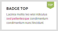
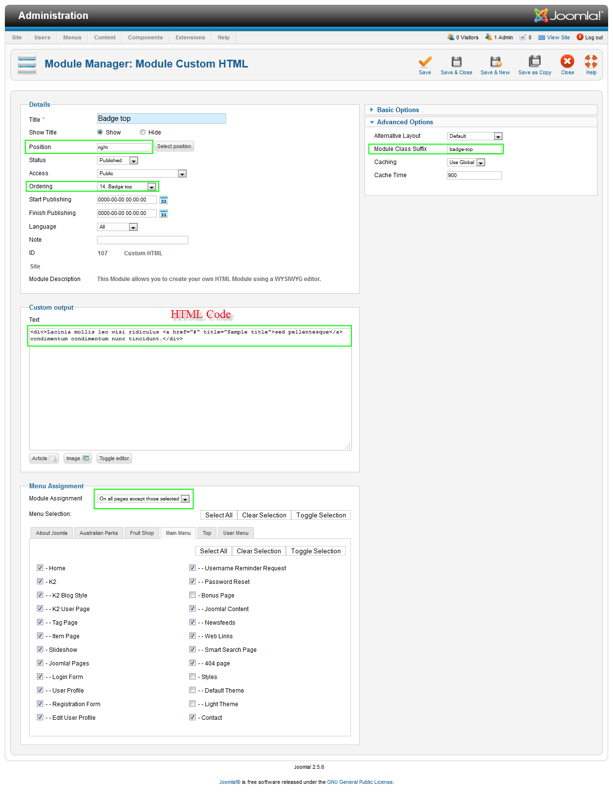
6. Badge top
Module position: right

Module Suffix :   badge-top
<div>Lacinia mollis leo wisi ridiculus <a href=”#” title=”Sample title”>sed pellentesque</a> condimentum condimentum nunc tincidunt.</div>
Backend SettingsFront-end appearance:
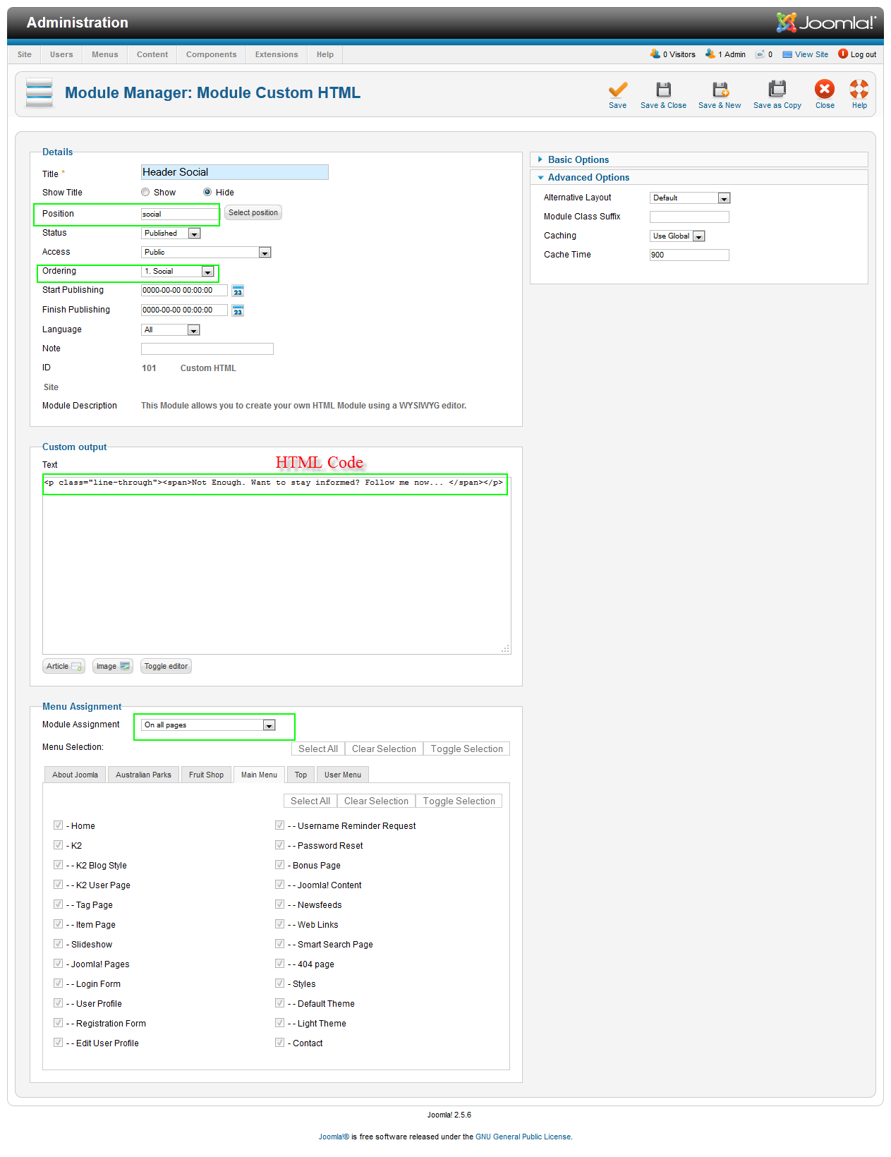
7. Header Social
Module position: social

Module Suffix : NOT USED
<p class=”line-through”><span>Not Enough. Want to stay informed? Follow me now… </span></p>
Backend SettingsFront-end appearance:
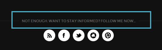
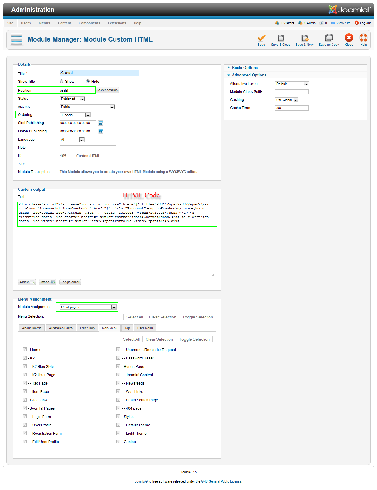
8. Social
Module position: social

Module Suffix : NOT USED
<div class=”social”><a class=”ico-social ico-rss” href=”#” title=”RSS”><span>RSS</span></a> <a class=”ico-social ico-facebooks” href=”#” title=”Facebook”><span>Facebook</span></a> <a class=”ico-social ico-twitters” href=”#” title=”Twitter”><span>Twitter</span></a> <a class=”ico-social ico-chorme” href=”#” title=”chorme”><span>Chorme</span></a> <a class=”ico-social ico-vimeo” href=”#” title=”Feed”><span>Porfolio Vimeo</span></a></div>
Backend SettingsFront-end appearance:

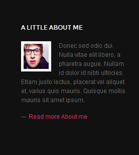
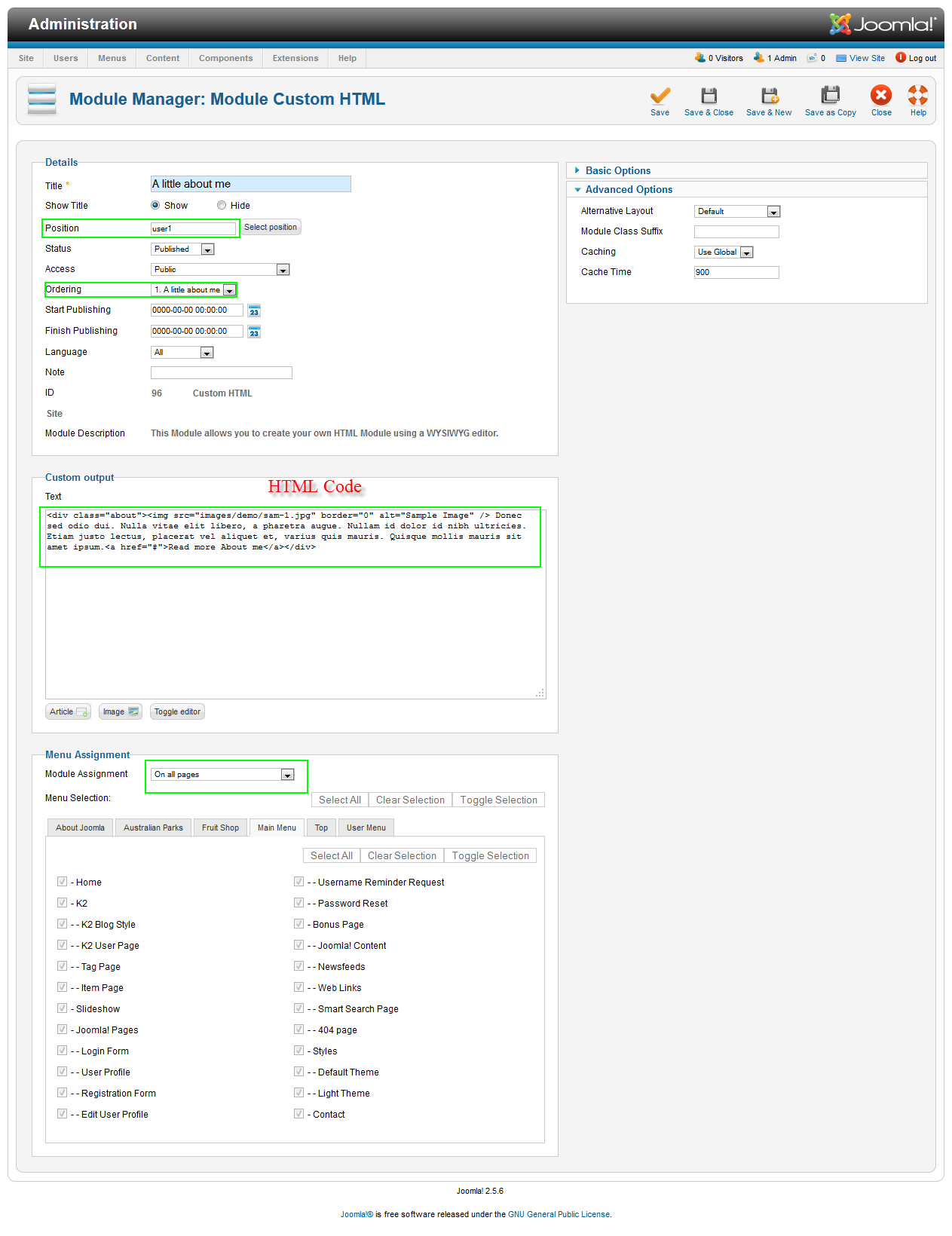
9. A little about me
Module position: user1

Module Suffix : NOT USED
<div class=”about”><img src=”images/demo/sam-1.jpg” border=”0″ alt=”Sample Image” /> Donec sed odio dui. Nulla vitae elit libero, a pharetra augue. Nullam id dolor id nibh ultricies. Etiam justo lectus, placerat vel aliquet et, varius quis mauris. Quisque mollis mauris sit amet ipsum.<a href=”#”>Read more About me</a></div>
Backend SettingsFront-end appearance:
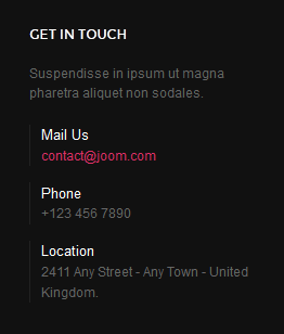
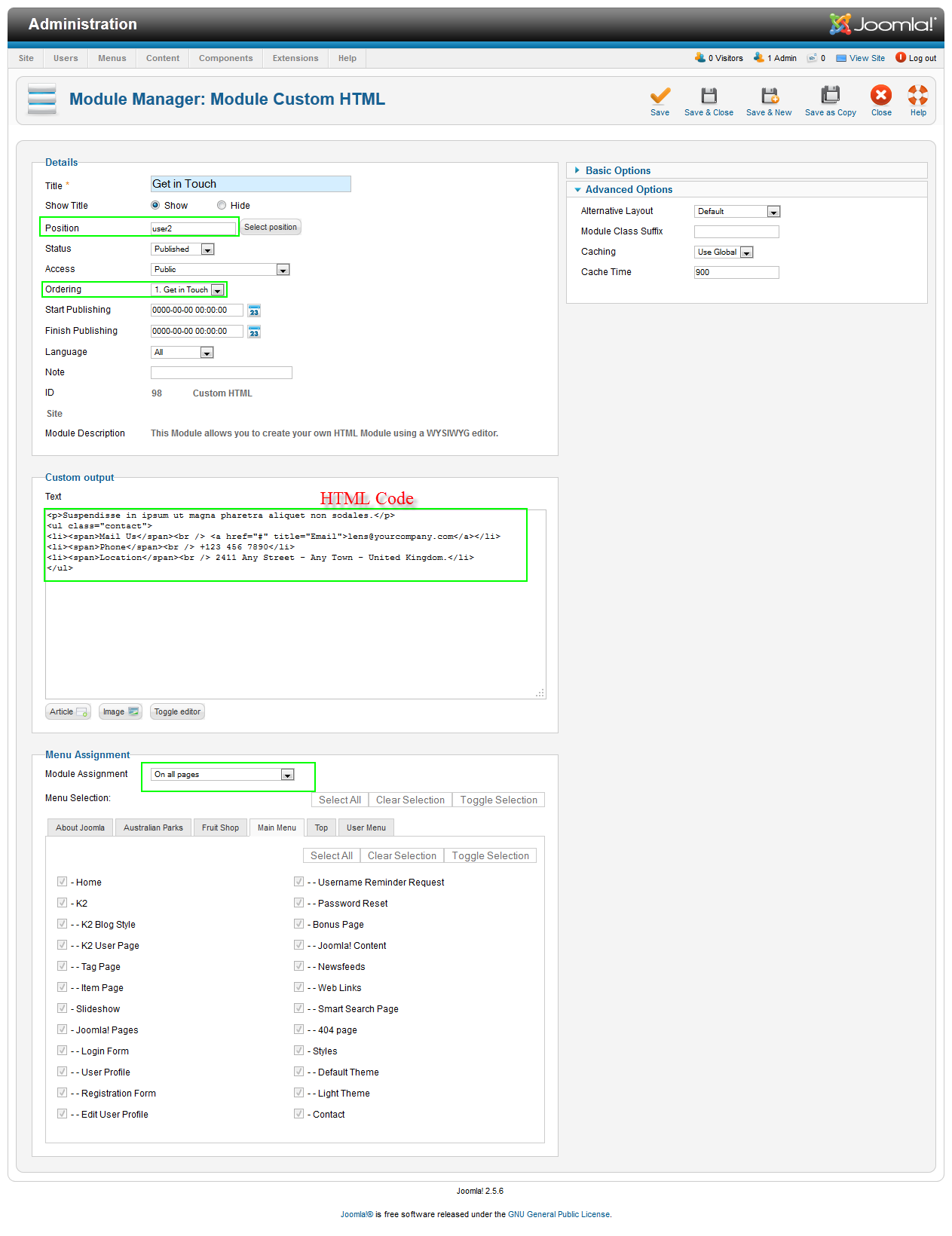
10. Get in Touch
Module position: user2

Module Suffix : NOT USED
<p>Suspendisse in ipsum ut magna pharetra aliquet non sodales.</p>
<ul class=”contact”>
<li><span>Mail Us</span><br /> <a href=”#” title=”Email”>contact@joom.com</a></li>
<li><span>Phone</span><br /> +123 456 7890</li>
<li><span>Location</span><br /> 2411 Any Street – Any Town – United Kingdom.</li>
</ul>
Backend SettingsFront-end appearance:
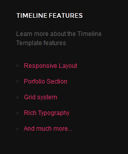
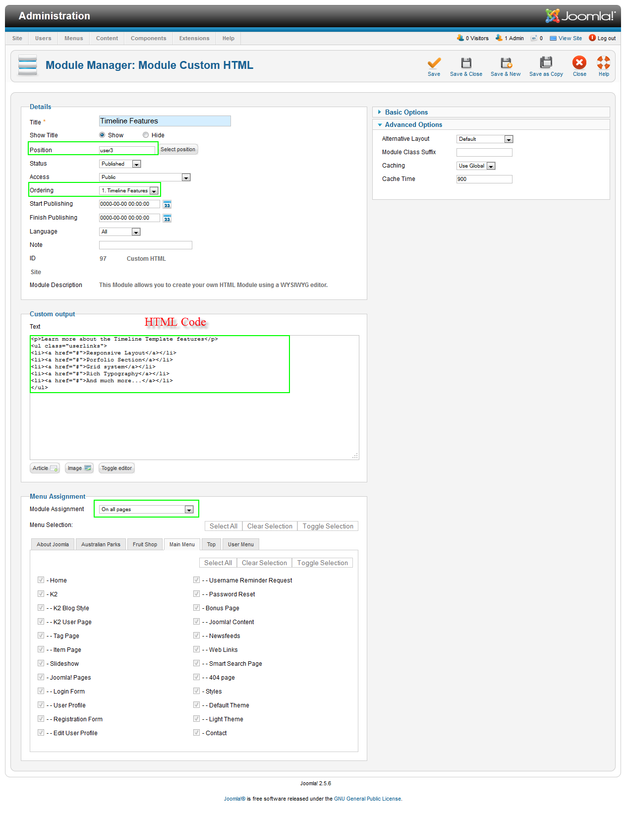
11. Timeline Features
Module position: user3

Module Suffix : NOT USED
<p>Learn more about the Timeline Template features</p>
<ul class=”userlinks”>
<li><a href=”#”>Responsive Layout</a></li>
<li><a href=”#”>Porfolio Section</a></li>
<li><a href=”#”>Grid system</a></li>
<li><a href=”#”>Rich Typography</a></li>
<li><a href=”#”>And much more…</a></li>
</ul>
Backend SettingsFront-end appearance:
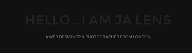
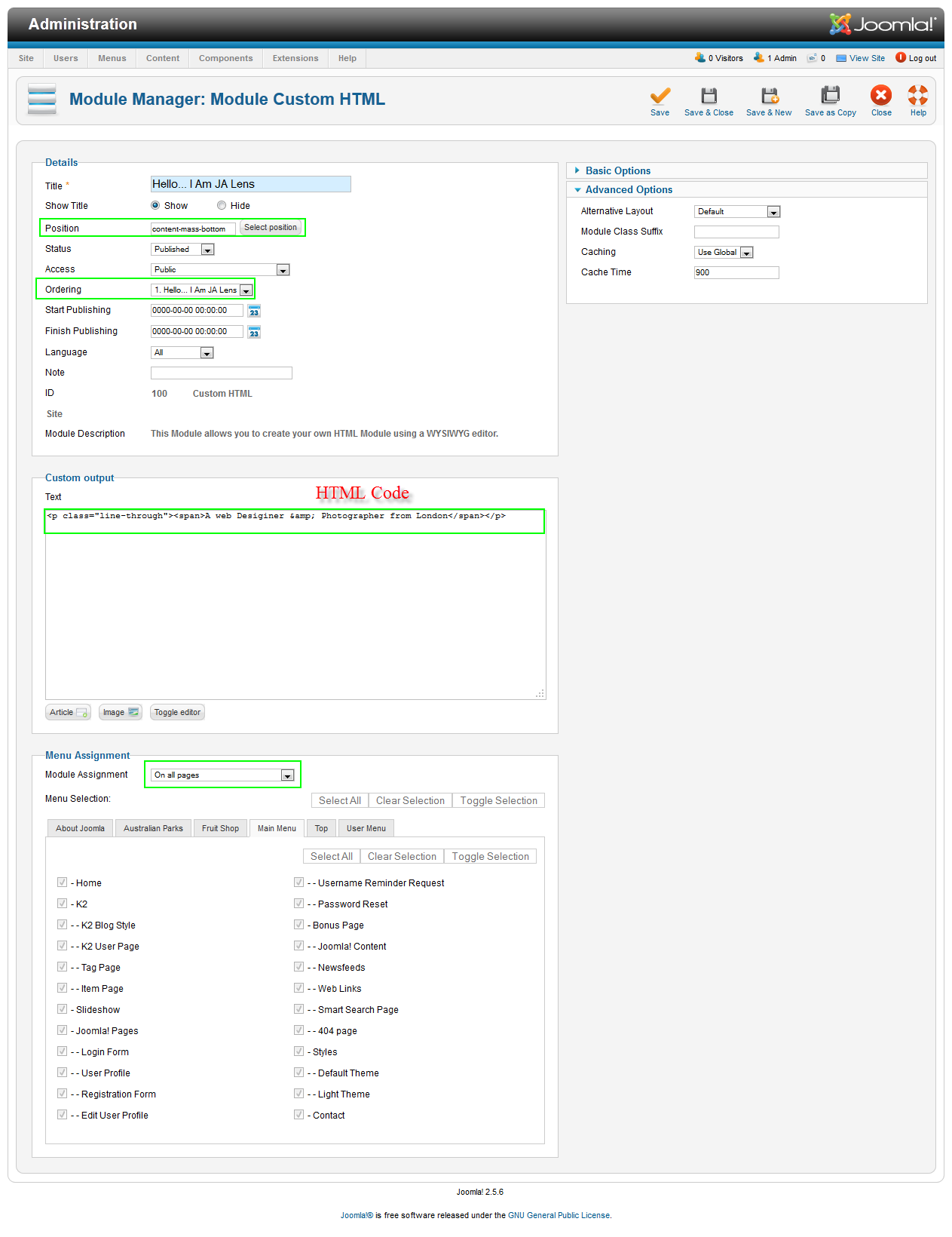
12. Hello… I Am JA Lens
Module position: content-mass-bottom

Module Suffix : NOT USED
<p class=”line-through”><span>A web Desiginer & Photographer from London</span></p>
Backend SettingsFront-end appearance:
Hung Dinh
- Join date:
- September 2014
- Posts:
- 4408
- Downloads:
- 11
- Uploads:
- 189
- Thanks:
- 309
- Thanked:
- 3310 times in 3 posts
May 11, 2012 at 9:32 am #452568Template Back-end settings
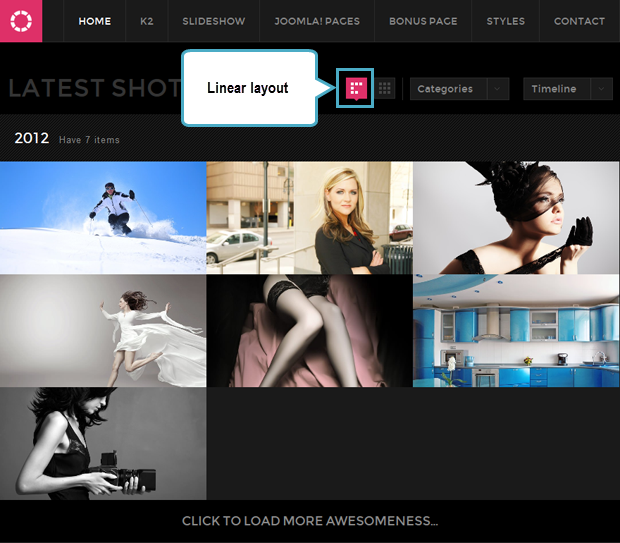
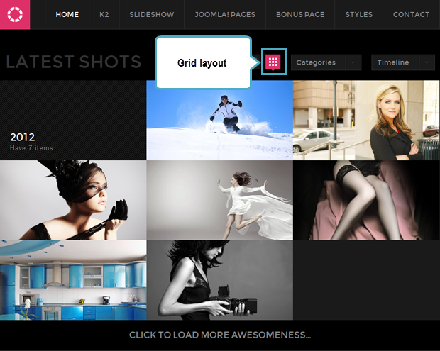
1. Layout Setting
This template supports 2 layouts: Linear and Grid. To configure the layout, navigate the setting panel of JA Lens template in back-end.
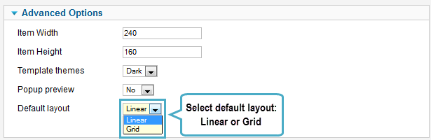
In front-end, you can set to display items in Linear or Grid layout also.
2. Styles/Themes Setting
This template supports 2 styles: Defaultand Light style/theme. To configure the layout, navigate the setting panel of JA Lens template in back-end.
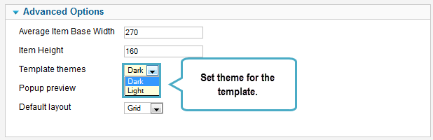
Front-end Appearance.
Light Style
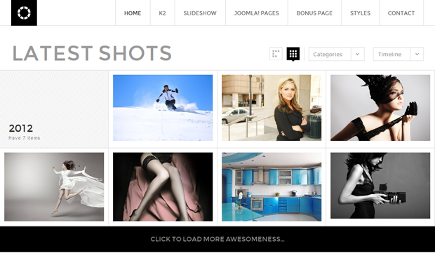
Default Style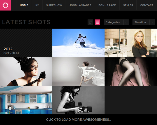
3. Item’s size Setting
You can set the item’s size for items displayed in front-end. To configure the layout, navigate the setting panel of JA Lens template in back-end.
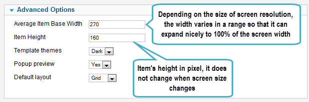
Front-end Appearance.
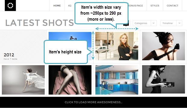
Note: The Average Item Base Width is the average base width of item, however, depending on the size of the screen resolution, the width varies in a range so that it can expand nicely to 100% of the screen width. For example: If you set 270, the item width will vary from ~250px to 290px (more or less).
The Item’s height is not changed when screen size changes.Hung Dinh
- Join date:
- September 2014
- Posts:
- 4408
- Downloads:
- 11
- Uploads:
- 189
- Thanks:
- 309
- Thanked:
- 3310 times in 3 posts
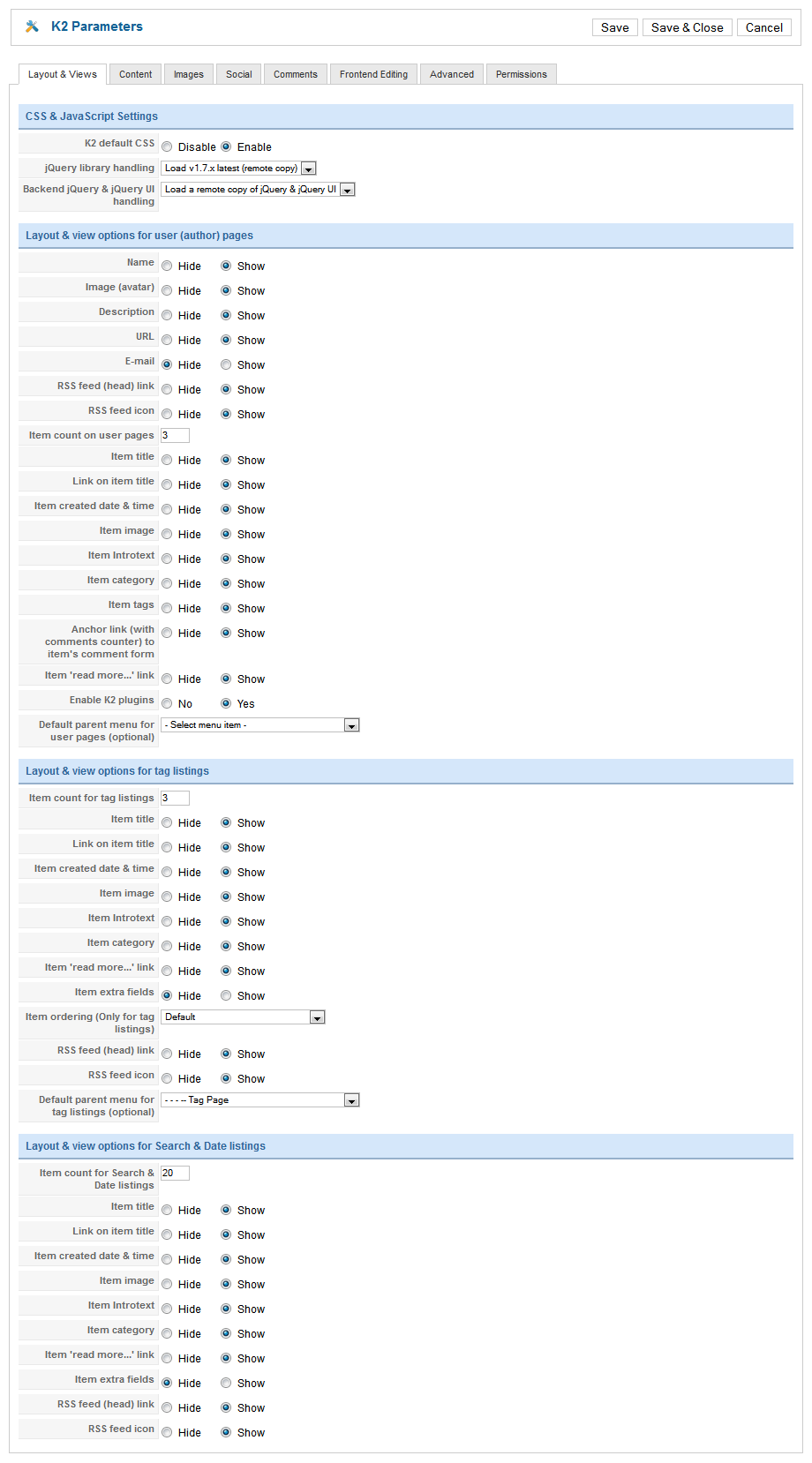
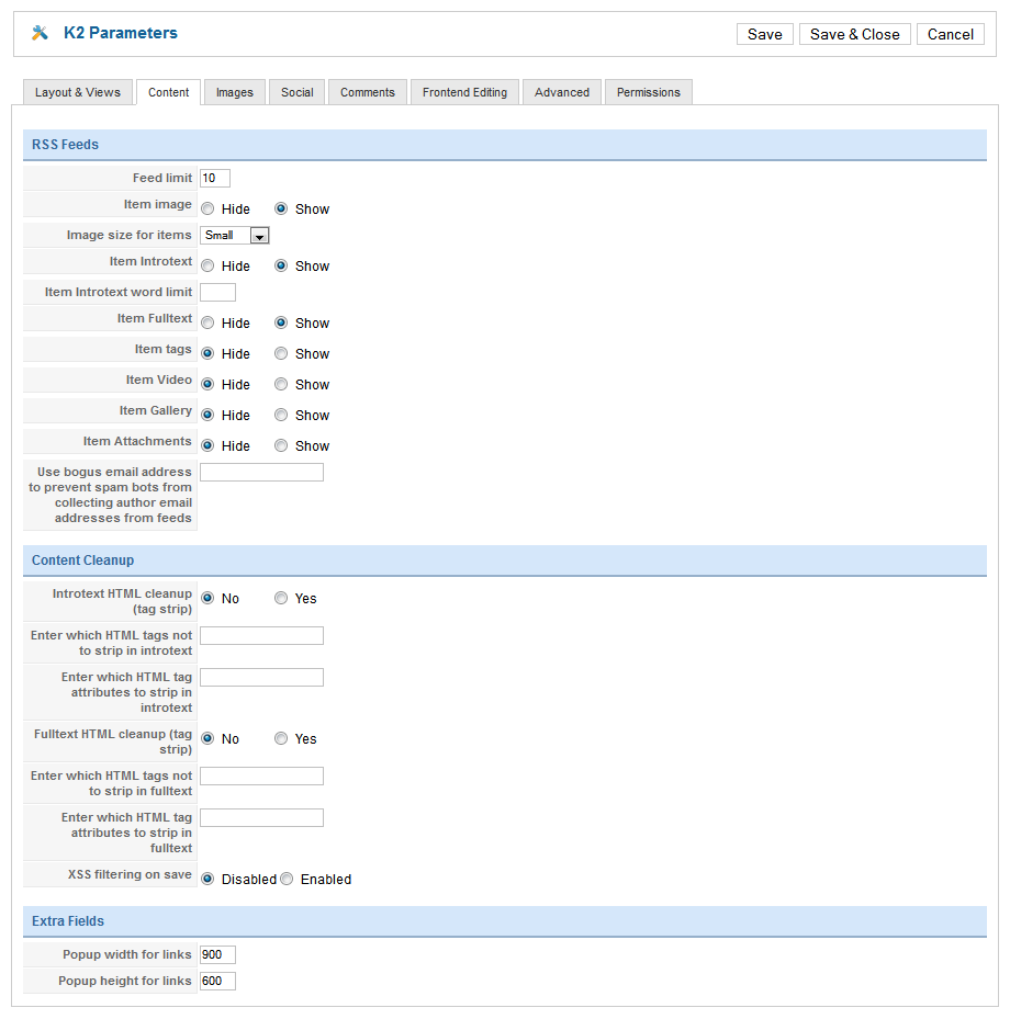
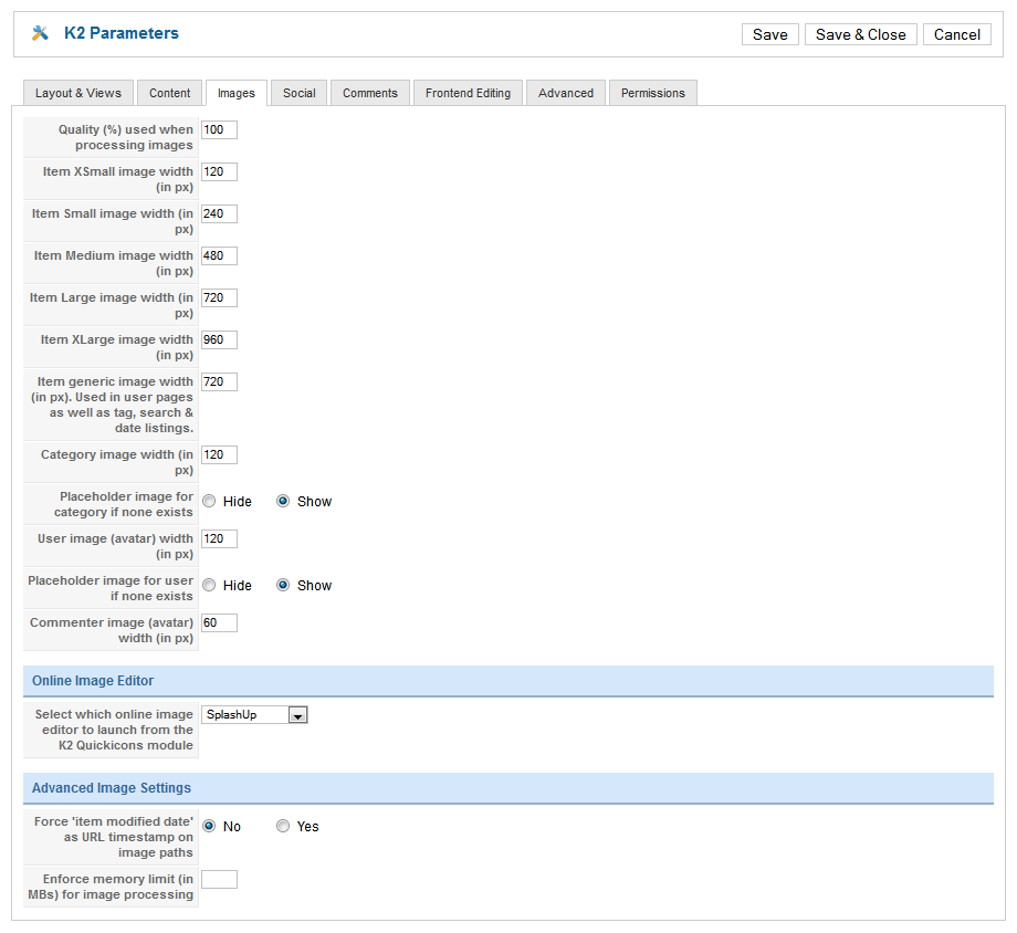
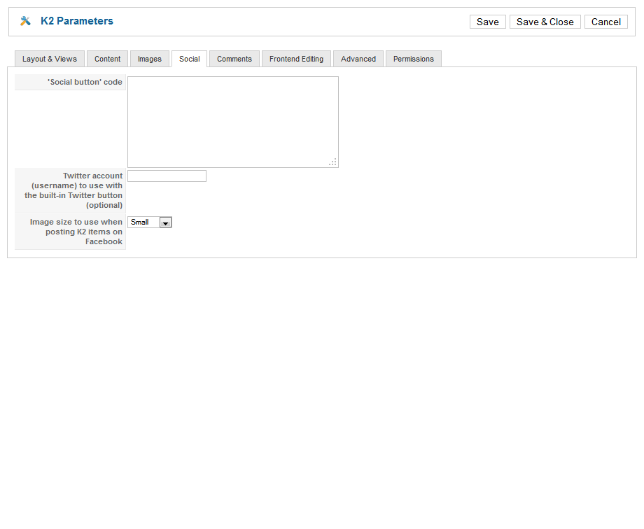
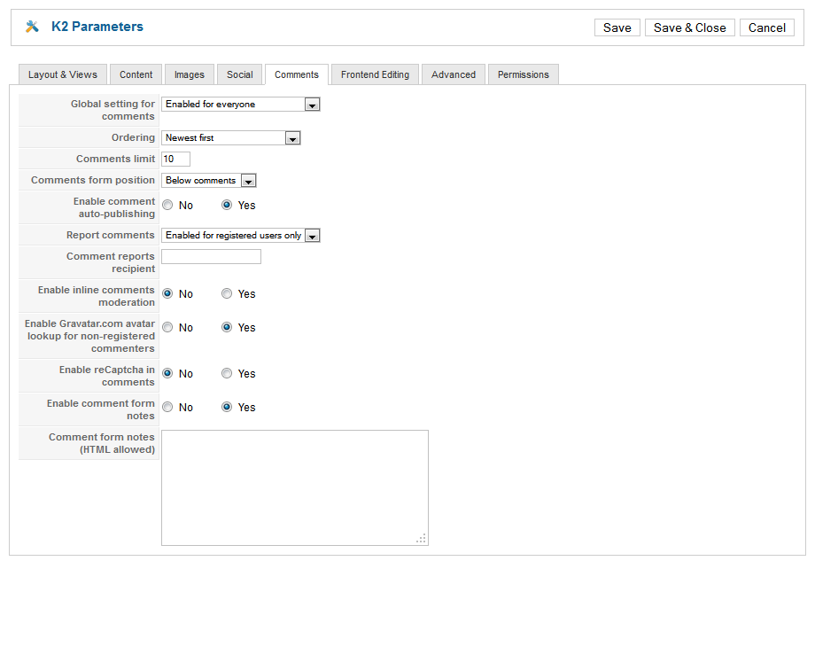
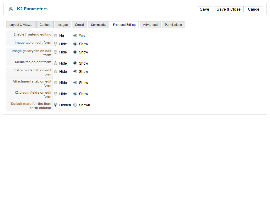
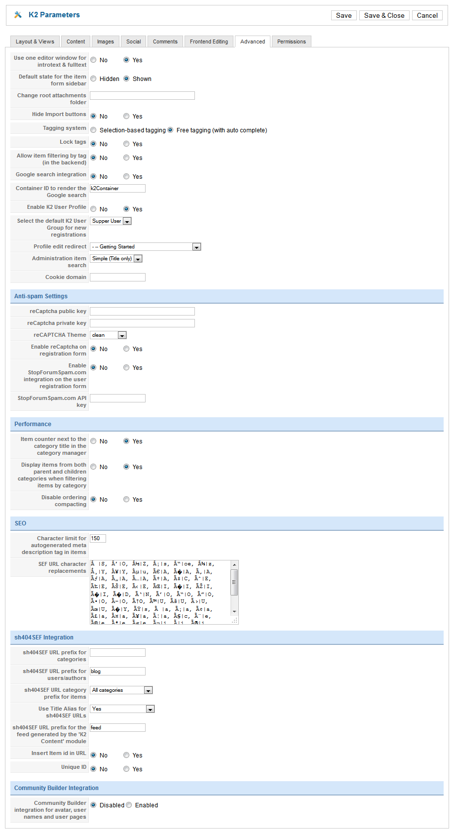
May 11, 2012 at 9:33 am #452569Configure K2 Component
Note : JA Lens supports and uses K2 component extensively for the demo and styling purposes. It is strongly advised to use K2 for demo like features and functionalities. com_content does not allow much flexiblity (as compared with k2) for styling.
1. Installing
If you are new to this Joomla! component, please read this guide.
2 Configuring K2 component
All the settings of K2 component in the demo site are presented here with the screenshots.
2.1 Global Configuration: Click Parameter button on the right
Backend settings2.2 Category Configuration
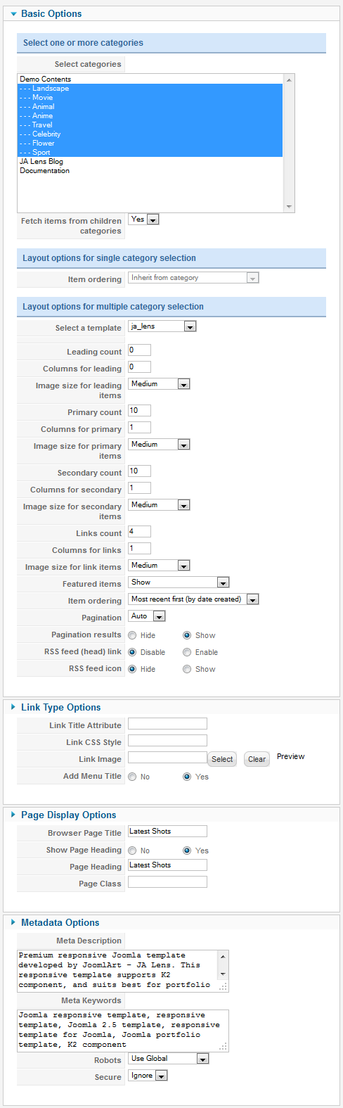
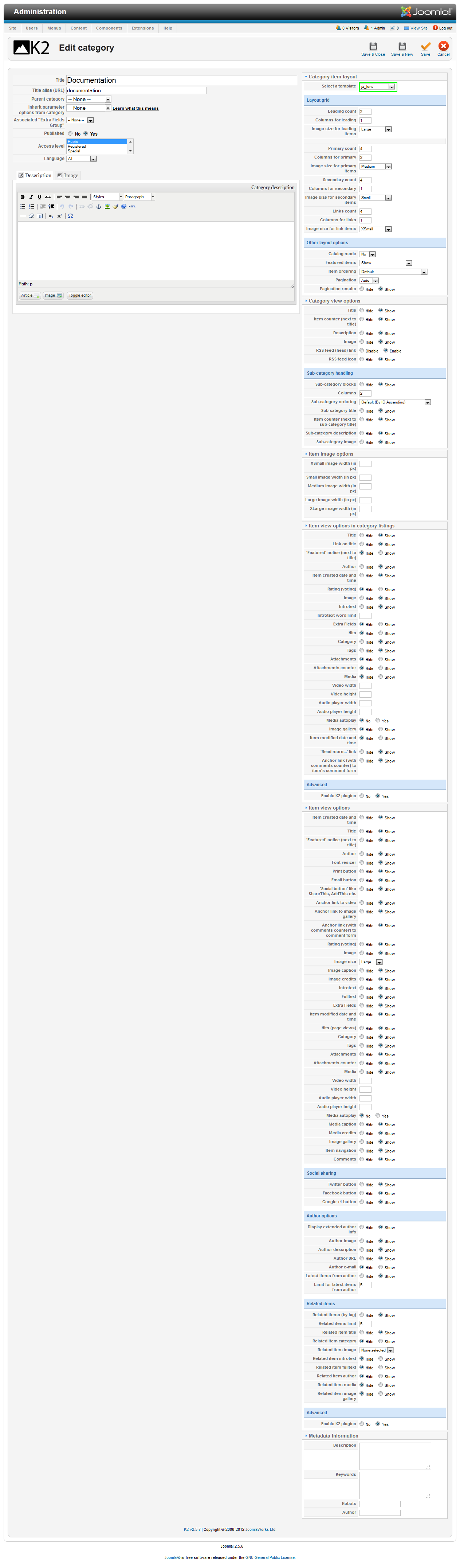
Note : We at times use different k2 templates for different category layouts. Please make sure you follow the below given screenshots to get the demo site like layout and styles.
To build your website like our demo, navigate to Administrator >> Component >> K2 >> Categories
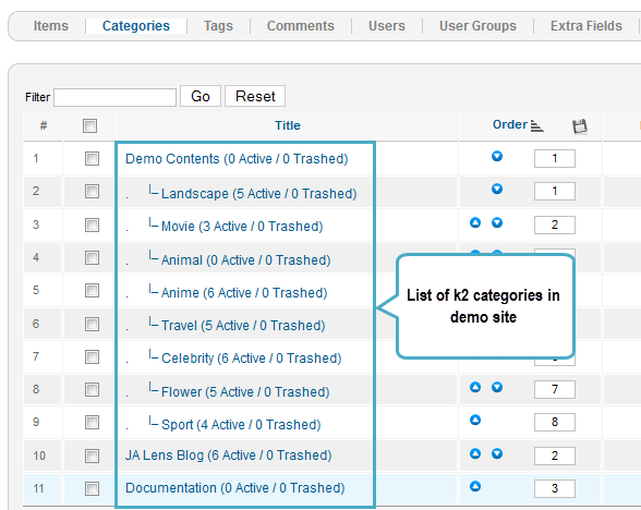
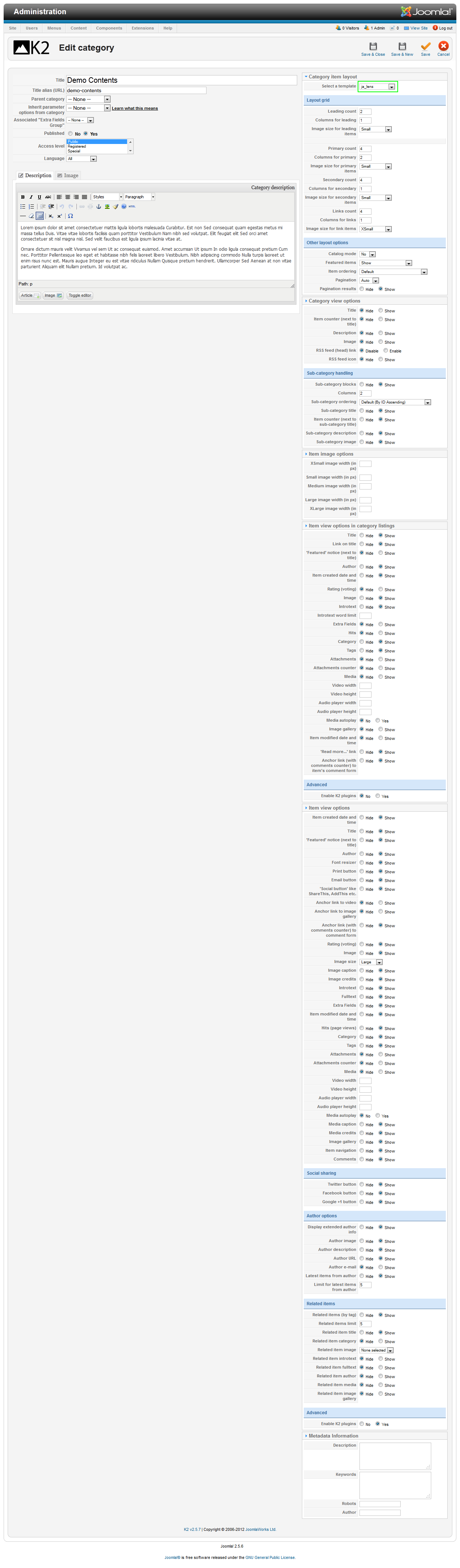
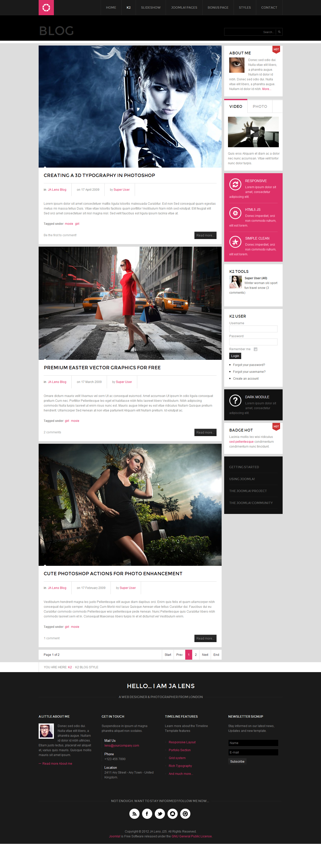
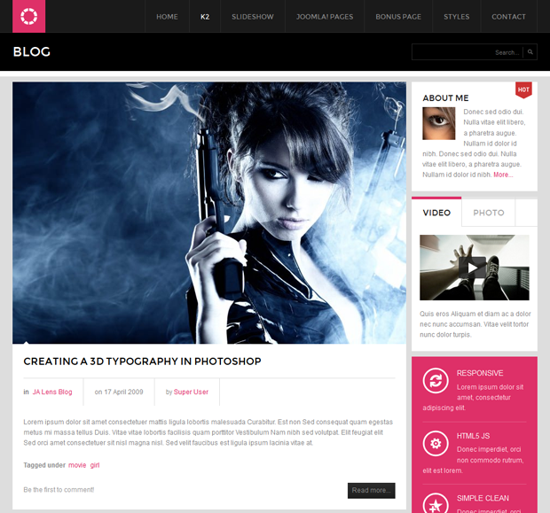
In the template, the Demo Content category uses ja_lens template. This template divides layout into number of columns to display content due to screen size. The JA Lens Blog category uses ja_lens_blog template. The template has content block and right side to display modules. The content block is 720 pixel in wide.
Demo Content category
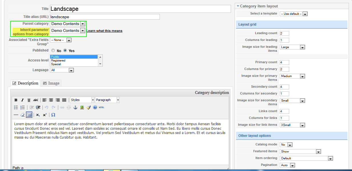
Note: Create sub-categories with Inherit parameter options from category “Demo Content”[/B]. For example, Backend Settings for Landscape category. Other sub-categories must be created like Landscape sub-category
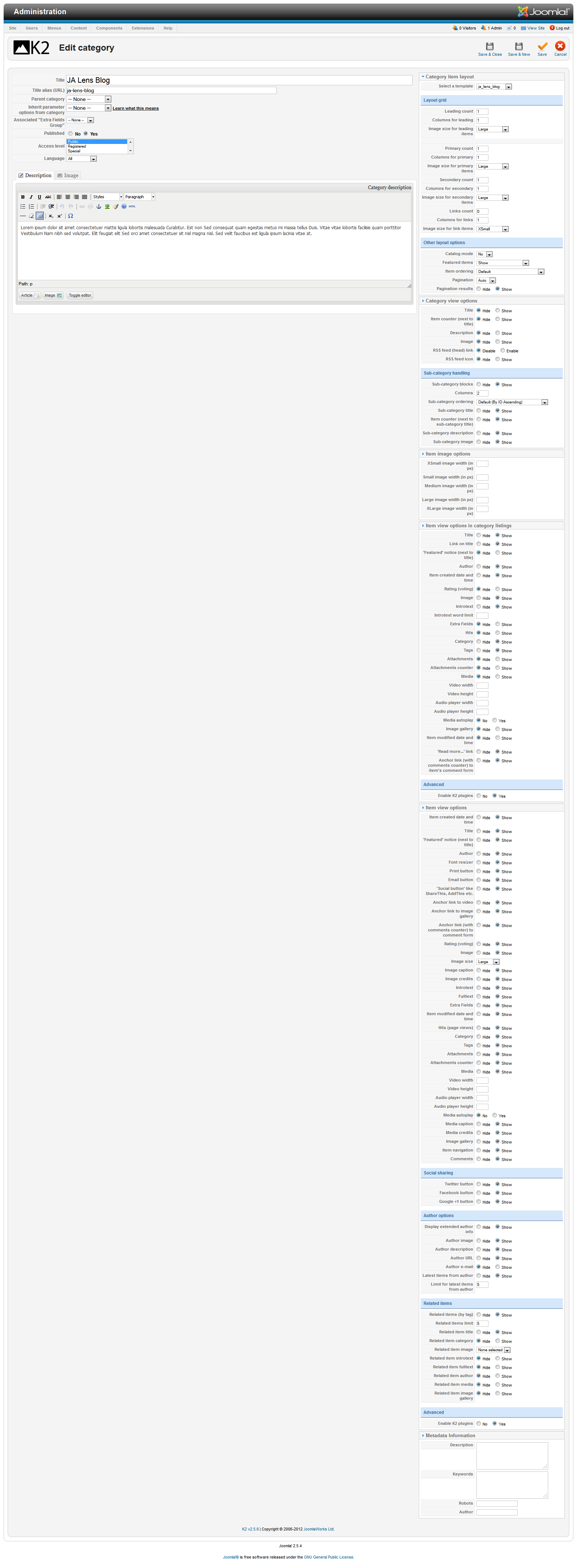
JA Lens Blog category.Documentation category
3. Configurations for K2 Modules as on our Demo
NOTE : Lens uses many K2 modules and the backend settings for the same along with positions or module suffixes (whereever applicable) are provided below for you to follow:
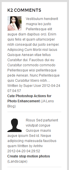
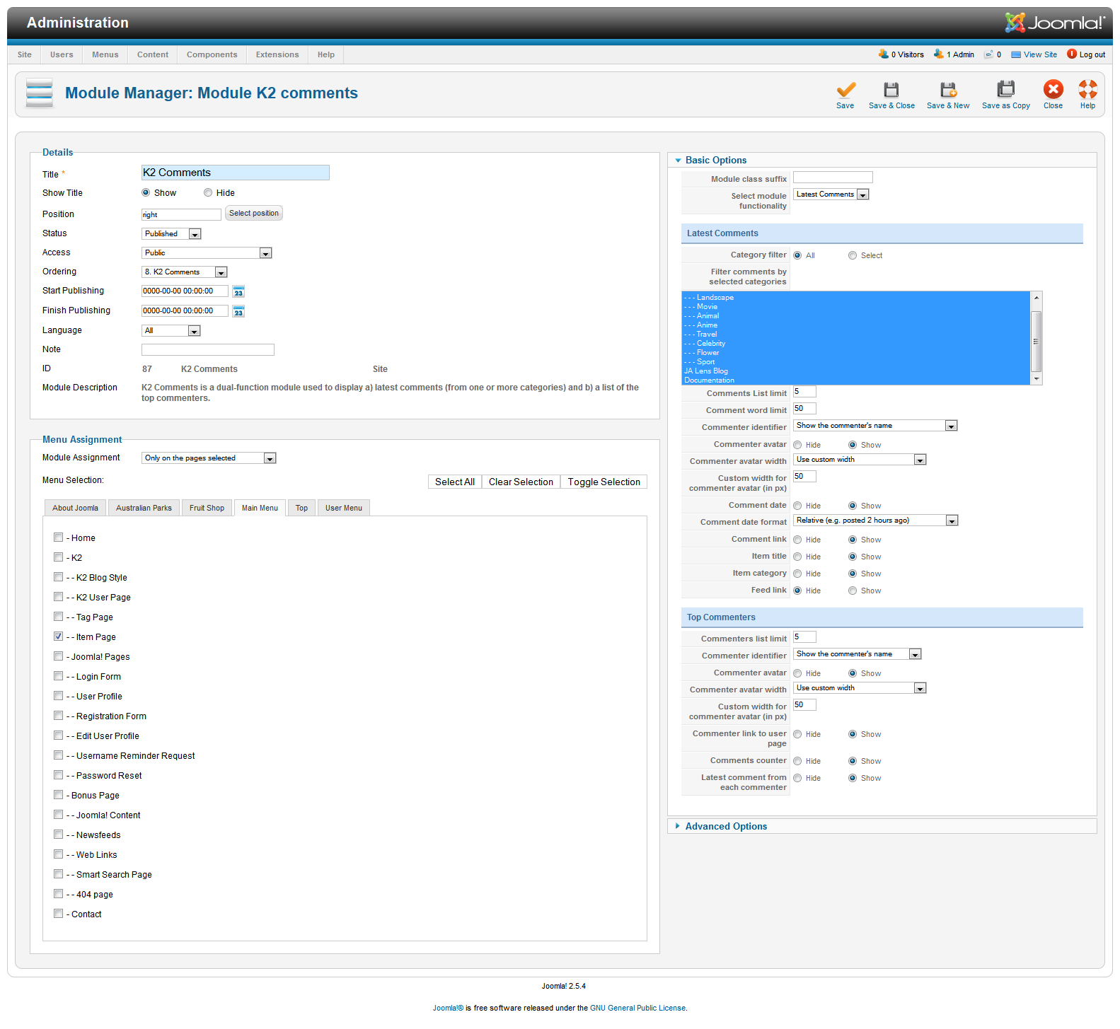
3.1 K2 Comment Module
Module Position :  right

Module suffix : NOT USED
Backend settingsFront-end Appearance.
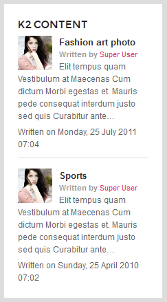
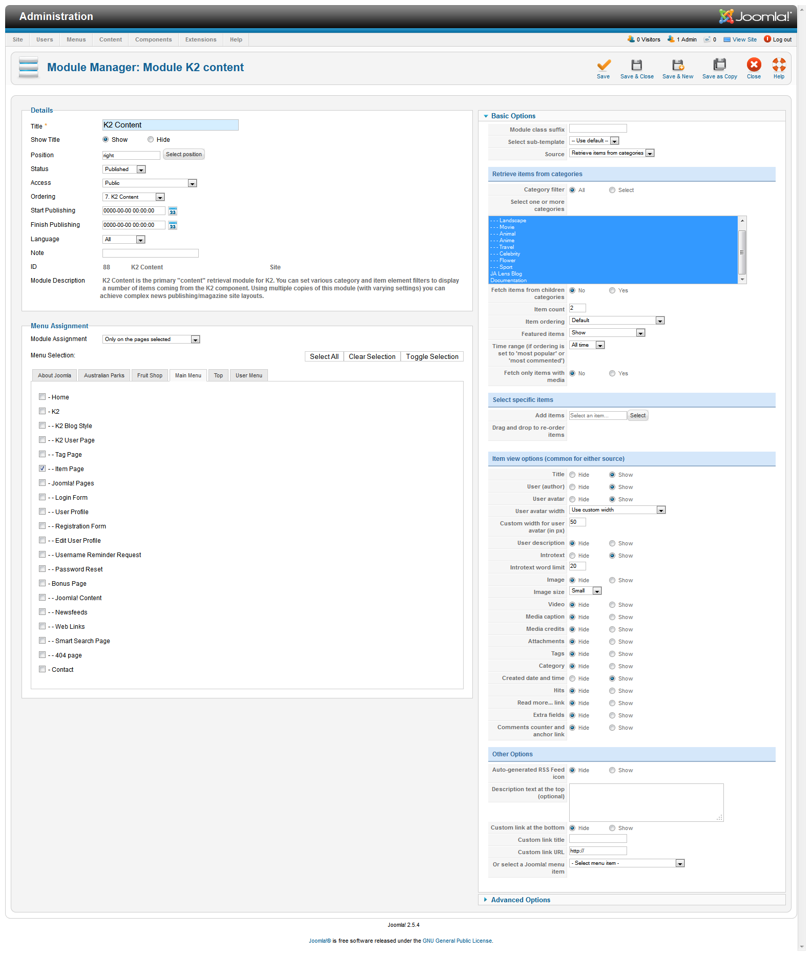
3.2 JA K2 Content Module
Module Position : right

Module suffix : NOT USED
Backend settingsFront-end Appearance.
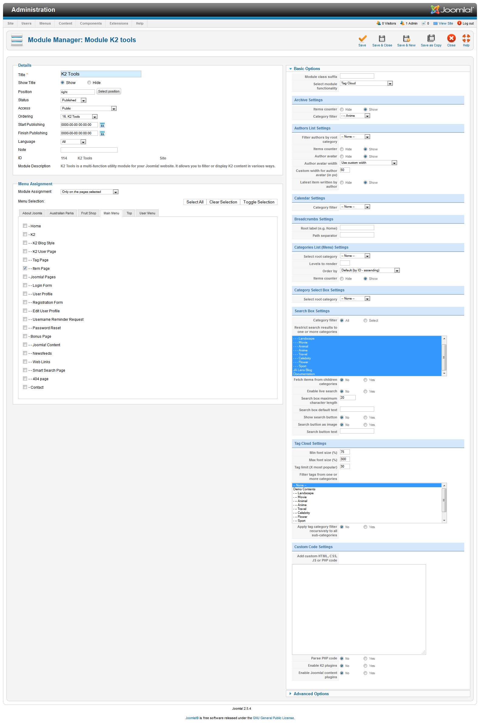
3.3 JA K2 Tools Module
3.3.1 K2 Tools to display Author list
Module Position :  right

Module suffix : NOT USED
Backend settingsFront-end Appearance.
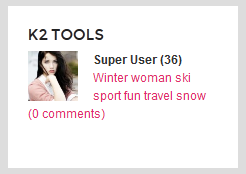
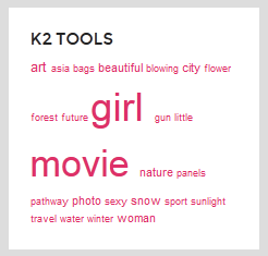
3.3.2 K2 Tools to display Tag Cloud
Module Position :  right

Module suffix : NOT USED
Backend settingsFront-end Appearance.
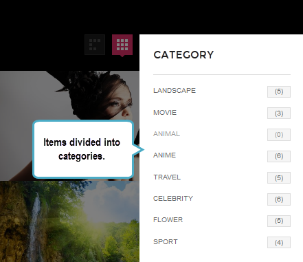
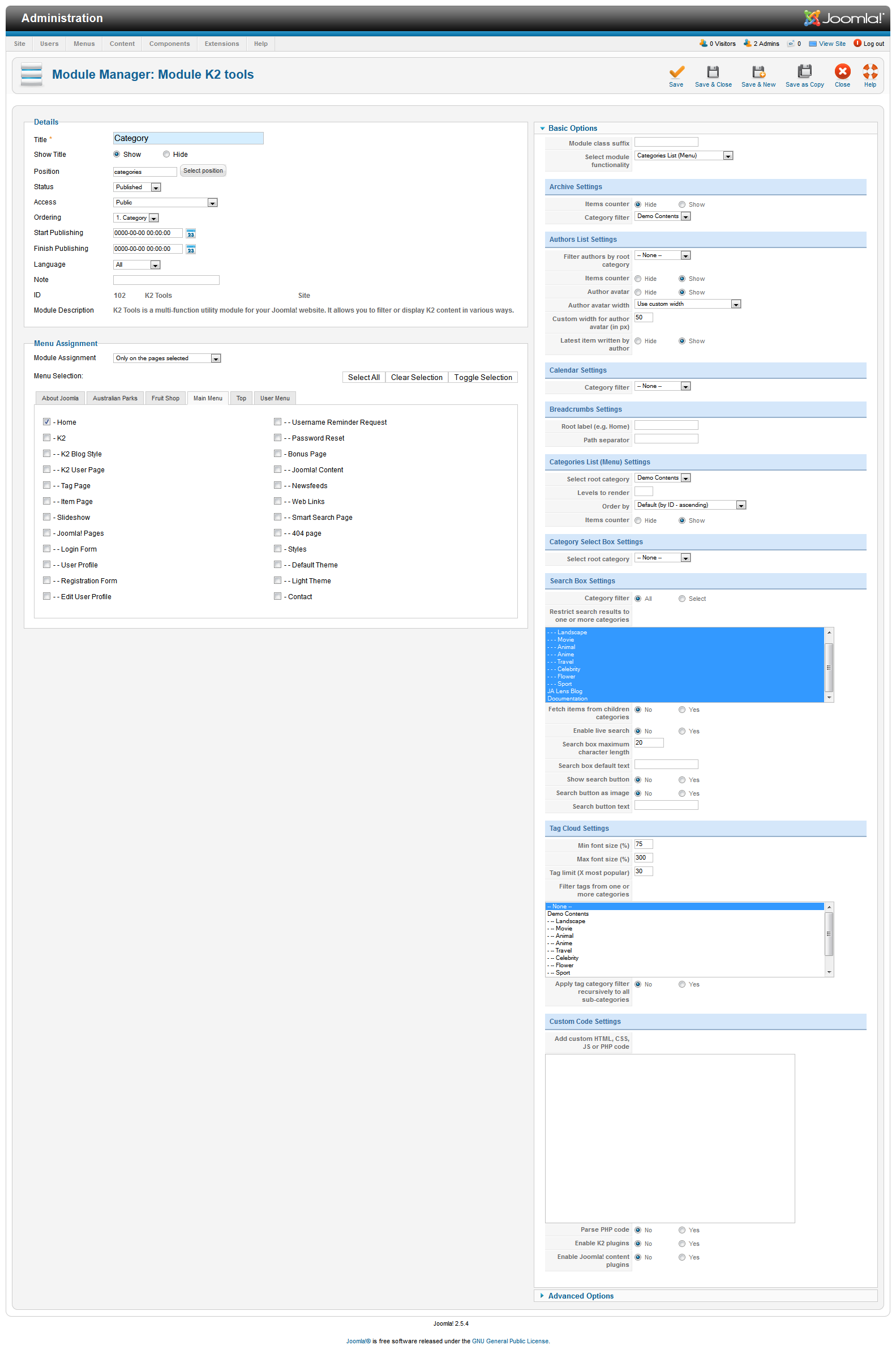
3.3.3 K2 Tools to display Category
Module Position :  categories

Module suffix : NOT USED
Backend settingsFront-end Appearance.
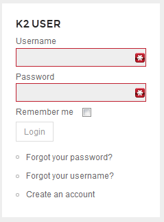
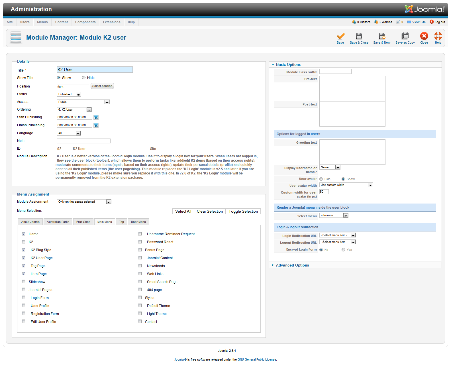
3.4 JA K2 User Module
Module Position : right

Module suffix : NOT USED
Backend settingsFront-end Appearance.
Hung Dinh
- Join date:
- September 2014
- Posts:
- 4408
- Downloads:
- 11
- Uploads:
- 189
- Thanks:
- 309
- Thanked:
- 3310 times in 3 posts
May 11, 2012 at 9:33 am #452570Menu Configuration
In the demo site, you can see so many pages that have different style. The section will show you how to configure main pages in the demo.
1. Homepage
The homepage menu gets content from K2 categories, its menu type = K2 categories and using template: ja_lens.
Front-end Appearance.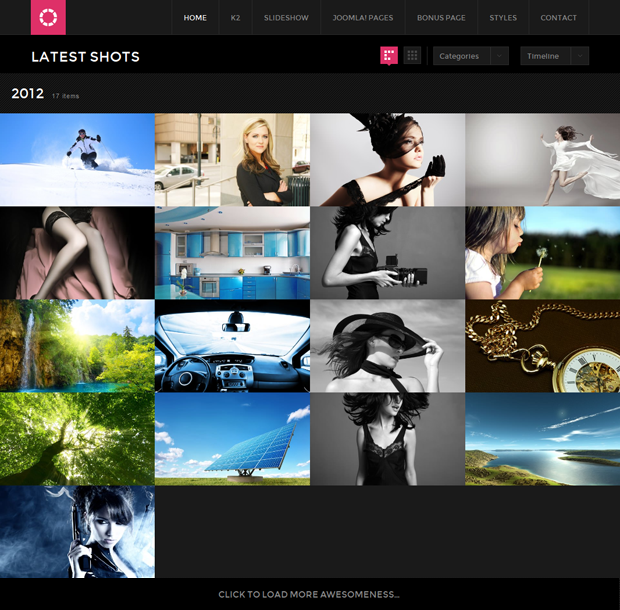
2. K2 Menu
Front-end Appearance.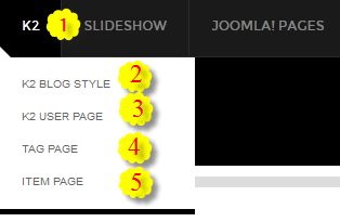
Backend Settings : Main Menu Items (parent & child)
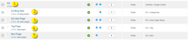
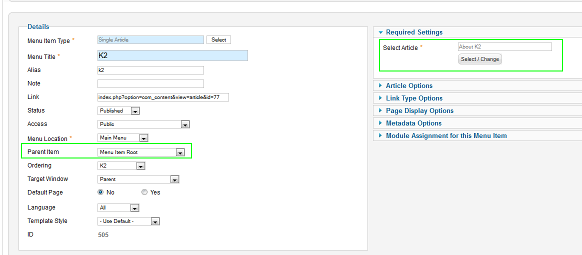
- Item 1 – K2 – Menu Backend Settings
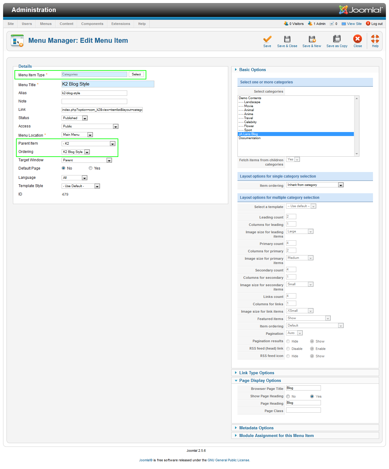
- Item 2- K2 Blog Style– Menu Backend Settings– Frontend Appearance.
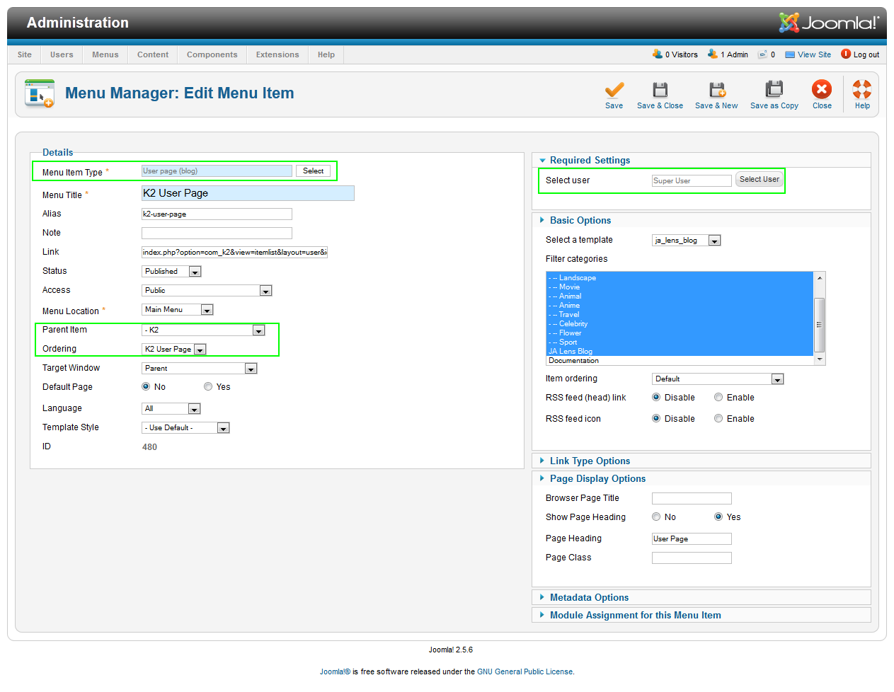
- Item 3- K2 User Page– Menu Backend Settings – Frontend Appearance
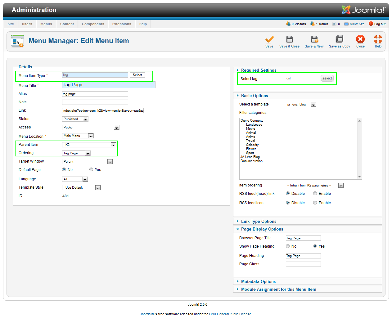
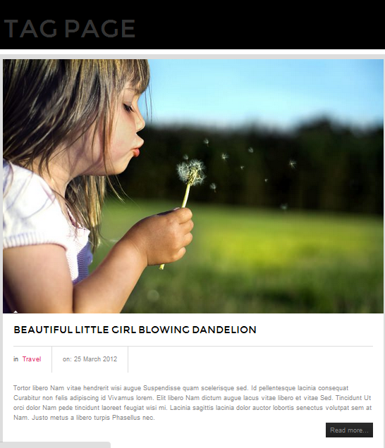
- Item 4- Tag Page– Menu Backend Settings – Frontend Appearance
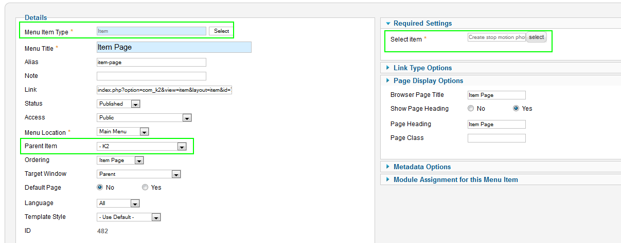
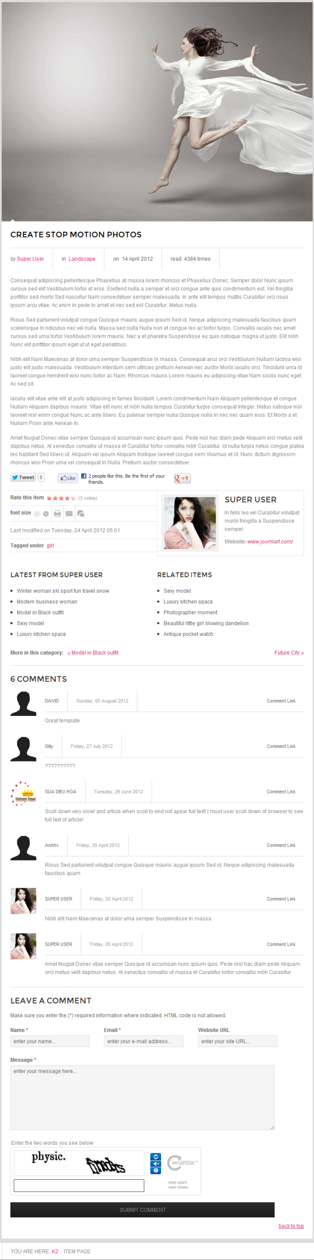
- Item 5- Item Page– Menu Backend Settings – Frontend Appearance
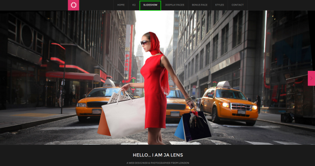
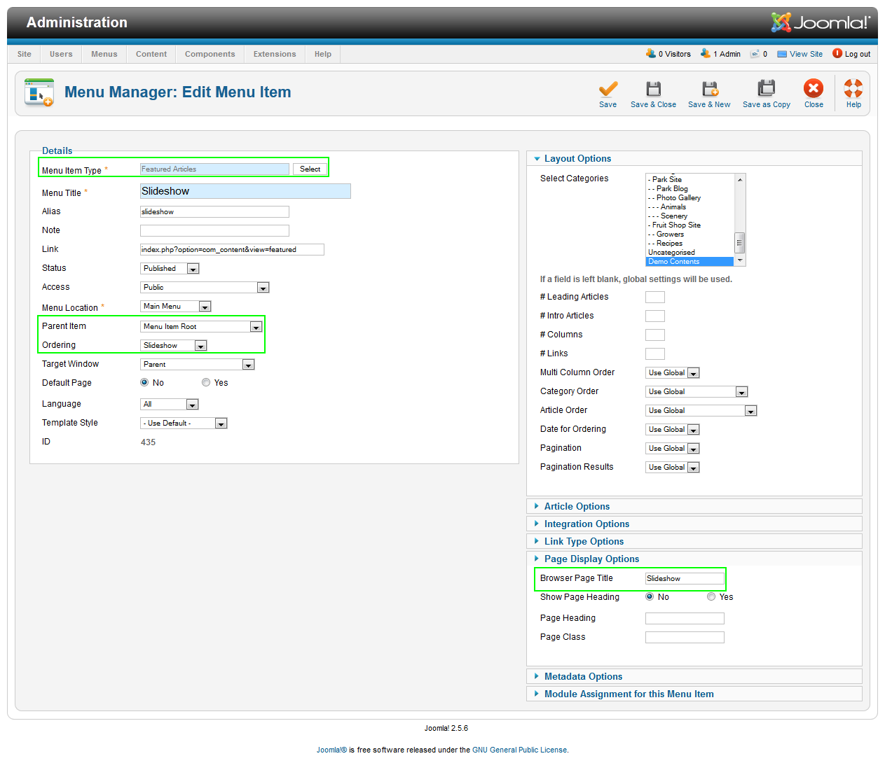
3. Slideshow Menu
Menu Backend SettingsFront-end Appearance:
4. Joomla! Pages and Bonus Page Menus
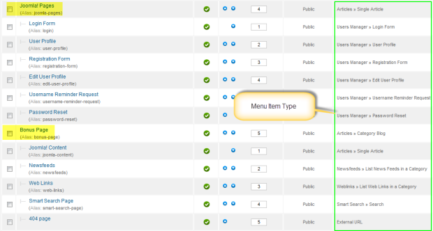
Note: All sub-menus must be created with correspondent menu item type.
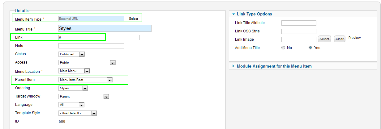
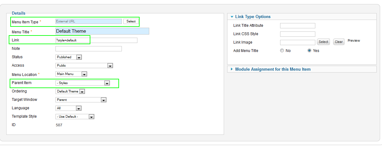
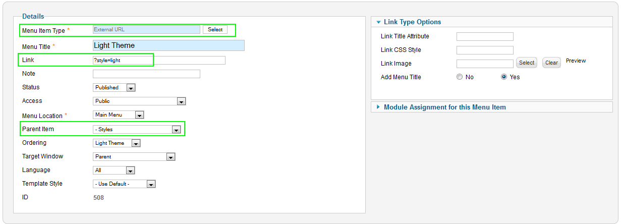
5. Styles Page Menus
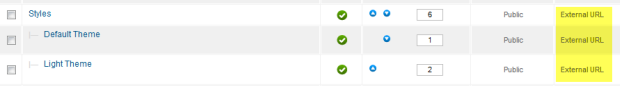
- Item 1 – Styles – Menu Backend Settings
- Item 2 – Default Theme – Menu Backend Settings
- Item 3 – Light Theme – Menu Backend Settings
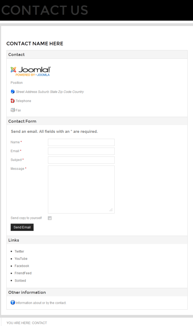
6. Contact Menus
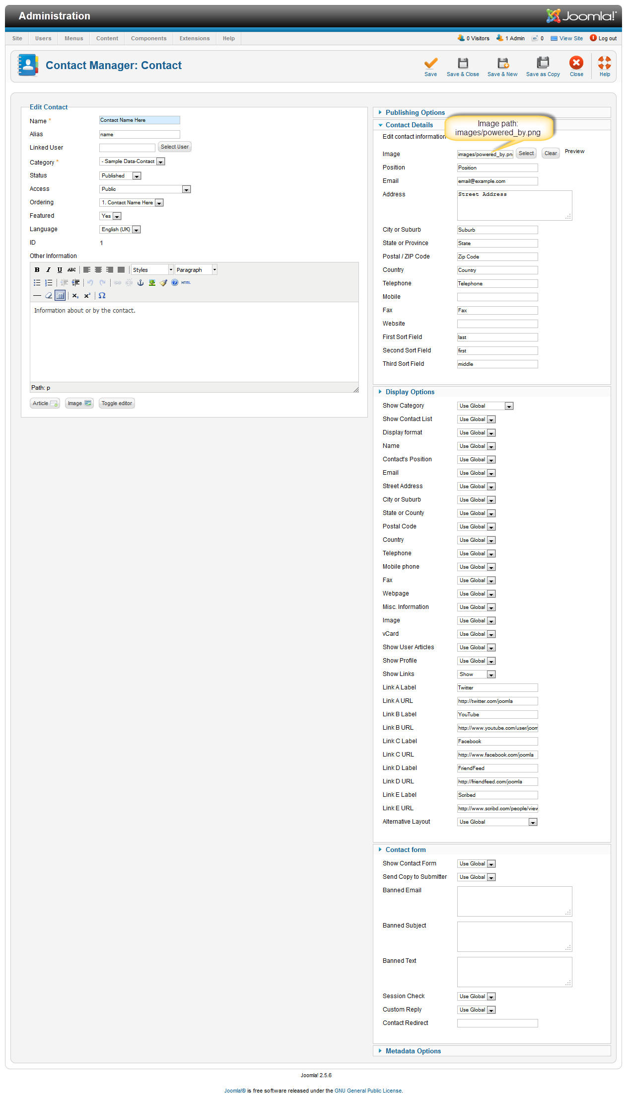
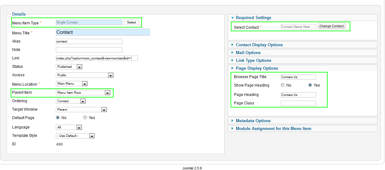
To create Contacts page like demo site, you must go to Components >> Contacts >> Contact Name Here to configure – Backend Settings
Contacts – Menu Backend Settings
Frontend Apperance:
Hung Dinh
- Join date:
- September 2014
- Posts:
- 4408
- Downloads:
- 11
- Uploads:
- 189
- Thanks:
- 309
- Thanked:
- 3310 times in 3 posts
May 11, 2012 at 9:33 am #452571The above userguide should help one in replicating the Demo site settings for the template and extension on their site.
Recommended :
If you are new or are confused. We recommend installing Quickstart on your localhost and use it as reference for configs. This is the best way to work with any template.
Links to all the resources are provided above, you should carefully read them to take the maximum advantage of our products.Support :
Please raise your support queries in the forum and make sure you follow the support guidelines. We spend more time in getting the information from user incase the support guidelines are not followed.
If you have any questions regarding this userguide, please ask in the forum. This thread is locked.
2 users say Thank You to Hung Dinh for this useful post
-
AuthorPosts
This topic contains 9 replies, has 1 voice, and was last updated by 
We moved to new unified forum. Please post all new support queries in our New Forum