-
AuthorPosts
-
September 4, 2014 at 7:29 pm #201083
How do I set a module to only display on mobile devices? In this case we got a module in parallax position that only displays in desktop size. When this one hides, we would like a module to appear in the same position. How is that achieved? Is there certain module-suffixes for this maybe?
pavit Moderator
pavit
- Join date:
- September 2007
- Posts:
- 15749
- Downloads:
- 199
- Uploads:
- 2274
- Thanks:
- 417
- Thanked:
- 4028 times in 3778 posts
September 4, 2014 at 7:44 pm #548343Hi
<blockquote>How do I set a module to only display on mobile devices?</blockquote>
Did you tried hiding it for desktop size ?
September 4, 2014 at 7:49 pm #548344Thank you very much for quick reply pavit! Doesn’t that hide the whole module position and all modules published in that position? I might have been a bit unclear in my previous post. If so, sorry for that. But we want one module to only display in desktop size and another to display on all smaller sizes. Both in parallax position.
pavit
- Join date:
- September 2007
- Posts:
- 15749
- Downloads:
- 199
- Uploads:
- 2274
- Thanks:
- 417
- Thanked:
- 4028 times in 3778 posts
September 8, 2014 at 3:49 pm #548738Thanks! I will check that link and report back with result.
September 9, 2014 at 4:29 pm #548885Can’t get this to work. I’ve created the custom.css file and placed inside css folder in appolio folder. My goal is to only display when screen size is less than 768px, but I really can’t get it to work! Can I use something similar to this or how should I go about this?
@media (min-width: 768px){
.t3-module.module hidden-lg {
display: none; }
}pavit
- Join date:
- September 2007
- Posts:
- 15749
- Downloads:
- 199
- Uploads:
- 2274
- Thanks:
- 417
- Thanked:
- 4028 times in 3778 posts
September 9, 2014 at 4:53 pm #548891Did you added the hidden-lg suffix to the module ?
September 9, 2014 at 4:55 pm #548892<em>@pavit 445009 wrote:</em><blockquote>Did you added the hidden-lg suffix to the module ?</blockquote>
Yes I did, sorry forgot to mention that.pavit
- Join date:
- September 2007
- Posts:
- 15749
- Downloads:
- 199
- Uploads:
- 2274
- Thanks:
- 417
- Thanked:
- 4028 times in 3778 posts
September 9, 2014 at 5:26 pm #548898Hi
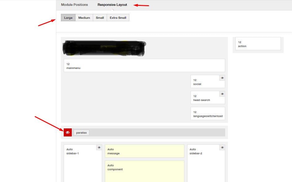
You should use the right suffix for various screen sizes as described in the variable.less file
// Extra small screen / phone

// Note: Deprecated @screen-xs and @screen-phone as of v3.0.1

@screen-xs:                  480px;

@screen-xs-min:              @screen-xs;

@screen-phone:               @screen-xs-min;
// Small screen / tablet
// Note: Deprecated @screen-sm and @screen-tablet as of v3.0.1
@screen-sm: 768px;
@screen-sm-min: @screen-sm;
@screen-tablet: @screen-sm-min;
@container-x-tablet: 1024px;// Medium screen / desktop
// Note: Deprecated @screen-md and @screen-desktop as of v3.0.1
@screen-md: 992px;
@screen-md-min: @screen-md;
@screen-desktop: @screen-md-min;// Large screen / wide desktop
// Note: Deprecated @screen-lg and @screen-lg-desktop as of v3.0.1
@screen-lg: 1200px;
@screen-lg-min: @screen-lg;
@screen-lg-desktop: @screen-lg-min;// So media queries don't overlap when required, provide a maximum
@screen-xs-max: (@screen-sm-min - 1);
@screen-sm-max: (@screen-md-min - 1);
@screen-md-max: (@screen-lg-min - 1);Then you should compile less to css to make it active
September 9, 2014 at 5:33 pm #548900Thanks for your help, but I’m afraid I still don’t get it. I saw that code in the tutorial you linked, but can’t understand how to use the suffixes and which to use. Could you please point me in the right direction here? I want to hide the module on desktop, wide desktop, and tablet size according to above dimensions. And I need to avoid overlap when changing from tablet to phone.
Do I need to create a suffix for each size and combine them in the module? Sorry for beeing so slow here..
September 10, 2014 at 12:51 am #548923Hi, did you get an answer for it?
September 10, 2014 at 2:12 pm #549027<em>@grafov 445052 wrote:</em><blockquote>Hi, did you get an answer for it?</blockquote>
Hi, no I have still not managed to solve this issue. Are you having the same problem?pavit
- Join date:
- September 2007
- Posts:
- 15749
- Downloads:
- 199
- Uploads:
- 2274
- Thanks:
- 417
- Thanked:
- 4028 times in 3778 posts
September 10, 2014 at 2:20 pm #549028Hi @franzonal , @grafov
We are waiting to verify behaviours of settings for these settings i showed above.
Please be patient we will answer to it as soon as possible.
Thanks
September 10, 2014 at 2:22 pm #549029Thank you very much for your help Pavit!
September 10, 2014 at 11:28 pm #549092Me too: thanks!
AuthorPostsThis topic contains 19 replies, has 5 voices, and was last updated by
 Ninja Lead 9 years, 2 months ago.
We moved to new unified forum. Please post all new support queries in our New Forum

