-
AuthorPosts
-
May 19, 2012 at 11:28 am #177271
excuse for my bad English.
my question is;
how I can deactivate the iphone ,android,tablet mode, I try on the backend but not working ,I changed many things on the page and need to always be the default view.thank you very much. Muchas gracias
Saguaros Moderator
Saguaros
- Join date:
- September 2014
- Posts:
- 31405
- Downloads:
- 237
- Uploads:
- 471
- Thanks:
- 845
- Thanked:
- 5346 times in 4964 posts
May 21, 2012 at 7:32 am #453980Hi rafanet,
This JA Puresite template is responsive template so that it will adapt and transform to fit the screen area of the devices(iPhone/iPad). I suggest that you edit the layout file of this template so that you can view desktop layout in mobile devices. You can go to Backend > Template managers > Your_default_template(here is ja puresite) > Layout tab
http://easycaptures.com/1134151321
Then, you open this file: templatesja_puresitecsstemplate.css
Add this:
body#bd #ja-wrapper {

    overflow: visible;

}
This helps you to scroll your site to see entire page in mobile deviceClean cache and refresh your site.
May 23, 2012 at 5:23 pm #454560I did what you said and did not solve my problem , I need your help please the url http://hostingprofesionalnet.net/simon/
thank you very much again .Muchas gracias
Saguaros
- Join date:
- September 2014
- Posts:
- 31405
- Downloads:
- 237
- Uploads:
- 471
- Thanks:
- 845
- Thanked:
- 5346 times in 4964 posts
May 24, 2012 at 3:40 am #454623Hi rafanet,
PM me a private message with a temporary admin account and FTP account. I shall check it for you.
May 26, 2012 at 10:27 am #455007send a private message but do not know if you received
hpeeters Friend
hpeeters
- Join date:
- January 2008
- Posts:
- 70
- Downloads:
- 0
- Uploads:
- 19
- Thanks:
- 15
- Thanked:
- 2 times in 1 posts
May 31, 2012 at 11:48 am #455516Hi,
I have the same question, can you tell me how you solved it? I checked your site and it seems to be solved?
Rgds,
Henry
hpeeters
- Join date:
- January 2008
- Posts:
- 70
- Downloads:
- 0
- Uploads:
- 19
- Thanks:
- 15
- Thanked:
- 2 times in 1 posts
May 31, 2012 at 2:23 pm #455528Dear Saguaros,
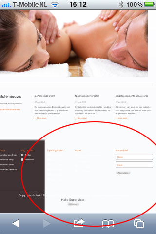
I did what you said and it solved the problem, but now something else is happening when the portable device is in portrait mode. The brown background color of the footer bar is cut off, check attached picture what the result is on ipad & iphone. Can you tell me how to fix this so the footer bar will show properly.?
Rgds,
Henry

Saguaros
- Join date:
- September 2014
- Posts:
- 31405
- Downloads:
- 237
- Uploads:
- 471
- Thanks:
- 845
- Thanked:
- 5346 times in 4964 posts
June 4, 2012 at 4:34 am #455797Dear hpeeters,
Is there any link so that I can see this issue?
hpeeters
- Join date:
- January 2008
- Posts:
- 70
- Downloads:
- 0
- Uploads:
- 19
- Thanks:
- 15
- Thanked:
- 2 times in 1 posts
June 5, 2012 at 12:59 pm #456082Hi Saguaros,
I’ve sent you a PM!
Rgds,
Henry
Saguaros
- Join date:
- September 2014
- Posts:
- 31405
- Downloads:
- 237
- Uploads:
- 471
- Thanks:
- 845
- Thanked:
- 5346 times in 4964 posts
June 7, 2012 at 8:06 am #456437Hi Henry,
Please try to open: templates/dehcos/css/template.css, at approx line 808
#ja-botsl1 {

    background: url("../images/bg-body.gif") repeat scroll left top transparent;

    border-top: 5px solid #E5E6E7

    width: 100% !important;  << add this line

}
If the problem still persists, send me a temporary admin and FTP account. I shall check this for you.
1 user says Thank You to Saguaros for this useful post
hpeeters
- Join date:
- January 2008
- Posts:
- 70
- Downloads:
- 0
- Uploads:
- 19
- Thanks:
- 15
- Thanked:
- 2 times in 1 posts
June 7, 2012 at 2:53 pm #456523Hi Saguaros,
I’ve tried it but unfortunately it doesn’t work, i’ve sent you a PM with the temporary admin and FTP account. Please note that it cuts the brown bar also in the top when resizing the browser, check attached picture.
Rgds,
Henry
Saguaros
- Join date:
- September 2014
- Posts:
- 31405
- Downloads:
- 237
- Uploads:
- 471
- Thanks:
- 845
- Thanked:
- 5346 times in 4964 posts
June 9, 2012 at 8:10 am #456734Hi Henry,
Please check your site again and let me know if problem still persists.
hpeeters
- Join date:
- January 2008
- Posts:
- 70
- Downloads:
- 0
- Uploads:
- 19
- Thanks:
- 15
- Thanked:
- 2 times in 1 posts
June 9, 2012 at 9:56 am #456767Hi Saguaros,
The problem is gone but now the look & feel of the template has changed, the brown top & bottom bar doesn’t run through and is cut to the width of the sit which is not nice. See screenshot.
Rgds,
Henry
Saguaros
- Join date:
- September 2014
- Posts:
- 31405
- Downloads:
- 237
- Uploads:
- 471
- Thanks:
- 845
- Thanked:
- 5346 times in 4964 posts
June 9, 2012 at 10:00 am #456769Dear Henry,
To fix the previous issue, I think the only way is to fix the width of your template and I added this class in template.css file:
#ja-wrapper {

width: 980px!important;

position: relative;

margin: 0 auto;

}
You can change the width to your desired size.
Regards.
hpeeters
- Join date:
- January 2008
- Posts:
- 70
- Downloads:
- 0
- Uploads:
- 19
- Thanks:
- 15
- Thanked:
- 2 times in 1 posts
June 9, 2012 at 2:35 pm #456801Hi Saguaros,
Your solution is not an adaptable one, in other words when increasing the size will result in horizontal scroll bars on machines with a lower resolution, this is because the width is fixed. Anyhow, i’ve found a solution, in /plugins/system/jat3/jat3/base-themes/default/css/layout.css i’ve added the following line to .wrap:
min-width: 1024px;This solves my issue.
1 user says Thank You to hpeeters for this useful post
AuthorPostsThis topic contains 30 replies, has 7 voices, and was last updated by
Saguaros 10 years, 3 months ago.
We moved to new unified forum. Please post all new support queries in our New Forum
Jump to forum


