-
AuthorPosts
-
October 25, 2017 at 2:53 pm #1070034
Hi, I got a small issue regarding the navbar in purity III, maybe you could help me on this.
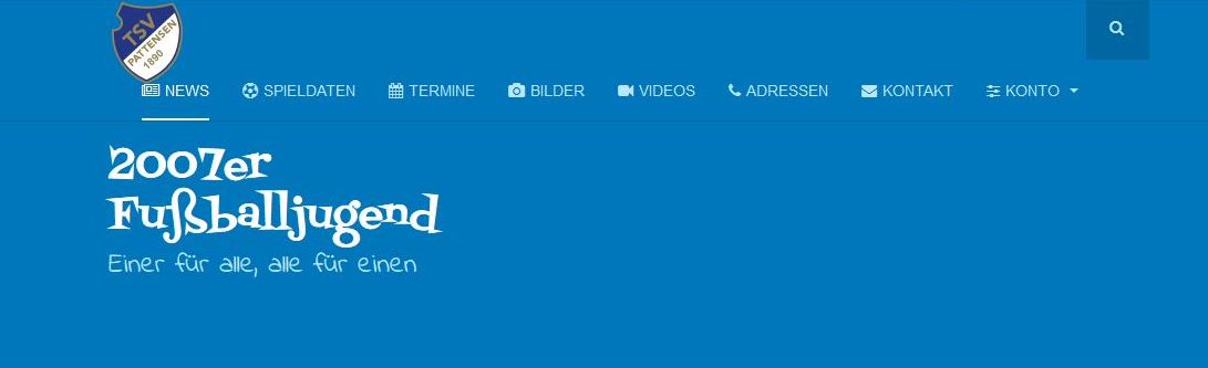
The navbar on my side works well on a standard desktop resolution (see attachment 1.jpg), but if i reduce the screensize it will come to status where it looks a little bit aweful because it doesn´t wrap (see attachment 2.jpg).
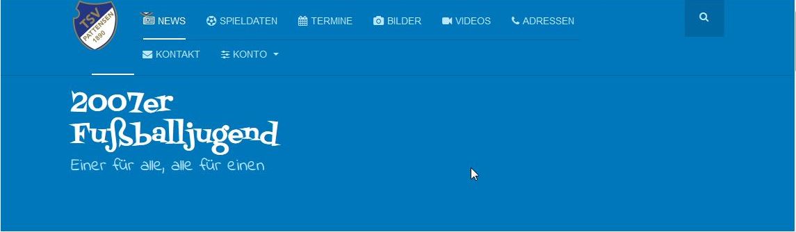
Is there a way that the navbar wrap like in attachment 3.jpg.rgs
Jan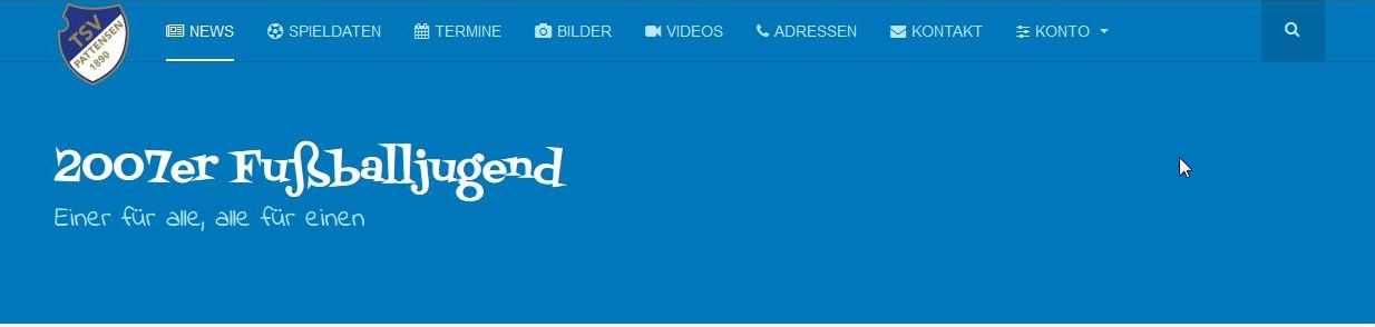
 Pankaj Sharma
Moderator
Pankaj Sharma
Moderator
Pankaj Sharma
- Join date:
- February 2015
- Posts:
- 24589
- Downloads:
- 144
- Uploads:
- 202
- Thanks:
- 127
- Thanked:
- 4196 times in 4019 posts
October 26, 2017 at 1:40 am #1070120Hi
When the screen size reduces the container width also reduced and all items do not fit in the less space this is why it comes down in the next row.Regards
October 26, 2017 at 6:30 am #1070187Hi, I think you get me wrong. My problem is that it doesn´t wrap.
1.jpg shows how it looks on a fullscreen desktop, fine from my point of view.
2.jpg is the reduced size, it doesn´t wrap.
3.jpg is the way I would like to have it, but it doesn´t look like this.I want that the navbar wraps like in 3.jpg, actually it looks like in 2.jpg rgs Jan
-
This reply was modified 6 years, 7 months ago by
jasimo. Reason: typo
Pankaj Sharma
Moderator
Pankaj Sharma
- Join date:
- February 2015
- Posts:
- 24589
- Downloads:
- 144
- Uploads:
- 202
- Thanks:
- 127
- Thanked:
- 4196 times in 4019 posts
October 26, 2017 at 6:56 am #1070192In NO.3 screenshot the menu items are in a 2nd row as per size.
Kindly share the URL of the page and illustrate the description in no.3 screenshot how u want to display the items and device name on which u took screenshot no3.Regards
October 26, 2017 at 7:06 am #1070196This reply has been marked as private.Pankaj Sharma
Moderator
Pankaj Sharma
- Join date:
- February 2015
- Posts:
- 24589
- Downloads:
- 144
- Uploads:
- 202
- Thanks:
- 127
- Thanked:
- 4196 times in 4019 posts
October 26, 2017 at 7:40 am #1070202Hi
Add more menu items so items will comes in the next row.
Or define a max width fo mainnav using below code in custom.css fille.t3-mainnav .t3-navbar { max-width: 500px; }Regards
October 26, 2017 at 8:32 am #1070230This reply has been marked as private.Pankaj Sharma
Moderator
Pankaj Sharma
- Join date:
- February 2015
- Posts:
- 24589
- Downloads:
- 144
- Uploads:
- 202
- Thanks:
- 127
- Thanked:
- 4196 times in 4019 posts
October 26, 2017 at 9:49 am #1070260Hi
I checked it in different devices and its working fine, kindly check site in real devices for the screen size.
Also your screenshot the site view are different in menu items.
RegarsdOctober 26, 2017 at 10:59 am #1070284This reply has been marked as private.Pankaj Sharma
Moderator
Pankaj Sharma
- Join date:
- February 2015
- Posts:
- 24589
- Downloads:
- 144
- Uploads:
- 202
- Thanks:
- 127
- Thanked:
- 4196 times in 4019 posts
October 27, 2017 at 12:49 am #1070361Hi
Add below code in custom.css file.logo-image > a { max-width: 160px; max-height: 96px; }Regards
October 27, 2017 at 5:46 am #1070426Thx, looks better, but this will influence the masthead when reducing the screen width.
I think the best way is to get rid of one menu point (submenu) to get the menu shorter.Pankaj Sharma
Moderator
Pankaj Sharma
- Join date:
- February 2015
- Posts:
- 24589
- Downloads:
- 144
- Uploads:
- 202
- Thanks:
- 127
- Thanked:
- 4196 times in 4019 posts
AuthorPostsViewing 13 posts - 1 through 13 (of 13 total)This topic contains 12 replies, has 2 voices, and was last updated by
We moved to new unified forum. Please post all new support queries in our New Forum
Jump to forum

