-
AuthorPosts
-
ankianka66 Developer
ankianka66
- Join date:
- August 2008
- Posts:
- 98
- Downloads:
- 0
- Uploads:
- 15
- Thanks:
- 10
- Thanked:
- 2 times in 1 posts
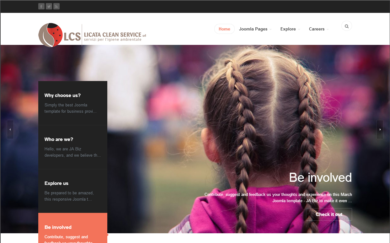
March 3, 2014 at 11:08 pm #195419Hi!
Why do you keep making templates with such small logos? This one has a height of 30 px. Most of my clients have logos that aren´t readable in such small sizes. Of course I know I can make them bigger, but then everything looks a mess in for example an iphone.
Isn´t there a way to get over this problem? A bit bigger logos that don´t interfere with the responsiveness?
 TomC
Moderator
TomC
Moderator
TomC
- Join date:
- October 2014
- Posts:
- 14077
- Downloads:
- 58
- Uploads:
- 137
- Thanks:
- 948
- Thanked:
- 3155 times in 2495 posts
March 3, 2014 at 11:33 pm #525136How much bigger do you want your logo to be?
Hayden A Friend
Hayden A
- Join date:
- April 2010
- Posts:
- 282
- Downloads:
- 0
- Uploads:
- 20
- Thanked:
- 54 times in 53 posts
March 4, 2014 at 3:20 am #525159@ankianka66,
Please try to upload a bigger logo http://easycaptures.com/fs/uploaded/662/5004544491.jpg You also need to create a new css file named: custom.css in templatesja_bizcss path, then add this CSS rule:
[PHP]@media (max-width: 767px) {
.logo-image .logo-img {
max-width: 90%;
}
}[/PHP]ankianka66
- Join date:
- August 2008
- Posts:
- 98
- Downloads:
- 0
- Uploads:
- 15
- Thanks:
- 10
- Thanked:
- 2 times in 1 posts
March 4, 2014 at 7:28 am #525198This is the way my clients logo look (see encl picture, 30 px to the right). If I make the height 30 px the companys name is impossble to read. I can´t be the only one who deals with detailed logos…
ankianka66
- Join date:
- August 2008
- Posts:
- 98
- Downloads:
- 0
- Uploads:
- 15
- Thanks:
- 10
- Thanked:
- 2 times in 1 posts
March 4, 2014 at 8:36 am #525216I managed to do the logo 50 px high and I think it looks OK in all devices… :):laugh:
March 4, 2014 at 9:00 am #525224<em>@ankianka66 414493 wrote:</em><blockquote>I managed to do the logo 50 px high and I think it looks OK in all devices… :):laugh:</blockquote>
Have te same problem with logo. How did you managed to do the logo @ 50 px height?
ankianka66
- Join date:
- August 2008
- Posts:
- 98
- Downloads:
- 0
- Uploads:
- 15
- Thanks:
- 10
- Thanked:
- 2 times in 1 posts
March 4, 2014 at 9:05 am #525228I use the default style. Made the logo 50 px high and uploaded it via FTP.
In template.css I found:
.t3-logo {
width: 182px;
height: 50px;
}
.t3-logo-small {
width: 60px;
height: 30px;
}So I hope this will work in all sorts of devices.
March 4, 2014 at 9:08 am #525231I think both t3 classes are used for t3 logo in footer. Company logo style is in .logo-image .logo-img class.
.logo-image .logo-img {
max-height: 40px;ankianka66
- Join date:
- August 2008
- Posts:
- 98
- Downloads:
- 0
- Uploads:
- 15
- Thanks:
- 10
- Thanked:
- 2 times in 1 posts
March 4, 2014 at 9:10 am #525232Aha… Then perhaps I have to change to 40 px. But it looks great with 50…
lg21 Friend
lg21
- Join date:
- July 2012
- Posts:
- 335
- Downloads:
- 109
- Uploads:
- 100
- Thanks:
- 36
- Thanked:
- 9 times in 1 posts
March 4, 2014 at 4:06 pm #525301I also have the same problem. I would like to put a logo of width 344 px and height 80 px
I made the following changes to the file template.css
. t3-mainnav. container {
** padding-top: 30px;
** padding-bottom: 30px;
** position: relative;. {t3-logo
** width: 344px;
** height: 80px;
}
. {t3-logo-small
** width: 172px;
** height: 40px;. logo-image. logo-img {
** max-height: 80px;but I do not see the logo properly centered with menu
what wrong?
TomC
Moderator
TomC
- Join date:
- October 2014
- Posts:
- 14077
- Downloads:
- 58
- Uploads:
- 137
- Thanks:
- 948
- Thanked:
- 3155 times in 2495 posts
March 4, 2014 at 5:27 pm #525309<em>@lg21 414595 wrote:</em><blockquote>
but I do not see the logo properly centered with menuwhat wrong?
</blockquote>So that we can try to take a closer look, it would be helpful if you could provide the url of the site you’re working on – as well as temporarily set “Optimize CSS” to “Off” within your Template Manager — General settings.
March 5, 2014 at 10:45 am #525448<em>@TomC 414608 wrote:</em><blockquote>So that we can try to take a closer look, it would be helpful if you could provide the url of the site you’re working on – as well as temporarily set “Optimize CSS” to “Off” within your Template Manager — General settings.</blockquote>
You almost made it. Yet the snarky remarks are transparently present. You are the exact reason, why I do not ask questions when I need assistance.lg21
- Join date:
- July 2012
- Posts:
- 335
- Downloads:
- 109
- Uploads:
- 100
- Thanks:
- 36
- Thanked:
- 9 times in 1 posts
March 5, 2014 at 2:38 pm #525474James G Friend
James G
- Join date:
- September 2014
- Posts:
- 130
- Downloads:
- 104
- Uploads:
- 4
- Thanks:
- 20
- Thanked:
- 40 times in 6 posts
March 5, 2014 at 4:35 pm #525483In Custom.css
Add:
.t3-mainnav .container {
padding-top: 20px;
padding-bottom: 40px;
position: relative;
}
.t3-mainnav .t3-navbar {
padding: 15px 5px 5px 5px;
float: right;
z-index: 100;
margin-right: 60px;
}
.head-search {
padding-top: 10px;
height: 32px;
margin: 0;
position: absolute;
right: 30px;
top: 25px;
}Change the padding to your liking and this will increase the top menu bar.
Also change the 15px to the padding you like so the menu stays in the middle.
There may be a better way but this works.
😎
1 user says Thank You to James G for this useful post
lg21
- Join date:
- July 2012
- Posts:
- 335
- Downloads:
- 109
- Uploads:
- 100
- Thanks:
- 36
- Thanked:
- 9 times in 1 posts
March 5, 2014 at 5:48 pm #525496perfect thanks
AuthorPostsThis topic contains 36 replies, has 12 voices, and was last updated by
chavan 10 years, 9 months ago.
We moved to new unified forum. Please post all new support queries in our New Forum
Jump to forum
melih

