-
AuthorPosts
-
mbs2008 Friend
mbs2008
- Join date:
- September 2010
- Posts:
- 39
- Downloads:
- 7
- Uploads:
- 4
- Thanks:
- 20
- Thanked:
- 3 times in 1 posts
January 6, 2012 at 6:22 am #172483I am using the default (vs. iphone) layout option for my website for both the IPhone and Android Layouts. My website displays correctly (centered) on my Desktop and on my Android. However, it seems to be left justified when viewing the same website on my IPad. Can you offer any assistance?
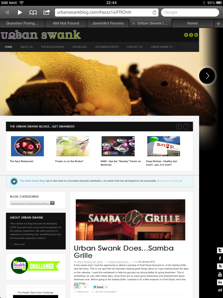
Website: http://urbanswankblog.com
Thanks!
pixelzombie Friend
pixelzombie
- Join date:
- August 2010
- Posts:
- 339
- Downloads:
- 2
- Uploads:
- 49
- Thanks:
- 32
- Thanked:
- 168 times in 107 posts
January 7, 2012 at 11:04 pm #432943Hi mbs2008,
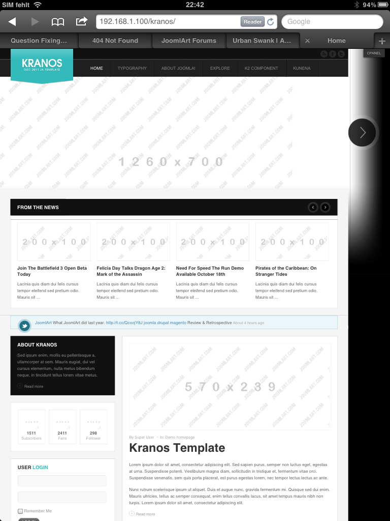
thank you for pointing this problem out. I think this is a problem the dev’s need to have a look at. Here are 2 screenshots of a fresh kranos quickinstallation and your site viewed on an iPad 2:
The only way of debugging this (from my point of knowledge) is using a safari browser on pc and set the user agend to iPad, I allready did that but the site renders fine. I found a setting that solves the centering of the site. Please add
body.bd #ja-wrapper {

    min-width: 1260px !important;

}
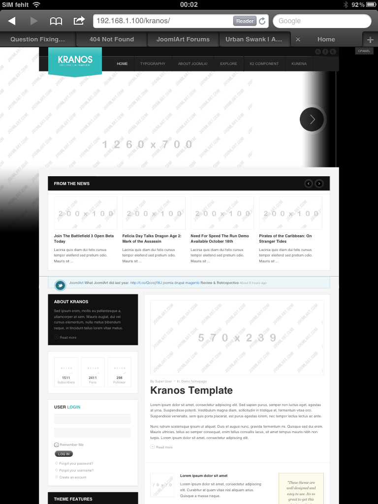
to your kranos template.css. By default the max-width of the wrapper is 1000px but the slideshow is set to 1260 by default. This will look like this:
The only thing left is the slideshow template that doesn’t render the backround image centered and the left control button is missing (or out of the viewport).
If you need a fast solution, please open up a ticket.
Cheers
Frank
webmastergol Friend
webmastergol
- Join date:
- October 2012
- Posts:
- 17
- Downloads:
- 1
- Uploads:
- 1
- Thanks:
- 5
- Thanked:
- 1 times in 1 posts
November 4, 2012 at 12:02 pm #471862Hello,
i have the same problem with my ipad.
Is there a (complete) solution to center the layout en top slideshow (buttons)?Regards,
Erik
 Ninja Lead
Moderator
Ninja Lead
Moderator
Ninja Lead
- Join date:
- November 2014
- Posts:
- 16064
- Downloads:
- 310
- Uploads:
- 2864
- Thanks:
- 341
- Thanked:
- 3854 times in 3563 posts
November 5, 2012 at 8:29 am #471916<em>@webmastergol 344771 wrote:</em><blockquote>Hello,
i have the same problem with my ipad.
Is there a (complete) solution to center the layout en top slideshow (buttons)?Regards,
Erik</blockquote>
This is my fixed with button slideshow on JA Kranos template
+ Download my attachment file, extract it and copy paste to this folder
<blockquote>templates/ja_kranos/css</blockquote>
+ Config it
<blockquote>Admin area->Extension->Template Manager->JA_Kranos – Default ->Layouts tab</blockquote>
from
<stylesheets>

	</stylesheets>
change to
<stylesheets>

		<file media="only screen and (min-width:720px) and (max-width: 1049px)">css/layout-tablet.css</file>

		<file media="only screen and (min-width:720px) and (max-width: 959px)">css/layout-tablet-vertical.css</file>

	</stylesheets>
With layout-tablet.css and layout-tablet-vertical.css file from my attachment filewebmastergol
- Join date:
- October 2012
- Posts:
- 17
- Downloads:
- 1
- Uploads:
- 1
- Thanks:
- 5
- Thanked:
- 1 times in 1 posts
November 6, 2012 at 7:58 pm #472077Hello Ninja Lead,
where can I find the attached files?
I don’t see them.Regards,
webmastergol
Ninja Lead
Moderator
Ninja Lead
- Join date:
- November 2014
- Posts:
- 16064
- Downloads:
- 310
- Uploads:
- 2864
- Thanks:
- 341
- Thanked:
- 3854 times in 3563 posts
November 7, 2012 at 1:48 am #4720911 user says Thank You to Ninja Lead for this useful post
webmastergol
- Join date:
- October 2012
- Posts:
- 17
- Downloads:
- 1
- Uploads:
- 1
- Thanks:
- 5
- Thanked:
- 1 times in 1 posts
November 7, 2012 at 6:09 pm #472202Hello Ninja Lead,
It worked for me :), thanks.
regards,
webmastergol
lbarriocanal Friend
lbarriocanal
- Join date:
- November 2007
- Posts:
- 14
- Downloads:
- 78
- Uploads:
- 4
- Thanks:
- 2
- Thanked:
- 1 times in 1 posts
January 21, 2013 at 7:58 pm #480653I have made the changes yoy say. But now the problem is in masshead module when i see my site in the iPad.
Background image has now a big right margin. ¿any help? ThanksNinja Lead
Moderator
Ninja Lead
- Join date:
- November 2014
- Posts:
- 16064
- Downloads:
- 310
- Uploads:
- 2864
- Thanks:
- 341
- Thanked:
- 3854 times in 3563 posts
January 22, 2013 at 9:02 am #480739Because this template do not support responsive layout but you can try to fix this issue as per my suggestion :
<blockquote>Open templates/ja_kranos/css/layout-tablet.css file</blockquote>
add new script
#ja-masshead .main {

	left:60%;

}

#ja-masshead .ja-masshead {

	width:100%;

}
Let me know if it helps
lbarriocanal
- Join date:
- November 2007
- Posts:
- 14
- Downloads:
- 78
- Uploads:
- 4
- Thanks:
- 2
- Thanked:
- 1 times in 1 posts
January 24, 2013 at 5:46 pm #481054<em>@Ninja Lead 356449 wrote:</em><blockquote>
add new script
#ja-masshead .main {

	left:60%;

}

#ja-masshead .ja-masshead {

	width:100%;

}
</blockquote>
No luck, Ninja.
I get the same rigth margin. ¿?lbarriocanal
- Join date:
- November 2007
- Posts:
- 14
- Downloads:
- 78
- Uploads:
- 4
- Thanks:
- 2
- Thanked:
- 1 times in 1 posts
January 25, 2013 at 4:54 pm #481177I have just seen this happens in desktop browsers too when the window is narrow, IE, when screen resolution is lower than 1260 px (more or less)
ThanksNinja Lead
Moderator
Ninja Lead
- Join date:
- November 2014
- Posts:
- 16064
- Downloads:
- 310
- Uploads:
- 2864
- Thanks:
- 341
- Thanked:
- 3854 times in 3563 posts
January 28, 2013 at 7:44 am #481299<em>@lbarriocanal 357008 wrote:</em><blockquote>I have just seen this happens in desktop browsers too when the window is narrow, IE, when screen resolution is lower than 1260 px (more or less)
Thanks</blockquote>
I would need to take a closer look at your site. Please send pm me with url, admin access and fpt account, I shall help you check itlbarriocanal
- Join date:
- November 2007
- Posts:
- 14
- Downloads:
- 78
- Uploads:
- 4
- Thanks:
- 2
- Thanked:
- 1 times in 1 posts
January 29, 2013 at 10:25 pm #481571PM Sent. Thanks in advance
Ninja Lead
Moderator
Ninja Lead
- Join date:
- November 2014
- Posts:
- 16064
- Downloads:
- 310
- Uploads:
- 2864
- Thanks:
- 341
- Thanked:
- 3854 times in 3563 posts
January 30, 2013 at 8:51 am #481647<em>@lbarriocanal 357573 wrote:</em><blockquote>PM Sent. Thanks in advance</blockquote>
Fixed it 🙂
<blockquote>Open /templates/ja_kranos/css/layout-tablet.css file</blockquote>
from
#ja-masshead .main {

	left:60%;

}
change to
#ja-masshead .main {

	left:60% !important;

}
Please check it on your site again
1 user says Thank You to Ninja Lead for this useful post
lbarriocanal
- Join date:
- November 2007
- Posts:
- 14
- Downloads:
- 78
- Uploads:
- 4
- Thanks:
- 2
- Thanked:
- 1 times in 1 posts
January 30, 2013 at 9:16 pm #481752Great! Now it works perfect.
AuthorPostsViewing 15 posts - 1 through 15 (of 15 total)This topic contains 15 replies, has 5 voices, and was last updated by
lbarriocanal 11 years, 3 months ago.
We moved to new unified forum. Please post all new support queries in our New Forum
Jump to forum