-
AuthorPosts
-
Ch1vpH Friend
Ch1vpH
- Join date:
- February 2016
- Posts:
- 299
- Downloads:
- 21
- Uploads:
- 128
- Thanks:
- 29
- Thanked:
- 1 times in 1 posts
June 25, 2017 at 10:47 am #1043992Hi there,
Is there any way to have the top nav-bar menu ‘sticky’ so it moves down with the page as you scroll??
Please advise,
Ps; desperately need this option…as I can’t really hire a developer re; my ‘side menu’ post
site: http://ch1vph.xyz/ri2k
 Pankaj Sharma
Moderator
Pankaj Sharma
Moderator
Pankaj Sharma
- Join date:
- February 2015
- Posts:
- 24589
- Downloads:
- 144
- Uploads:
- 202
- Thanks:
- 127
- Thanked:
- 4196 times in 4019 posts
June 30, 2017 at 2:42 am #1045153Hi
Try this
add below code in custom.css file@media (min-width: 992px) { body.header-horizontal .t3-header { padding-left: 96px; padding-right: 96px; z-index: 9999; width: 100%; position: fixed; background: #ffffff; } body.header-horizontal .t3-mast-head { position: relative; padding-top: 240px; } }It work for large screen size only becuase of the header height is too long and it hide your content.
Regards
1 user says Thank You to Pankaj Sharma for this useful post
Ch1vpH
- Join date:
- February 2016
- Posts:
- 299
- Downloads:
- 21
- Uploads:
- 128
- Thanks:
- 29
- Thanked:
- 1 times in 1 posts
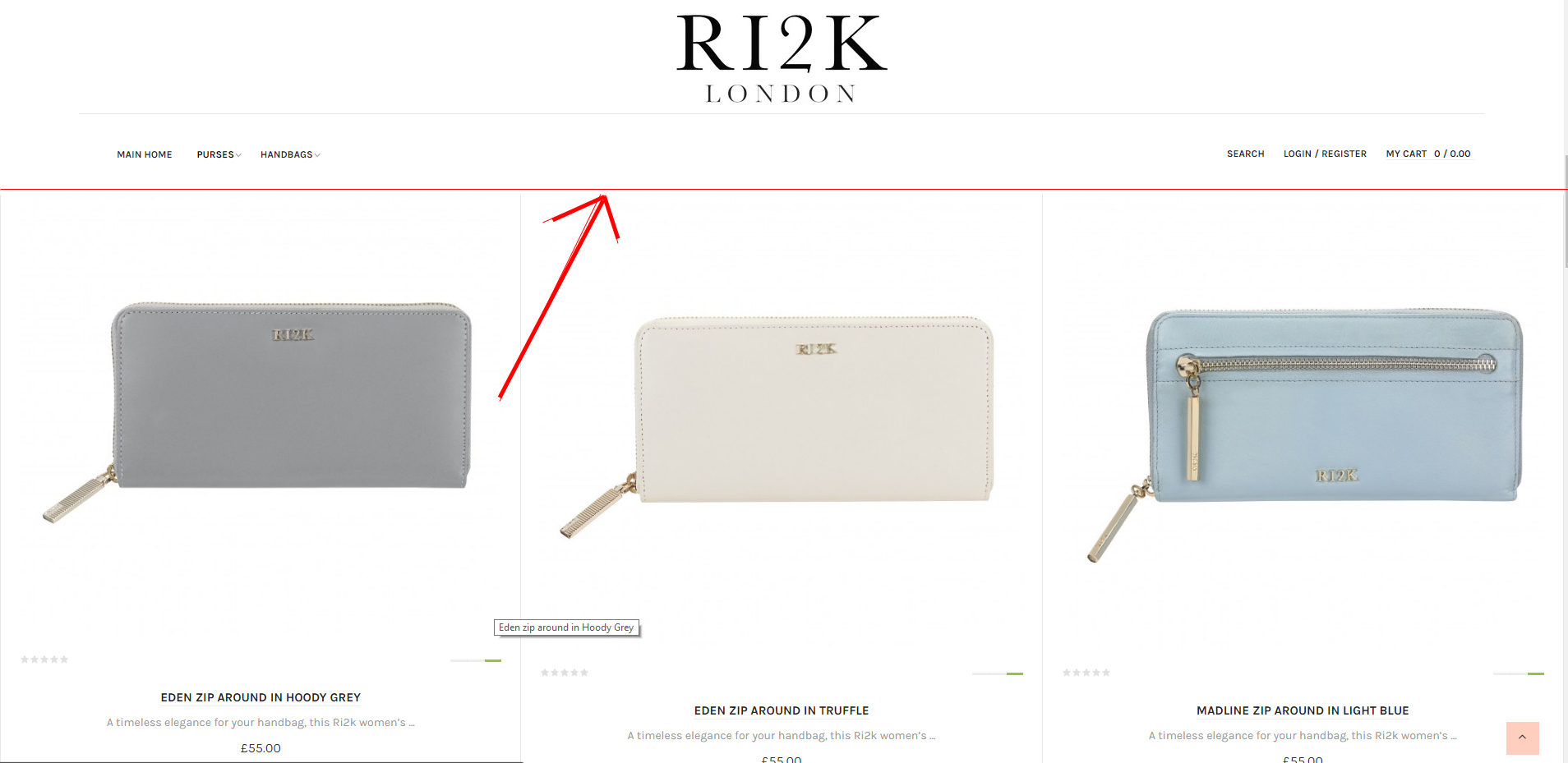
July 3, 2017 at 8:30 pm #1045798Hi that works perfectly thanks!
Can you tell me if its possible to have a thin or thick border on the sticky menu!?
See image for example…
Thanks
Pankaj Sharma
Moderator
Pankaj Sharma
- Join date:
- February 2015
- Posts:
- 24589
- Downloads:
- 144
- Uploads:
- 202
- Thanks:
- 127
- Thanked:
- 4196 times in 4019 posts
July 4, 2017 at 2:50 am #1045847You are welcome!
Please open a new thread for a new topic question. It also helps other users to find same topic.Regards
Ch1vpH
- Join date:
- February 2016
- Posts:
- 299
- Downloads:
- 21
- Uploads:
- 128
- Thanks:
- 29
- Thanked:
- 1 times in 1 posts
July 4, 2017 at 7:09 pm #1046076Ok I did a new topic, could you also you tell me if the sticky menu can be used on individual pages…
Pankaj Sharma
Moderator
Pankaj Sharma
- Join date:
- February 2015
- Posts:
- 24589
- Downloads:
- 144
- Uploads:
- 202
- Thanks:
- 127
- Thanked:
- 4196 times in 4019 posts
July 5, 2017 at 2:15 am #1046151Hi
You can apply the code I suggested and use the page class option for a different menu, to apply the different style code for each menu item.Regards
Ch1vpH
- Join date:
- February 2016
- Posts:
- 299
- Downloads:
- 21
- Uploads:
- 128
- Thanks:
- 29
- Thanked:
- 1 times in 1 posts
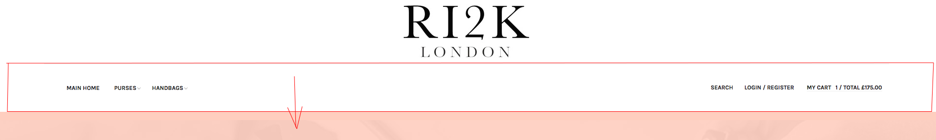
July 15, 2017 at 5:03 pm #1048807Hi there,
So my I’ve noticed that the sticky menu (although it looks great) its cutting the size of the pages a by a quarter, because of this it is hard to view pages in full.
Could you please let me know if there’s any way to compress this when scrolling or if theres a possibility to have just the menu area (see pic) move with the page and you only see the logo whilst at the top of page??
Please let me know possibles!
Thanks
New Site: https://ri2k.london
Pankaj Sharma
Moderator
Pankaj Sharma
- Join date:
- February 2015
- Posts:
- 24589
- Downloads:
- 144
- Uploads:
- 202
- Thanks:
- 127
- Thanked:
- 4196 times in 4019 posts
July 17, 2017 at 1:06 am #1048924Hi
I noticed you already fixed this with adding padding-top value style in the custom.css
http://prntscr.com/fwj36z
Please confirm.Regards
Ch1vpH
- Join date:
- February 2016
- Posts:
- 299
- Downloads:
- 21
- Uploads:
- 128
- Thanks:
- 29
- Thanked:
- 1 times in 1 posts
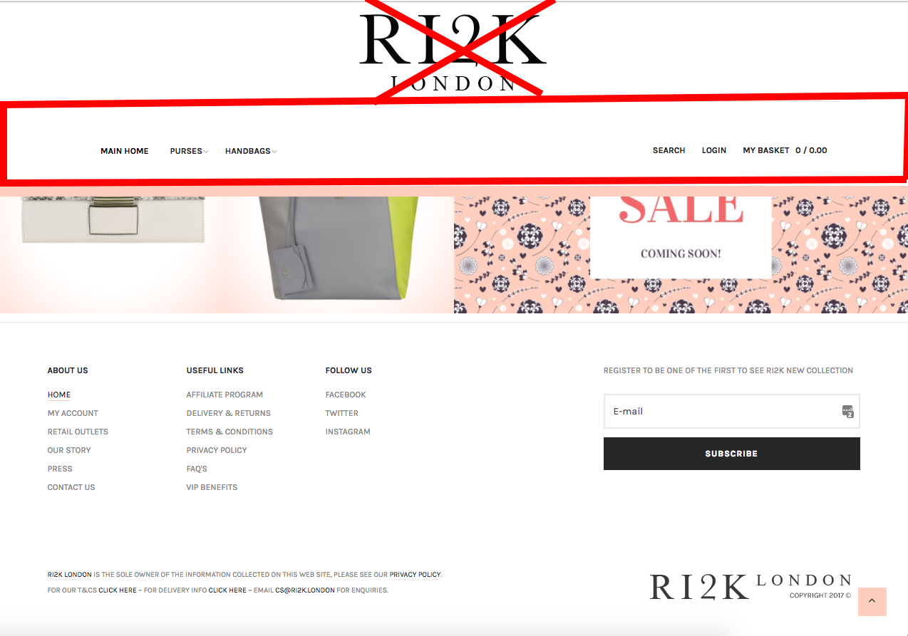
July 22, 2017 at 5:50 pm #1050654Hi there,
No I believe that padding was to just to keep the logo and menus ‘pink border’ consistent with my large screen views!
Let me know your thoughts on the possibilities of just moving the menu and not the logo…because if you view on an iPad at present the sticky menu takes up a third of the screen!
Thankyou
Pankaj Sharma
Moderator
Pankaj Sharma
- Join date:
- February 2015
- Posts:
- 24589
- Downloads:
- 144
- Uploads:
- 202
- Thanks:
- 127
- Thanked:
- 4196 times in 4019 posts
July 24, 2017 at 1:38 am #1050882Hi
When the screen size is smaller there is not enough width to get all in the same view, So it comes down in down the line and shows you like this.Regards
Ch1vpH
- Join date:
- February 2016
- Posts:
- 299
- Downloads:
- 21
- Uploads:
- 128
- Thanks:
- 29
- Thanked:
- 1 times in 1 posts
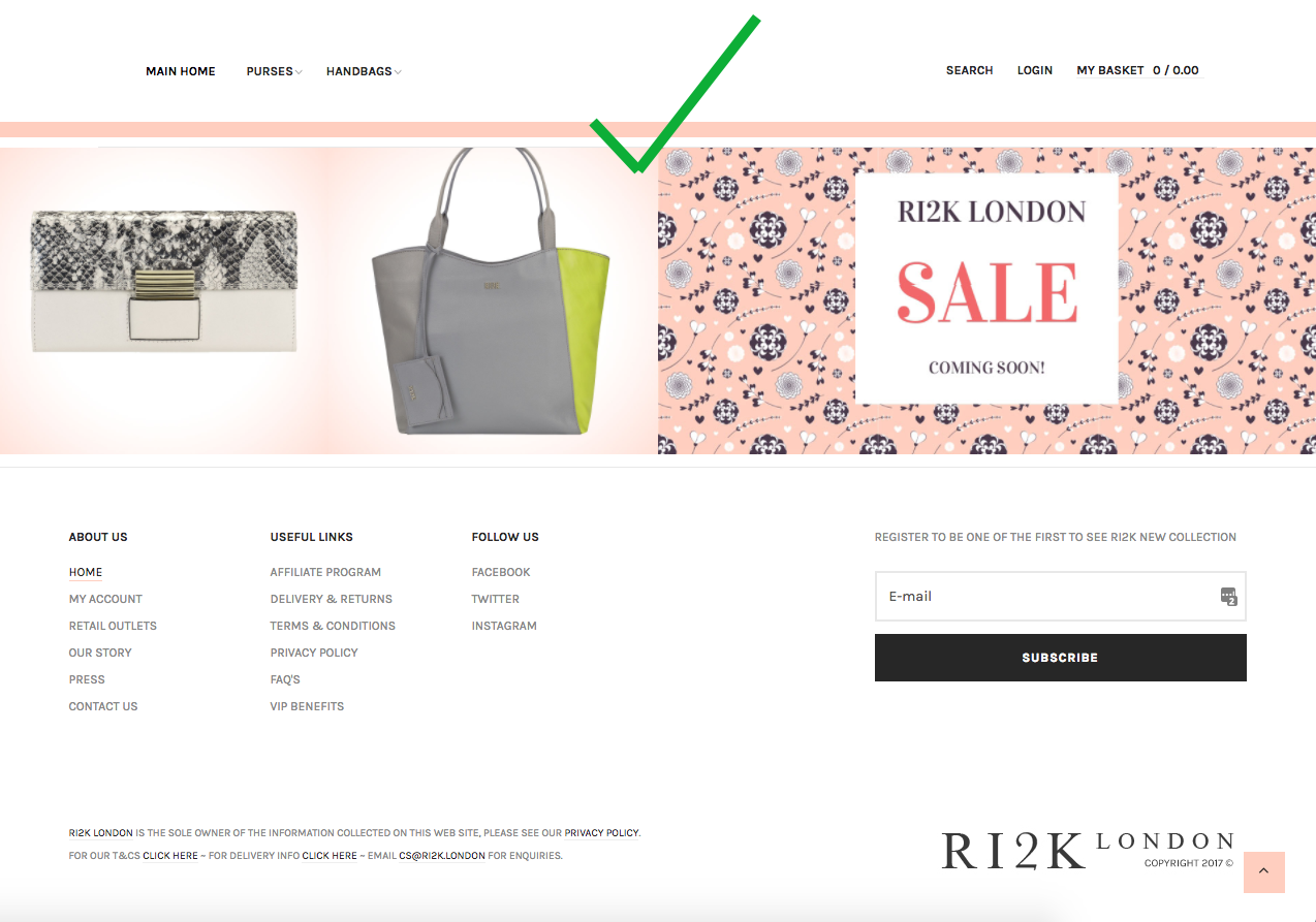
July 24, 2017 at 9:13 pm #1051164Hi there,
Sorry I’m unsure what you meant by your last post…but if I could just explain what I’m after again with a couple screenshots depicting exactly what I want to do. Its basically so my customers can see more of the page without having the main logo scroll down with the page and have just the menus scroll with the page instead…
Thanks
-
This reply was modified 7 years, 6 months ago by
Ch1vpH.
 Pankaj Sharma
Moderator
Pankaj Sharma
Moderator
Pankaj Sharma
- Join date:
- February 2015
- Posts:
- 24589
- Downloads:
- 144
- Uploads:
- 202
- Thanks:
- 127
- Thanked:
- 4196 times in 4019 posts
July 25, 2017 at 1:30 am #1051200Hi
Do you want to remove the logo from site?Regards
-
AuthorPosts
Viewing 12 posts - 1 through 12 (of 12 total)This topic contains 11 replies, has 2 voices, and was last updated by
Pankaj Sharma 7 years, 6 months ago.We moved to new unified forum. Please post all new support queries in our New Forum
Jump to forum
melih