-
AuthorPosts
-
swissa Friend
swissa
- Join date:
- November 2011
- Posts:
- 1955
- Downloads:
- 7
- Uploads:
- 277
- Thanks:
- 175
- Thanked:
- 717 times in 572 posts
November 6, 2012 at 1:18 pm #181991Hi Guys,
Like the look of the “Layout”. Really, really useful for web designers I think and could put you ahead of the competition….
One question.
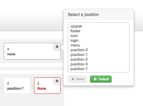
Is it possible (and I’ve asked this many times before) to have a dedicated ‘language’ position. It doesn’t appear in your drop-downs.
I think it would help numerous people in the simplicity of doing it and as this is a beta…. I’ll ask again!! 🙂
Secondly: I’m running two joomshopping tests – one on Warp6, one on T3V3 Beta2, both using a <div> based joomshopping template so that it is fully responsive. Warp works really well dropping each <div> below each other when in minimum format. T3 doesn’t – it compresses the <div>s alongside each other so that there are 3 products on the same horizontal plane. Just wondering why?
If you would like to see these then drop me a PM and I’ll give you the urls.
Haven’t played yet with sizing the positions so that for example I can have three positions horizontally but one is double size – is this a suffix thing or would it make sense to include this too into the back-end?
I know, I know, I need to read the documentation when it arrives!!
Well done on the development here – looking good.
swissa
Wall Crasher Developer
Wall Crasher
- Join date:
- December 2011
- Posts:
- 1113
- Downloads:
- 0
- Uploads:
- 15
- Thanks:
- 66
- Thanked:
- 361 times in 300 posts
November 8, 2012 at 2:11 am #472220Hi swissa,
Thank for interesting in our framework.
– About the ‘language’ position, it is depend on the template, not framework. We will try to include this position in our future template.
– For joomshopping, we will check again and let you know the result soon.Regards
2 users say Thank You to Wall Crasher for this useful post
swissa
- Join date:
- November 2011
- Posts:
- 1955
- Downloads:
- 7
- Uploads:
- 277
- Thanks:
- 175
- Thanked:
- 717 times in 572 posts
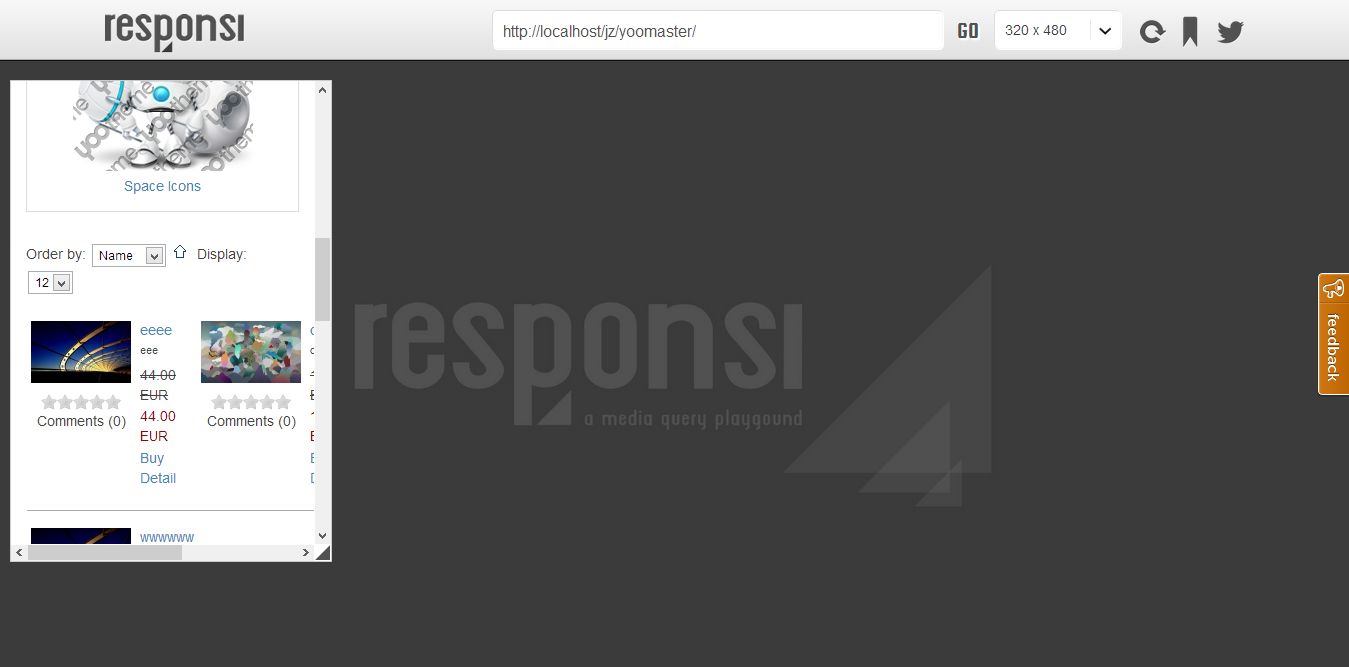
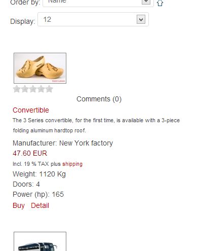
November 9, 2012 at 11:43 am #472396FYI,
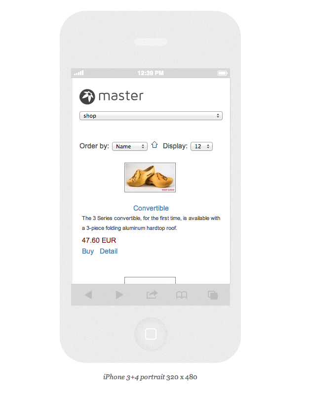
jshopping screenshots for each framework – both are J3 (T3 is RC2 and T3 Blank is RC1)
Thanks a lot for taking a look – unless it is fixed I won’t be using T3V3 for any e-commerce sites!
Wall Crasher
- Join date:
- December 2011
- Posts:
- 1113
- Downloads:
- 0
- Uploads:
- 15
- Thanks:
- 66
- Thanked:
- 361 times in 300 posts
November 12, 2012 at 3:26 am #472590Hi swissa,
Can you please give me the link to test on?
I do not think the Joomshopping support responsive.
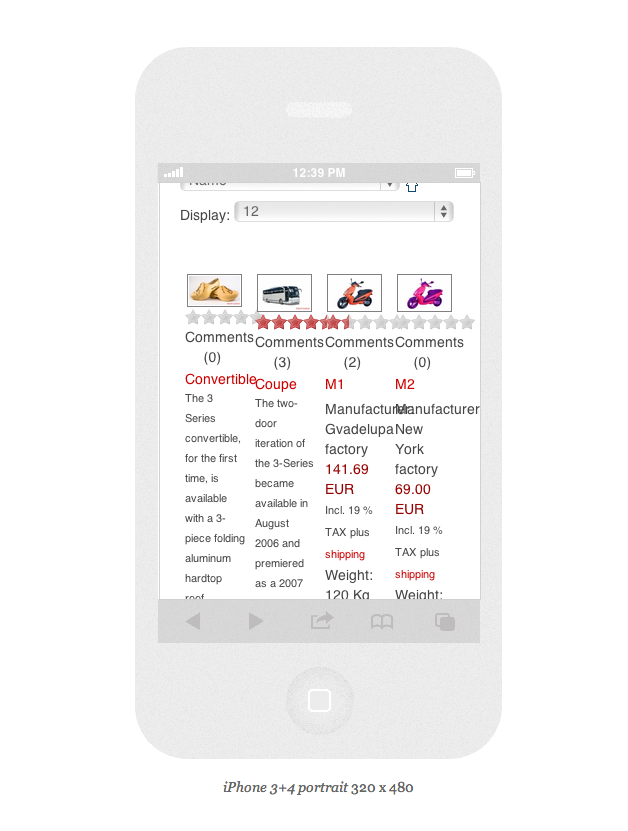
It use <table> for product list page. I have test on both Warp and T3v3 and give the same result.Can you create a menu Products types and choose a category id which have several product then check the result.
on T3v3 http://easycaptures.com/fs/uploaded/716/2017469038.jpg
on Yoo Master http://easycaptures.com/fs/uploaded/716/6441434824.jpgPlease check again.
swissa
- Join date:
- November 2011
- Posts:
- 1955
- Downloads:
- 7
- Uploads:
- 277
- Thanks:
- 175
- Thanked:
- 717 times in 572 posts
November 12, 2012 at 11:55 am #472654<em>@Wall Crasher 345785 wrote:</em><blockquote>Hi swissa,
Can you please give me the link to test on?
I do not think the Joomshopping support responsive.
It use <table> for product list page. I have test on both Warp and T3v3 and give the same result.Can you create a menu Products types and choose a category id which have several product then check the result.
on T3v3 http://easycaptures.com/fs/uploaded/716/2017469038.jpg
on Yoo Master http://easycaptures.com/fs/uploaded/716/6441434824.jpgPlease check again.</blockquote>
Hi Wall Crasher
Thanks for coming back to me. I will send the links via PM as I would like to keep these closed off until I have resolved all my tests.
I am aware that joomshopping normally uses <tables> as default and therefore doesn’t react to responsive.
However I have replaced the tables with <divs> and it is now fully responsive! As I said it works on warp just not on T3v3.
If you need any more help pls PM me but please keep the urls private for me and off here for the moment.
Thanks
swisssa
Wall Crasher
- Join date:
- December 2011
- Posts:
- 1113
- Downloads:
- 0
- Uploads:
- 15
- Thanks:
- 66
- Thanked:
- 361 times in 300 posts
November 13, 2012 at 2:12 am #472703Hi swissa,
I just take a look on both site and see that.
Warp Framework has define some responsive in responsive.css fileSomething like
/* Only Phones (Portrait) */ @media (max-width: 479px) {/* Base */
body { word-wrap: break-word; }/* Layout */
.width16,
.width20,
.width25,
.width33,
.width40,
.width50,
.width60,
.width66,
.width75,
.width80 { width: 100%;
}which will make those class full screen when on Phone.
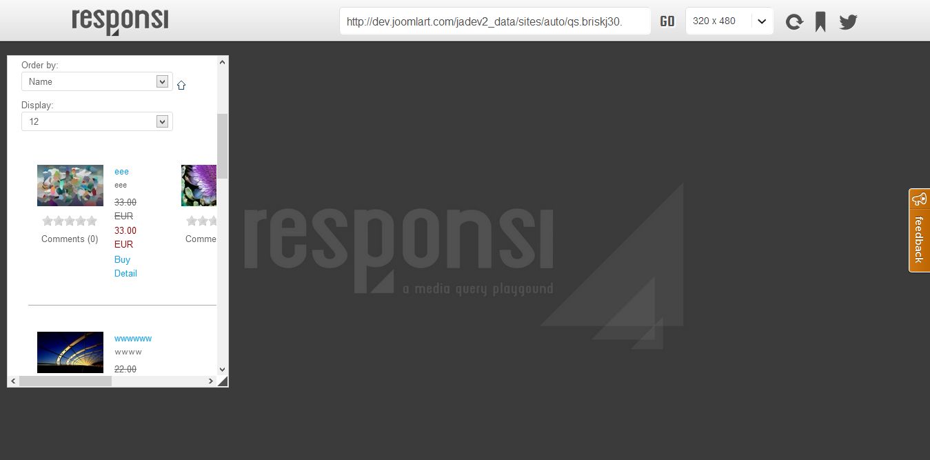
Our T3v3 Framework does not define those classes. We are using Bootstrap grid system. You can take a look at here.
http://twitter.github.com/bootstrap/scaffolding.htmlSince we already have a cool new grid system, we do not want to support those old classes.
You can replace class ‘width25’ by ‘span3’, or ‘width50’ by ‘span6’, …. as something like the imagehttp://easycaptures.com/fs/uploaded/717/2921736272.jpg
Hope this helps.
Regards
-
AuthorPosts
Viewing 6 posts - 1 through 6 (of 6 total)This topic contains 6 replies, has 2 voices, and was last updated by
Wall Crasher 12 years, 2 months ago.
We moved to new unified forum. Please post all new support queries in our New Forum
Jump to forum
melih

