-
AuthorPosts
-
smitheringale Friend
smitheringale
- Join date:
- December 2009
- Posts:
- 236
- Downloads:
- 0
- Uploads:
- 0
- Thanks:
- 63
- Thanked:
- 44 times in 18 posts
March 16, 2010 at 3:42 pm #149571Hello,
I have been exploring some of your templates with safari on my iphone (3G, 8GB, safari 4.0 i believe although very gard to find which version of safari my iphone is using).
Not so good with new t3 templates on iphone
It is not always a great browsing experience with templates based on your t3 framework. I cannot zoom into articles and the text is really very small and totally unreadable in the majority of cases.
Better browsing on iphone with non-t3 templates
However, on your older templates that are not using the t3 framework, I have a considerably better browsing experience, whereby I am able to navigate around the website more easily and zoom in and out on text, pictures, sections etc.
I do not have a great deal of experience designing websites for mobile users, but of course, this is becoming increasingly important with the increasing adoption of smartphones from apple (iphone), research in motion (rim – blackberry), nokia, samsung etc.
Comments on t3 from anyone?
Could anyone comment on how good they consider the t3 templates to be for mobile browsing?
Perhaps things look better with an iphone 3GS (surely irrelevant) or with a different mobile broswer (but i think i have the latest version of safari).
General remarks on t3
What is the main advantage of the t3 framework
- Is it really so much faster than non-t3 templates?
- Or is the advantage mainly due to it being better for the joomlart team to produce templates?
- Is it just more customisable?
I have read what I could find on t3 templates but im still not completely sure what are the main pros of the t3 templates verses non t3 templates
Cheers for all assistance 🙂
EDIT – Actually. I don’t think this is a t3 issue or a joomlart issue. I think t3 works as well as anything with the iphone for example, but you need to know a few tricks to make the text readable. For example, turning the iphone on its side gives a bigger screen and bigger text. Also, having a column for text and a side column makes things better for jooming in.
I think some of the main advantages of t3 is that you can have a mega menu, and i bloody love the mega menu!
Is there any way of easily adding a mega menu to an older template – or upgrading to t3 template with an older template.
If I knew how to do it, I would love to work on joomlart topaz myself and add in a mega menu and some other features of t3.
(OK, lots of text there ! i’ll stop writing now and clean the blood stains from my keyboard 🙂April 11, 2010 at 4:21 pm #339931I agree with much of this post. I am researching the use and relevance of the T3 framework and have many of the same questions and would be interested in hearing the response.
I have tried viewing a few sites on my Samsung Finesse and the menu button doesn’t seem to work. I tried looking at the mobile demos on aPC as well in Firefox, IE and Safari, Chrome and the menu button doesn’t seem to work at all. It could be user oversite, but why doesn’t the menu button work on JA demos when viewing the mobile version?
Thanks for your thoughts.smitheringale
- Join date:
- December 2009
- Posts:
- 236
- Downloads:
- 0
- Uploads:
- 0
- Thanks:
- 63
- Thanked:
- 44 times in 18 posts
April 12, 2010 at 10:23 am #340039<em>@dig814 174064 wrote:</em><blockquote>I agree with much of this post. I am researching the use and relevance of the T3 framework and have many of the same questions and would be interested in hearing the response.
I have tried viewing a few sites on my Samsung Finesse and the menu button doesn’t seem to work. I tried looking at the mobile demos on aPC as well in Firefox, IE and Safari, Chrome and the menu button doesn’t seem to work at all. It could be user oversite, but why doesn’t the menu button work on JA demos when viewing the mobile version?
Thanks for your thoughts.</blockquote>I have just checked seleni. There is an option to switch to the mobile verson of the template, and it is true that you cannot (or at least I cannot) see the menu from a desktop. However, I have been able to use the menu button on my iphone, and I have known people to be able to do it from their blackberry. Upshot is: i’m sure it works, just not on a desktop (with the latest firefox browser anyway)
I have noticed that you cannot switch to the mobile version of other t3 templates in the demo and this is presumably partly because of this menu issue.
Although, you have to wonder why anyone with a desktop would really want to view the mobile version – except out of sheer curisosity. Having a mobile version for desktop users surely cannot appeal to the vast majority (if not all) legitimate users of a website.
By and large, the t3 templates are good for mobile broswers – although the text is perhaps a little small and it would be nice to be able to enlarge this (perhaps you can customise this quite easily – I havent really checked int he relevant forum)
It would be nice to be able to set which modules and content is displayed in the mobile version. Again, perhaps there is an article somewhere explaning how this can be achieved – as i say, i havent really looked.
But by and large the mobile version is ok, but i find it easier to view the non-mobile version on my iphone, as it gives a better browsing experience.
But of course, this could just be down to personal preference.
Hung Dinh Friend
Hung Dinh
- Join date:
- September 2014
- Posts:
- 4408
- Downloads:
- 11
- Uploads:
- 189
- Thanks:
- 309
- Thanked:
- 3310 times in 3 posts
April 13, 2010 at 7:40 pm #340260smitheringale;169728Hello,
I have been exploring some of your templates with safari on my iphone (3G, 8GB, safari 4.0 i believe although very gard to find which version of safari my iphone is using).
Not so good with new t3 templates on iphone
It is not always a great browsing experience with templates based on your t3 framework. I cannot zoom into articles and the text is really very small and totally unreadable in the majority of cases.
Better browsing on iphone with non-t3 templates
However, on your older templates that are not using the t3 framework, I have a considerably better browsing experience, whereby I am able to navigate around the website more easily and zoom in and out on text, pictures, sections etc.
I do not have a great deal of experience designing websites for mobile users, but of course, this is becoming increasingly important with the increasing adoption of smartphones from apple (iphone), research in motion (rim – blackberry), nokia, samsung etc.
[/quote]
We have about 5 iphones in the office (1 2G, 2 3G and 2 3Gs) and don’t find any problem using the template. The Zoom feature does not work simply because you have already been at the maximum size (Am I right? correct me if I am wrong)
Anyway, you can always assign standard layout to iphone+handheld view and give your users the same browsing experience as they are browsing from computer. See attached file
7477
smitheringale;169728
Comments on t3 from anyone?Could anyone comment on how good they consider the t3 templates to be for mobile browsing?
Perhaps things look better with an iphone 3GS (surely irrelevant) or with a different mobile broswer (but i think i have the latest version of safari).
[/quote]
Thank you and welcome, we are developing version 2.0 of T3 and your comment will help us to do it better.General remarks on t3
What is the main advantage of the t3 framework
- Is it really so much faster than non-t3 templates?
- Or is the advantage mainly due to it being better for the joomlart team to produce templates?
- Is it just more customisable?
I have read what I could find on t3 templates but im still not completely sure what are the main pros of the t3 templates verses non t3 templates
Cheers for all assistance 🙂
- Is it really so much faster than non-t3 templates? <– YES, it is. It loads smaller image size, media or unnecessary modules are removed (of cause loading modules are all configurable)
- Or is the advantage mainly due to it being better for the joomlart team to produce templates? <– No, with T3, we almost double the template development working time (RTL, Mobile views, mega menu). If it is not for user benefit, why we need to get more work for us 😎
- Is it just more customisable? Yes, it is more customizable, more flexible
EDIT – Actually. I don’t think this is a t3 issue or a joomlart issue. I think t3 works as well as anything with the iphone for example, but you need to know a few tricks to make the text readable. For example, turning the iphone on its side gives a bigger screen and bigger text. Also, having a column for text and a side column makes things better for jooming in.
I think some of the main advantages of t3 is that you can have a mega menu, and i bloody love the mega menu!
Is there any way of easily adding a mega menu to an older template – or upgrading to t3 template with an older template.
If I knew how to do it, I would love to work on joomlart topaz myself and add in a mega menu and some other features of t3.
(OK, lots of text there ! i’ll stop writing now and clean the blood stains from my keyboard 🙂Thanks a lot for your “bloody love the mega menu! ”
We are updating JA templates to T3 framework one by one, ordered by template’s popularity (we have finished: Zeolite, Mesolite, and soon JA Pyrite, Edenite to come)Hung Dinh
- Join date:
- September 2014
- Posts:
- 4408
- Downloads:
- 11
- Uploads:
- 189
- Thanks:
- 309
- Thanked:
- 3310 times in 3 posts
April 13, 2010 at 7:55 pm #340261<blockquote>I have just checked seleni. There is an option to switch to the mobile verson of the template, and it is true that you cannot (or at least I cannot) see the menu from a desktop. However, I have been able to use the menu button on my iphone, and I have known people to be able to do it from their blackberry. Upshot is: i’m sure it works, just not on a desktop (with the latest firefox browser anyway)
I have noticed that you cannot switch to the mobile version of other t3 templates in the demo and this is presumably partly because of this menu issue.
Although, you have to wonder why anyone with a desktop would really want to view the mobile version – except out of sheer curisosity. Having a mobile version for desktop users surely cannot appeal to the vast majority (if not all) legitimate users of a website. </blockquote>
In the 1st place, we had planned to support mobile view switcher while in desktop mode but after searching all big site, such options are not offered then we withdraw the option. And we do see that had been a good choice. Why don’t we have to fixed mobile view so it can well displayed in desktop mode? It is like trying putting 4 wheels to a boat which never run on the road 🙂
<blockquote>By and large, the t3 templates are good for mobile broswers – although the text is perhaps a little small and it would be nice to be able to enlarge this (perhaps you can customise this quite easily – I havent really checked int he relevant forum)
</blockquote>Thanks, this is what we have been doing in upcoming T3 version: T3 version 2.0
<blockquote>It would be nice to be able to set which modules and content is displayed in the mobile version. Again, perhaps there is an article somewhere explaning how this can be achieved – as i say, i havent really looked. </blockquote>
Yes, you can do this by opening the main.php file (or even header.php, footer.php) in
layoutsblockshandheld add add more modules loads<blockquote>
But by and large the mobile version is ok, but i find it easier to view the non-mobile version on my iphone, as it gives a better browsing experience. </blockquote>That while we provide option switch to standard mode if user find it more comfortable browsing in desktop mode
dfirsching Friend
dfirsching
- Join date:
- January 2010
- Posts:
- 48
- Downloads:
- 16
- Uploads:
- 2
- Thanks:
- 12
- Thanked:
- 5 times in 3 posts
February 22, 2011 at 7:28 pm #377974We have a problem switching back from standard to mobile on iphone. The message: “Switch to standard mode? Switch back to mobile view via a link at the bottom of the page in standard mode.”
Where is this link, or how do I add it to standard mode?
Thanks! Ninja Lead
Moderator
Ninja Lead
Moderator
Ninja Lead
- Join date:
- November 2014
- Posts:
- 16064
- Downloads:
- 310
- Uploads:
- 2864
- Thanks:
- 341
- Thanked:
- 3854 times in 3563 posts
February 23, 2011 at 8:15 am #378058Hi dfirsching,
All new version our template have been desktop version and mobile version, you can switch back together. Give me exactly your site problem i will check it.
Thanks
Tamdfirsching
- Join date:
- January 2010
- Posts:
- 48
- Downloads:
- 16
- Uploads:
- 2
- Thanks:
- 12
- Thanked:
- 5 times in 3 posts
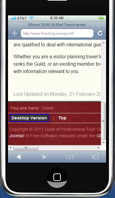
March 9, 2011 at 11:00 pm #380604test site is http://www.firsching.com/guild
dfirsching
- Join date:
- January 2010
- Posts:
- 48
- Downloads:
- 16
- Uploads:
- 2
- Thanks:
- 12
- Thanked:
- 5 times in 3 posts
March 16, 2011 at 11:52 pm #381746<em>@dfirsching 226699 wrote:</em><blockquote>test site is http://www.firsching.com/guild</blockquote>
I am still looking for how to have that link to switch back to mobile mode “at the bottom of the page”
Ninja Lead
Moderator
Ninja Lead
- Join date:
- November 2014
- Posts:
- 16064
- Downloads:
- 310
- Uploads:
- 2864
- Thanks:
- 341
- Thanked:
- 3854 times in 3563 posts
March 17, 2011 at 1:44 am #381756<em>@dfirsching 228189 wrote:</em><blockquote>I am still looking for how to have that link to switch back to mobile mode “at the bottom of the page”</blockquote>
i just checked your site, can you see desktop version and mobile version from screenshot my phone.
ErikThorsen Friend
ErikThorsen
- Join date:
- December 2005
- Posts:
- 1098
- Downloads:
- 0
- Uploads:
- 7
- Thanks:
- 22
- Thanked:
- 10 times in 1 posts
March 18, 2011 at 3:36 pm #382094I am having the same issue. Set up a demo site to test for myself. iphone.erikthorsen.no
The site is just a default joomla 1.6 install and your template and plugins and modules installed. It works fine first time I go to the site but when I click on the “desktop version” I don’t see the “mobile version” link in the footer. Actually I don’t see any footer at all?
Tips? Ideas? Thanks!Arvind Chauhan Moderator
Arvind Chauhan
- Join date:
- September 2014
- Posts:
- 3835
- Downloads:
- 74
- Uploads:
- 92
- Thanks:
- 1240
- Thanked:
- 1334 times in 848 posts
March 19, 2011 at 2:56 am #382177Hi Erik,
Its a bug of T3 and would be fixed soon. >> http://pm.joomlart.com/browse/JAECPLGTIIIJOOMLAIVI-107
Arvind
dfirsching
- Join date:
- January 2010
- Posts:
- 48
- Downloads:
- 16
- Uploads:
- 2
- Thanks:
- 12
- Thanked:
- 5 times in 3 posts
May 6, 2011 at 8:53 pm #390175Ha! The screenshots from your phone that showed the link in the footer — That is the workaround I put in there. I had thought the template was supposed to provide a link or otherwise handle the switch automatically!
cgc0202 Friend
cgc0202
- Join date:
- August 2007
- Posts:
- 2244
- Downloads:
- 0
- Uploads:
- 3
- Thanks:
- 206
- Thanked:
- 262 times in 1 posts
May 7, 2011 at 11:12 pm #390264<em>@Hung Dinh 174456 wrote:</em><blockquote>In the 1st place, we had planned to support mobile view switcher while in desktop mode but after searching all big site, such options are not offered then we withdraw the option. And we do see that had been a good choice. Why don’t we have to fixed mobile view so it can well displayed in desktop mode? It is like trying putting 4 wheels to a boat which never run on the road 🙂
Thanks, this is what we have been doing in upcoming T3 version: T3 version 2.0
Yes, you can do this by opening the main.php file (or even header.php, footer.php) in
layoutsblockshandheld add add more modules loadsThat while we provide option switch to standard mode if user find it more comfortable browsing in desktop mode</blockquote>
Hung,
How well does the mobile work with Teline IV Joomla 1.6? Or Joomla 1.5?
The sanbox version I was experimenting with for Teline IV was nice with iPads. It was terrible with both the Xoom and the Samsung Galaxy. And very slow if it loaded at all. I did it only once for the latter two in Verizon demos. They were kind of slow so I did not pursue them any further.
I did not even try it with the iPhone because there are issues that up to now have not been resolved with Teline IV. It is a perspective or a matter of preference.
Personally, I think just like many companies or publications do with respect to the iOS devices, they create specific Apps for the smaller iPhone/iPod touch and a separate Apps for the iPad.
I am trying to create iBooks right now, with lots of images with text embedded on each image and realized that the area difference between the smaller iPhone/iPod touch vs iPad — especially with iBooks that have lots of images. It is a lot of work but I decided to create separate versions.
I think that is true also with web versions of sites with lots of images.
I was hoping that Joomlart would venture into creation of Joomla based template, along the lines of the layout presentation of the “Daily” by Wall Street Journal that attempts to utilize the unique features of the iPad.
Cornelio
harsa Friend
harsa
- Join date:
- August 2008
- Posts:
- 34
- Downloads:
- 0
- Uploads:
- 3
- Thanks:
- 9
- Thanked:
- 1 times in 1 posts
November 17, 2012 at 9:20 am #473199hi,
i have problem with ja portfolio.. cannot view in iphone.. please try http://maysky.com.mywhat should i do so that people can view thru iphone. by the way, i’m using version 1.5.26
thank you
AuthorPostsThis topic contains 20 replies, has 10 voices, and was last updated by
rdxdude007 11 years, 4 months ago.
We moved to new unified forum. Please post all new support queries in our New Forum


