-
AuthorPosts
-
emicoma Friend
emicoma
- Join date:
- January 2009
- Posts:
- 29
- Downloads:
- 36
- Uploads:
- 1
- Thanked:
- 2 times in 1 posts
April 16, 2013 at 7:34 pm #186821Hi,
Slideshow position modules don’t show up on mobile device. Any idea ?
emicoma
- Join date:
- January 2009
- Posts:
- 29
- Downloads:
- 36
- Uploads:
- 1
- Thanked:
- 2 times in 1 posts
April 16, 2013 at 9:49 pm #490089I did not find where to change that and to get slideshow position on mobile.
it seems to be in purpose on the template, but does not suit me..Saguaros Moderator
Saguaros
- Join date:
- September 2014
- Posts:
- 31405
- Downloads:
- 237
- Uploads:
- 471
- Thanks:
- 845
- Thanked:
- 5346 times in 4964 posts
April 17, 2013 at 10:03 am #490157Hi,
Yes, due to style of this template which hides the slideshow when view in mobile, you can enable it by opening file: /templates/ja_mitius/css/template-responsive.css, you will see these lines of code:
  .ja-slideshow {

    display: none;

  }

  .ja-slideshow .left-slideshow,

  .ja-slideshow .right-slideshow {

    width: 100% !important;

    display: none !important;

  }

  .ja-slideshow .right-slideshow {

    margin-left: 0px !important;

    margin-right: 0 !important;

    display: none !important;

  }
You can remove the display: none so that slideshow can display in mobile view.
Regards
trombonegirl Friend
trombonegirl
- Join date:
- February 2011
- Posts:
- 19
- Downloads:
- 1
- Uploads:
- 7
- Thanks:
- 6
- Thanked:
- 1 times in 1 posts
March 9, 2015 at 4:24 am #562169Hi everyone. My site (beta) is http://karincarlson.net/musicprosmanitoba/index.php. I am trying to get the slideshow and the slidenews position to show up in ALL responsive positions. I commented out the “display: none” lines in the CSS as per the instructions, but it didn’t seem to have any effect. I am looking at the responsive layout in the template, too, and there is no “visibility eye” on the slidenews position, but there is on the slideshow. I’m not really sure what this means. Does this mean that I can’t hide the slidenews position using the layout tool, but I can hide the slideshow (which DOES have the visibility eye)?
Thanks in advance for your help.
Adam M Moderator
Adam M
- Join date:
- May 2014
- Posts:
- 5159
- Downloads:
- 33
- Uploads:
- 66
- Thanks:
- 95
- Thanked:
- 1271 times in 1235 posts
March 10, 2015 at 10:27 am #562398Hi @trombonegirl,
Please open file root_folder/templates/ja_mitius/css/themes/blue/template-responsive.css and remove this code :
.ja-slideshow {

  display: none;

}
then look for this code :
.ja-slideshow .left-slideshow,

.ja-slideshow .right-slideshow {

  width: 100% !important;

  display: none !important;

}
and update as below :
.ja-slideshow .left-slideshow,

.ja-slideshow .right-slideshow {

  width: 100% !important;

}
trombonegirl
- Join date:
- February 2011
- Posts:
- 19
- Downloads:
- 1
- Uploads:
- 7
- Thanks:
- 6
- Thanked:
- 1 times in 1 posts
March 22, 2015 at 3:03 am #564075Thanks for that! I did that, and the module still doesn’t show up. So I tried going into the layout and I changed both module positions to display “none.” Then I assigned the configurable module positions (the spotlight ones) to 2 across, evenly spaced, and assigned one to slideshow and one to slidenews. In the responsive tabs (where you choose “wide” “xtablet” etc.) they are set to show with the “visibility eye” for all.
But this is the part I don’t get: when I go to the site, they don’t show up at all. If I add “?tp=1” after the address, I do see the module. What CSS or template setting could be causing module content to show up when the “none” (tp=1) is “on” but be hidden when you just navigate to the site? The address again is http://musicprosmanitoba.ca
Thanks!!
Adam M
- Join date:
- May 2014
- Posts:
- 5159
- Downloads:
- 33
- Uploads:
- 66
- Thanks:
- 95
- Thanked:
- 1271 times in 1235 posts
March 23, 2015 at 6:21 am #564186Hi @trombonegirl,
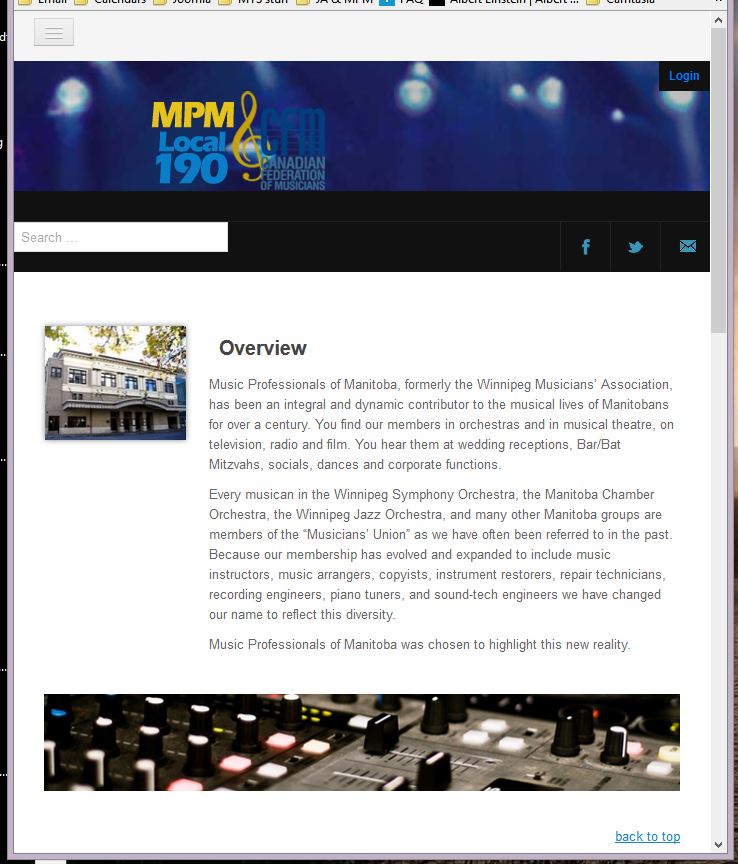
I checked your site but did see the module there, you can check attachment screenshot.
trombonegirl
- Join date:
- February 2011
- Posts:
- 19
- Downloads:
- 1
- Uploads:
- 7
- Thanks:
- 6
- Thanked:
- 1 times in 1 posts
March 23, 2015 at 8:28 pm #564297<em>@Adam M 464898 wrote:</em><blockquote>Hi @trombonegirl,
I checked your site but did see the module there, you can check attachment screenshot.</blockquote>
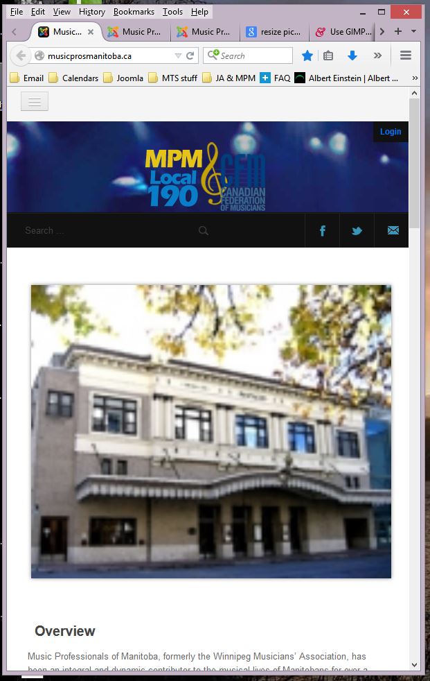
Thanks for that, Adam. The modules (both slidenews and slideshow) disappear at the phone size and the size one up from that. (See attachments.) I want them to be visible in all responsive modes.
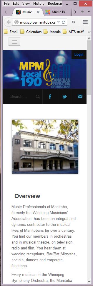
While we’re at it, where is the setting so that the K2 Item image (the building) isn’t ginormous at the one view? Is there a way to put a max width on it or something?
Thanks.
Adam M
- Join date:
- May 2014
- Posts:
- 5159
- Downloads:
- 33
- Uploads:
- 66
- Thanks:
- 95
- Thanked:
- 1271 times in 1235 posts
March 24, 2015 at 4:15 am #564347Hi @trombonegirl,
I checked your site but still see the code there, please provide a temporary back-end account / FTP account via private reply so I can update the code for you.
trombonegirl
- Join date:
- February 2011
- Posts:
- 19
- Downloads:
- 1
- Uploads:
- 7
- Thanks:
- 6
- Thanked:
- 1 times in 1 posts
March 24, 2015 at 5:10 am #564359I did this in a PM earlier, in response to another post.
Adam M
- Join date:
- May 2014
- Posts:
- 5159
- Downloads:
- 33
- Uploads:
- 66
- Thanks:
- 95
- Thanked:
- 1271 times in 1235 posts
March 24, 2015 at 8:51 am #564386Hi @trombonegirl,
I navigate to your site back-end >>> Extensions >>> Template Manager >>> choose your template >>> in tab General >>> temporary disable CSS compression and look like the layout changed (I guess it should look like this, please confirm).
Are your modifying files in root_folder/t3-assets instead of creating custom.css file ? If so please make sure that all changes / update in root_folder/t3-assets will be lost as it’s a temporary folder and you should add custom.css file, then update your changes there.
Please also provide a temporary FTP account via private reply so I can check and update CSS code for you.
trombonegirl
- Join date:
- February 2011
- Posts:
- 19
- Downloads:
- 1
- Uploads:
- 7
- Thanks:
- 6
- Thanked:
- 1 times in 1 posts
March 24, 2015 at 6:12 pm #564460Yes, that is how it’s supposed to look. As I mentioned in another post I switched the layout in the template layout just now, to switch the slideshow and slidenews module positions, and that moved everything back.
Could be that I was modifying the assets folder — I remember doing that at one point — but I have been trying to limit what I’m editing to css/custom.css so good to know that this is the correct place to do the work. Let me know if the credentials I’ve supplied you with are working.
(PS On another thread I said that the z-index didn’t work — it does of course, just took a few minutes to see it. I tried to modify the other thread but keep getting a “site maintenance” error and it won’t open.)
Adam M
- Join date:
- May 2014
- Posts:
- 5159
- Downloads:
- 33
- Uploads:
- 66
- Thanks:
- 95
- Thanked:
- 1271 times in 1235 posts
March 25, 2015 at 4:56 am #564498Hi @trombonegirl,
Yes, if you need to add custom CSS code, please update custom.css file instead. All files in the assets folder are temporary and you will lost it after a period of time of when CSS / JS compression are disable.
trombonegirl
- Join date:
- February 2011
- Posts:
- 19
- Downloads:
- 1
- Uploads:
- 7
- Thanks:
- 6
- Thanked:
- 1 times in 1 posts
March 25, 2015 at 5:23 am #564502<em>@Adam M 465303 wrote:</em><blockquote>Hi @trombonegirl,
Yes, if you need to add custom CSS code, please update custom.css file instead. All files in the assets folder are temporary and you will lost it after a period of time of when CSS / JS compression are disable.</blockquote>
That’s very good information, thank you.
trombonegirl
- Join date:
- February 2011
- Posts:
- 19
- Downloads:
- 1
- Uploads:
- 7
- Thanks:
- 6
- Thanked:
- 1 times in 1 posts
March 25, 2015 at 10:13 pm #564599<em>@Adam M 462545 wrote:</em><blockquote>Hi @trombonegirl,
Please open file root_folder/templates/ja_mitius/css/themes/blue/template-responsive.css and remove this code :
.ja-slideshow {

  display: none;

}
then look for this code :
.ja-slideshow .left-slideshow,

.ja-slideshow .right-slideshow {

  width: 100% !important;

  display: none !important;

}
and update as below :
.ja-slideshow .left-slideshow,

.ja-slideshow .right-slideshow {

  width: 100% !important;

}
</blockquote>Hi Adam. I checked this code again and the changes you requested were made in the cssthemesbluetemplate-responsive.css file. Here’s what’s there now:
  .ja-slideshow .left-slideshow,

  .ja-slideshow .right-slideshow {

    width: 100% !important;

  }

  .ja-slideshow .right-slideshow {

    margin-left: 0px !important;

    margin-right: 0 !important;

   /* display: none !important;*/

  }

  .right-slideshow .main-siderbar {

    margin-left: 30px;

    margin-right: 30px;

    margin-top: 20px;

  }

  .ja-slideshow .right-slideshow .t3-module {

    width: 100%;

  }

  .ja-slideshow .right-slideshow  .ja-contentslider-center {

    width: 260px !important;

  }
The slideshow and slidenews modules are still not showing in smaller screen widths. Is there another property I need to adjust?
AuthorPostsThis topic contains 25 replies, has 7 voices, and was last updated by
 Ninja Lead 7 years, 8 months ago.
We moved to new unified forum. Please post all new support queries in our New Forum
Jump to forum