-
AuthorPosts
-
December 12, 2014 at 5:30 am #203513
Hi
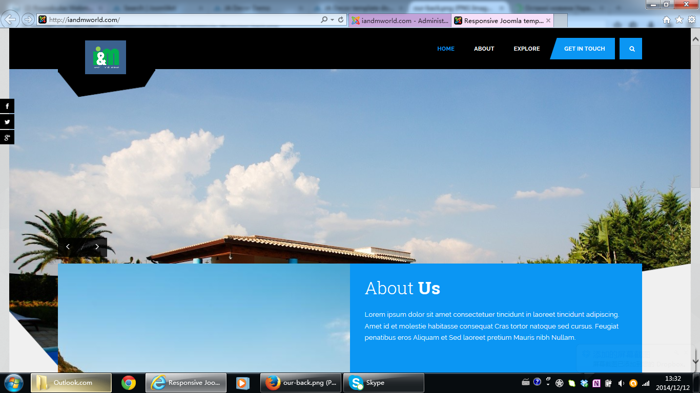
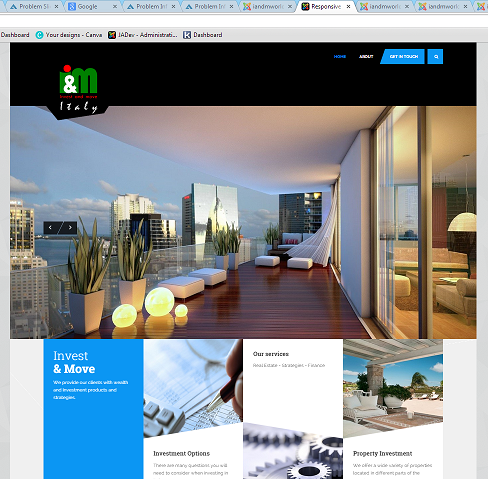
As you can see on picture, slider is blocked by modules underneath.
Logo is very small.
Modules, which are supposed to go in feature – 1 position are not there.
Why such a mess?
ThanksDecember 12, 2014 at 9:16 am #558502The problems appear in IE by the way, Firefox is fine. Not sure about chrome.
December 13, 2014 at 1:11 pm #558584To add more problems on small devices the logo appears very small.
Eragon H Friend
Eragon H
- Join date:
- July 2014
- Posts:
- 468
- Downloads:
- 1
- Uploads:
- 39
- Thanks:
- 5
- Thanked:
- 156 times in 149 posts
December 15, 2014 at 3:20 am #558654Can you provide the temporary admin account, so I can access your site to check the issue
Eragon H
- Join date:
- July 2014
- Posts:
- 468
- Downloads:
- 1
- Uploads:
- 39
- Thanks:
- 5
- Thanked:
- 156 times in 149 posts
December 18, 2014 at 4:26 am #559026I received your PM.
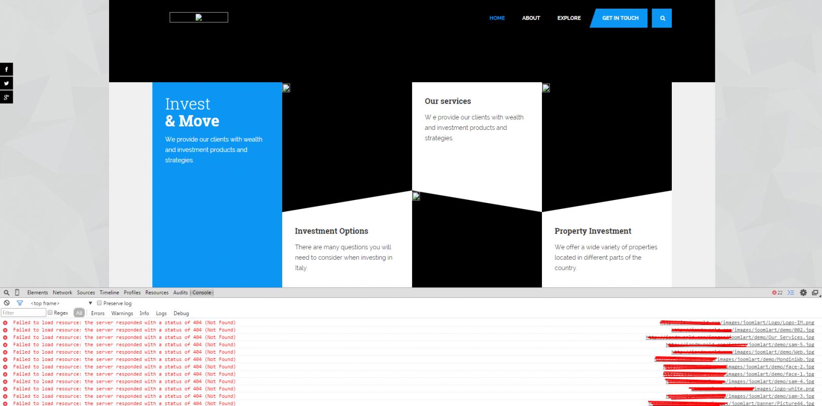
I checked your site and find that all images aren’t loaded >>
Can you recheck this firstly?
December 18, 2014 at 5:13 am #559030am i right in thinking you are doing some work ont he website? coz all many things are not showing up on it.
Eragon H
- Join date:
- July 2014
- Posts:
- 468
- Downloads:
- 1
- Uploads:
- 39
- Thanks:
- 5
- Thanked:
- 156 times in 149 posts
December 18, 2014 at 5:40 am #559032I’ve just logged in your site and haven’t done anything yet. Kindly check my reply above
December 18, 2014 at 10:51 am #559066Im not sure your question has any relevance. You need to open it through IE and see the problems with the layoout. Forget about the pictures.
Eragon H
- Join date:
- July 2014
- Posts:
- 468
- Downloads:
- 1
- Uploads:
- 39
- Thanks:
- 5
- Thanked:
- 156 times in 149 posts
December 19, 2014 at 2:41 am #559117<em>@vmalyshev 458086 wrote:</em><blockquote>Im not sure your question has any relevance. You need to open it through IE and see the problems with the layoout. Forget about the pictures.</blockquote>
How can I fix your logo in mobile without seeing the logo image?
1. I checked your site and there is only 1 module assign to Homepage at “feature-1” position, and it is displaying well
2. I can’t find any difference when viewing your site in Chrome, Firefox and IE
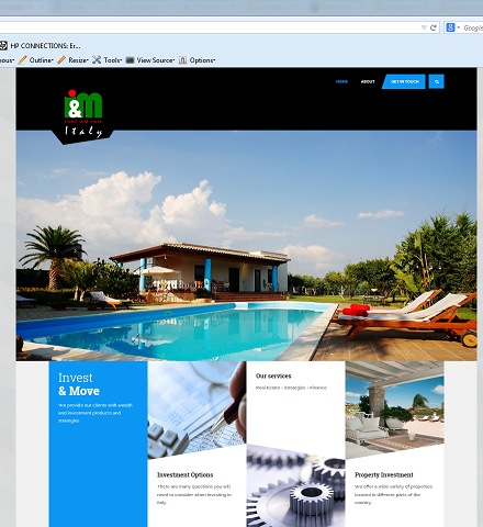
a. IE:
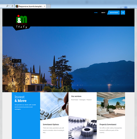
b. Firefox:
c.3. To fixed the problem in mobile/tablet, you can edit the file root/templates/ja_decor/custom.css as below
a. Change the code
From:
 .navbar-header {

    height: 180px;}
To:
@media (min-width: 993px)

{

 .navbar-header {

    height: 180px;}

}
b. Add this code
@media (max-width: 992px)

{

  .logo-image {

    margin-top: -30px !important;}
.logo-image a img {
max-height: 90px !important;}.t3-header {
min-height: 90px !important;}
}
You can change the value to the one you need
Result:
You may need to clear cache (Joomla cache, Browser cache) to see the change

 December 19, 2014 at 2:56 pm #559172
Thanks
my css looks like this
/*Increase the width and height of DECOR Logo*/ .logo-image img { max-width: 450px; max-height: 200px; }
/*slideshow space*/ .t3-slideshow { margin-bottom: 0px;}
@media (min-width: 993px)
{
.navbar-header {
height: 180px;}
}
@media (max-width: 992px)
{
.logo-image {
margin-top: -30px !important;}.logo-image a img {
max-height: 90px !important;}.t3-header {
min-height: 90px !important;}
}Is this what you mean?
December 19, 2014 at 3:02 pm #559173on mobile devices logo looks too small and top bar is too thin. Not like on the pic you sent.
AuthorPostsViewing 13 posts - 1 through 13 (of 13 total)This topic contains 13 replies, has 2 voices, and was last updated by
vmalyshev 10 years, 1 month ago.
We moved to new unified forum. Please post all new support queries in our New Forum
Jump to forum
Slider layout
Viewing 13 posts - 1 through 13 (of 13 total)