-
AuthorPosts
-
fintan Friend
fintan
- Join date:
- October 2011
- Posts:
- 50
- Downloads:
- 4
- Uploads:
- 0
- Thanks:
- 13
- Thanked:
- 2 times in 1 posts
February 18, 2014 at 10:35 am #194912As the title say I would like to show respectivly hide ceratin menu items on mobile devices.
I tried playing with megamenu->menuitem->extra classes and adding:
.hidden-lgto a menu item, but that didn’t seem to work.
Any ideas please?
fintan
- Join date:
- October 2011
- Posts:
- 50
- Downloads:
- 4
- Uploads:
- 0
- Thanks:
- 13
- Thanked:
- 2 times in 1 posts
February 18, 2014 at 3:24 pm #523246Ok. I found something here:
http://getbootstrap.com/2.3.2/scaffolding.html#responsiveI added:
hidden-desktopThat works fine.
to the menu item I wanted visble only on mmobiles and:
visible-desktop
to the menu item I wanted only on desktop version.This still shows the menu in mobile.
Please, any suggestions? so near and yet…..
fintan
- Join date:
- October 2011
- Posts:
- 50
- Downloads:
- 4
- Uploads:
- 0
- Thanks:
- 13
- Thanked:
- 2 times in 1 posts
February 18, 2014 at 3:44 pm #523251Ok I found this:
http://getbootstrap.com/2.3.2/scaffolding.html#responsiveI have two prices menus, so I added:
hidden-desktop
to the one I wanted to see only on mobiles.
This works.I then added:
visible-desktop
to the one I only wanted to see on the desktop.This is still visible on mobile.
Any Ideas, please.
swissa Friend
swissa
- Join date:
- November 2011
- Posts:
- 1955
- Downloads:
- 7
- Uploads:
- 277
- Thanks:
- 175
- Thanked:
- 717 times in 572 posts
February 18, 2014 at 3:59 pm #523253Purity III uses Bootstrap 3 I believe – but I can’t get that to work with the menüs either.
fintan
- Join date:
- October 2011
- Posts:
- 50
- Downloads:
- 4
- Uploads:
- 0
- Thanks:
- 13
- Thanked:
- 2 times in 1 posts
February 18, 2014 at 4:08 pm #523257Right Thanks for the pointer.
I changed the syntax to desktop = lg.
Still doesn’t work here either.
What to do?
Khanh Le Moderator
Khanh Le
- Join date:
- November 2013
- Posts:
- 1884
- Downloads:
- 41
- Uploads:
- 31
- Thanks:
- 44
- Thanked:
- 203 times in 131 posts
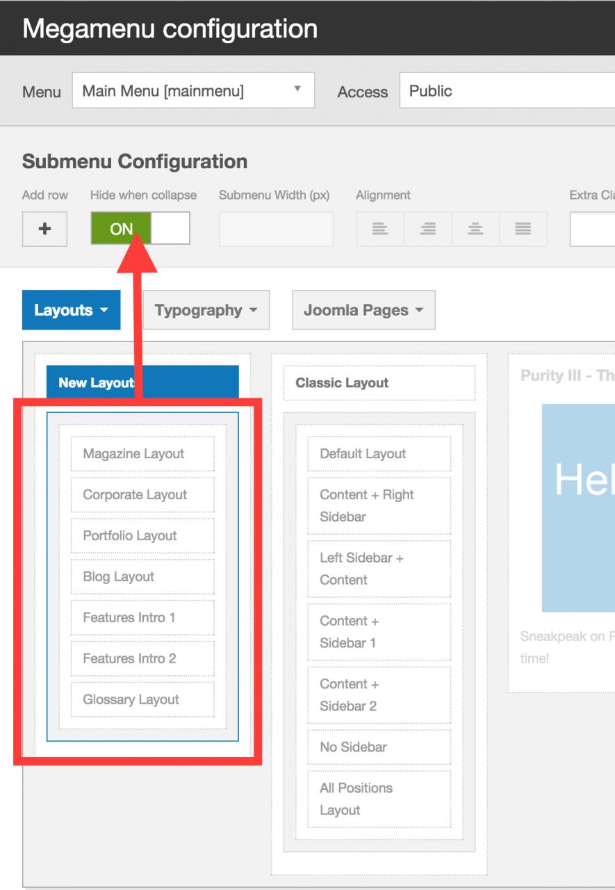
February 19, 2014 at 3:21 am #523318T3 provide an option to show/hide an element for megamenu when the menu is collapsed (Hide when collapse). However, the function doesn’t work on the latest version of T3. The fix will be available in next release of T3.
fintan
- Join date:
- October 2011
- Posts:
- 50
- Downloads:
- 4
- Uploads:
- 0
- Thanks:
- 13
- Thanked:
- 2 times in 1 posts
February 19, 2014 at 6:22 am #523343Ah.. and when will that be? Do you know?
Khanh Le
- Join date:
- November 2013
- Posts:
- 1884
- Downloads:
- 41
- Uploads:
- 31
- Thanks:
- 44
- Thanked:
- 203 times in 131 posts
February 19, 2014 at 7:00 am #523346I’ve made a commit to fix the issue on github here:
https://github.com/t3framework/t3/commit/61fbea8a490fec3cc9103fce7adfc8da784af19dYou can update this file to fix the issue:
https://github.com/t3framework/t3/blob/master/source/plg_system_t3/base-bs3/js/nav-collapse.jsfintan
- Join date:
- October 2011
- Posts:
- 50
- Downloads:
- 4
- Uploads:
- 0
- Thanks:
- 13
- Thanked:
- 2 times in 1 posts
February 19, 2014 at 8:16 am #523362Great thanks, that works a treat, except for on the dolphin browser on android 4.2.2. Here it breaks the page.
Default browser is fine. I’ll try it on firefox just to check.
Edit: works of firefox as well.
1 user says Thank You to fintan for this useful post
April 3, 2015 at 2:52 pm #565658Template Information
Name:Purity III
Version:1.1.2Framework Information
Name:T3
FrameworkVersion:2.4.8running on the above specs but I still can’t get it working.. the “Hide when collapse” button is enabled for certain menu item but it is still showing on the smaller screens.
 Ninja Lead
Moderator
Ninja Lead
Moderator
Ninja Lead
- Join date:
- November 2014
- Posts:
- 16064
- Downloads:
- 310
- Uploads:
- 2864
- Thanks:
- 341
- Thanked:
- 3854 times in 3563 posts
April 6, 2015 at 10:23 am #565903I used Purity III and T3 framework version as you mentioned but I could not duplicate the problem at my end
+ Step 1:
+ Step 2:
+ Step 3:
 April 14, 2015 at 7:15 am #566872
Hi I tried again and it works, but now I have another question – how to hide selected parent menu item in mobile environment?
Ninja Lead
Moderator
Ninja Lead
- Join date:
- November 2014
- Posts:
- 16064
- Downloads:
- 310
- Uploads:
- 2864
- Thanks:
- 341
- Thanked:
- 3854 times in 3563 posts
April 15, 2015 at 4:03 am #566986<em>@rzrz 468484 wrote:</em><blockquote>Hi I tried again and it works, but now I have another question – how to hide selected parent menu item in mobile environment?</blockquote>
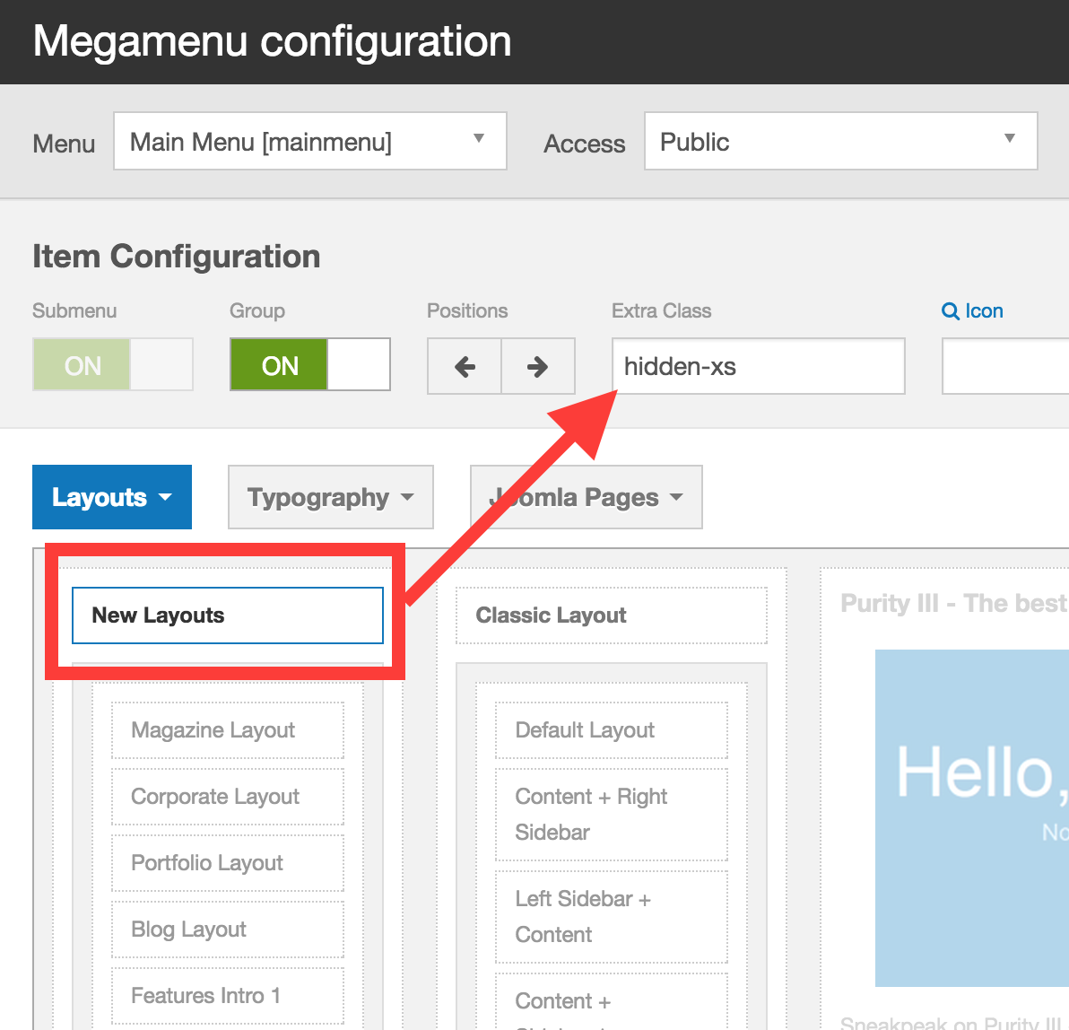
You can add hidden-xs css class into Extra Class, see the screenshot
April 16, 2015 at 3:29 am #567153hi thanks again and is it possible to hide parent menu item and display child menu item at the same time in mobile?
Ninja Lead
Moderator
Ninja Lead
- Join date:
- November 2014
- Posts:
- 16064
- Downloads:
- 310
- Uploads:
- 2864
- Thanks:
- 341
- Thanked:
- 3854 times in 3563 posts
April 16, 2015 at 6:02 am #567184<em>@rzrz 468835 wrote:</em><blockquote>hi thanks again and is it possible to hide parent menu item and display child menu item at the same time in mobile?</blockquote>
How can you touch child menu item without parent menu?
AuthorPostsThis topic contains 17 replies, has 5 voices, and was last updated by
Ninja Lead 9 years ago.We moved to new unified forum. Please post all new support queries in our New Forum
Jump to forum

