-
AuthorPosts
-
unvacancier Friend
unvacancier
- Join date:
- May 2013
- Posts:
- 148
- Downloads:
- 9
- Uploads:
- 69
- Thanks:
- 18
- Thanked:
- 3 times in 1 posts
March 11, 2014 at 9:16 am #195677Hello,
I have an problem with the template :
Internet Explorer 8.0.6601.18702 (Same with IE 11)
IE 11 – 1920*1080 (24″ screen) and IE 8 – 1680*1050 (22″ screen) : it’s displayed in columns
IE 8 – 1280*1024 (17″ screen) : It’s displayed right
How is it possible to display like the 1280*1024 ?
IE and Firefox not displayed the same screen :
FF:
IE:


 Ninja Lead
Moderator
Ninja Lead
Moderator
Ninja Lead
- Join date:
- November 2014
- Posts:
- 16064
- Downloads:
- 310
- Uploads:
- 2864
- Thanks:
- 341
- Thanked:
- 3854 times in 3563 posts
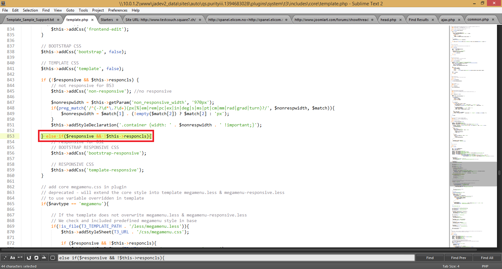
March 12, 2014 at 10:15 am #526452To fix the responsive off but resized issue as well as to display like the 1280*1024 layout, you can follow these steps:
+ Open the plugins/system/t3/includes/core/template.php file
Change
else if($responsive && !$this->responcls){To
else if($responsive){+ Open the templates/ja_mitius/less/variables.less file
Change
// Default 940px grid

@T3gridWidth:             940px;  // T3 add. For non-responsive layout.
To
// Default 940px grid
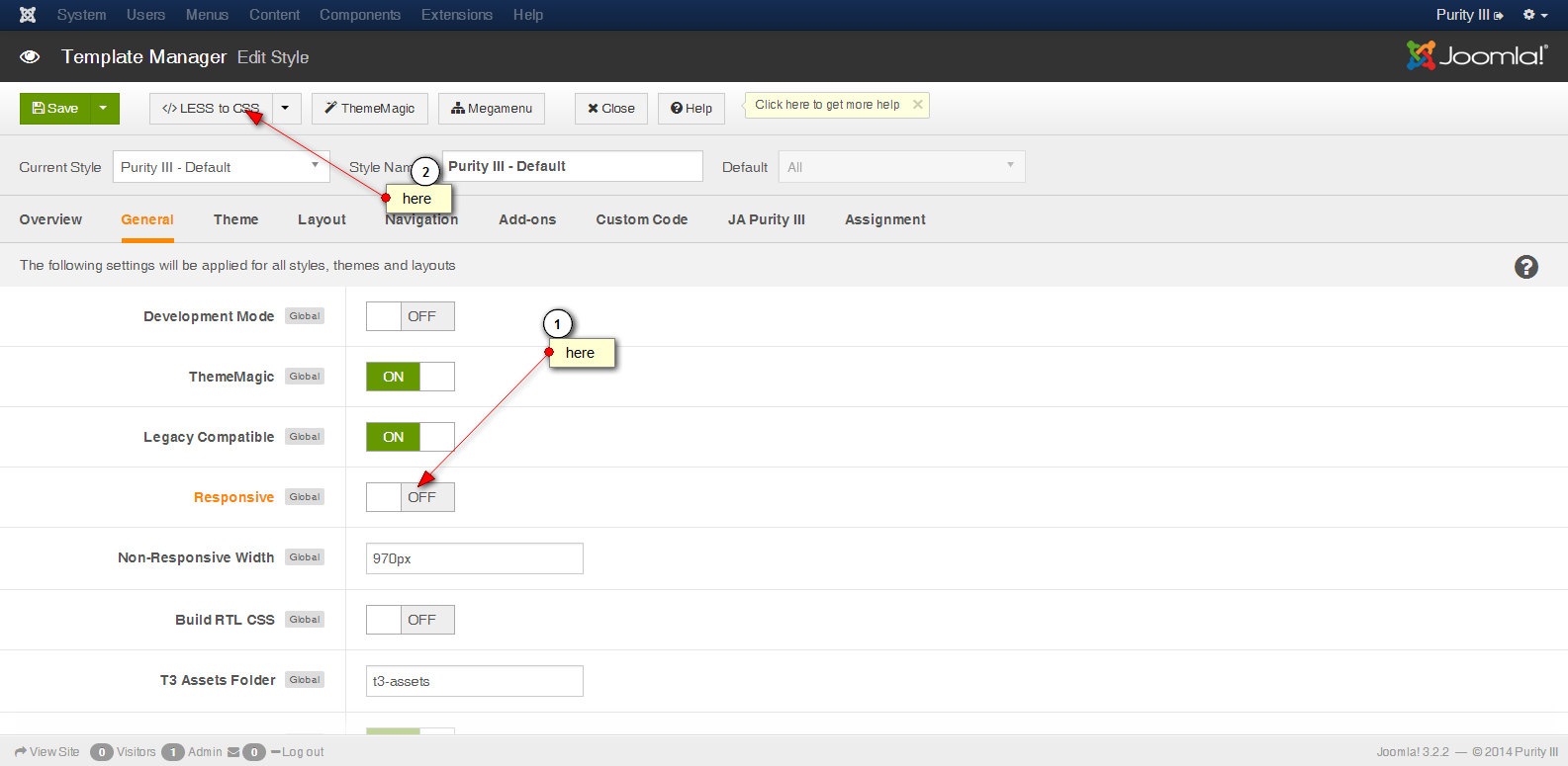
@T3gridWidth: 1280px; // T3 add. For non-responsive layout.+ Go to Admin site -> Extensions -> Template Manager -> JA Mitius – Default -> click Responsive: OFF and click compile LESS to CSS button, see the screenshot
unvacancier
- Join date:
- May 2013
- Posts:
- 148
- Downloads:
- 9
- Uploads:
- 69
- Thanks:
- 18
- Thanked:
- 3 times in 1 posts
March 12, 2014 at 11:21 am #526466Hello,
I’ve found if($responsive && !$this->responcls){ but not else if($responsive && !$this->responcls){
It’s not MITIUS but purity III
, i think it’s the same for this two templates.But i can’t found
 // Default 940px grid

@T3gridWidth:             940px;  // T3 add. For non-responsive layout.
Thanks for your reply.
in variables.less i have only this :
// Container sizes

// --------------------------------------------------
// Small screen / tablet
@container-tablet: ((720px + @grid-gutter-width));
@container-sm: @container-tablet;// Medium screen / desktop
@container-desktop: ((940px + @grid-gutter-width));
@container-md: @container-desktop;// Large screen / wide desktop
@container-large-desktop: ((1140px + @grid-gutter-width));
@container-lg: @container-large-desktop;unvacancier
- Join date:
- May 2013
- Posts:
- 148
- Downloads:
- 9
- Uploads:
- 69
- Thanks:
- 18
- Thanked:
- 3 times in 1 posts
March 12, 2014 at 2:06 pm #526481I’ve finally found for the difference between internet explorer and firefox. By default on intranet website IE use the display compatibility. When i turn it off the website is OK.
I just need now to disable the automatic resized.
Thanks.
Ninja Lead
Moderator
Ninja Lead
- Join date:
- November 2014
- Posts:
- 16064
- Downloads:
- 310
- Uploads:
- 2864
- Thanks:
- 341
- Thanked:
- 3854 times in 3563 posts
March 13, 2014 at 4:09 am #526538Glad that you figured it out.
To disable the automatic resized, you can edit this file: plugins/system/t3/includes/core/template.php
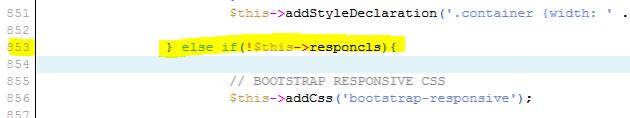
Line 853
Change:
else if($responsive && !$this->responcls){To:
else if($responsive){See the screenshot
If you still need help on this, please put your site LIVE and pm me URL, admin and FTP account, I will help you out.
unvacancier
- Join date:
- May 2013
- Posts:
- 148
- Downloads:
- 9
- Uploads:
- 69
- Thanks:
- 18
- Thanked:
- 3 times in 1 posts
March 13, 2014 at 1:58 pm #526603Thanks for your support, i only have this :
When i change for else if($responsive){ the website is a white screen.
Ninja Lead
Moderator
Ninja Lead
- Join date:
- November 2014
- Posts:
- 16064
- Downloads:
- 310
- Uploads:
- 2864
- Thanks:
- 341
- Thanked:
- 3854 times in 3563 posts
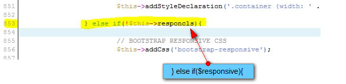
March 14, 2014 at 4:08 am #526667Your screenshot reveals that the change is not correct. It should be:
For your convenience, I attach modified file here, simply extract and copy it into plugins/system/t3/includes/core/ folder.
unvacancier
- Join date:
- May 2013
- Posts:
- 148
- Downloads:
- 9
- Uploads:
- 69
- Thanks:
- 18
- Thanked:
- 3 times in 1 posts
March 14, 2014 at 8:06 am #526701Thanks for reply.
It’s the same, i’d replaced template.php but it resized automatically.

 Ninja Lead
Moderator
Ninja Lead
Moderator
Ninja Lead
- Join date:
- November 2014
- Posts:
- 16064
- Downloads:
- 310
- Uploads:
- 2864
- Thanks:
- 341
- Thanked:
- 3854 times in 3563 posts
March 17, 2014 at 4:31 am #526876I would need to take a closer look at your site. Please pm me URL, admin and FTP credentials of your site. I will help you out.
-
AuthorPosts
Viewing 9 posts - 1 through 9 (of 9 total)This topic contains 9 replies, has 2 voices, and was last updated by
Ninja Lead 10 years, 1 month ago.We moved to new unified forum. Please post all new support queries in our New Forum
Jump to forum
Responsive OFF but resized
Viewing 9 posts - 1 through 9 (of 9 total)