-
AuthorPosts
-
Fred Tep Friend
Fred Tep
- Join date:
- September 2014
- Posts:
- 76
- Downloads:
- 46
- Uploads:
- 7
- Thanks:
- 15
- Thanked:
- 2 times in 1 posts
May 22, 2013 at 4:22 pm #187691Hi,
I’m just wondering if there is any way to have a responsive googlemap on my template (I did try on the JA onepage and the JA elastica). I’d like it to resize as my windows does. I’ve tried to put a width of 100% on the plugin but it did not work.
I think it would be really good to have that feature.
Thanks for the plugin anyway. It still does the job.
Fred
Saguaros Moderator
Saguaros
- Join date:
- September 2014
- Posts:
- 31405
- Downloads:
- 237
- Uploads:
- 471
- Thanks:
- 845
- Thanked:
- 5346 times in 4964 posts
June 6, 2013 at 2:24 am #494940Hi Fred,
Apologies for this late response, somehow I missed this thread. If you still need help, you can follow my suggestion:
– Create a new custom HTML module to display map in frontend.
– In advanced option of this new module > add a class suffix named ‘ map; for example (remember to add a space before class name)
– Add this css rule for this class into css file of template, I assume you use JA Elastica and it should be file: /templates/ja_elastica/css/template.css
/* Map */

.map .map-container {

  max-width: 100% !important;

  width: 100% !important;

}
– Clean all cache once done.
Regards
2 users say Thank You to Saguaros for this useful post
Fred Tep
- Join date:
- September 2014
- Posts:
- 76
- Downloads:
- 46
- Uploads:
- 7
- Thanks:
- 15
- Thanked:
- 2 times in 1 posts
June 10, 2013 at 10:35 am #495320It’s working like a charm.
Thanks a lotSaguaros
- Join date:
- September 2014
- Posts:
- 31405
- Downloads:
- 237
- Uploads:
- 471
- Thanks:
- 845
- Thanked:
- 5346 times in 4964 posts
June 10, 2013 at 10:38 am #495321You are welcome :laugh::laugh:
November 12, 2013 at 1:53 pm #511985Hi,
I am reopening this post because I have a similar question.
On my site I am using multiple maps within several articles and want the maps to be responsive. To achieve this I created the following override based on the code posted in this thread.
.map-container*{max-width:*100%*!important;*width:*100%*!important;}
The override works, the maps become responsive, but the map don´t stay centered when the size change. can you help me with this situation.
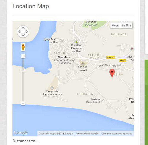
I placed an image to better illustrate My question.
tfosnom Friend
tfosnom
- Join date:
- October 2010
- Posts:
- 742
- Downloads:
- 0
- Uploads:
- 31
- Thanks:
- 145
- Thanked:
- 200 times in 94 posts
November 12, 2013 at 2:07 pm #511987<em>@nunoc 397573 wrote:</em><blockquote>Hi,
I am reopening this post because I have a similar question.
On my site I am using multiple maps within several articles and want the maps to be responsive. To achieve this I created the following override based on the code posted in this thread.
.map-container*{max-width:*100%*!important;*width:*100%*!important;}
The override works, the maps become responsive, but the map don´t stay centered when the size change. can you help me with this situation.
I placed an image to better illustrate My question.</blockquote>
not sure but I’d try to add center to your overide code prolly after the last declaration call?
.map-container*{max-width:*100%*!important;*width:*100%*!important; center }or look and see if the template already has a .center declaration present, if so just prefix your overide code with
.center
.map-container*{max-width:*100%*!important;*width:*100%*!important;}Blessings Shannon
1 user says Thank You to tfosnom for this useful post
Saguaros
- Join date:
- September 2014
- Posts:
- 31405
- Downloads:
- 237
- Uploads:
- 471
- Thanks:
- 845
- Thanked:
- 5346 times in 4964 posts
November 13, 2013 at 4:06 pm #512119My site is still under development and so offline.
I can send you a pm with the information needed to access the site?
November 13, 2013 at 4:24 pm #512122Hí tfosnom,
Both your suggestions do not solve the problem.
<em>@tfosnom 397576 wrote:</em><blockquote>
.map-container*{max-width:*100%*!important;*width:*100%*!important; center }or look and see if the template already has a .center declaration present, if so just prefix your overide code with
.center
.map-container*{max-width:*100%*!important;*width:*100%*!important;}
</blockquote>But thanks for your suggestion.
Saguaros
- Join date:
- September 2014
- Posts:
- 31405
- Downloads:
- 237
- Uploads:
- 471
- Thanks:
- 845
- Thanked:
- 5346 times in 4964 posts
November 14, 2013 at 2:21 pm #512219<blockquote>I can send you a pm with the information needed to access the site?</blockquote>
Yes, you can send me login info 🙂
 woluweb
Friend
woluweb
Friend
woluweb
- Join date:
- October 2012
- Posts:
- 196
- Downloads:
- 18
- Uploads:
- 69
- Thanks:
- 68
- Thanked:
- 31 times in 3 posts
October 1, 2014 at 2:30 pm #551362<em>@nunoc 397573 wrote:</em><blockquote>Hi,
The override works, the maps become responsive, but the map don´t stay centered when the size change. can you help me with this situation.
I placed an image to better illustrate My question.</blockquote>
Hi Nunoc,
I have just tested Saguaros’ solution and it works fine.
Now I read your problem : you resize and your map is not centered.
Well, *if* if have resized your browser, this is normal behaviour : you still have to refresh the page and it should be perfectly centered.
But so this means that somebody opening your page on, say, a smartphone, will have it centered immediately.
But resizing your browser is not sufficient to make it center “live” : just refresh and check.Yours,
Marc
1 user says Thank You to woluweb for this useful post
AuthorPostsViewing 11 posts - 1 through 11 (of 11 total)This topic contains 11 replies, has 5 voices, and was last updated by
woluweb 9 years, 7 months ago.We moved to new unified forum. Please post all new support queries in our New Forum
Responsive google map
Viewing 11 posts - 1 through 11 (of 11 total)