

-
AuthorPosts
-
December 12, 2016 at 5:32 pm #993907
Hello,
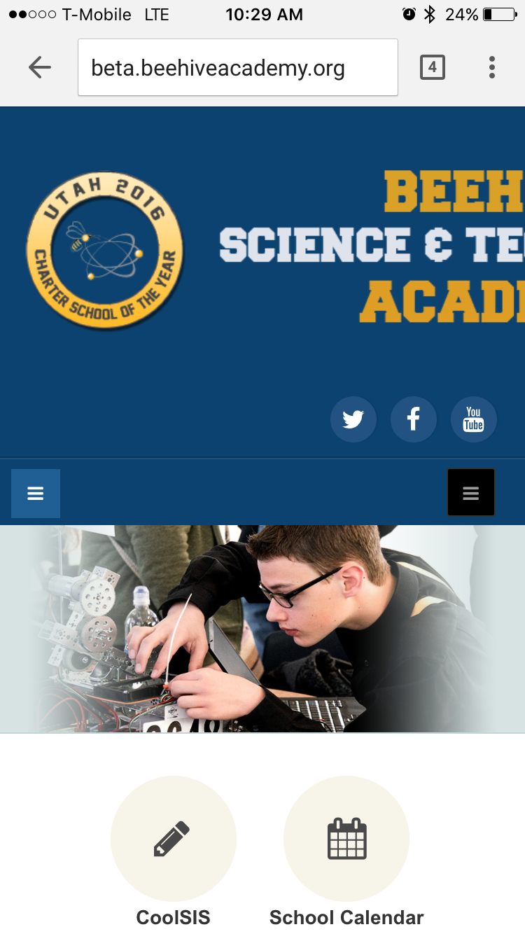
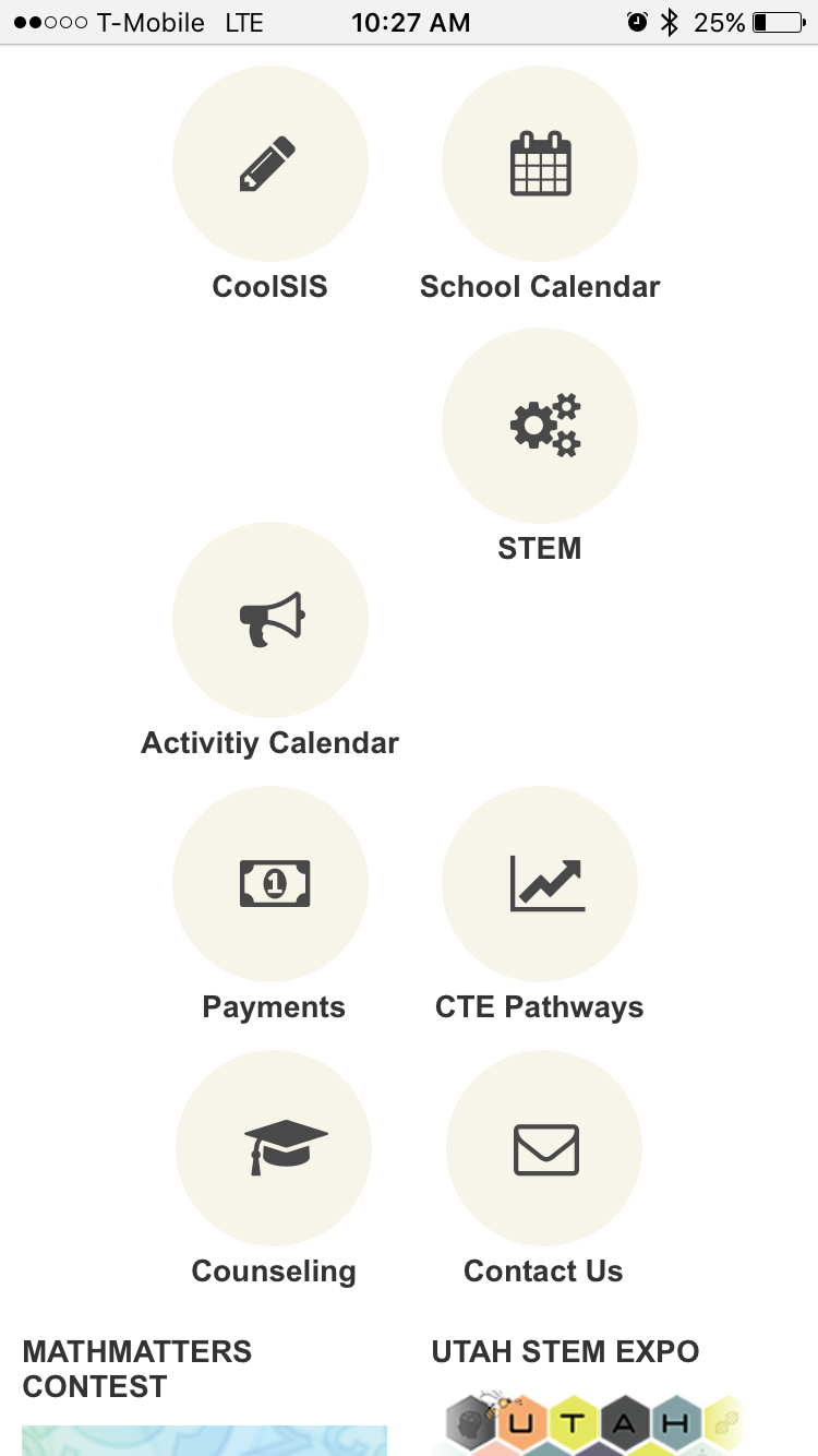
Everything on the homepage looks good on desktop view. However, especially department icons do not look organized on mobile devices. What should I do? I am attaching both views here.
Also, I added a custom code to make the logo larger. However, it is not being resized on the responsive view. How can I fix it?


 Pankaj Sharma
Moderator
Pankaj Sharma
Moderator
Pankaj Sharma
- Join date:
- February 2015
- Posts:
- 24589
- Downloads:
- 144
- Uploads:
- 202
- Thanks:
- 127
- Thanked:
- 4196 times in 4019 posts
December 13, 2016 at 3:23 am #994059Hi
First remove the custom code applied for logo width .
Now
Open template folder/tpls/blocks/header.php file<div class="col-xs-12 col-sm-6 <?php echo $logosize ?> logo">replace it with
<div class="col-xs-12 col-sm-8 <?php echo $logosize ?> logo">After this step
Find<?php if ($headright): ?> <div class="col-xs-12 col-sm-6">replace it with
    <?php if ($headright): ?>
                    <div class="col-xs-12 col-sm-4">
save and check logo size .
Now go to /css/custom.css file template folder . create it if its not present add below code
@media (max-width:767px) { .t3-spotlight-1 .t3-module {min-height: 225px;}
.department-list ul.department-list li {float:left!important;}

}
save and check .
December 13, 2016 at 5:36 pm #994373Hello,
That worked very well. Thank you!
I need the logo to be larger though. How do I change the size?
By the way, I had
<div class="col-xs-12 <?php echo $logosize ?> logo">not
<div class="col-xs-12 col-sm-6 <?php echo $logosize ?> logo">in template folder/tpls/blocks/header.php. I am not sure why. I changed this line the way you told me. The logo did get little larger, but I need it to be larger than it is now.
Pankaj Sharma
Moderator
Pankaj Sharma
- Join date:
- February 2015
- Posts:
- 24589
- Downloads:
- 144
- Uploads:
- 202
- Thanks:
- 127
- Thanked:
- 4196 times in 4019 posts
December 13, 2016 at 10:36 pm #994416Hi
Change logo size to
<div class="col-xs-12 col-sm-9 <?php echo $logosize ?> logo">And search block to col-md-3 .
Total would be 12 so it fit in one row.December 14, 2016 at 6:03 pm #994672It is still not looking the way I want. I need the logo to be larger, and social media icons and "call us" modules to be aligned to the right. I am attaching two images, one for what I currently have, and second one for what I want. How do I do that?
I also need to remove the "sidebar" on the homepage. I already removed it from the "Article Layout" style and it works. I removed it from the "Blue" Style that I use for the homepage, but it is still there. What am I missing?
 Pankaj Sharma
Moderator
Pankaj Sharma
Moderator
Pankaj Sharma
- Join date:
- February 2015
- Posts:
- 24589
- Downloads:
- 144
- Uploads:
- 202
- Thanks:
- 127
- Thanked:
- 4196 times in 4019 posts
December 15, 2016 at 1:54 am #994710Hi
You have mistakes in the header.php file.
Kindly change it to col-sm-9, It will look like this: http://prntscr.com/djksnw
For different topics , will you be so kind to open separate thread with all details of issue .
It also helps other user to search same topics .January 4, 2017 at 5:07 pm #999591Hello,
I cannot see your screenshot. So I am not sure what you mean. Can you please update it?
Pankaj Sharma
Moderator
Pankaj Sharma
- Join date:
- February 2015
- Posts:
- 24589
- Downloads:
- 144
- Uploads:
- 202
- Thanks:
- 127
- Thanked:
- 4196 times in 4019 posts
January 5, 2017 at 2:13 am #999709Hi
I mean the logo size is showing low . Open header.php file and change the logo column size.
If you will open my screenshot you will see the logo col size.
Or give me a temp super user login of site via Private reply i will fix it for you.Pankaj Sharma
Moderator
Pankaj Sharma
- Join date:
- February 2015
- Posts:
- 24589
- Downloads:
- 144
- Uploads:
- 202
- Thanks:
- 127
- Thanked:
- 4196 times in 4019 posts
January 5, 2017 at 2:15 am #999710Hi
I mean the logo size is showing low . Open header.php file and change the logo column size.
If you will open my screenshot you will see the logo col size.
Or give me a temp super user login of site via Private reply i will fix it for you.-
AuthorPosts
Viewing 9 posts - 1 through 9 (of 9 total)This topic contains 8 replies, has 2 voices, and was last updated by
Pankaj Sharma 8 years ago.We moved to new unified forum. Please post all new support queries in our New Forum
Jump to forum
Problems with responsive view (Department icons and Website Logo)
Viewing 9 posts - 1 through 9 (of 9 total)