-
AuthorPosts
-
puntje Friend
puntje
- Join date:
- April 2014
- Posts:
- 239
- Downloads:
- 29
- Uploads:
- 119
- Thanks:
- 48
- Thanked:
- 4 times in 3 posts
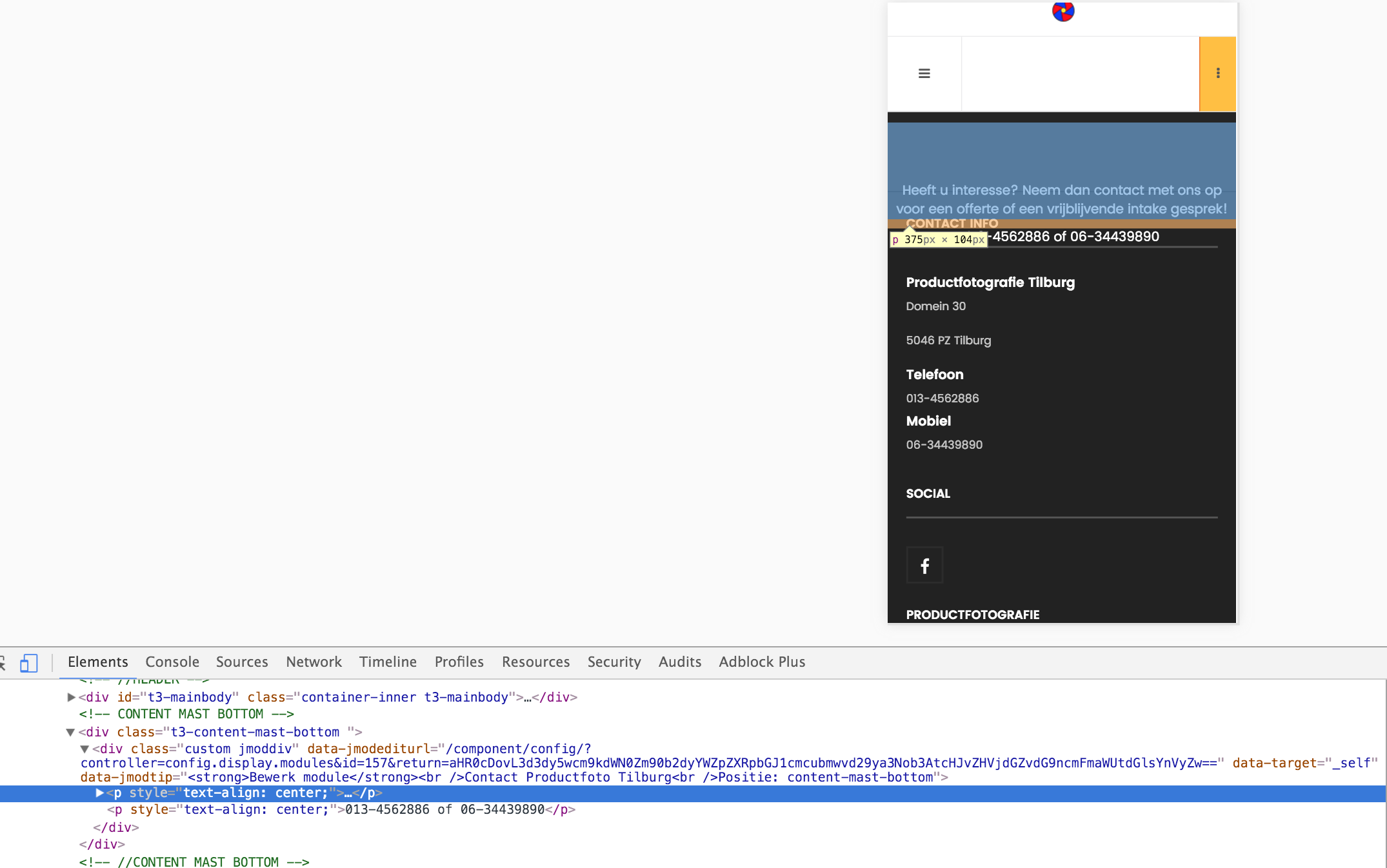
March 29, 2016 at 8:18 am #906057I have trouble with the layout, see attachments
- The sidebar yellow is not scrolling on iPhone and is not aligned in center and not closing on the iPhone
- The copyright is not showing all. I miss the line or logo or a part of it
-
Content-bottom is not aligned wright on the iPhone, it is also on the footer
- Can i make different kind of spotlights with there own css. Know they are the same
- With tabs can i make a custom html, just a question

 Ninja Lead
Moderator
Ninja Lead
Moderator
Ninja Lead
- Join date:
- November 2014
- Posts:
- 16064
- Downloads:
- 310
- Uploads:
- 2864
- Thanks:
- 341
- Thanked:
- 3854 times in 3563 posts
March 30, 2016 at 3:47 am #906483Hi,
You can find my answer to your request.
1) It does not work with responsive on the mobile layout because the module id: 137 (custom html module) does not support the responsive layout and you have to make module id: 137 to support responsive layout first
2) You can create the footer module and assign it to footer position
3) Please have a look at the screenshot, you will see the text in Content-bottom is forcing align center.
4) With spotlight postion, you only change the width on that but all css styles and effect are the same.
5) You can give the screenshot of what you are trying to do.
Regards
puntje
- Join date:
- April 2014
- Posts:
- 239
- Downloads:
- 29
- Uploads:
- 119
- Thanks:
- 48
- Thanked:
- 4 times in 3 posts
April 4, 2016 at 12:30 am #908675This reply has been marked as private.Ninja Lead
Moderator
Ninja Lead
- Join date:
- November 2014
- Posts:
- 16064
- Downloads:
- 310
- Uploads:
- 2864
- Thanks:
- 341
- Thanked:
- 3854 times in 3563 posts
April 4, 2016 at 7:14 am #908834The problem of your site came from your custom work on your site and you need to fix it as my tweak
Open templates/ja_moviemax/css/custom.css file
find and change
.btn-sidebar.open {
  position: fixed;
  right: 400px;
  top: 0;
  background-color: #ffbf43;
}

.t3-big-sidebar > .inner {
    background-color: #ffbf43;
    color: #000;
    height: 100vh;
    position: fixed;
    top: 0;
    overflow: none;
    width: 400px;
    padding-left:5px;
    padding-right:5px;
}
to
.btn-sidebar.open {
  position: fixed;
  top: 0;
  background-color: #ffbf43;
}

.t3-big-sidebar > .inner {
    background-color: #ffbf43;
    color: #000;
    height: 100vh;
    position: fixed;
    top: 0;
    overflow: none;
    padding-left:5px;
    padding-right:5px;
}
Hope it helps
puntje
- Join date:
- April 2014
- Posts:
- 239
- Downloads:
- 29
- Uploads:
- 119
- Thanks:
- 48
- Thanked:
- 4 times in 3 posts
April 4, 2016 at 11:08 am #908936This reply has been marked as private.puntje
- Join date:
- April 2014
- Posts:
- 239
- Downloads:
- 29
- Uploads:
- 119
- Thanks:
- 48
- Thanked:
- 4 times in 3 posts
April 4, 2016 at 11:11 am #908954This reply has been marked as private.puntje
- Join date:
- April 2014
- Posts:
- 239
- Downloads:
- 29
- Uploads:
- 119
- Thanks:
- 48
- Thanked:
- 4 times in 3 posts
April 4, 2016 at 11:25 pm #909175This reply has been marked as private.Ninja Lead
Moderator
Ninja Lead
- Join date:
- November 2014
- Posts:
- 16064
- Downloads:
- 310
- Uploads:
- 2864
- Thanks:
- 341
- Thanked:
- 3854 times in 3563 posts
April 5, 2016 at 3:13 pm #909708Can you give me the link to see that problem on your site? I will help you to check it
puntje
- Join date:
- April 2014
- Posts:
- 239
- Downloads:
- 29
- Uploads:
- 119
- Thanks:
- 48
- Thanked:
- 4 times in 3 posts
April 5, 2016 at 3:23 pm #909724This reply has been marked as private.Ninja Lead
Moderator
Ninja Lead
- Join date:
- November 2014
- Posts:
- 16064
- Downloads:
- 310
- Uploads:
- 2864
- Thanks:
- 341
- Thanked:
- 3854 times in 3563 posts
April 6, 2016 at 3:49 am #909944You can use this way to fix this bug
Open templates/ja_moviemax/css/custom.css file and add the CSS style
@media  (max-width: 767px) {
    .t3-footer .t3-spotlight {
        display: none !important;
    }
    .t3-footer {
        margin-top: 70px !important;
        margin-bottom: 20px !important;
    }
}
1 user says Thank You to Ninja Lead for this useful post
AuthorPostsViewing 10 posts - 1 through 10 (of 10 total)This topic contains 9 replies, has 2 voices, and was last updated by
Ninja Lead 8 years, 10 months ago.We moved to new unified forum. Please post all new support queries in our New Forum
Jump to forum
melih