-
AuthorPosts
-
jacqueline stott Friend
jacqueline stott
- Join date:
- September 2014
- Posts:
- 35
- Downloads:
- 0
- Uploads:
- 5
- Thanks:
- 3
- Thanked:
- 1 times in 1 posts
July 5, 2013 at 8:58 am #188714Hi I have a problem displaying the desktop layout on ipad and iphone JZite – Joomla 2.5, the site diplays properly on android and fits on screen but gets cut on iphone and ipad (actual size) – please help…
 Ninja Lead
Moderator
Ninja Lead
Moderator
Ninja Lead
- Join date:
- November 2014
- Posts:
- 16064
- Downloads:
- 310
- Uploads:
- 2864
- Thanks:
- 341
- Thanked:
- 3854 times in 3563 posts
July 8, 2013 at 9:17 am #498257So that I can take a look and try to assist, please provide the url of the site you’re working on
jacqueline stott
- Join date:
- September 2014
- Posts:
- 35
- Downloads:
- 0
- Uploads:
- 5
- Thanks:
- 3
- Thanked:
- 1 times in 1 posts
July 8, 2013 at 9:33 am #498260Hi can i send to a private email address?
Ninja Lead
Moderator
Ninja Lead
- Join date:
- November 2014
- Posts:
- 16064
- Downloads:
- 310
- Uploads:
- 2864
- Thanks:
- 341
- Thanked:
- 3854 times in 3563 posts
July 8, 2013 at 10:06 am #498264<em>@jacquis 379771 wrote:</em><blockquote>Hi can i send to a private email address?</blockquote>
Yes, I have received your pm.
I quickly checked the problem on your site and see css responsive on JA Zite Template doesn’t include on your site. You can fix it as my suggestion below:
Open templates/ja_zite/etc/layouts/default.xml file
From
<stylesheets>

<file media="only screen and (min-width:980px) and (max-width: 1235px)">css/layout-normal.css</file>

</stylesheets>
Change to
<stylesheets>

<file media="only screen and (max-width:719px)">css/layout-mobile.css</file>

<file media="only screen and (max-width:479px)">css/layout-mobile-port.css</file>

<file media="only screen and (min-width:720px) and (max-width: 985px)">css/layout-tablet.css</file>

<file media="only screen and (min-width:986px) and (max-width: 1235px)">css/layout-normal.css</file>

</stylesheets>
Remember to clear cache from Admin area.
If you don’t solve this problem you can pm me admin access and ftp account of your site. I shall check it for you.
jacqueline stott
- Join date:
- September 2014
- Posts:
- 35
- Downloads:
- 0
- Uploads:
- 5
- Thanks:
- 3
- Thanked:
- 1 times in 1 posts
July 8, 2013 at 10:17 am #498265Hi, i actually removed the 3 lines of code, as to disable it from being responsive – so i dont want it to be responsive for now (it gave me a few problems since i tried to customize the template) – iam on a deadline so the client is happy with the site site displaying desktop mode on mobile or tablets…but the iphone and ipad doesn’t fit the screen (zoom out to fit)…can you help with that please and i will send you the login details via pm anyway…thank you so much for the superb support
Ninja Lead
Moderator
Ninja Lead
- Join date:
- November 2014
- Posts:
- 16064
- Downloads:
- 310
- Uploads:
- 2864
- Thanks:
- 341
- Thanked:
- 3854 times in 3563 posts
July 8, 2013 at 11:03 am #498272You can try this way, hope it will help you to solve problem
Open templates/ja_zite/blocks/head.php file
from
<!-- META FOR IOS & HANDHELD -->

<meta name="viewport" content="width=device-width, initial-scale=1.0, maximum-scale=1.0, user-scalable=no"/>

<meta name="HandheldFriendly" content="true" />

<meta name="apple-touch-fullscreen" content="YES" />

<!-- //META FOR IOS & HANDHELD -->
<?php if (T3Common::mobile_device_detect()):?>
<meta name="HandheldFriendly" content="true" />
<?php endif;?>
Change to
<!-- META FOR IOS & HANDHELD -->

<meta name="viewport" content="width=device-width, initial-scale=1.0"/>

<!-- //META FOR IOS & HANDHELD -->
Remember to clear cache from Admin area
Let me know if it helps
jacqueline stott
- Join date:
- September 2014
- Posts:
- 35
- Downloads:
- 0
- Uploads:
- 5
- Thanks:
- 3
- Thanked:
- 1 times in 1 posts
July 8, 2013 at 11:23 am #498274Hi, i did what you suggested and still no changes iam using this emulator : http://ipadpeek.com/
to test for iphone and ipad…
Ninja Lead
Moderator
Ninja Lead
- Join date:
- November 2014
- Posts:
- 16064
- Downloads:
- 310
- Uploads:
- 2864
- Thanks:
- 341
- Thanked:
- 3854 times in 3563 posts
July 9, 2013 at 2:53 am #498360<em>@jacquis 379788 wrote:</em><blockquote>Hi, i did what you suggested and still no changes iam using this emulator : http://ipadpeek.com/
to test for iphone and ipad…</blockquote>
You can open templates/ja_zite/blocks/head.php file
and delete this code again
<!-- META FOR IOS & HANDHELD -->

<meta name="viewport" content="width=device-width, initial-scale=1.0"/>

<!-- //META FOR IOS & HANDHELD -->
Remember to clear cache from Admin area.
If it doesn’t work, you can pm me ftp account of your site. I shall check it for you.
jacqueline stott
- Join date:
- September 2014
- Posts:
- 35
- Downloads:
- 0
- Uploads:
- 5
- Thanks:
- 3
- Thanked:
- 1 times in 1 posts
July 9, 2013 at 7:52 am #498394Hi Mr Ninja,
i pm’ed you the ftp account, thank you so much…
Ninja Lead
Moderator
Ninja Lead
- Join date:
- November 2014
- Posts:
- 16064
- Downloads:
- 310
- Uploads:
- 2864
- Thanks:
- 341
- Thanked:
- 3854 times in 3563 posts
July 9, 2013 at 9:42 am #498405<em>@jacquis 379935 wrote:</em><blockquote>Hi Mr Ninja,
i pm’ed you the ftp account, thank you so much…</blockquote>
I have added directly on your site into head.php file
<blockquote><meta name=”viewport” content=”initial-scale=1.0; user-scalable=1;” />
<meta name=”HandheldFriendly” content=”true” /></blockquote>It’s working on Android device, you can check with other device again.
jacqueline stott
- Join date:
- September 2014
- Posts:
- 35
- Downloads:
- 0
- Uploads:
- 5
- Thanks:
- 3
- Thanked:
- 1 times in 1 posts
July 10, 2013 at 6:08 am #498498Hi Mr Ninja,
The site has always been working on android, we would like it to work on iphone and ipad – i mean even the thread subject is “Problem displaying the desktop layout on ipad and iphone JZite – Joomla 2.5”
Ninja Lead
Moderator
Ninja Lead
- Join date:
- November 2014
- Posts:
- 16064
- Downloads:
- 310
- Uploads:
- 2864
- Thanks:
- 341
- Thanked:
- 3854 times in 3563 posts
July 10, 2013 at 9:46 am #498528I have tested on your site with iphone. ipad and android device but it always shows fully and zoom out is very nice. You can try to clear cache your device browser and check it again.
November 30, 2013 at 5:20 pm #513993Hi!
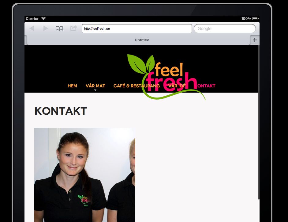
I have a similar problem, on my site http://www.feelfresh.se.
When using an iPhone (5), the full with of the screen is not used in landscape mode.
In vertical mode, images in blogs/contact are cut – both images inside articles and “article-images” (iPhone & iPad).
The logo is also cut or off-center as shown in the picture. (iPad)
I have changed the size of the logo i layout.css.I have not tried the changes suggested in this thread, as I am not sure if my problem really is the same as the thread starter.
Any help with this would be much appreciated!
Kind regards,
Marten, Sweden.phong nam Friend
phong nam
- Join date:
- May 2015
- Posts:
- 3779
- Downloads:
- 1
- Uploads:
- 587
- Thanks:
- 499
- Thanked:
- 974 times in 888 posts
December 2, 2013 at 5:01 pm #514119Hi Marten,
<blockquote>In vertical mode, images in blogs/contact are cut – both images inside articles and “article-images” (iPhone & iPad).
</blockquote>You can make the article images on blog/contact page look better by putting below css styles into the end of templates/ja_zite/css/layout-mobile.css file:
.contact-image img {

max-width: 100%;

}
.blog .category-desc img {
padding-right: 20px;
}<blockquote>The logo is also cut or off-center as shown in the picture. (iPad) </blockquote>
You can try to put these codes into the end of /templates/ja_zite/css/layout-tablet.css file:
h1.logo a {

height: 80px;

width: 92px;

background-size: 100% auto;

}
Remember to clear JAT3 cache after updating changes.
TzuChi Foundation Friend
TzuChi Foundation
- Join date:
- September 2014
- Posts:
- 39
- Downloads:
- 0
- Uploads:
- 12
- Thanks:
- 10
November 4, 2014 at 4:00 pm #554140Hi Ninja,
Urgent!
Do the method still applicable?
I’m using ja zite quickstart 2.5.16, and updated to 2.5.27 currently.I used the method mention here to disable the responsive featured
http://www.joomlart.com/forums/topic/turn-off-responsive/and what happen now is, my site couldn’t fit in to mobile phone an tablets portrait, and lose zoom in zoom out features.
What i wish to be is, the site appear as desktop layout at all devices with the zoom in zoom out features.
Please, All are ready, just One more step to be done.i could pm ftp or admin username & password. Thank you very much
AuthorPostsThis topic contains 16 replies, has 5 voices, and was last updated by
TzuChi Foundation 10 years, 3 months ago.
We moved to new unified forum. Please post all new support queries in our New Forum
melih

