

-
AuthorPosts
-
Hung Dinh Friend
Hung Dinh
- Join date:
- September 2014
- Posts:
- 4408
- Downloads:
- 11
- Uploads:
- 189
- Thanks:
- 309
- Thanked:
- 3310 times in 3 posts
November 2, 2015 at 9:39 am #720947Howdy friends,
Hope you have a happy time with Halloween. This week, our responsive Joomla template for Creative Business – JA Mono is on its way to the stage. Here is the sneak preview, have a look and let us know your comments.
JA Mono sports the following features:
- Joomla T3 Framework
- Integrated Bootstrap 3
- Fully responsive
- Support Megamenu
- JA Masthead Module
- JA ACM Module
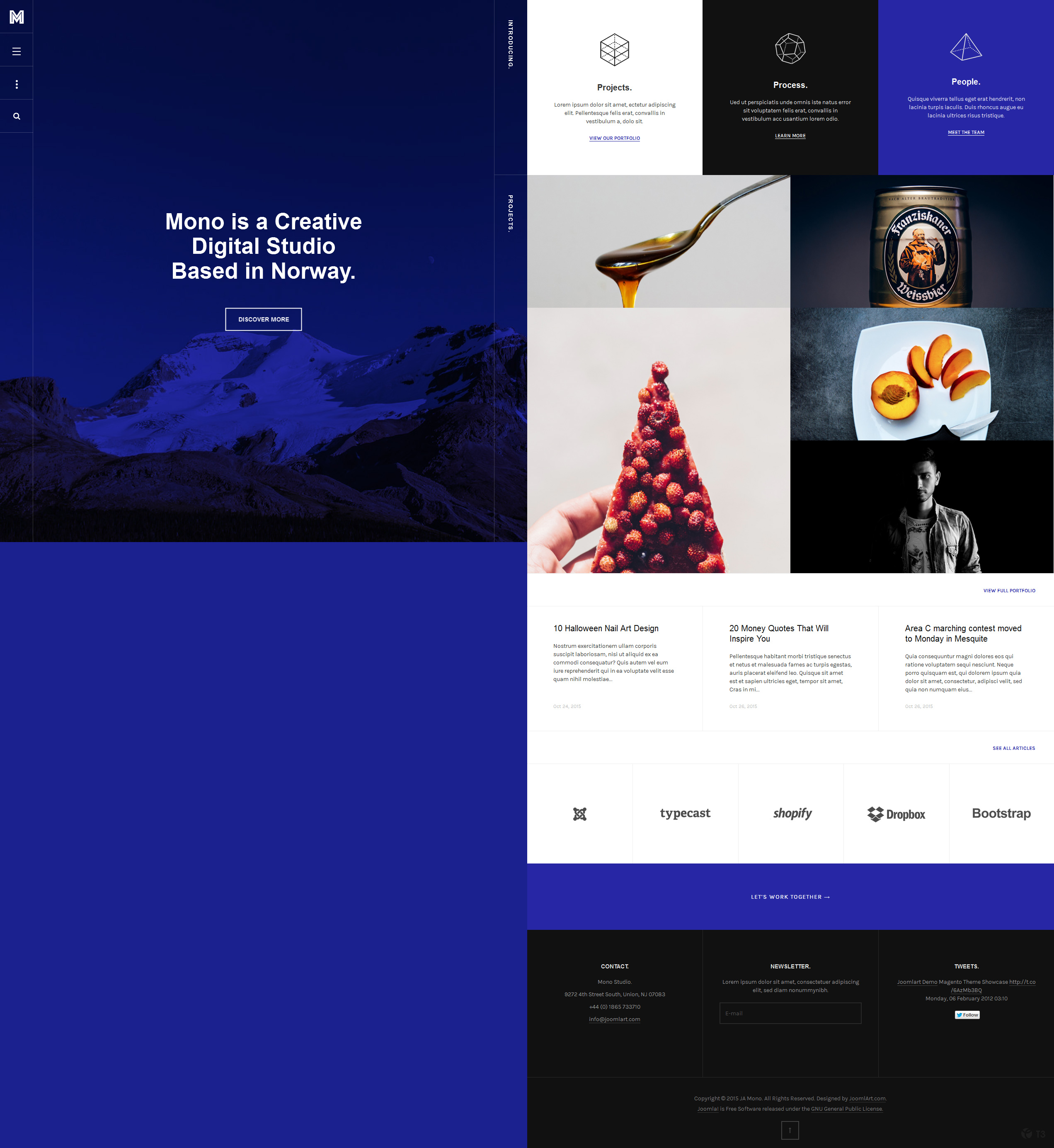
Sneak Peek 1: Home Page
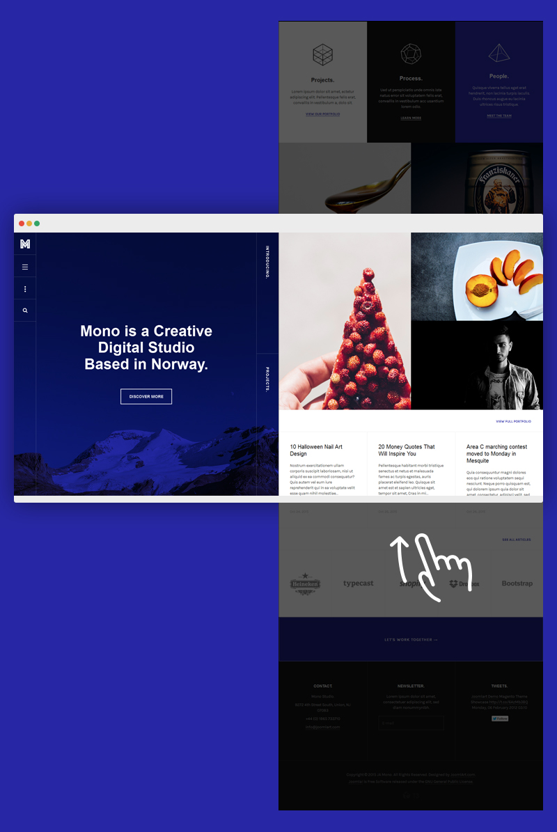
View the higher resolution Here
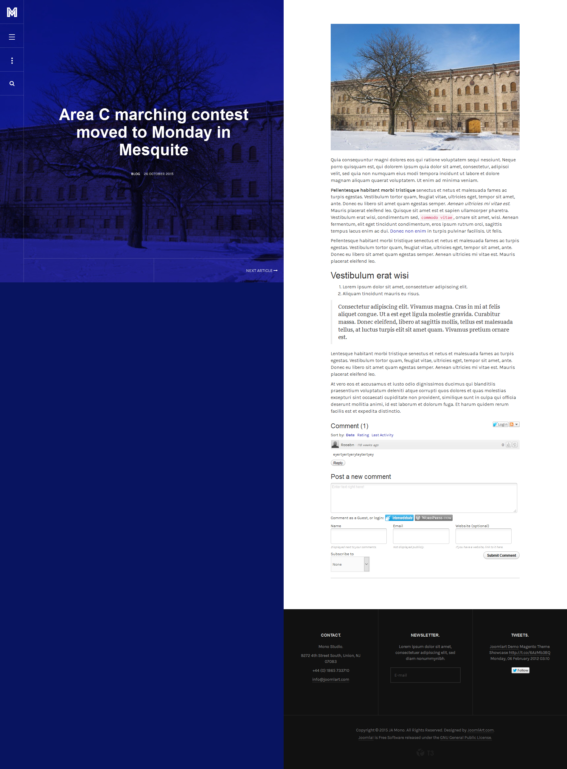
Sneak Peek 2: Article View
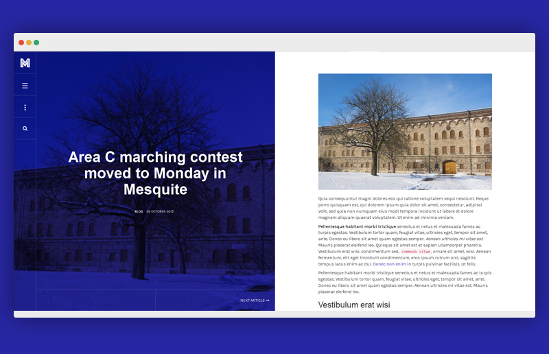
View the higher resolution Here
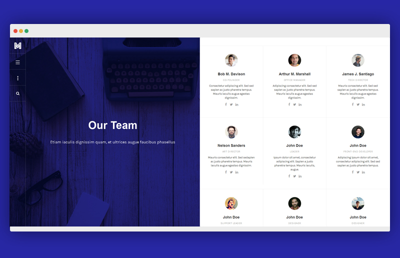
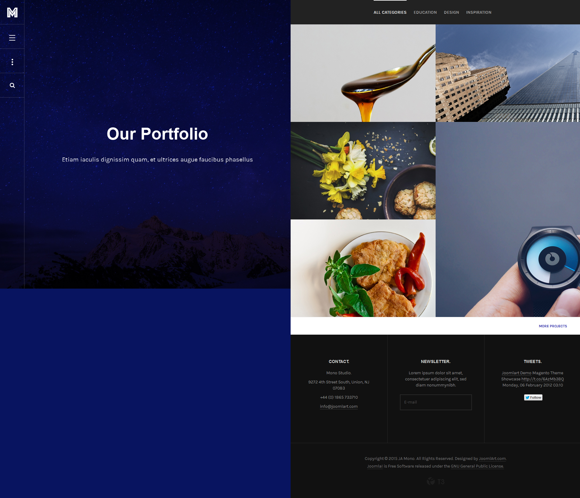
Sneak Peek 3: Portfolio View
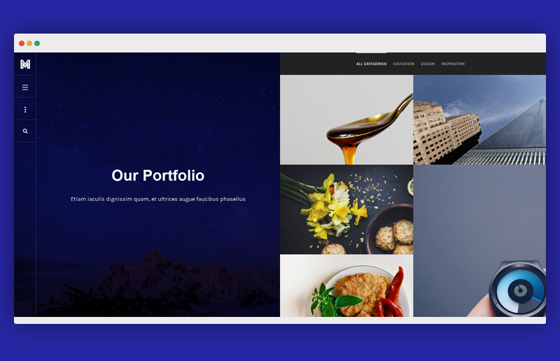
View the higher resolution Here
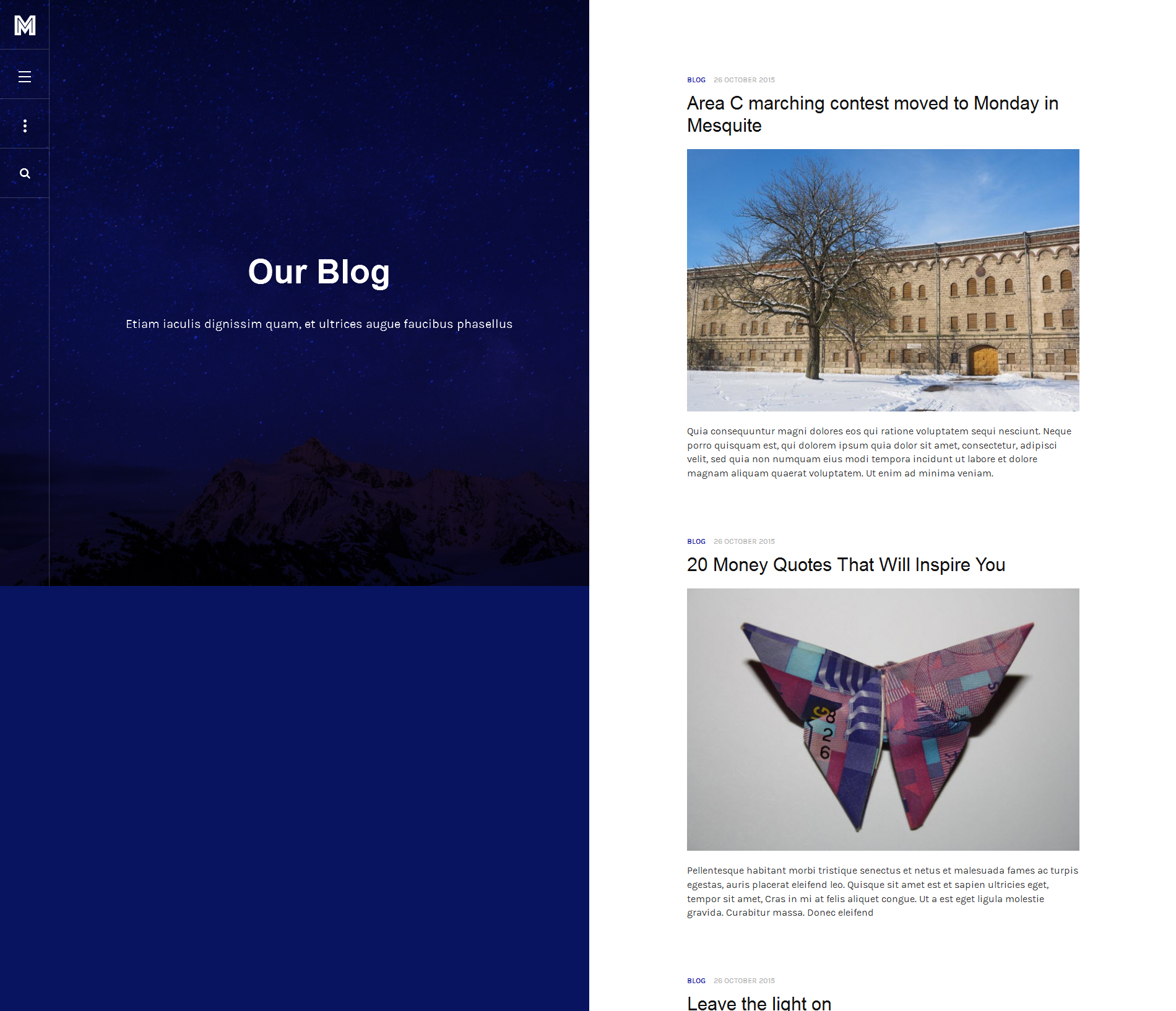
Sneak Peek 4: Blog Page View
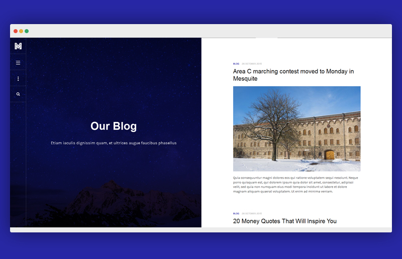
View the higher solution Here
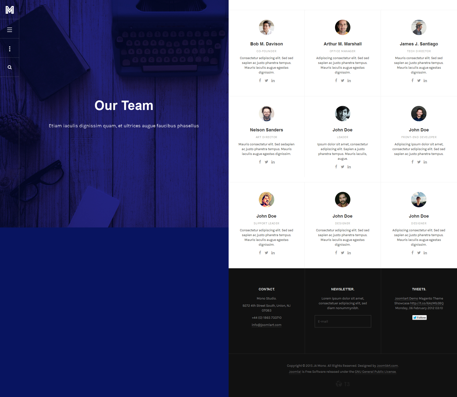
Sneak Peek 5: Bonus Pages
View the higher resolution Here
We also have an animated gif of JA Mono for your viewing pleasure!
<iframe src=”http://gfycat.com/ifr/BrownUnacceptableAnkolewatusi” frameborder=”0″ scrolling=”no” width=”800″ height=”470″ style=”-webkit-backface-visibility: hidden;-webkit-transform: scale(1);” ></iframe>
***Please note that all sneak peeks above are subject to change as the template’s implementation continues. So watch out! There will be more to add. If you have any proposals or suggestions on the template, please feel free to drop a line down below. We’d love to know.
hjames Friend
hjames
- Join date:
- March 2010
- Posts:
- 82
- Downloads:
- 475
- Uploads:
- 3
- Thanked:
- 8 times in 2 posts
November 2, 2015 at 1:56 pm #721103Very nice.
Question – Can the main area that is blue be hidden from view or collapsed from view?
Suggestion – Duel Component View (This is unconventional but would be an awesome concept. For example the left view could be Static and represent a users profilepage while the right side could be Dynamic and represent their stream. Assuming one used this as a Social Template)
James
hjames
- Join date:
- March 2010
- Posts:
- 82
- Downloads:
- 475
- Uploads:
- 3
- Thanked:
- 8 times in 2 posts
November 2, 2015 at 1:56 pm #753505Very nice.
Question – Can the main area that is blue be hidden from view or collapsed from view?
Suggestion – Duel Component View (This is unconventional but would be an awesome concept. For example the left view could be Static and represent a users profilepage while the right side could be Dynamic and represent their stream. Assuming one used this as a Social Template)
James
 art3
Friend
art3
Friend
art3
- Join date:
- April 2011
- Posts:
- 146
- Downloads:
- 81
- Uploads:
- 65
- Thanks:
- 96
- Thanked:
- 26 times in 4 posts
November 4, 2015 at 3:07 pm #721488Sorry for the comment, but a company that you think they liked it?
– Businesses want to show your logo, Where is?
– The hidden menu links is good for business, not everyone knows how to navigate and should not be necessary to look for it.
– That blue is crude, tasteless.
– It serves no client is not applicable.Do not try to make gunpowder, designs that can be sold to customers need.
Designs must be created from the needs of many customers and not the few.JoomlArt is no longer a solution to my needs.
It’s a shame.
—- It’s just my personal view.
art3
Friend
art3
- Join date:
- April 2011
- Posts:
- 146
- Downloads:
- 81
- Uploads:
- 65
- Thanks:
- 96
- Thanked:
- 26 times in 4 posts
November 4, 2015 at 3:07 pm #753739Sorry for the comment, but a company that you think they liked it?
– Businesses want to show your logo, Where is?
– The hidden menu links is good for business, not everyone knows how to navigate and should not be necessary to look for it.
– That blue is crude, tasteless.
– It serves no client is not applicable.Do not try to make gunpowder, designs that can be sold to customers need.
Designs must be created from the needs of many customers and not the few.JoomlArt is no longer a solution to my needs.
It’s a shame.
—- It’s just my personal view.
 tecnolog
Friend
tecnolog
Friend
tecnolog
- Join date:
- August 2014
- Posts:
- 88
- Downloads:
- 95
- Uploads:
- 6
- Thanks:
- 19
- Thanked:
- 16 times in 1 posts
tecnolog
Friend
tecnolog
- Join date:
- August 2014
- Posts:
- 88
- Downloads:
- 95
- Uploads:
- 6
- Thanks:
- 19
- Thanked:
- 16 times in 1 posts
Hung Dinh
- Join date:
- September 2014
- Posts:
- 4408
- Downloads:
- 11
- Uploads:
- 189
- Thanks:
- 309
- Thanked:
- 3310 times in 3 posts
November 5, 2015 at 4:25 am #721536Hi @hjames,
JA Mono has 2 blocks layout design. And the blue view you mentioned will be repositioned in small screen, the preview is showed the large screen display (> 1,400 pixels width).
Regarding your suggestion:
Suggestion – Duel Component View (This is unconventional but would be an awesome concept. For example the left view could be Static and represent a users profilepage while the right side could be Dynamic and represent their stream. Assuming one used this as a Social Template)
Yes, the dev team has taken it into consideration.
Thank you for your feedback!
Hung Dinh
- Join date:
- September 2014
- Posts:
- 4408
- Downloads:
- 11
- Uploads:
- 189
- Thanks:
- 309
- Thanked:
- 3310 times in 3 posts
November 5, 2015 at 4:25 am #753787Hi @hjames,
JA Mono has 2 blocks layout design. And the blue view you mentioned will be repositioned in small screen, the preview is showed the large screen display (> 1,400 pixels width).
Regarding your suggestion:
Suggestion – Duel Component View (This is unconventional but would be an awesome concept. For example the left view could be Static and represent a users profilepage while the right side could be Dynamic and represent their stream. Assuming one used this as a Social Template)
Yes, the dev team has taken it into consideration.
Thank you for your feedback!
websair Friend
websair
- Join date:
- February 2015
- Posts:
- 29
- Downloads:
- 343
- Uploads:
- 1
- Thanked:
- 7 times in 2 posts
November 5, 2015 at 5:44 am #721546<em>@art3 500799 wrote:</em><blockquote>Sorry for the comment, but a company that you think they liked it?
– Businesses want to show your logo, Where is?
– The hidden menu links is good for business, not everyone knows how to navigate and should not be necessary to look for it.
– That blue is crude, tasteless.
– It serves no client is not applicable.Do not try to make gunpowder, designs that can be sold to customers need.
Designs must be created from the needs of many customers and not the few.JoomlArt is no longer a solution to my needs.
It’s a shame.
—- It’s just my personal view.</blockquote>
I agree with art3,
ja recent templates are very bad and bad creativity. T3 framwork also bad (t3 does not have layout option, like full & box width, multipal header styles, drag and drop layout builder, many more …..)
1 user says Thank You to websair for this useful post
websair
- Join date:
- February 2015
- Posts:
- 29
- Downloads:
- 343
- Uploads:
- 1
- Thanked:
- 7 times in 2 posts
November 5, 2015 at 5:44 am #753793<em>@art3 500799 wrote:</em><blockquote>Sorry for the comment, but a company that you think they liked it?
– Businesses want to show your logo, Where is?
– The hidden menu links is good for business, not everyone knows how to navigate and should not be necessary to look for it.
– That blue is crude, tasteless.
– It serves no client is not applicable.Do not try to make gunpowder, designs that can be sold to customers need.
Designs must be created from the needs of many customers and not the few.JoomlArt is no longer a solution to my needs.
It’s a shame.
—- It’s just my personal view.</blockquote>
I agree with art3,
ja recent templates are very bad and bad creativity. T3 framwork also bad (t3 does not have layout option, like full & box width, multipal header styles, drag and drop layout builder, many more …..)
1 user says Thank You to websair for this useful post
-
AuthorPosts
This topic contains 11 replies, has 5 voices, and was last updated by websair 8 years, 6 months ago.
We moved to new unified forum. Please post all new support queries in our New Forum