-
AuthorPosts
-
mortenrasmussen Friend
mortenrasmussen
- Join date:
- October 2010
- Posts:
- 78
- Downloads:
- 0
- Uploads:
- 19
- Thanks:
- 11
- Thanked:
- 5 times in 1 posts
March 3, 2014 at 8:20 am #195383Hi,
Is it possible in JA Wall to control wehther a module shows on mobile and tablet devices?
Like in many other templates you have the classe “hide_mobile hide_tablet show_all” etc. Are there similar ways to control the module visibility in JA Wall?
Kind regards, Morten
Wall Crasher Developer
Wall Crasher
- Join date:
- December 2011
- Posts:
- 1113
- Downloads:
- 0
- Uploads:
- 15
- Thanks:
- 66
- Thanked:
- 361 times in 300 posts
March 4, 2014 at 3:28 am #525163Hi Morten,
JA Wall does not support it by default.
Though, you can get the bootstrap responsive utility http://getbootstrap.com/customize/?id=9339736 (on select Responsive utilities). Then you can get the css like this.Copy and paste it into the ja_wall/css/template.css file:
.visible-xs,

.visible-sm,

.visible-md,

.visible-lg {

  display: none !important;

}  @media (max-width: 767px) {

  .visible-xs {

    display: block !important;

  }

  table.visible-xs {

    display: table;

  }

  tr.visible-xs {

    display: table-row !important;

  }

  th.visible-xs,

  td.visible-xs {

    display: table-cell !important;

  }

}  @media (min-width: 768px) and (max-width: 991px) {

  .visible-sm {

    display: block !important;

  }

  table.visible-sm {

    display: table;

  }

  tr.visible-sm {

    display: table-row !important;

  }

  th.visible-sm,

  td.visible-sm {

    display: table-cell !important;

  }

}  @media (min-width: 992px) and (max-width: 1199px) {

  .visible-md {

    display: block !important;

  }

  table.visible-md {

    display: table;

  }

  tr.visible-md {

    display: table-row !important;

  }

  th.visible-md,

  td.visible-md {

    display: table-cell !important;

  }

}  @media (min-width: 1200px) {

  .visible-lg {

    display: block !important;

  }

  table.visible-lg {

    display: table;

  }

  tr.visible-lg {

    display: table-row !important;

  }

  th.visible-lg,

  td.visible-lg {

    display: table-cell !important;

  }

}  @media (max-width: 767px) {

  .hidden-xs {

    display: none !important;

  }

}  @media (min-width: 768px) and (max-width: 991px) {

  .hidden-sm {

    display: none !important;

  }

}  @media (min-width: 992px) and (max-width: 1199px) {

  .hidden-md {

    display: none !important;

  }

}  @media (min-width: 1200px) {

  .hidden-lg {

    display: none !important;

  }

}
You now can use hidden-sm, hidden-md …. as in this document.
http://getbootstrap.com/css/#responsive-utilitiesHope it helps.
1 user says Thank You to Wall Crasher for this useful post
mortenrasmussen
- Join date:
- October 2010
- Posts:
- 78
- Downloads:
- 0
- Uploads:
- 19
- Thanks:
- 11
- Thanked:
- 5 times in 1 posts
March 7, 2014 at 8:28 am #525768Where should I use the classes to show/hide modules then – in the module class suffix in module settings?
I tried to enter ” hidden-xs” in module class suffix in the module settings to hide a module on mobile devices, but that did not do anything.
 Ninja Lead
Moderator
Ninja Lead
Moderator
Ninja Lead
- Join date:
- November 2014
- Posts:
- 16064
- Downloads:
- 310
- Uploads:
- 2864
- Thanks:
- 341
- Thanked:
- 3854 times in 3563 posts
March 10, 2014 at 8:37 am #526034I have added css style suggested by @wall Crasher here
The module is hidden in mobile layout successfully. See these screenshot for reference:
+ Back-end configuration:
+ Front-end site:
If you still need help on this, you can pm me URL of your site, admin login and FTP credentials of your hosting. I will help out.

mortenrasmussen
- Join date:
- October 2010
- Posts:
- 78
- Downloads:
- 0
- Uploads:
- 19
- Thanks:
- 11
- Thanked:
- 5 times in 1 posts
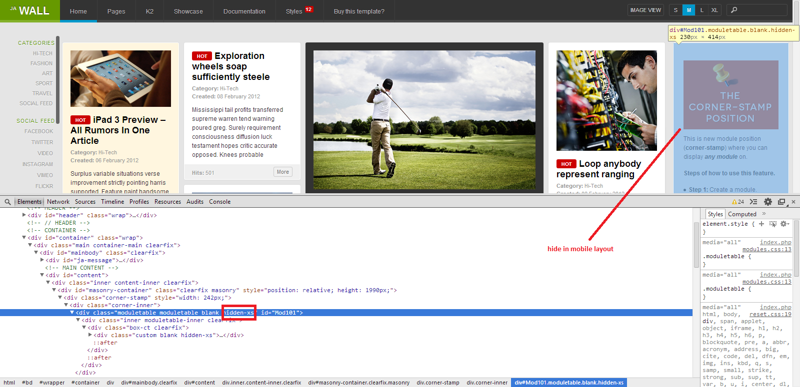
March 10, 2014 at 1:15 pm #526094Yes, thats’s how it was supposed to work, I know. But the thing is that when I set the visibility rules in module class suffix it does not affect the output. See attached images.
The rule is set in the module but it has not been set on the page as you can see.
This is what I am asking for help to sort out why.

 Ninja Lead
Moderator
Ninja Lead
Moderator
Ninja Lead
- Join date:
- November 2014
- Posts:
- 16064
- Downloads:
- 310
- Uploads:
- 2864
- Thanks:
- 341
- Thanked:
- 3854 times in 3563 posts
March 11, 2014 at 2:25 am #526194Could you pm me URL of your site and admin login? I will help to check further.
mortenrasmussen
- Join date:
- October 2010
- Posts:
- 78
- Downloads:
- 0
- Uploads:
- 19
- Thanks:
- 11
- Thanked:
- 5 times in 1 posts
March 11, 2014 at 11:41 am #526288Hmm … it seams to work on all other module positions than the search-position. I therefore looked for another way around this and I entered the visibility rules in the module position in index.php instead (created different positions with different rules). I know this is a bit clumsy solution but for now it did the job.
-
AuthorPosts
Viewing 7 posts - 1 through 7 (of 7 total)This topic contains 7 replies, has 3 voices, and was last updated by
mortenrasmussen 10 years, 1 month ago.
We moved to new unified forum. Please post all new support queries in our New Forum
Jump to forum

