-
AuthorPosts
-
 Richard A
Friend
Richard A
Friend
Richard A
- Join date:
- January 2013
- Posts:
- 190
- Downloads:
- 19
- Uploads:
- 14
- Thanks:
- 35
- Thanked:
- 18 times in 2 posts
June 13, 2013 at 11:38 pm #188230I am using Joomla 3.1.1 on JA Mitius.
I noticed the following modules/positions disappear in the demo for Tablet Portrait and Smartphone sizes but should be there according to the template responsive layouts for those devices:
Headlines…………………top-newsticker
Slideshow Lite…………..slideshow
Content Slider…………..slidenews
Custom Banner…………slidenews
Content Pop Up………..position-1The top menu also disappears but is shown at the top of the responsive layout for Tablet and Smartphone.
The items disappear on my own site, as in the demo, is this a fault to be corrected?
I know the Main Menu is adjusted to off canvas and works well, but it seems odd for a whole area of content to vanish.
 Ninja Lead
Moderator
Ninja Lead
Moderator
Ninja Lead
- Join date:
- November 2014
- Posts:
- 16064
- Downloads:
- 310
- Uploads:
- 2864
- Thanks:
- 341
- Thanked:
- 3854 times in 3563 posts
June 14, 2013 at 6:58 am #495879This is not bug because the resolution in Portrait Tablet and Mobile device is so small, we have hidden some positions on it, this helps to increase performance and nice looking in mobile devices.
Regards
Richard A
Friend
Richard A
- Join date:
- January 2013
- Posts:
- 190
- Downloads:
- 19
- Uploads:
- 14
- Thanks:
- 35
- Thanked:
- 18 times in 2 posts
June 14, 2013 at 10:22 am #495899Thank you for letting me know, appreciated.
July 3, 2013 at 8:22 am #497791Hi Ninja Lead,
May i know how to unhidden the slideshow in Portrait Tablet and Mobile device? Thanks!
Ninja Lead
Moderator
Ninja Lead
- Join date:
- November 2014
- Posts:
- 16064
- Downloads:
- 310
- Uploads:
- 2864
- Thanks:
- 341
- Thanked:
- 3854 times in 3563 posts
July 4, 2013 at 4:43 am #497915Due to concept of this JA Mitius Template, JA Slideshow Lite module is hidden. In this case you want to show it, you can follow with my solution
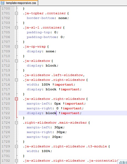
Open templates/ja_mitius/css/template-responsive.css file
from
.ja-slideshow {

    display: none;

}

.ja-slideshow .left-slideshow,

  .ja-slideshow .right-slideshow {

    width: 100% !important;

    display: none !important;

}

.ja-slideshow .right-slideshow {

    margin-left: 0px !important;

    margin-right: 0 !important;

    display: none !important;

}
Change to
.ja-slideshow {

    display: block;

}

.ja-slideshow .left-slideshow,

  .ja-slideshow .right-slideshow {

    width: 100% !important;

    display: block !important;

}

.ja-slideshow .right-slideshow {

    margin-left: 0px !important;

    margin-right: 0 !important;

    display: block !important;

}
If you don’t use default theme you can find css file on this path: templates/ja_mitius/css/themes/your_theme/template-responsive.css
1 user says Thank You to Ninja Lead for this useful post
July 8, 2013 at 6:29 am #498231hi,
Thanks!
now the slideshow module is appear in smartphone portraits.
but there is quite a lot extra spaces under the slideshow? how could i remove it?Ninja Lead
Moderator
Ninja Lead
- Join date:
- November 2014
- Posts:
- 16064
- Downloads:
- 310
- Uploads:
- 2864
- Thanks:
- 341
- Thanked:
- 3854 times in 3563 posts
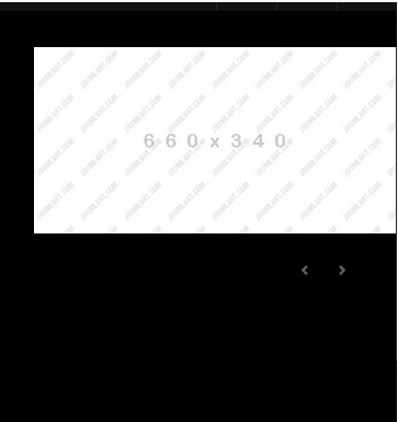
July 8, 2013 at 8:51 am #498253I could not find extra spaces under the slideshow as your mention, see the screenshot
You need to put image on the JA Slideshow Lite and provide the url of the site you’re working on. So that I can take a look and try to assist
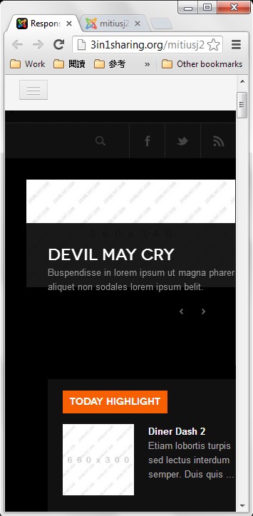
July 9, 2013 at 9:59 am #498408Hi Ninja Lead,
I just setup JA_Mitius in live.
I modified the code as you mentioned before only. It just look same, and the alignment for slideshow and today hightlight module doesn’t align center. Please have a look. Thanks!
/www/mitiusj25/templates/ja_mitius/css/template-responsive.csshttp://3in1sharing.org/mitiusj25/
 Ninja Lead
Moderator
Ninja Lead
Moderator
Ninja Lead
- Join date:
- November 2014
- Posts:
- 16064
- Downloads:
- 310
- Uploads:
- 2864
- Thanks:
- 341
- Thanked:
- 3854 times in 3563 posts
July 10, 2013 at 3:41 am #498480I have compared and added some my fixes into template-responsive.css file
You can download and copy my file into: templates/ja_mitius/css/template-responsive.css (remember backup old file before updating)
Let me know if it helps
July 10, 2013 at 8:18 am #498515thank you very much.
I just overwrite the file, but the slideshow not shown in mobile device anymore. :((
http://3in1sharing.org/mitiusj25/Could i pm my ftp details to you? Please~
Ninja Lead
Moderator
Ninja Lead
- Join date:
- November 2014
- Posts:
- 16064
- Downloads:
- 310
- Uploads:
- 2864
- Thanks:
- 341
- Thanked:
- 3854 times in 3563 posts
July 11, 2013 at 9:13 am #498685<em>@sling19 380089 wrote:</em><blockquote>thank you very much.
I just overwrite the file, but the slideshow not shown in mobile device anymore. :((
http://3in1sharing.org/mitiusj25/Could i pm my ftp details to you? Please~</blockquote>
Please send pm me admin access and ftp account of your site. I shall help you to solve this problem
Ninja Lead
Moderator
Ninja Lead
- Join date:
- November 2014
- Posts:
- 16064
- Downloads:
- 310
- Uploads:
- 2864
- Thanks:
- 341
- Thanked:
- 3854 times in 3563 posts
July 11, 2013 at 10:35 am #498704Thanks for your pm.
I fixed the problem directly on your site, you can check it again
Open templates/ja_mitius/css/custom.css file
and saw new script
  @media(max-width: 767px) {

	.ja-slideshow {

		display: block !important;

	}
.ja-slideshow .left-slideshow {
display: block !important;
}
.main-slideshow {
margin-left:0px !important;
}
.ja-slideshow .container {
padding-bottom: 0px !important;
}
.ja-ss-item{
min-height:200px !important;
}
.ja-ss-desc{
bottom: 0px !important;
padding:0px !important;
}
.ja-ss-btns {
bottom: 0px !important;
right: 0px !important;
}
}
Let me know if it helps
1 user says Thank You to Ninja Lead for this useful post
July 11, 2013 at 11:39 am #498715It works! Thank you very much!
Just one more question.
how to make the background (1050px*130px ) at header container to be responsive?Ninja Lead
Moderator
Ninja Lead
- Join date:
- November 2014
- Posts:
- 16064
- Downloads:
- 310
- Uploads:
- 2864
- Thanks:
- 341
- Thanked:
- 3854 times in 3563 posts
July 12, 2013 at 8:41 am #498821Yes, I helped you to do this on your site
Open templates/ja_mitius/css/custom.css file
add new script
.ja-header .container {

		background-repeat: no-repeat;

    		background-size: 100% 130px !important;

    		padding: 0;

	}

}
1 user says Thank You to Ninja Lead for this useful post
-
AuthorPosts
Viewing 14 posts - 1 through 14 (of 14 total)This topic contains 14 replies, has 3 voices, and was last updated by
Ninja Lead 11 years, 6 months ago.We moved to new unified forum. Please post all new support queries in our New Forum
Jump to forum
melih

