

-
AuthorPosts
-
July 18, 2015 at 5:52 pm #208976
I’m very new to creating sites (a few days ago I didn’t even know what css, less and php are) and struggle with a hopefully simple problem:
I would like to change the drop-down menu on small and extra small media. Here’s a screenshot with my current example:
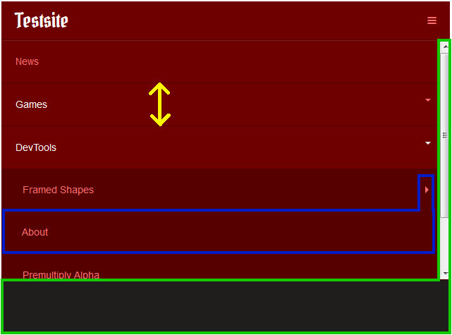
What I’d like to change (preferrably in .less or custom.css):
1. Marked Green: I’d like to increase the height of the whole menu to i.e. 80% of the screen height so more elements can be shown without scrolling.
2. Marked Yellow: I’d like to reduce the menu entry height a tiny bit so more elements can be shown as well. I guess I need to set padding or something but just don’t know where.
3. Marked Blue: My main menu has 3 levels:
– On the screenshot you see the first level: News, Games, DevTools.
– The second level of DevTools is Framed Shapes and Premultiply Alpha.
– And the third level of Framed Shapes currently has only the ‘About’ entry.
I’d like to not show the third level. Usually if I set a menu to a module in joomla I can set it to show 1st and 2nd level only. But how can I do that in Purity’s Nav bar? And is it possible to only hide it on small and extra small media but show all levels on larger media?Where in all those less files can I change those settings? I managed to change lots of format settings in purity already but just cannot find these and would maybe not know what to set without doing a lot of trial and error. Help on these matters would be very much appreciated.
polo974 Friend
polo974
- Join date:
- May 2015
- Posts:
- 63
- Downloads:
- 133
- Uploads:
- 4
- Thanks:
- 13
- Thanked:
- 5 times in 2 posts
July 19, 2015 at 3:04 pm #577882Hi,
For question 1 :
IMOO, it’s not really possible to adapt something like a menu to 80% height of screens, because there is too many different screen heights and resolutions, and other reasons but it would take to long to explain. I would suggest to reducing the space between each element, like you ask for in 2).
BTW, something really really helpfull for finding what element to modify in css is Firebug (in firefox) or chrome developer tools. For firefox, you have to install it (just google it), and in chrome it can be accessed just typing F12 on your keyboard.
It’s a tool that allows you to check every element on the page and find what css rules are applied to them. You can change them “on the fly”, and have a look at the result directly.Answering your question 2, you can try to inspect padding and line-height property of classes showing in next screenshot , and reduce it in custom.css.
For question 3, I can suggest something, but I don’t know if it’s gonna work. Just open your purity iii template and the megamenu manager, and select your third level menu link and add them those classes like shown on the next picture :
hidden-xs hidden-sm
these are boostrap classes (purity iii is based on that css framework, and you can find a lot of information on it with google) which are gonna hide those links on extra small and small screens. I think that can do the job !
I hope it will help you some !
Cheers,
Paul
July 22, 2015 at 1:08 am #578207Thanks alot for your reply.
About the drop down height: I found the variable nav-bar-collapse-max-height in bootstrap wich sets an absolute height. Guess I could get the viewport height with js and go from there if I really want a percentage.
About menu item padding: I set the padding in custom.css for level 1 items:
.navbar-default .navbar-nav > li > a {…
but that changed the navbar height on larger screens as well. I’ll need to find another setting I guess.and for level 2 items:
.navbar-default .navbar-nav .open .dropdown-menu > li > a {…
wich seems to work nicely.About hiding level 3 items with hidden-* classes is a pretty neat idea and does hide level 3 but still shows the caret and causes a thicker line between menu items. So I’ll have to look into other solutions there as well.
Currently I’m so incredibly busy with so many things I only get to work on that internetsite every few days. I’ll ask for more help if I can’t figure a way during the next few days.
Thanks again
July 22, 2015 at 1:08 am #644498Thanks alot for your reply.
About the drop down height: I found the variable nav-bar-collapse-max-height in bootstrap wich sets an absolute height. Guess I could get the viewport height with js and go from there if I really want a percentage.
About menu item padding: I set the padding in custom.css for level 1 items:
.navbar-default .navbar-nav > li > a {…
but that changed the navbar height on larger screens as well. I’ll need to find another setting I guess.and for level 2 items:
.navbar-default .navbar-nav .open .dropdown-menu > li > a {…
wich seems to work nicely.About hiding level 3 items with hidden-* classes is a pretty neat idea and does hide level 3 but still shows the caret and causes a thicker line between menu items. So I’ll have to look into other solutions there as well.
Currently I’m so incredibly busy with so many things I only get to work on that internetsite every few days. I’ll ask for more help if I can’t figure a way during the next few days.
Thanks again
July 22, 2015 at 1:08 am #743130Thanks alot for your reply.
About the drop down height: I found the variable nav-bar-collapse-max-height in bootstrap wich sets an absolute height. Guess I could get the viewport height with js and go from there if I really want a percentage.
About menu item padding: I set the padding in custom.css for level 1 items:
.navbar-default .navbar-nav > li > a {…
but that changed the navbar height on larger screens as well. I’ll need to find another setting I guess.and for level 2 items:
.navbar-default .navbar-nav .open .dropdown-menu > li > a {…
wich seems to work nicely.About hiding level 3 items with hidden-* classes is a pretty neat idea and does hide level 3 but still shows the caret and causes a thicker line between menu items. So I’ll have to look into other solutions there as well.
Currently I’m so incredibly busy with so many things I only get to work on that internetsite every few days. I’ll ask for more help if I can’t figure a way during the next few days.
Thanks again
-
AuthorPosts
This topic contains 5 replies, has 2 voices, and was last updated by 
We moved to new unified forum. Please post all new support queries in our New Forum