-
AuthorPosts
-
mazhar shah Friend
mazhar shah
- Join date:
- September 2014
- Posts:
- 201
- Downloads:
- 132
- Uploads:
- 37
- Thanks:
- 37
- Thanked:
- 8 times in 5 posts
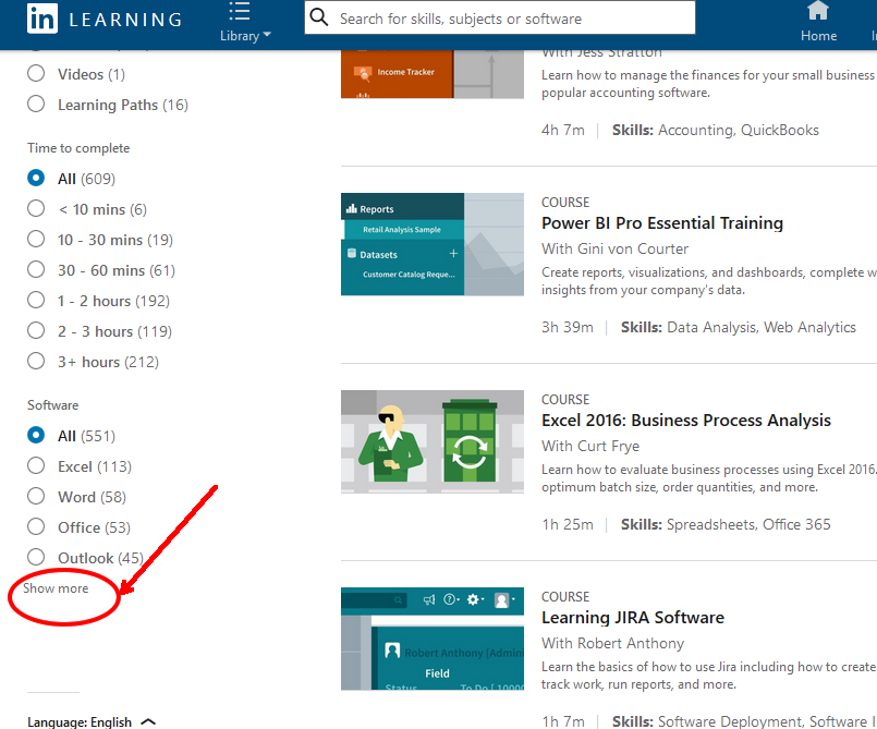
February 23, 2018 at 9:17 am #1093442In the multi-select filter option, I have over 20-30 select options and the page becomes far too long if they are all showing at the beginning. THE IDEAL SOLUTION would be to have about 5 select items showing and then a ‘ show more’ link which expands to show the rest.
Please see the attached image of the way LinkedIn does it. Almost ALL of the other major sites all have this filter function too. It is far too important to ignore and at the moment restricts the otherwise brilliant JA Megafilter.
I asked for this improvement last November and was told it was good and would be considered for the ‘next release’ . Its now almost March. Is there any progress on this please? It seems an ESSENTIAL and a much cleaner and tidier solution to the one at present where there is no control at all and the layout looks rather long and messy when there are so many multi-select option.
I THINK THIS IS ONLY NEEDED ON THE MULTI-SELECT OPTIONS (not on the drop downs or anywhere else)
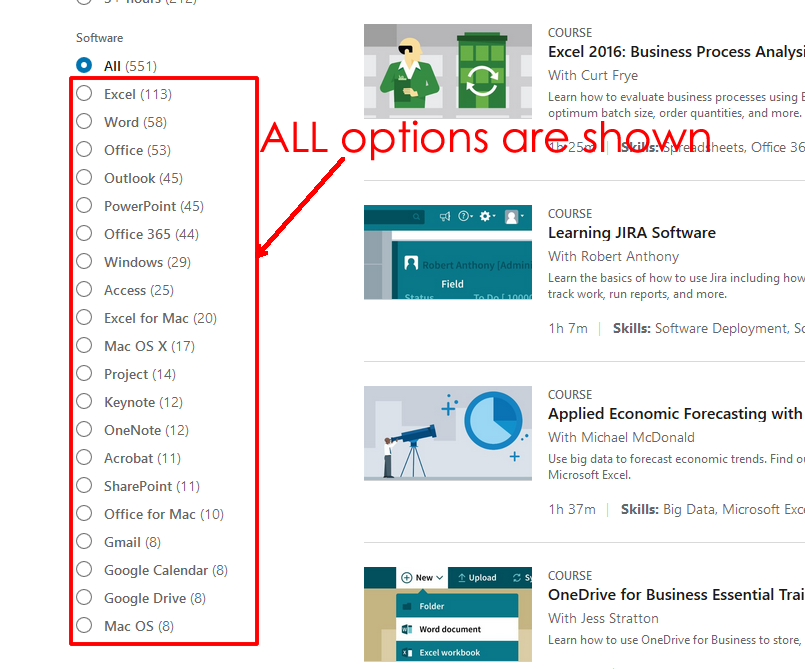
(whilst the attached image doesn’t show it, this LinkedIn page is also a filter which works just like JA Megafilter. And when you click show more all options are shown)
p.s. I am using JA Megafilter only to filter JOOMLA CONTENT PAGES – (joomla custom fields and joomla content plugin)
-
This topic was modified 6 years, 11 months ago by
mazhar shah.
-
This topic was modified 6 years, 11 months ago by
Saguaros Moderator
Saguaros
- Join date:
- September 2014
- Posts:
- 31405
- Downloads:
- 237
- Uploads:
- 471
- Thanks:
- 845
- Thanked:
- 5346 times in 4964 posts
February 26, 2018 at 10:33 am #1093911Hi,
I’ve already shared your request to the team but there is still no news yet. I will get back to you when having news.
Regards
1 user says Thank You to Saguaros for this useful post
thesdhotel Friend
thesdhotel
- Join date:
- March 2017
- Posts:
- 90
- Downloads:
- 25
- Uploads:
- 1
- Thanks:
- 31
- Thanked:
- 22 times in 20 posts
March 6, 2018 at 8:31 pm #1095617If you add this feature – make it an option, not a forced thing. Some people might want the full lists to show entirely.
Saguaros
- Join date:
- September 2014
- Posts:
- 31405
- Downloads:
- 237
- Uploads:
- 471
- Thanks:
- 845
- Thanked:
- 5346 times in 4964 posts
March 7, 2018 at 7:43 am #1095738Agree, most of the people want to show all. Let’s wait for the news from the team.
mazhar shah
- Join date:
- September 2014
- Posts:
- 201
- Downloads:
- 132
- Uploads:
- 37
- Thanks:
- 37
- Thanked:
- 8 times in 5 posts
March 7, 2018 at 10:14 am #1095779A simple option in the admin could be a box asking for how many to show before the ‘more’ link is shown. For example, it could be ‘0’ – to show all, and any number, for example ‘5’ to show the first 5, after which a ‘show more’ link would appear below.
Though in my humble opinion, I would disagree that ‘most people would want to show all’ (in every case IF the field lists were very long. 🙂 The whole idea is to keep page looking neat and smart. But how can you do that with for example, just 5 fields with just 10 select filter items in each…. that’s 50 lines!!! And its NOT practical, to have ALL fields ‘either’ ‘closed or all open’ from the start (+ -) which we have at the present.
Almost all the ‘major sites’ with filters have this feature – from Linkedin to Amazon to Ebay to Argos to Marks and Spencer …. they all can’t all be wrong. Even a company like VERY puts its LONG FILTER LISTS in a scroll box https://www.very.co.uk/men/t-shirts-polos/e/b/2227.end. Otherwise the page lengths can be ridiculously long. Another example http://www.argos.co.uk/browse/sports-and-leisure/fitness-equipment/rowing-machines/c:30611/ These are ALL major sites.
I have over 15 selections in one field. The page is so long I cannot add more than 2 or 3 extra custom field filters without the page extending uncontrollably downwards – completely leaving a blank area in the centre because the page is too long! That’s just with one field. How can I add more fields without spoiling the page further?
Look forward to what the development team comes up with.
-
This reply was modified 6 years, 11 months ago by
-
AuthorPosts
Viewing 5 posts - 1 through 5 (of 5 total)This topic contains 4 replies, has 3 voices, and was last updated by
We moved to new unified forum. Please post all new support queries in our New Forum
Jump to forum
melih

