-
AuthorPosts
-
freissmann Developer
freissmann
- Join date:
- February 2011
- Posts:
- 294
- Downloads:
- 0
- Uploads:
- 71
- Thanks:
- 79
- Thanked:
- 29 times in 1 posts
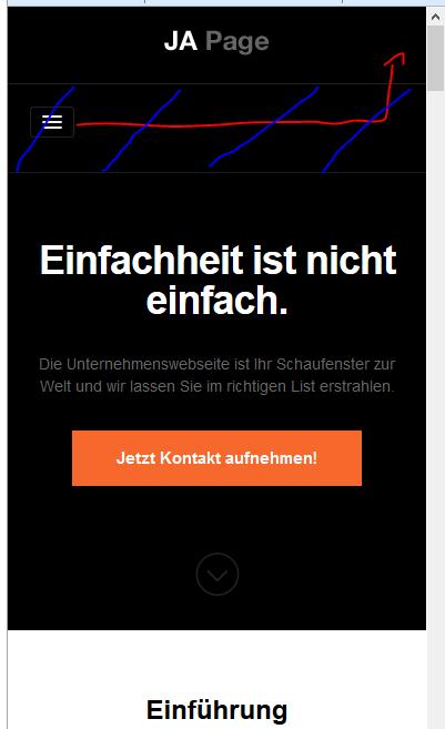
August 24, 2013 at 4:51 am #190004From my point of view it would make sense to move the menu button to the top logo area to get more space for relevant content when viewing website on smartphones.
Any ideas on how to achieve that?
 Ninja Lead
Moderator
Ninja Lead
Moderator
Ninja Lead
- Join date:
- November 2014
- Posts:
- 16064
- Downloads:
- 310
- Uploads:
- 2864
- Thanks:
- 341
- Thanked:
- 3854 times in 3563 posts
August 26, 2013 at 3:57 pm #503489This is link our demo site: http://joomla25-templates.joomlart.com/ja_onepage/ but mobile layout is difference the screenshot as you mentioned.
So that I can take a look and try to assist, please provide the url of the site you’re working on
freissmann
- Join date:
- February 2011
- Posts:
- 294
- Downloads:
- 0
- Uploads:
- 71
- Thanks:
- 79
- Thanked:
- 29 times in 1 posts
Ninja Lead
Moderator
Ninja Lead
- Join date:
- November 2014
- Posts:
- 16064
- Downloads:
- 310
- Uploads:
- 2864
- Thanks:
- 341
- Thanked:
- 3854 times in 3563 posts
August 27, 2013 at 8:00 am #503579You can follow my below solution.
Open templates/ja_onepage/css/custom.css file
Add new script
  @media (max-width: 767px) {

	position: relative;

	margin-left: 220px;

	top: -25px;

}
Hope this helps
September 3, 2013 at 9:44 am #504373The code didn’t work for me, but I used:
@media  (max-width: 767px) {

	.t3-mainnav {

        	position: relative;

		margin-left: 220px;

		top: -75px;

	}

}
It moves the menu button next to the logo, but the black space where the menu button used to be is still there. I want to get rid of that blank space.
Ninja Lead
Moderator
Ninja Lead
- Join date:
- November 2014
- Posts:
- 16064
- Downloads:
- 310
- Uploads:
- 2864
- Thanks:
- 341
- Thanked:
- 3854 times in 3563 posts
September 3, 2013 at 8:18 pm #504444pm sent with site info.
screenshot would be the same as the OP. The menu button has moved as indicated with the red arrow. However the space marked by the blue line still remains.
Ninja Lead
Moderator
Ninja Lead
- Join date:
- November 2014
- Posts:
- 16064
- Downloads:
- 310
- Uploads:
- 2864
- Thanks:
- 341
- Thanked:
- 3854 times in 3563 posts
September 4, 2013 at 8:45 am #504509I got this error when i tried to access your pm. Please check and send back me again
September 4, 2013 at 11:35 pm #504618Resent the PM, I think i send the wrong pswd first time around:-P
Ninja Lead
Moderator
Ninja Lead
- Join date:
- November 2014
- Posts:
- 16064
- Downloads:
- 310
- Uploads:
- 2864
- Thanks:
- 341
- Thanked:
- 3854 times in 3563 posts
September 5, 2013 at 7:32 am #504657<em>@piman 387980 wrote:</em><blockquote>Resent the PM, I think i send the wrong pswd first time around:-P</blockquote>
I could access your site now, this is my suggestion:
Open templates/ja_onepage/css/custom.css file
Add new script
@media (max-width: 767px) {

	#ja-header {

		height: 85px;

	}

	#ja-header .span10 {

		height: 0px;

	}

}
1 user says Thank You to Ninja Lead for this useful post
September 5, 2013 at 10:28 am #504700Awesome that works perfectly! Thanks and have fun!
kimandboo Friend
kimandboo
- Join date:
- April 2012
- Posts:
- 4
- Downloads:
- 5
- Uploads:
- 1
- Thanks:
- 6
- Thanked:
- 1 times in 1 posts
October 4, 2013 at 6:44 am #507995I was extraordinarily grateful to have found Ninja Lead’s suggestions on how to move the menu button on a smartphone to reduce the footprint for the logo and menu bar(s) over the website content.
I added your suggested code, with a change in the left margin position of the menu toggle button to be 2px, rather than 220px. The left position change is nominal – rather than leaving the menu button close to the center of the screen and almost overlapping the logo:
@media (max-width: 767px) {
.t3-mainnav {
position: relative;
margin-left: 2px;
top: -75px;
}
}@media (max-width: 767px) {
#ja-header {
height: 85px;
}
#ja-header .span10 {
height: 0px;
}
}The logo and menu toggle button are now on one bar, as I wanted, although I do have a distinct black line somewhere near the bottom margin of the original position of the menu bar.
If the image I uploaded is displayed correctly, you should see a smartphone screen capture of the logo and menu bar as it appears on the website homepage, with notations: (A) for the black line that I want to eliminate; (B) the thin bar that appears under the combined logo and menu bar, the width of which I would like to control or eliminate entirely.
AuthorPostsViewing 12 posts - 1 through 12 (of 12 total)This topic contains 12 replies, has 4 voices, and was last updated by
kimandboo 10 years, 7 months ago.
We moved to new unified forum. Please post all new support queries in our New Forum
Jump to forum

