-
AuthorPosts
-
diofou Friend
diofou
- Join date:
- October 2013
- Posts:
- 53
- Downloads:
- 20
- Uploads:
- 15
- Thanks:
- 18
- Thanked:
- 2 times in 1 posts
January 27, 2014 at 4:04 am #194127Hello,
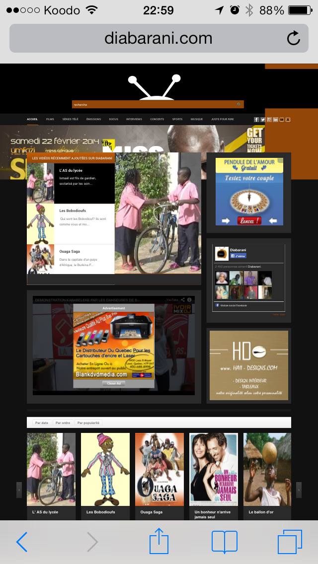
The reponsive layout was enable on my website and it showed perfectly on mobile devices when using only k2 articles but the problem is that the main component i use along my k2 articles is the HD webplayer that you can use as a standalone module or insert it in a k2 article with it’S plugin.
On my website, i have some pages with only k2 articles, like Films, Série Télé and Émission, those look fine on mobile
but on my other pages like Sports, Docus where i use the module as standAlone, they just don’t show the modules on mobile, so for now i’ve disabled the responsive template option but that’s not good for the long term.Is there anything i can do about this? i don’t mind keeping the responsive option disabled if i was having on my iphone was the same thing as on the computer, i small of course but the same, if you look at the screen shot below you will see what i’am having on my phone, the black color in the header does not go all the way to the right. if that can be fixed then i’ll keep it inactive if not how can we fix the mobile vue when it’s enabled.
Hope i’m making sense 🙂
diofou
- Join date:
- October 2013
- Posts:
- 53
- Downloads:
- 20
- Uploads:
- 15
- Thanks:
- 18
- Thanked:
- 2 times in 1 posts
January 29, 2014 at 4:51 pm #520394Hello?
Anybody?
Saguaros Moderator
Saguaros
- Join date:
- September 2014
- Posts:
- 31405
- Downloads:
- 237
- Uploads:
- 471
- Thanks:
- 845
- Thanked:
- 5346 times in 4964 posts
February 5, 2014 at 8:10 am #521259Hi,
I’m sorry for this late response. That module position maybe hidden in mobile layout, please try to enable responsive mode again, I will have a look and suggest you further.
Best.
diofou
- Join date:
- October 2013
- Posts:
- 53
- Downloads:
- 20
- Uploads:
- 15
- Thanks:
- 18
- Thanked:
- 2 times in 1 posts
February 10, 2014 at 5:59 pm #522097Hello,
i’ve enabled it, thank you for your help.
Best regards.
Saguaros
- Join date:
- September 2014
- Posts:
- 31405
- Downloads:
- 237
- Uploads:
- 471
- Thanks:
- 845
- Thanked:
- 5346 times in 4964 posts
February 11, 2014 at 8:27 am #522181Please open the file: /templates/ja_obelisk/css/themes/christmas/template-responsive.css, find this CSS rule:
@media (min-width: 600px) and (max-width: 767px) {

.t3respon {

    display: none;

}

}
Change it to:
@media (min-width: 600px) and (max-width: 767px) {

.t3respon {

    display: block;

}

}
diofou
- Join date:
- October 2013
- Posts:
- 53
- Downloads:
- 20
- Uploads:
- 15
- Thanks:
- 18
- Thanked:
- 2 times in 1 posts
February 17, 2014 at 11:45 pm #523073Hello,
I’ve changed it to block but it didn’t work, the modules are still not showing up on the pages mentioned in my first post.
Thank you.
Saguaros
- Join date:
- September 2014
- Posts:
- 31405
- Downloads:
- 237
- Uploads:
- 471
- Thanks:
- 845
- Thanked:
- 5346 times in 4964 posts
February 18, 2014 at 7:33 am #523140
.hidden-default {

  display: none !important;

}   @media (min-width: 1200px) {

  .hidden-wide {

    display: none !important;

  }

}   @media (min-width: 980px) and (max-width: 1199px) {

  .hidden-normal {

    display: none !important;

  }

}   @media (min-width: 768px) and (max-width: 979px) {

  .hidden-xtablet {

    display: none !important;

  }

}   @media (min-width: 600px) and (max-width: 767px) {

  .hidden-tablet {

    display: none !important;

  }

}   @media (max-width: 599px) {

  .hidden-mobile {

    display: none !important;

  }

}
.hidden {
display: none !important;
visibility: hidden;
}
Above is CSS rule we add to hide block in mobile view based on different screen resolution. Depend on the screen size you want to enable these blocks, you can add the appropriate style into custom.css file and change from display: none !important; to display: block !important;AuthorPostsViewing 7 posts - 1 through 7 (of 7 total)This topic contains 7 replies, has 2 voices, and was last updated by
Saguaros 10 years, 11 months ago.
We moved to new unified forum. Please post all new support queries in our New Forum
Modules not showing on responsive layout for mobile devices
Viewing 7 posts - 1 through 7 (of 7 total)