-
AuthorPosts
-
Saguaros Moderator
Saguaros
- Join date:
- September 2014
- Posts:
- 31405
- Downloads:
- 237
- Uploads:
- 471
- Thanks:
- 845
- Thanked:
- 5346 times in 4964 posts
February 28, 2018 at 2:55 am #1094314Hi Jason,
Could you use the off-canvas for menu navigation on mobile?
Go to admin panel > Templates > ja elicyon > Add-ons tab and enable the off-canvas: http://prntscr.com/ikpi4j
And disable the collapse navigation in ‘Navigation’ tab: http://prntscr.com/ikpigs
Regards
February 28, 2018 at 3:16 am #1094320The off-canvas wraps the menu below the logo level when the screen size falls below 360px. I have disabled collapsed menu and enabled off-canvas so you can confirm. I gave you admin credentials in my other thread if you need to look at anything.
Saguaros
- Join date:
- September 2014
- Posts:
- 31405
- Downloads:
- 237
- Uploads:
- 471
- Thanks:
- 845
- Thanked:
- 5346 times in 4964 posts
March 1, 2018 at 9:57 am #1094638Yes, share me the credentials of site you’re working on.
March 1, 2018 at 4:59 pm #1094683This reply has been marked as private.Saguaros
- Join date:
- September 2014
- Posts:
- 31405
- Downloads:
- 237
- Uploads:
- 471
- Thanks:
- 845
- Thanked:
- 5346 times in 4964 posts
March 2, 2018 at 4:35 am #1094804This reply has been marked as private.March 2, 2018 at 5:35 pm #1094948yeah i moved it into production yesterday so it’s at weareimago.com now
Saguaros
- Join date:
- September 2014
- Posts:
- 31405
- Downloads:
- 237
- Uploads:
- 471
- Thanks:
- 845
- Thanked:
- 5346 times in 4964 posts
March 4, 2018 at 3:37 am #1095081Hi,
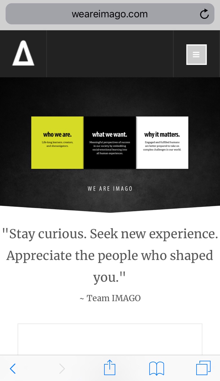
Screenshot is how your site looks on my mobile device, could you check with your device?
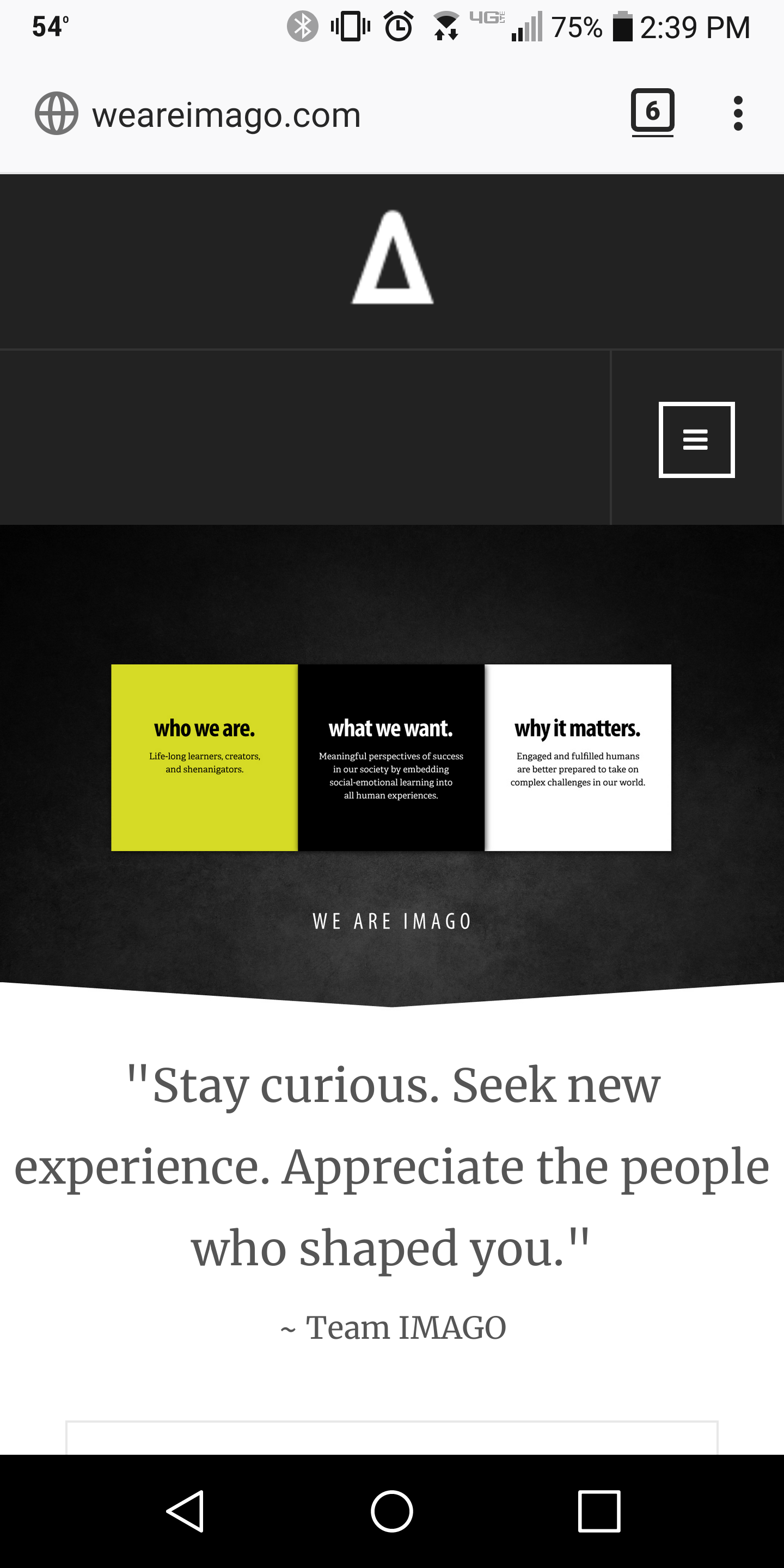
March 4, 2018 at 10:42 pm #1095175You must be holding it in landscape position as that’s what mine looks like in landscape. See attached for image of it in portrait position.
Saguaros
- Join date:
- September 2014
- Posts:
- 31405
- Downloads:
- 237
- Uploads:
- 471
- Thanks:
- 845
- Thanked:
- 5346 times in 4964 posts
March 5, 2018 at 9:19 am #1095287Hi,
You can try this custom CSS code:
@media (max-width: 360px) { .logo { width: auto !important; } }March 5, 2018 at 5:33 pm #1095376worked perfectly…thank you!
AuthorPostsViewing 10 posts - 1 through 10 (of 10 total)This topic contains 10 replies, has 2 voices, and was last updated by
jasonshoulet 6 years, 1 month ago.
The topic ‘Mobile Menu – Logo Icon and Collapsed Menu on Same Line’ is closed to new replies.
Jump to forum

