-
AuthorPosts
-
librandi Friend
librandi
- Join date:
- February 2012
- Posts:
- 587
- Downloads:
- 89
- Uploads:
- 163
- Thanks:
- 123
- Thanked:
- 2 times in 2 posts
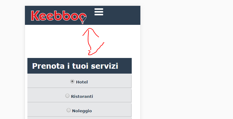
September 13, 2017 at 7:24 am #1061713hi,
how I can move the menu on the right and up?
thank you Pankaj Sharma
Moderator
Pankaj Sharma
Moderator
Pankaj Sharma
- Join date:
- February 2015
- Posts:
- 24589
- Downloads:
- 144
- Uploads:
- 202
- Thanks:
- 127
- Thanked:
- 4196 times in 4019 posts
September 13, 2017 at 7:28 am #1061719Hi
Try this code in custom.css file@media screen and (max-width: 767px) { .t3-header .row { margin: 0; display: flex; }}Hope it helps.
Regards
librandi
- Join date:
- February 2012
- Posts:
- 587
- Downloads:
- 89
- Uploads:
- 163
- Thanks:
- 123
- Thanked:
- 2 times in 2 posts
September 13, 2017 at 8:56 am #1061754Hi Pankaj Sharma,
I try but nothing changePankaj Sharma
Moderator
Pankaj Sharma
- Join date:
- February 2015
- Posts:
- 24589
- Downloads:
- 144
- Uploads:
- 202
- Thanks:
- 127
- Thanked:
- 4196 times in 4019 posts
September 13, 2017 at 9:03 am #1061758Hi
Kindly clear cache and check again,
It’s working fine at my end http://prntscr.com/gkkeojRegards
librandi
- Join date:
- February 2012
- Posts:
- 587
- Downloads:
- 89
- Uploads:
- 163
- Thanks:
- 123
- Thanked:
- 2 times in 2 posts
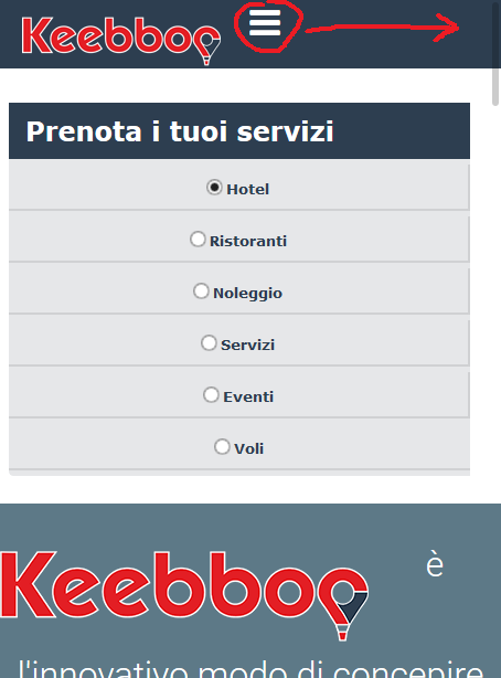
September 13, 2017 at 2:10 pm #1061817thank you very much,
is it possible to reduce this space on the mobil?Pankaj Sharma
Moderator
Pankaj Sharma
- Join date:
- February 2015
- Posts:
- 24589
- Downloads:
- 144
- Uploads:
- 202
- Thanks:
- 127
- Thanked:
- 4196 times in 4019 posts
September 14, 2017 at 12:58 am #1061937Hi
It’s coming from your custom.css file : http://prntscr.com/gkvye9
You can apply media query on the code to apply it only to PC.Regards
librandi
- Join date:
- February 2012
- Posts:
- 587
- Downloads:
- 89
- Uploads:
- 163
- Thanks:
- 123
- Thanked:
- 2 times in 2 posts
September 14, 2017 at 6:36 am #1062008thanks,can you write me the code?
Pankaj Sharma
Moderator
Pankaj Sharma
- Join date:
- February 2015
- Posts:
- 24589
- Downloads:
- 144
- Uploads:
- 202
- Thanks:
- 127
- Thanked:
- 4196 times in 4019 posts
librandi
- Join date:
- February 2012
- Posts:
- 587
- Downloads:
- 89
- Uploads:
- 163
- Thanks:
- 123
- Thanked:
- 2 times in 2 posts
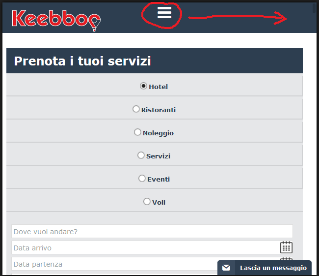
September 15, 2017 at 10:18 am #1062287hi,
how I can move the menu on the right?
thank youPankaj Sharma
Moderator
Pankaj Sharma
- Join date:
- February 2015
- Posts:
- 24589
- Downloads:
- 144
- Uploads:
- 202
- Thanks:
- 127
- Thanked:
- 4196 times in 4019 posts
librandi
- Join date:
- February 2012
- Posts:
- 587
- Downloads:
- 89
- Uploads:
- 163
- Thanks:
- 123
- Thanked:
- 2 times in 2 posts
September 19, 2017 at 8:40 am #1062871thank you, but for larger formats the nav tag is not aligned to the right. is there a way to do this?
Pankaj Sharma
Moderator
Pankaj Sharma
- Join date:
- February 2015
- Posts:
- 24589
- Downloads:
- 144
- Uploads:
- 202
- Thanks:
- 127
- Thanked:
- 4196 times in 4019 posts
September 19, 2017 at 8:55 am #1062880Hi
You can change the media query value if you want to apply the code in more than 768px display or define new custom code for different display devices.Regards
librandi
- Join date:
- February 2012
- Posts:
- 587
- Downloads:
- 89
- Uploads:
- 163
- Thanks:
- 123
- Thanked:
- 2 times in 2 posts
September 19, 2017 at 9:16 am #1062884I meant a width greater than 360 but always lower than 767, for example overturned 360px one becomes 640px in width. thanks
Pankaj Sharma
Moderator
Pankaj Sharma
- Join date:
- February 2015
- Posts:
- 24589
- Downloads:
- 144
- Uploads:
- 202
- Thanks:
- 127
- Thanked:
- 4196 times in 4019 posts
AuthorPostsViewing 14 posts - 1 through 14 (of 14 total)This topic contains 13 replies, has 2 voices, and was last updated by
Pankaj Sharma 6 years, 7 months ago.We moved to new unified forum. Please post all new support queries in our New Forum
Jump to forum