-
AuthorPosts
-
toloekka Friend
toloekka
- Join date:
- September 2007
- Posts:
- 117
- Downloads:
- 168
- Uploads:
- 35
- Thanks:
- 6
- Thanked:
- 7 times in 1 posts
March 30, 2013 at 11:20 am #186320Hi. 🙂
I am testing Mitius on a Joomla 3.0.x site and I have placed the logo/header-image using this in template.css
.logo-image a {

  background-image: url("../images/header-image.jpg");

  background-repeat: no-repeat;

  width: 1060px;

  height: 205px;

}
Here is the site: http://www.testeside.com
When I test it on my Android phone, the logo (my own logo/header-image) shrinks and fits when looking at the site in portrait view. When looking at the site in landscape, the logo does not shrink and fit like it do in portrait and I got scrolling to the side to see the hole logo/header-image. The content aperas to fit like it should.
It apears like the iPhone 3+4 and iPhone 5 (not as crappy android landscape) checking it with http://responsinator.com/?url=testeside.com
Selecting the logo/header-image in the template gave me the same result.
How can I solve this or what am I doing wrong?
Tom Løkka
phong nam Friend
phong nam
- Join date:
- May 2015
- Posts:
- 3779
- Downloads:
- 1
- Uploads:
- 587
- Thanks:
- 499
- Thanked:
- 974 times in 888 posts
April 7, 2013 at 2:40 pm #489075Hi toloekka,
Can you check your logo responsiveness on Iphone 3,4,5 ? Here is what I added in Extensions >> Template Manager >> Templates >> Mitius template files >> custom.css.
/* Iphone 3+4 (landscape) -----------*/ @media (min-width: 320px) {.logo-image {
margin-left: 0px;
}
.logo-image a {
background-size: 100% 100%;
height: 95px;
width: 460px;}
}/* Iphone 5 (landscape) -----------*/ @media (min-width: 568px) {
.logo-image {
margin-left: 0px;
}
.logo-image a {
background-size: 100% 100%;
height: 115px;
width: 550px;
}
}
* You should check your logo directly on real mobile device because http://responsinator.com/ is not a trusted online tool totally.
Regards,
—
Leotoloekka
- Join date:
- September 2007
- Posts:
- 117
- Downloads:
- 168
- Uploads:
- 35
- Thanks:
- 6
- Thanked:
- 7 times in 1 posts
April 8, 2013 at 11:48 am #489204Hi again 🙂
On my Android phone and iPhone 4 the logo/header-image is OK in Portrait as last time and “almost” OK in landscape. In landscape the logo/header-image is a bit to small. It is black on both sides of the logo/header-image.
And on my Mac and PC the logo/header-image is about half the width of the webside (115x550px?).
I would believe that this is not how the Mitius template should behave, so what is it that I have done wrong to get this problem?
Tom Løkka
phong nam
- Join date:
- May 2015
- Posts:
- 3779
- Downloads:
- 1
- Uploads:
- 587
- Thanks:
- 499
- Thanked:
- 974 times in 888 posts
April 8, 2013 at 3:32 pm #489216Hi toloekka,
I did fix this responsive issue on Mac & PC view. Here is what I added in custom.css
/* Desktop -----------*/

  @media only screen and (min-width : 1224px) {

.logo-image {

  margin-left: 0px;

}

.logo-image a {

  background-size: 100% 100%;

  width: 1050px;

  height: 205px;

}

}
“I would believe that this is not how the Mitius template should behave, so what is it that I have done wrong to get this problem?”
>> Yes. You can see that our demo logo doesn’t face this responsive issue: http://www.joomlart.com/demo/#ja_mitius
But I think the mail difference in this case that you set the logo image as large as header’s background image, while our original logo size is 357×60 px.Regards,
—
Leotoloekka
- Join date:
- September 2007
- Posts:
- 117
- Downloads:
- 168
- Uploads:
- 35
- Thanks:
- 6
- Thanked:
- 7 times in 1 posts
April 9, 2013 at 6:27 am #489279Hi and thanks again 🙂
The header-image/logo is still half the width of the webpage on my Mac and PC. (And on my Android phone, the header-image/logo in landscape is still a little to small with black on either side).
Tom Løkka
phong nam
- Join date:
- May 2015
- Posts:
- 3779
- Downloads:
- 1
- Uploads:
- 587
- Thanks:
- 499
- Thanked:
- 974 times in 888 posts
April 9, 2013 at 6:42 am #489280Hi toloekka,
Can you clean your browser cache please ??? :-*
Regards,
—
Leotoloekka
- Join date:
- September 2007
- Posts:
- 117
- Downloads:
- 168
- Uploads:
- 35
- Thanks:
- 6
- Thanked:
- 7 times in 1 posts
April 10, 2013 at 3:34 pm #489451Hi Leo and thank once more. 🙂
I have done that but now I see what is causing this for me. I hade the browser window just a little bit to small. If the browser window is about 1220 pixel or less (the header-image and content normaly is 1050 pixel wide), the header-image is half the size. If I expand the browser window to more than 1220 pixel, the header-image “pops” to the full size.
I think that this behavior is because it is responsive? But it have been nice if the header-image would not do this until you narrow down the browser window to less then the width of the header-image and the content that is normaly 1050 pixel wide, if you know what I mean.
But I do like this behavior that if I narrow down the browser window, the header-image and all the content fits in the smaller and smaller browser window.Tom Løkka 🙂
phong nam
- Join date:
- May 2015
- Posts:
- 3779
- Downloads:
- 1
- Uploads:
- 587
- Thanks:
- 499
- Thanked:
- 974 times in 888 posts
April 12, 2013 at 7:02 am #489638Hi toloekka,
It is better that you can give me your ftp account for quick fixing, because It takes me alot of time when I edit your custom.css from your admin, I need to clean browser cache each time I apply changes. In addition, I can only help to make your logo fit all the device resolutions in http://responsinator.com/ (Iphone 3,4,5, android, Ipad, PC), they are standard device solutions for all developers.
Regards,
—
Leophong nam
- Join date:
- May 2015
- Posts:
- 3779
- Downloads:
- 1
- Uploads:
- 587
- Thanks:
- 499
- Thanked:
- 974 times in 888 posts
April 15, 2013 at 6:28 am #489866Hi toloekka,
I did fit your logo in all main device views for both portrait & landscape (Iphone 3,4,5, Samsung Android, Ipad, PC, Kindle). I also include my custom.css content for whom has the same concern like you. Here is detailed codes:
@import url(../fonts/novecentowide1/stylesheet.css);/* Android mini portrait-----------*/
@media (max-width: 240px) {
.logo-image {
margin-left: 0px;
}
.logo-image a {
background-size: 100% 100%;
height: 45px;
width: 219px;
}
}
/* Samsung Android portrait-----------*/
@media (min-width : 378px) {
.logo-image {
margin-left: 0px;
}.logo-image a {
background-size: 100% 100%;
width: 360px;
height: 70px;
}
}/* Iphone 3,4 (landscape) -----------*/
@media (min-width: 478px) {
.logo-image {
margin-left: 0px;
}
.logo-image a {
background-size: 100% 100%;
height: 95px;
width: 460px;
}
}/* Iphone 5 (landscape) -----------*/ @media (min-width: 560px) {
.logo-image {
margin-left: 0px;
}.logo-image a {
background-size: 100% 100%;
height: 115px;
width: 550px;
}}
/* Kindle portrait -----------*/
@media (min-width: 598px) {
.logo-image {
margin-left: 0px;
}.logo-image a {
background-size: 100% 100%;
height: 125px;
width: 581px;
}}
/* Samsung Android lanscape-----------*/
@media (min-width : 680px) {
.logo-image {
margin-left: 0px;
}.logo-image a {
background-size: 100% 100%;
width: 668px;
height: 137px;
}
}/* iPad in portrait */ @media (min-width: 768px) {
.logo-image {
margin-left: 0px;
}.logo-image a {
background-size: 100% 100%;
width: 732px;
height: 175px;
}}
/* iPad in landscape */ @media (min-width: 1022px) {
.logo-image {
margin-left: 0px;
}.logo-image a {
background-size: 100% 100%;
width: 930px;
height: 195px;
}}
/* Desktop -----------*/
@media (min-width : 1220px) {
.logo-image {
margin-left: 0px;
}.logo-image a {
background-size: 100% 100%;
width: 1050px;
height: 205px;
}
}
http://responsinator.com/?url=http%3A%2F%2Fwww.testeside.com%2F
* Don’t forget to clean your browser cachce before checking my result.
Regards,
—
Leotoloekka
- Join date:
- September 2007
- Posts:
- 117
- Downloads:
- 168
- Uploads:
- 35
- Thanks:
- 6
- Thanked:
- 7 times in 1 posts
April 15, 2013 at 8:15 pm #489964Hi and many thanks again. 🙂
Is the problem that the header-image goes down in size before the content when I narrow the browser window fixable?
In my laptop I usually have the browser window cover the hole 15 inch screen so then it is not a problem, but on my 23 inch screen on my Mac, I narrow down the browser screen so its not covering the hole screen, and if I narrow down the screnn to less than 1220 pixel, the problem happens.
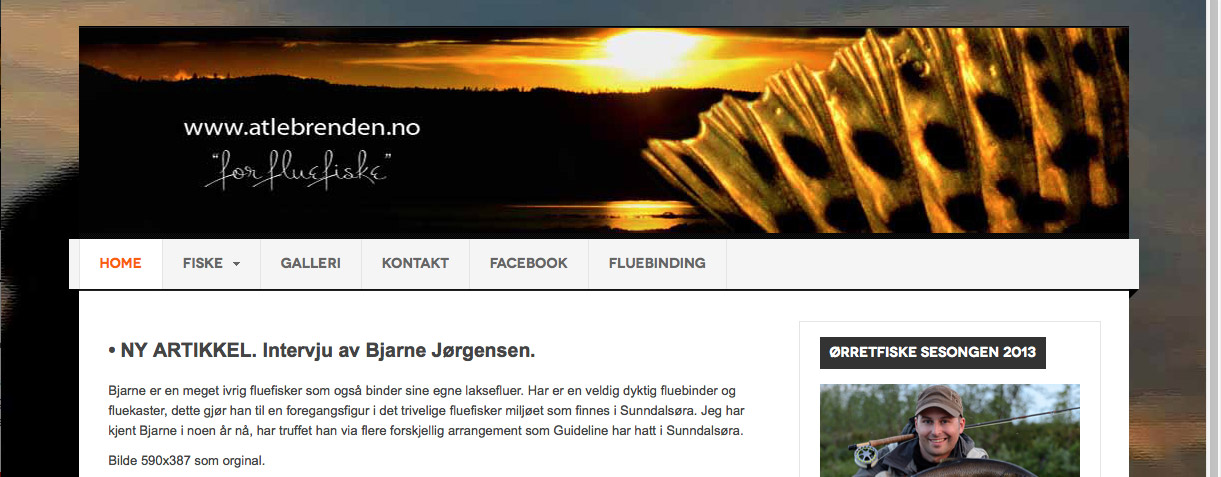
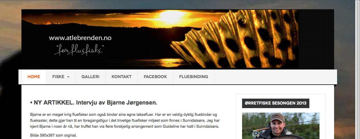
Its not the biggest problem in the world – but…..Here two attachments if I do not express my self good enough (poor english). Browser windows over 1220 pixel is OK. Browser window just a little bit less, the header-image goes down in size but not the content. If I narrow down the browser window just some more, the content goes down to the width of the header-image and looks OK again.
1209 pixel browser window1221 pixel browser window
(I cleaned the browser cache :)).
Tom Løkka
phong nam
- Join date:
- May 2015
- Posts:
- 3779
- Downloads:
- 1
- Uploads:
- 587
- Thanks:
- 499
- Thanked:
- 974 times in 888 posts
April 17, 2013 at 3:22 am #490107Hi toloekka,
Ok. I did fit your logo with all popular devices’ views as I mentioned, but there is still issue of resizing browser. So, I need more times to solve it because I’m not all that good at Bootstrap.
Hope you can wait !Regards,
—
Leotoloekka
- Join date:
- September 2007
- Posts:
- 117
- Downloads:
- 168
- Uploads:
- 35
- Thanks:
- 6
- Thanked:
- 7 times in 1 posts
April 18, 2013 at 6:49 am #490268Hi again.
Of course I can wait. Take your time. 🙂
Thanks again.:)
Tom Løkkaphong nam
- Join date:
- May 2015
- Posts:
- 3779
- Downloads:
- 1
- Uploads:
- 587
- Thanks:
- 499
- Thanked:
- 974 times in 888 posts
April 20, 2013 at 8:24 am #490518Hi toloekka,
Can you check your website again ? Finally, I fixed brower resizing for you.
Thank for your patience 🙂Regards,
—
Leotoloekka
- Join date:
- September 2007
- Posts:
- 117
- Downloads:
- 168
- Uploads:
- 35
- Thanks:
- 6
- Thanked:
- 7 times in 1 posts
April 23, 2013 at 1:50 pm #490835Hi Leo. 🙂
The resizing works better now but the header-image get smaller in the width but not in height on my Mac (out of proportion).
On my android phone the header-image have the same problem in landscape. The header-image is to high (out of proportion).
But Leo, you have used so much time on this, so I am not sorry if you give up now. I appreciate the help you have give me! 🙂
And I am not sure if I will use Mitius with the responsive option at all (do this header-image causing to much challenges) and maybe I will use Joomla 2.5.x instead of Joomla 3.0.x because of some image gallery I am testing. RS Media Gallery is not ready for Joomla 3.0.x
Will you kill me now?:((
Tom Løkka
phong nam
- Join date:
- May 2015
- Posts:
- 3779
- Downloads:
- 1
- Uploads:
- 587
- Thanks:
- 499
- Thanked:
- 974 times in 888 posts
April 24, 2013 at 8:32 am #490896Hi toloeka,
Of course. No. I think I need to learn more about Bootstrap for better customization support.
And I have recently received a PM about your new issue, I’ll check it & reply back.Regards,
—
Len-
AuthorPosts
This topic contains 16 replies, has 2 voices, and was last updated by
toloekka 11 years ago.
We moved to new unified forum. Please post all new support queries in our New Forum
Jump to forum

