-
AuthorPosts
-
okkhalid Friend
okkhalid
- Join date:
- November 2012
- Posts:
- 229
- Downloads:
- 2
- Uploads:
- 133
- Thanked:
- 3 times in 1 posts
April 28, 2014 at 3:31 am #197132hello,
I have placed an image to the mashead-1 postion
but the text in mashead-2 overlap the image. also the image is not fit right there:Another issue I have,
I’m trying to use the price list to use it to have the prices for our services.
1) I would like to center the 2 columns with the header text to the middle of the page:
the MAGIC STYLES PRICE LIST Text
Description and Price columns are not centered in the page, they are on the left.2) When I display the pricing page in the mobile phone:
http://www.magicstyles.ca/pricing-listthe 2 columns are mobile responsive, so the display shows, the description list and then under that the price list.
Since these 2 columns are must be together all time so the customer can see the description with the price.in desktop view it shows ok beside each others. but in the mobile it move it in the top each other.
Can I have the 2 columns beside each other all time, not matter what devices used to view the site.
Thanks,


fmfame Friend
fmfame
- Join date:
- October 2013
- Posts:
- 228
- Downloads:
- 4
- Uploads:
- 39
- Thanks:
- 8
- Thanked:
- 25 times in 1 posts
April 28, 2014 at 9:43 am #532670Hi.
For your first issue you need a bigger picture with more width and less height.
Your picture is too small so it never could shown right.
If you have problems with viewing again, please let me know.For your second issue you have to put the description in same window like the price. This is a pricing table for 3 different packages. So you cant use 2 price tables for the same packages without having viewing problems.
I would try to integrate the desc and the price in same line in ONE Table and so it should be view perfect.
example:
Mens hair cut —> $20,00
etc..okkhalid
- Join date:
- November 2012
- Posts:
- 229
- Downloads:
- 2
- Uploads:
- 133
- Thanked:
- 3 times in 1 posts
April 28, 2014 at 9:48 pm #532772Hi, I have upload bigger picture, now the area become big and the same problem is still there.
 TomC
Moderator
TomC
Moderator
TomC
- Join date:
- October 2014
- Posts:
- 14077
- Downloads:
- 58
- Uploads:
- 137
- Thanks:
- 948
- Thanked:
- 3155 times in 2495 posts
April 28, 2014 at 10:10 pm #532775<em>@okkhalid 424136 wrote:</em><blockquote>Hi, I have upload bigger picture, now the area become big and the same problem is still there.</blockquote>
Might you be able to throw together a quick screenshot mock-up of how you want your image/caption to display correctly?
okkhalid
- Join date:
- November 2012
- Posts:
- 229
- Downloads:
- 2
- Uploads:
- 133
- Thanked:
- 3 times in 1 posts
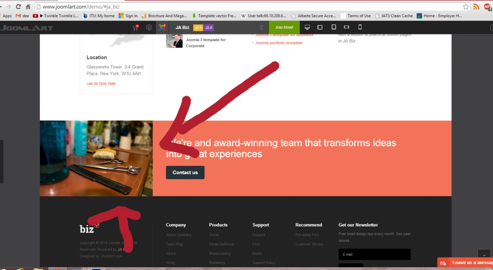
April 28, 2014 at 11:49 pm #532786Here you go,
Im looking to get this image in this section.
Hayden A Friend
Hayden A
- Join date:
- April 2010
- Posts:
- 282
- Downloads:
- 0
- Uploads:
- 20
- Thanked:
- 54 times in 53 posts
April 29, 2014 at 4:04 am #532811<blockquote>Im looking to get this image in this section.</blockquote>
Please create a new css file named: custom.css in the templatesja_bizcss path and add the following rule:
[PHP].mashead-1 img{
width: 100%;
}.mashead-1 .eq-first {
margin-left: -120px;
}.t3-mashead .custom {
padding: 0;
}.t3-mashead .custom > p {
padding: 0;
margin: 0;
}.mashead-2 h3 {
padding-top: 50px;
}[/PHP]okkhalid
- Join date:
- November 2012
- Posts:
- 229
- Downloads:
- 2
- Uploads:
- 133
- Thanked:
- 3 times in 1 posts
April 29, 2014 at 2:54 pm #532891Did not work, yet, 🙁
okkhalid
- Join date:
- November 2012
- Posts:
- 229
- Downloads:
- 2
- Uploads:
- 133
- Thanked:
- 3 times in 1 posts
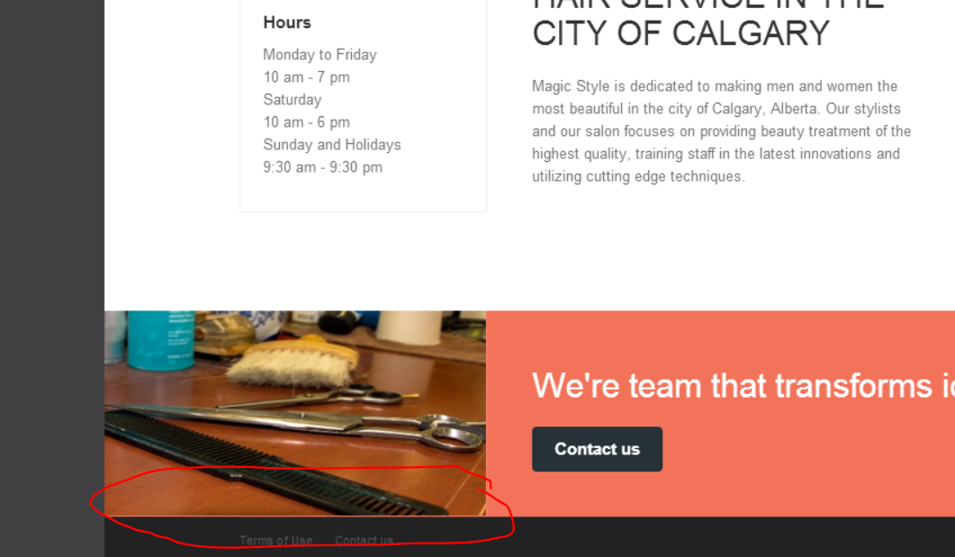
April 29, 2014 at 3:25 pm #532898It works, now, but the picture is stretched and become longer
Also there is a red gaps in the bottom and in the right of the image:
Here is mock for what I’m looking for:
an image the is can fill the area and not big so it looks nice with the text beside it.

fmfame
- Join date:
- October 2013
- Posts:
- 228
- Downloads:
- 4
- Uploads:
- 39
- Thanks:
- 8
- Thanked:
- 25 times in 1 posts
okkhalid
- Join date:
- November 2012
- Posts:
- 229
- Downloads:
- 2
- Uploads:
- 133
- Thanked:
- 3 times in 1 posts
April 29, 2014 at 8:46 pm #532925Worked very well, but still I can see small red gap in the bottom of the image. can we remove that. thanks
fmfame
- Join date:
- October 2013
- Posts:
- 228
- Downloads:
- 4
- Uploads:
- 39
- Thanks:
- 8
- Thanked:
- 25 times in 1 posts
April 30, 2014 at 9:21 am #532989Hi i have seen your issue.
but i found another one 😉
try this: 1. you have to upload the same picture with 1px more height ( now its 182px in height but the div container have a min-height of 183px)
And i have seen that on smaller browser width it have also a little issue in picture width.. And thats caused by haydens code.
add this code below your other custom.css lines
Now all should shown good!
@media (max-width: 990px){
.mashead-1 .eq-first {
margin-left: -20px;
margin-right: -20px;
}
}Let me know..
maybe you could provide us with your backend access if the problem persistsokkhalid
- Join date:
- November 2012
- Posts:
- 229
- Downloads:
- 2
- Uploads:
- 133
- Thanked:
- 3 times in 1 posts
May 2, 2014 at 12:48 am #533224sorry it did not work with the new code and the 183px.
I have pm you the login info, thank you for the help.fmfame
- Join date:
- October 2013
- Posts:
- 228
- Downloads:
- 4
- Uploads:
- 39
- Thanks:
- 8
- Thanked:
- 25 times in 1 posts
May 2, 2014 at 9:40 am #533269Hi okkhalid i added few lines in your custom.css and changed other lines a little bit..
Now it works!
I checked all widths!
on Mobile phones you have a little bit space around the whole masthead module, thats easier and that will also working with other picture sizes.
Have a nice day!
1 user says Thank You to fmfame for this useful post
okkhalid
- Join date:
- November 2012
- Posts:
- 229
- Downloads:
- 2
- Uploads:
- 133
- Thanked:
- 3 times in 1 posts
May 2, 2014 at 5:37 pm #533350Thank you so much for the great support.you guys are awesome 😀
AuthorPostsViewing 14 posts - 1 through 14 (of 14 total)This topic contains 14 replies, has 4 voices, and was last updated by
okkhalid 10 years, 9 months ago.
We moved to new unified forum. Please post all new support queries in our New Forum
Jump to forum
Minor customization
Viewing 14 posts - 1 through 14 (of 14 total)