-
AuthorPosts
-
 felix1
Friend
felix1
Friend
felix1
- Join date:
- February 2015
- Posts:
- 220
- Downloads:
- 36
- Uploads:
- 78
- Thanks:
- 67
- Thanked:
- 20 times in 6 posts
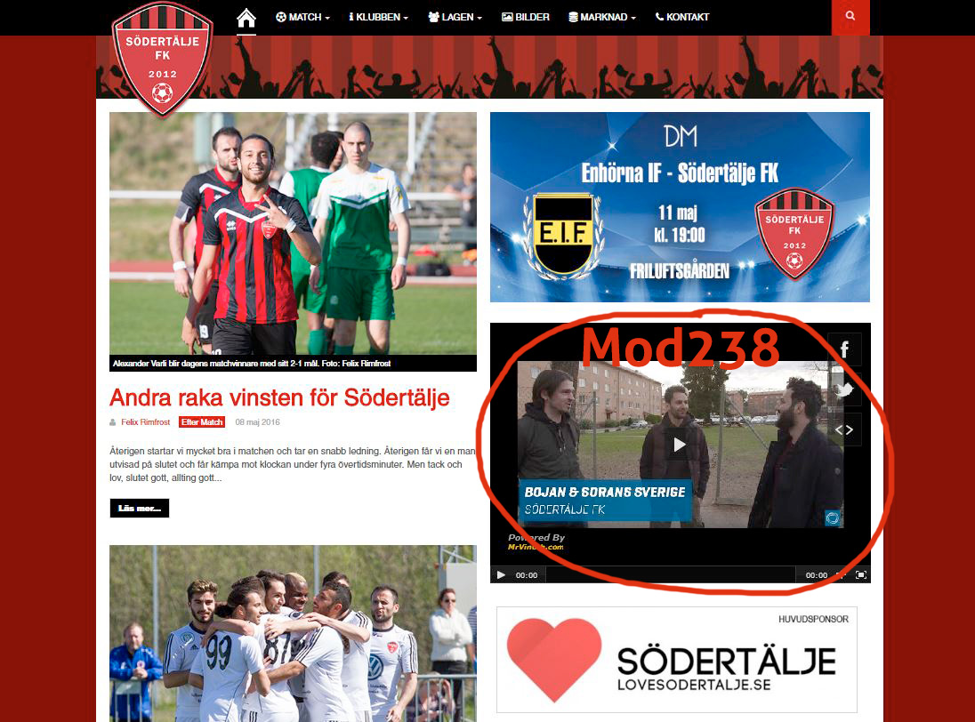
May 9, 2016 at 6:21 pm #928540I have a video module in mastcol with id=Mod238. How can I make it responsive?
Felix Rimfrost
 Pankaj Sharma
Moderator
Pankaj Sharma
Moderator
Pankaj Sharma
- Join date:
- February 2015
- Posts:
- 24589
- Downloads:
- 144
- Uploads:
- 202
- Thanks:
- 127
- Thanked:
- 4196 times in 4019 posts
May 10, 2016 at 2:06 am #928718Hi
This is because the iframe code you are using have a fixed width so its not resizing the video in small layouts
Check the 3rd party extension configurations you are using for this and make the width 100% .
Hope it helps .May 10, 2016 at 8:28 pm #929106Hey,
create a custom html module and insert this: (replace the src with your video)
HTML:
<div align="center"> <iframe width="854" height="510" src="https://www.youtube.com/embed/LOREMIPSUM" frameborder="0" allowfullscreen></iframe>Now go to /templates/purity_iii/css/custom.css (or create it) and insert this code:
CSS:.embed-container { position: relative; padding-bottom: 56.25%; height: 0; overflow: hidden; max-width: 100%; margin-top: 1.5rem; } .embed-container iframe, .embed-container object, .embed-container embed { position: absolute; top: 0; left: 0; width: 100%; height: 100%; }This is a common problem so you can just google for "make Iframe Responsive". The solutions should be adaptable to Purity 3 too.
Regards,
Marcelfelix1
Friend
felix1
- Join date:
- February 2015
- Posts:
- 220
- Downloads:
- 36
- Uploads:
- 78
- Thanks:
- 67
- Thanked:
- 20 times in 6 posts
May 13, 2016 at 1:05 pm #930366Thanks Marcel, but it didn’t work exactly as you described… 🙁
I changed following code in my custom HTML module:
<div class="embed-container"><iframe src="https://www.youtube.com/embed/lC6HTHINVVo" width="570" height="321" seamless="seamless" allowfullscreen="allowfullscreen"></iframe></div>And I inserted following code in my custom.css:
.embed-container { position: relative; padding-bottom: 56.25%; height: 0; overflow: hidden; max-width: 100%; margin-top: 1.5rem; } .embed-container iframe, .embed-container object, .embed-container embed { position: absolute; top: 0; left: 0; width: 100%; height: 100%; }What’s wrong?
Felix Rimfrost
Pankaj Sharma
Moderator
Pankaj Sharma
- Join date:
- February 2015
- Posts:
- 24589
- Downloads:
- 144
- Uploads:
- 202
- Thanks:
- 127
- Thanked:
- 4196 times in 4019 posts
May 14, 2016 at 1:29 am #930504Hi
Flexi
please check my last suggest , you should use the width of iframe as 100% .
Becuase there is fixed width of iframe it use same width in all devices .felix1
Friend
felix1
- Join date:
- February 2015
- Posts:
- 220
- Downloads:
- 36
- Uploads:
- 78
- Thanks:
- 67
- Thanked:
- 20 times in 6 posts
May 14, 2016 at 7:40 am #930512I changed the embed code in my custom HTML module to:
<iframe src="[https://www.youtube.com/embed/lC6HTHINVVo](https://www.youtube.com/embed/lC6HTHINVVo)" width="100%" height="100%" seamless="seamless" allowfullscreen="allowfullscreen">But now the module height is cut off? Why?
Felix Rimfrost
Pankaj Sharma
Moderator
Pankaj Sharma
- Join date:
- February 2015
- Posts:
- 24589
- Downloads:
- 144
- Uploads:
- 202
- Thanks:
- 127
- Thanked:
- 4196 times in 4019 posts
May 15, 2016 at 4:06 am #930651This reply has been marked as private.felix1
Friend
felix1
- Join date:
- February 2015
- Posts:
- 220
- Downloads:
- 36
- Uploads:
- 78
- Thanks:
- 67
- Thanked:
- 20 times in 6 posts
May 15, 2016 at 7:26 am #930677Now the width is responsiv but the sides are cut off in mobile view. Isn’t there really any way to make the whole module responsiv!?
Felix Rimfrost
Pankaj Sharma
Moderator
Pankaj Sharma
- Join date:
- February 2015
- Posts:
- 24589
- Downloads:
- 144
- Uploads:
- 202
- Thanks:
- 127
- Thanked:
- 4196 times in 4019 posts
May 16, 2016 at 12:16 am #930842This reply has been marked as private.felix1
Friend
felix1
- Join date:
- February 2015
- Posts:
- 220
- Downloads:
- 36
- Uploads:
- 78
- Thanks:
- 67
- Thanked:
- 20 times in 6 posts
May 17, 2016 at 10:07 pm #931776But the sides are cut off! If you make an image responsive, it isn’t cut off, it’s just getting smaller.
Can you please answer me why the width of the video is cut in the custom HTML module?
Felix Rimfrost
Pankaj Sharma
Moderator
Pankaj Sharma
- Join date:
- February 2015
- Posts:
- 24589
- Downloads:
- 144
- Uploads:
- 202
- Thanks:
- 127
- Thanked:
- 4196 times in 4019 posts
May 18, 2016 at 1:13 am #931789Hi
Give me screenshot and point the cutting part of iframe in screenshot .
You can see its showing normal >>> http://prntscr.com/b5cdgbfelix1
Friend
felix1
- Join date:
- February 2015
- Posts:
- 220
- Downloads:
- 36
- Uploads:
- 78
- Thanks:
- 67
- Thanked:
- 20 times in 6 posts
May 24, 2016 at 2:30 pm #934214Hi Felix
try this Its working for me . I am using 100%width for iframe .Thanks Joomstack!
This is exactly what I wanted help with, and what Pankaj Sharma couldn’t help me with.Now the video don’t get cut off on both sides. I wonder why Pankaj couldn’t see that!?
Felix Rimfrost
Pankaj Sharma
Moderator
Pankaj Sharma
- Join date:
- February 2015
- Posts:
- 24589
- Downloads:
- 144
- Uploads:
- 202
- Thanks:
- 127
- Thanked:
- 4196 times in 4019 posts
May 24, 2016 at 3:06 pm #934220HI
Great it worrk for u .thanks for update .Thanks Joomstack
AuthorPostsViewing 14 posts - 1 through 14 (of 14 total)This topic contains 13 replies, has 4 voices, and was last updated by
Pankaj Sharma 8 years, 8 months ago.We moved to new unified forum. Please post all new support queries in our New Forum
Jump to forum
melih

