-
AuthorPosts
-
Ch1vpH Friend
Ch1vpH
- Join date:
- February 2016
- Posts:
- 299
- Downloads:
- 21
- Uploads:
- 128
- Thanks:
- 29
- Thanked:
- 1 times in 1 posts
May 8, 2017 at 8:37 pm #1032172Hello,
I want my Menu Items to appear under the logo and with the Horizontal Line as it does on a medium to a large screen.
At the moment when on an extra large screen the menu items appear to the left of the logo with no hoz line.
Is there any way to do this?
Thanks in advance.
Chris.
 Pankaj Sharma
Moderator
Pankaj Sharma
Moderator
Pankaj Sharma
- Join date:
- February 2015
- Posts:
- 24589
- Downloads:
- 144
- Uploads:
- 202
- Thanks:
- 127
- Thanked:
- 4196 times in 4019 posts
May 9, 2017 at 3:37 am #1032247Hi
Open /tpls/blocks/header.php file
and change the column size as showing my screenshot http://prntscr.com/f5pbk8
Now open /templates/ja_brickstore/local/css/themes/dark-peach/template.css
Find and remove below code@media (min-width: 1200px){ body.header-horizontal .t3-mainnav { position: absolute; }}Regards
Ch1vpH
- Join date:
- February 2016
- Posts:
- 299
- Downloads:
- 21
- Uploads:
- 128
- Thanks:
- 29
- Thanked:
- 1 times in 1 posts
May 9, 2017 at 9:25 pm #1032535Hi – So I believe I made those changes correctly and there is extra space in the ‘menu area, but no horizontal line appears as yet…and I can’t seem to click my menu items whilst using a big screen monitor.
Please advise
Pankaj Sharma
Moderator
Pankaj Sharma
- Join date:
- February 2015
- Posts:
- 24589
- Downloads:
- 144
- Uploads:
- 202
- Thanks:
- 127
- Thanked:
- 4196 times in 4019 posts
May 10, 2017 at 1:14 am #1032582Hi
Use below code in custom.css file to add the border line@media (max-width: 5679px) { body.header-horizontal .logo { float: none; border-bottom: 1px solid #e8e8e8; margin-left: 0; width: 100%; } }Regards
1 user says Thank You to Pankaj Sharma for this useful post
Ch1vpH
- Join date:
- February 2016
- Posts:
- 299
- Downloads:
- 21
- Uploads:
- 128
- Thanks:
- 29
- Thanked:
- 1 times in 1 posts
May 10, 2017 at 10:05 pm #1033021Hi – Thanks it now works with the horizontal line across the top and looks much better!
Although since I added some of the original changes you mentioned in the first part of the thread, another separate problem has re-occurred.
The problem is to do with these bg-coloured blocks or coloured boxes (see image) from the .acm-features module which I did remove from the site with some custom code from another thread….but they have now re-appeared when on a smaller screen.
My question is: Can you help me remove just the coloured ‘bg-white’ boxes but keep the JA ACM Title, Description & Button as I initially needed to have on my site? see example
Please note I have since taken out the custom code I originally used to remove these blocks & below is the code I came up with to remove just the ‘coloured square’
.t3-section-module#Mod161 .acm-features.style-1 .right .features-item.odd .features-item-inner .bg-white {
position: display:none!; !important;
}
Pankaj Sharma
Moderator
Pankaj Sharma
- Join date:
- February 2015
- Posts:
- 24589
- Downloads:
- 144
- Uploads:
- 202
- Thanks:
- 127
- Thanked:
- 4196 times in 4019 posts
May 11, 2017 at 1:03 am #1033033Hi
Will u be so kind to open a separate thread for a different topic question?
It also helps our community.
RegardsCh1vpH
- Join date:
- February 2016
- Posts:
- 299
- Downloads:
- 21
- Uploads:
- 128
- Thanks:
- 29
- Thanked:
- 1 times in 1 posts
May 11, 2017 at 10:35 am #1033200Hi there,
I do already have another thread on this subject but it has come to a dead end.
I just thought relevant to this one, as the blocks only re-appeared after making the changes above to do with the Hoz line’ query in this thread.
I’m glad this re-occurred anyway, as I do still need to have these options from acm features-intro module ”title/description/button” on my site.
So should I still do a new thread? – Let me know
Thanks
Pankaj Sharma
Moderator
Pankaj Sharma
- Join date:
- February 2015
- Posts:
- 24589
- Downloads:
- 144
- Uploads:
- 202
- Thanks:
- 127
- Thanked:
- 4196 times in 4019 posts
May 12, 2017 at 12:43 am #1033376Hi
The changes do not belong to header as all classes are different.
to remove the white background use this code in custom.css.bg-white { color: #4c4c4c; background-color: transparent; }Ch1vpH
- Join date:
- February 2016
- Posts:
- 299
- Downloads:
- 21
- Uploads:
- 128
- Thanks:
- 29
- Thanked:
- 1 times in 1 posts
June 17, 2017 at 10:10 am #1042436Hi there – My site is http://ch1vph.xyz/ri2k/
A while back I set up a ‘hoz-line’ to go across the top of my page, (underneath my logo) and it works ok for most size screens… although when testing on very small screens/devices the horizontal line covers the text part of my logo – see attached image
Please advise if there is a way round this from happening.
Pankaj Sharma
Moderator
Pankaj Sharma
- Join date:
- February 2015
- Posts:
- 24589
- Downloads:
- 144
- Uploads:
- 202
- Thanks:
- 127
- Thanked:
- 4196 times in 4019 posts
Ch1vpH
- Join date:
- February 2016
- Posts:
- 299
- Downloads:
- 21
- Uploads:
- 128
- Thanks:
- 29
- Thanked:
- 1 times in 1 posts
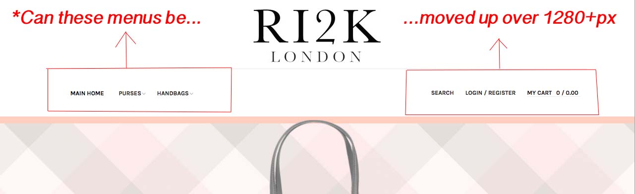
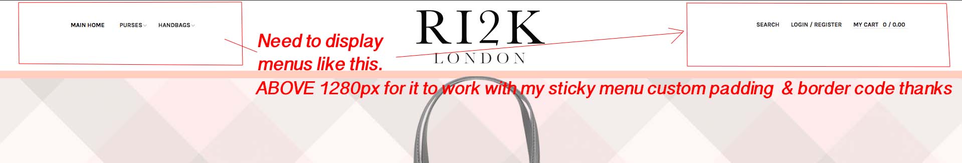
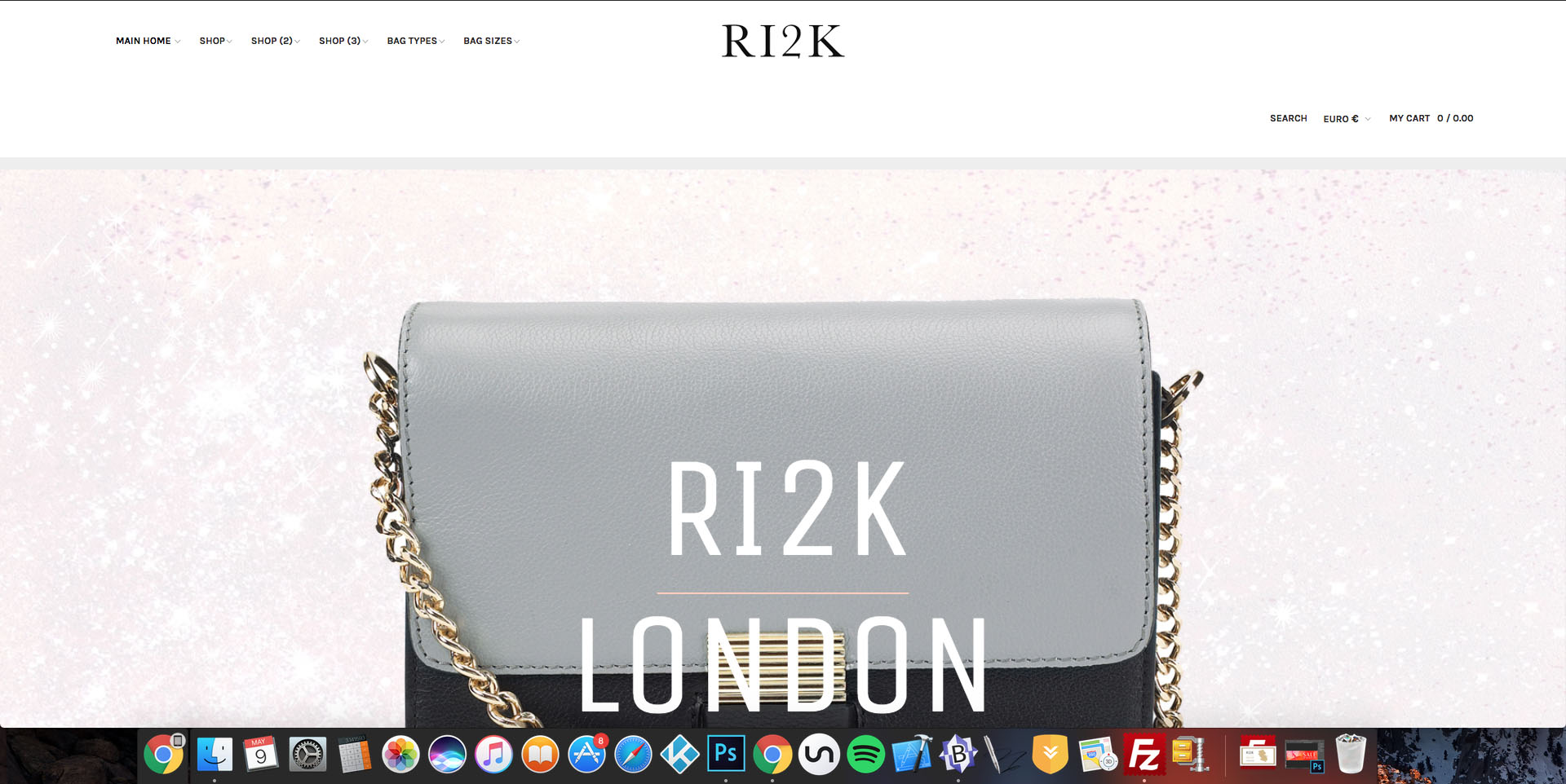
July 18, 2017 at 8:48 pm #1049606Hi there – My site that I’m currently testing this menu setup on is: http://ch1vph.xyz/ri2k/
My client now wants the ‘menu items’ sat next to the main logo (as it originally was) so I’ve backtracked through every step I took to have the menu items display under the logo! But I do want to keep the menus under the main logo but ONLY after 1280px’s
After 1280px I need to have Menu Items to display next to the logo on either side as it seems to do over 1600’ish pixels…
I have attached some screenshots explaining what I’m after doing just need a little help moving them!
Thanks
 Pankaj Sharma
Moderator
Pankaj Sharma
Moderator
Pankaj Sharma
- Join date:
- February 2015
- Posts:
- 24589
- Downloads:
- 144
- Uploads:
- 202
- Thanks:
- 127
- Thanked:
- 4196 times in 4019 posts
July 19, 2017 at 12:06 am #1049642Hi
Since the question is different than the topic, could u please open a separate thread for this, it also helps other users.Regards
-
AuthorPosts
Viewing 12 posts - 1 through 12 (of 12 total)This topic contains 11 replies, has 2 voices, and was last updated by
Pankaj Sharma 6 years, 9 months ago.We moved to new unified forum. Please post all new support queries in our New Forum
Jump to forum

