-
AuthorPosts
-
hooftman Friend
hooftman
- Join date:
- October 2014
- Posts:
- 23
- Downloads:
- 0
- Uploads:
- 7
- Thanks:
- 6
- Thanked:
- 1 times in 1 posts
October 17, 2014 at 9:07 am #202174The Slideshow disappears on mobile devices, responsive on or off doesn’t matter. It also disappears when resizing to very small browser window. Also the bottom menu gets stacked vertically on mobile and in small browser window. See attached screenshots for correct version and mobile version.
Please advise, thank you.
 Pankaj Sharma
Moderator
Pankaj Sharma
Moderator
Pankaj Sharma
- Join date:
- February 2015
- Posts:
- 24589
- Downloads:
- 144
- Uploads:
- 202
- Thanks:
- 127
- Thanked:
- 4196 times in 4019 posts
October 17, 2014 at 11:47 am #553380HI Slideshow is hidden for mobile device by default .
There is reason behind , its designed for the large display devices and its not looks good + to make the site load faster on mobile devices its hidden .
if you want to show it on mobile devices ,
add this css code into your custom.css file .path: /templates/your ja template/css/custom.css
if there is no custom.css file create a file with name custom.css
and add this code.hidden-xs {
display: block;
}Clear cache and check.
hooftman
- Join date:
- October 2014
- Posts:
- 23
- Downloads:
- 0
- Uploads:
- 7
- Thanks:
- 6
- Thanked:
- 1 times in 1 posts
October 19, 2014 at 2:59 pm #553488Hi Pankajsharma,
Thanks for the reply. Unfortunately it doesn’t make any difference. Cache is off and the new css file is being loaded, but it still doesn’t load the slideshow in a smaller window or on a mobile. Any ideas?
Also, any suggestion how to fix the footer menu?
Thx
hooftman
- Join date:
- October 2014
- Posts:
- 23
- Downloads:
- 0
- Uploads:
- 7
- Thanks:
- 6
- Thanked:
- 1 times in 1 posts
October 20, 2014 at 4:46 am #553551Thanks, that worked! How about the footer menu?
Pankaj Sharma
Moderator
Pankaj Sharma
- Join date:
- February 2015
- Posts:
- 24589
- Downloads:
- 144
- Uploads:
- 202
- Thanks:
- 127
- Thanked:
- 4196 times in 4019 posts
October 20, 2014 at 5:09 am #553555Can you PM me your working site admin details so that i can take look in it .
hooftman
- Join date:
- October 2014
- Posts:
- 23
- Downloads:
- 0
- Uploads:
- 7
- Thanks:
- 6
- Thanked:
- 1 times in 1 posts
October 20, 2014 at 6:09 am #553559I’ve sent you the details.
I have one more issue. The JA Bulletin module with the title “Laatste Nieuws” has a read more link which says “more”. However, our website is in Dutch, but I can’t find where to change this.
 Ninja Lead
Moderator
Ninja Lead
Moderator
Ninja Lead
- Join date:
- November 2014
- Posts:
- 16064
- Downloads:
- 310
- Uploads:
- 2864
- Thanks:
- 341
- Thanked:
- 3854 times in 3563 posts
October 20, 2014 at 10:28 am #553599@hooftman: You can rollback the fix here. I’m afraid that it will conflict/effect all classes in mobile layout 🙁
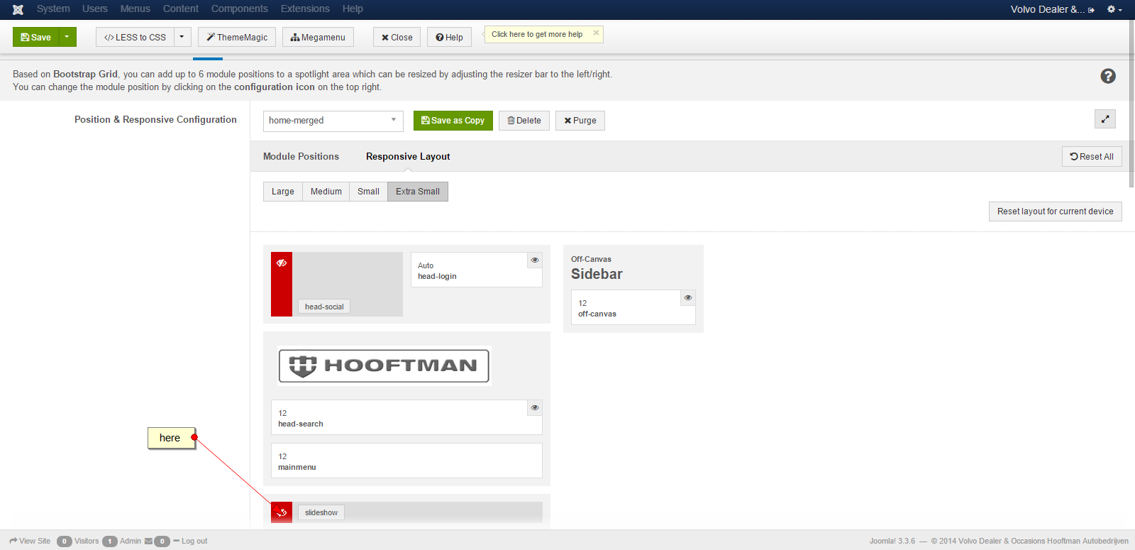
JA Slideshow doesn’t show on mobile viewport because it’s set to be hidden from back-end settings for Extra Small layout.
You can go to Admin site -> Template Manager -> ja_biz – Home merged -> Layout tabs -> Responsive Layout -> Extra Small -> click eye icon to show it, see the screenshot
Regarding to the “more” text in JA Bulletin module, you can translate this text via language file of this template: /language/xx-XX/xx-XX.tpl_ja_biz.ini (xx-XX here is code of your own language like en-GB of English)
Look for this text field:
TPL_MORE ="More"
and change to your desired text.
Pankaj Sharma
Moderator
Pankaj Sharma
- Join date:
- February 2015
- Posts:
- 24589
- Downloads:
- 144
- Uploads:
- 202
- Thanks:
- 127
- Thanked:
- 4196 times in 4019 posts
October 20, 2014 at 6:26 pm #553654Hi please revert the changes that i suggested in my previous post to show the slideshow on mobile devices . because there will be a chance of conflict of css.
you can enbale slideshow position from template options >>layout>>responsive layout >>extra small devices
>>> http://prntscr.com/4y23ev as Ninja Lead suggested in above psot .For the issue related to the footer . They are coming on the all devices view , you can control the position via template responsive layout options same as we mentioned for slideshow .
Note : If you are using a Non responsive (Off) , as i saw on your site , i suggest you to take full backup of your site .
Then compile less to css , because there are some css that are conflict from responsive template view Less to css will rebuild the css for non responsive view.
It will solve your all problemsAuthorPostsViewing 8 posts - 1 through 8 (of 8 total)This topic contains 7 replies, has 3 voices, and was last updated by
Pankaj Sharma 10 years, 3 months ago.We moved to new unified forum. Please post all new support queries in our New Forum
Jump to forum
melih