-
AuthorPosts
-
karocki Friend
karocki
- Join date:
- July 2011
- Posts:
- 10
- Downloads:
- 0
- Uploads:
- 0
- Thanks:
- 3
- Thanked:
- 1 times in 1 posts
February 18, 2014 at 8:56 am #194904Hi There,
I really like Purity iii and enjoying testing it out. I have noticed three issues though.
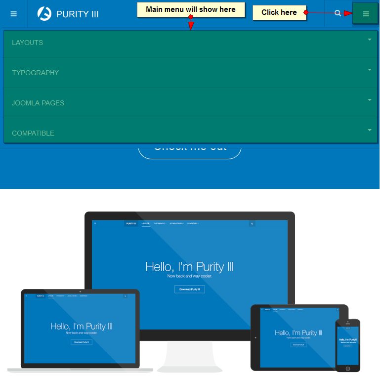
- on my iPad Retina display the mega menu goes off the screen making the site impossible to navigate on it…
- The images are very blurry on the retina display. Is there a way to load differnt images for devices like the iPad Retina?
- I followed the instructions to add the BACK TO TO BUTTON but did not work. I have now removed the changes I made but would you mind seeing why it did not work?
Thank you in advance for your assistance.
Regards,
Markrvillela Friend
rvillela
- Join date:
- March 2013
- Posts:
- 30
- Downloads:
- 0
- Uploads:
- 5
- Thanks:
- 7
- Thanked:
- 5 times in 1 posts
February 18, 2014 at 8:01 pm #523272I too think this template is Awesome!
I also noticed a MegaMenu issue on the iPad/mobile phone. The MegaMenu seems to conflict with JomSocial styles.
On desktops regardless of browsers the sub-menus work well with JomSocial, but on my iPad and mobile phone (Android), the sub-menus do not expand.Try this URL on a desktop http://www.bikingzone.us/my-profile and hover over the the Mountain for Road menus, the submenus dropdown just fine.
No do the same thing at the same URL on an iPad or mobile phone and you will notice that the sub-menus DO NOT expand. Now on the same iPad or mobile phone go to http://www.bikingzone.us and you will notice the sub-menus drop down just fine.Sorry I don’t know how to troubleshoot this issue on a mobile device.
Nazario A Friend
Nazario A
- Join date:
- April 2013
- Posts:
- 1183
- Downloads:
- 0
- Uploads:
- 406
- Thanks:
- 91
- Thanked:
- 284 times in 263 posts
February 19, 2014 at 8:03 am #523359Hi Mask,
<blockquote>1. on my iPad Retina display the mega menu goes off the screen making the site impossible to navigate on it…</blockquote>
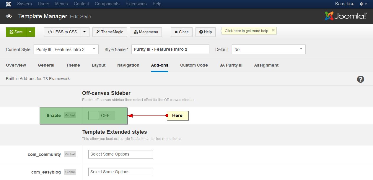
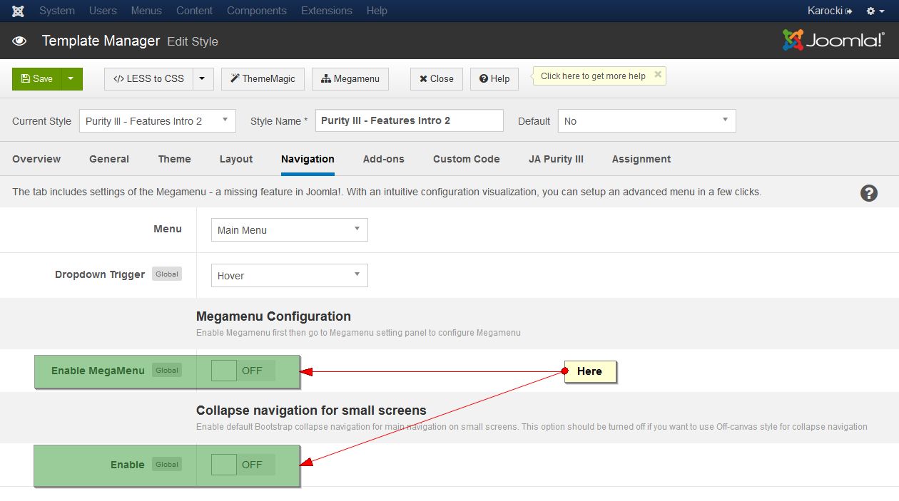
A – I just checked and see that your site did not use the megamenu, collapse navigation for small screens and Off-canvas Sidebar.As default, on the iPad, the menu will show as in this screnshort:
You need to enable “Collapse navigation for small screens” in template manager >> Navigation in the backend of your site.
Also, please create a new file called “custom.css” in /templates/purity_iii/css/ path then add this rule:
@media (max-width: 768px){

	.logo {

	    position: absolute;

	}

	.navbar {

		min-height: 65px;

	}

	.head-search .search .fa-search {

		top: 25px;

	}

	.head-search .form-control {

		height: 65px;

	}

}
<blockquote>2. The images are very blurry on the retina display. Is there a way to load differnt images for devices like the iPad Retina?</blockquote>
Please show where are the images you mentioned on your site?<blockquote>3. I followed the instructions to add the BACK TO TO BUTTON but did not work. I have now removed the changes I made but would you mind seeing why it did not work?
</blockquote>Here are steps:
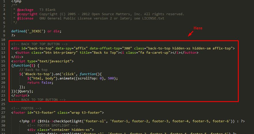
– Open the file: /templates/purity_iii/tpls/blocks/footer.php then add this rule:
<!-- BACK TOP TOP BUTTON -->

<div id="back-to-top" data-spy="affix" data-offset-top="300" class="back-to-top hidden-xs hidden-sm affix-top">

  <button class="btn btn-primary" title="Back to Top"><i class="fa fa-caret-up"></i></button>

</div>

<script type="text/javascript">

(function($) {

	// Back to top

	$('#back-to-top').on('click', function(){

		$("html, body").animate({scrollTop: 0}, 500);

		return false;

	});

})(jQuery);

</script>

<!-- BACK TO TOP BUTTON -->
– Open the file: /templates/purity_iii/css/custom.css then add this rule:
.back-to-top {

    bottom: 40px;

    right: 20px;

    top: auto;

}
Let me know how it goes.
1 user says Thank You to Nazario A for this useful post
karocki
- Join date:
- July 2011
- Posts:
- 10
- Downloads:
- 0
- Uploads:
- 0
- Thanks:
- 3
- Thanked:
- 1 times in 1 posts
February 22, 2014 at 8:09 am #523875Thanks for the help.
Yeah, I turned Megamenu off as was not working on iPad retina display. It works fine on a normal iPad (generation 1 and 2) but anything later and this template does not look/work well. The retina is 2048px x 1536px so it is by no means a small screen so your code for smaller screens does not apply to it.
Its not an issue anymore though as I have decided not to use the mega menu.
But the main issue that all the images (and I mean all) look blurry on it as the iPad retina blows them up so they are not tiny. Its a problem with all images on the retina display. I need to add some code that detects the retina display and then uses a different image. I found this http://www.ostraining.com/blog/joomla/retina-js/ but not sure where to add the,
<script src=”/<?php echo $this->baseurl; ?>/templates/<?php echo $this->template; ?>/js/retina.js” type=”text/javascript”></script>
code.
Thank you,
KarockiAuthorPostsViewing 5 posts - 1 through 5 (of 5 total)This topic contains 5 replies, has 3 voices, and was last updated by
karocki 10 years, 11 months ago.
We moved to new unified forum. Please post all new support queries in our New Forum
Jump to forum
melih

