-
AuthorPosts
-
March 15, 2016 at 10:00 am #899887
Hey again,
I tried to make my google maps inside my articles responsive but somehow it does not work.
I read a tutorial about it but can’t really make it work.
The tutorial said that I should use this container around the code from google maps:<div class="responsiveContainer"> <!-- iframe-Code von Google Maps --> </div>And I have to put this code into my stylsheet :
.responsiveContainer {
  position: relative;
  padding-bottom: 56%;
  height: 0;
  overflow: hidden;
}

.responsiveContainer iframe {
  position: absolute;
  top: 0;
  left: 0;
  width: 100%;
  height: 100%;
}
I created a custom.css and put it into /templates/ja_smashboard/css/
Does not seem to work. What am I missing?
 Ninja Lead
Moderator
Ninja Lead
Moderator
Ninja Lead
- Join date:
- November 2014
- Posts:
- 16064
- Downloads:
- 310
- Uploads:
- 2864
- Thanks:
- 341
- Thanked:
- 3854 times in 3563 posts
March 16, 2016 at 4:20 am #900237I created a custom.css and put it into /templates/ja_smashboard/css/
Hi,
You can apply my tweak below
.responsiveContainer {
  position: relative;
  width: 100%;
  height: 100%;
  overflow: hidden;
}

.responsiveContainer iframe,
.responsiveContainer object,
.responsiveContainer embed {
  position: absolute;
  top: 0;
  left: 0;
  width: 100%;
  height: 100%;
}
Regards
March 16, 2016 at 4:43 am #900244Hey, thanks for the quick reply.
I put your code in my custom.css but nothing changed.
This is how it looks on the desktop:
http://imgur.com/ZOAuM9K
And like this mobile:
http://imgur.com/nr2ArUjThis is the code I am using in my article right now.
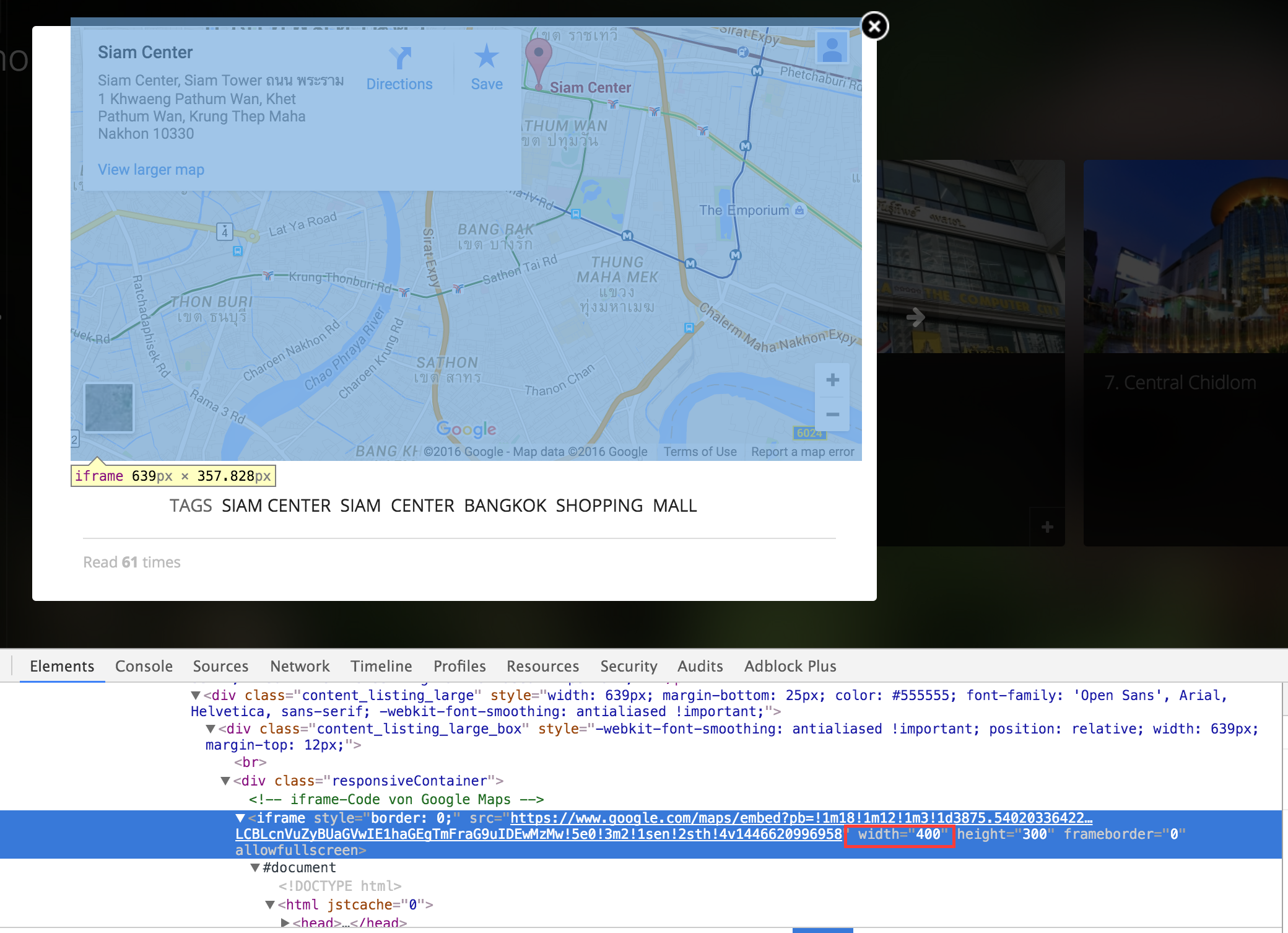
<div class="responsiveContainer"><!-- iframe-Code von Google Maps --> <iframe style="border: 0;" src="https://www.google.com/maps/embed?pb=!1m18!1m12!1m3!1d3875.540203364225!2d100.53063091453471!3d13.746264590351059!2m3!1f0!2f0!3f0!3m2!1i1024!2i768!4f13.1!3m3!1m2!1s0x30e29ecd86cba21f%3A0xa4718d11d120a6b0!2zU2lhbSBDZW50ZXIsIFNpYW0gVG93ZXIg4LiW4LiZ4LiZIOC4nuC4o-C4sOC4o-C4suC4oSAxIEtod2FlbmcgUGF0aHVtIFdhbiwgS2hldCBQYXRodW0gV2FuLCBLcnVuZyBUaGVwIE1haGEgTmFraG9uIDEwMzMw!5e0!3m2!1sen!2sth!4v1446620996958" width="400" height="300" frameborder="0" allowfullscreen=""></iframe></div>What am I doing wrong?
Ninja Lead
Moderator
Ninja Lead
- Join date:
- November 2014
- Posts:
- 16064
- Downloads:
- 310
- Uploads:
- 2864
- Thanks:
- 341
- Thanked:
- 3854 times in 3563 posts
March 16, 2016 at 5:07 am #900251You can give me the URL of your site here, I will check it for you.
March 16, 2016 at 5:25 am #900254I´ll send you a PM
// Ehm don’t see where or how I can send you a PM. I created an admin account for you so I don’t wanna write the login details public.
The website is : http://www.bangkok-top10.com
The site is in maintenance mode.Ninja Lead
Moderator
Ninja Lead
- Join date:
- November 2014
- Posts:
- 16064
- Downloads:
- 310
- Uploads:
- 2864
- Thanks:
- 341
- Thanked:
- 3854 times in 3563 posts
March 16, 2016 at 5:49 am #900257// Ehm don’t see where or how I can send you a PM
Please send me the credentials info via your reply and set as private reply.
March 16, 2016 at 6:47 am #900267This reply has been marked as private.Ninja Lead
Moderator
Ninja Lead
- Join date:
- November 2014
- Posts:
- 16064
- Downloads:
- 310
- Uploads:
- 2864
- Thanks:
- 341
- Thanked:
- 3854 times in 3563 posts
March 16, 2016 at 7:58 am #900283This reply has been marked as private.March 16, 2016 at 8:02 am #900285This reply has been marked as private.Ninja Lead
Moderator
Ninja Lead
- Join date:
- November 2014
- Posts:
- 16064
- Downloads:
- 310
- Uploads:
- 2864
- Thanks:
- 341
- Thanked:
- 3854 times in 3563 posts
March 16, 2016 at 8:18 am #900297This reply has been marked as private.March 16, 2016 at 8:29 am #900308This reply has been marked as private.Ninja Lead
Moderator
Ninja Lead
- Join date:
- November 2014
- Posts:
- 16064
- Downloads:
- 310
- Uploads:
- 2864
- Thanks:
- 341
- Thanked:
- 3854 times in 3563 posts
March 16, 2016 at 9:29 am #900340I fixed it directly on your site and you can see my solution into custom.css file
.responsiveContainer {
  position: relative;
  width: 100%;
  height: 100%;
  overflow: hidden;
  margin-left: -80px !important;
}
with
margin-left: -80px !important;March 16, 2016 at 9:41 am #900354Yeah I can see it, but on the mobile phone it still doesn’t work.
Ninja Lead
Moderator
Ninja Lead
- Join date:
- November 2014
- Posts:
- 16064
- Downloads:
- 310
- Uploads:
- 2864
- Thanks:
- 341
- Thanked:
- 3854 times in 3563 posts
March 16, 2016 at 9:50 am #900358Please have a look at a screenshot with my highlight on that, you will see
widthis forcing with 400px and I am afraid you won’t able to make the responsive on mobile layout.March 16, 2016 at 9:56 am #900363This is the demo site of the guy who did the tutorial I was talking about.
https://media.kulturbanause.de/blog/2012/10/google-maps-responsive.htmlDoes that help you in any way?
AuthorPostsThis topic contains 18 replies, has 2 voices, and was last updated by
shorttimefun 8 years, 10 months ago.
We moved to new unified forum. Please post all new support queries in our New Forum
melih

