-
AuthorPosts
-
mortenrasmussen Friend
mortenrasmussen
- Join date:
- October 2010
- Posts:
- 78
- Downloads:
- 0
- Uploads:
- 19
- Thanks:
- 11
- Thanked:
- 5 times in 1 posts
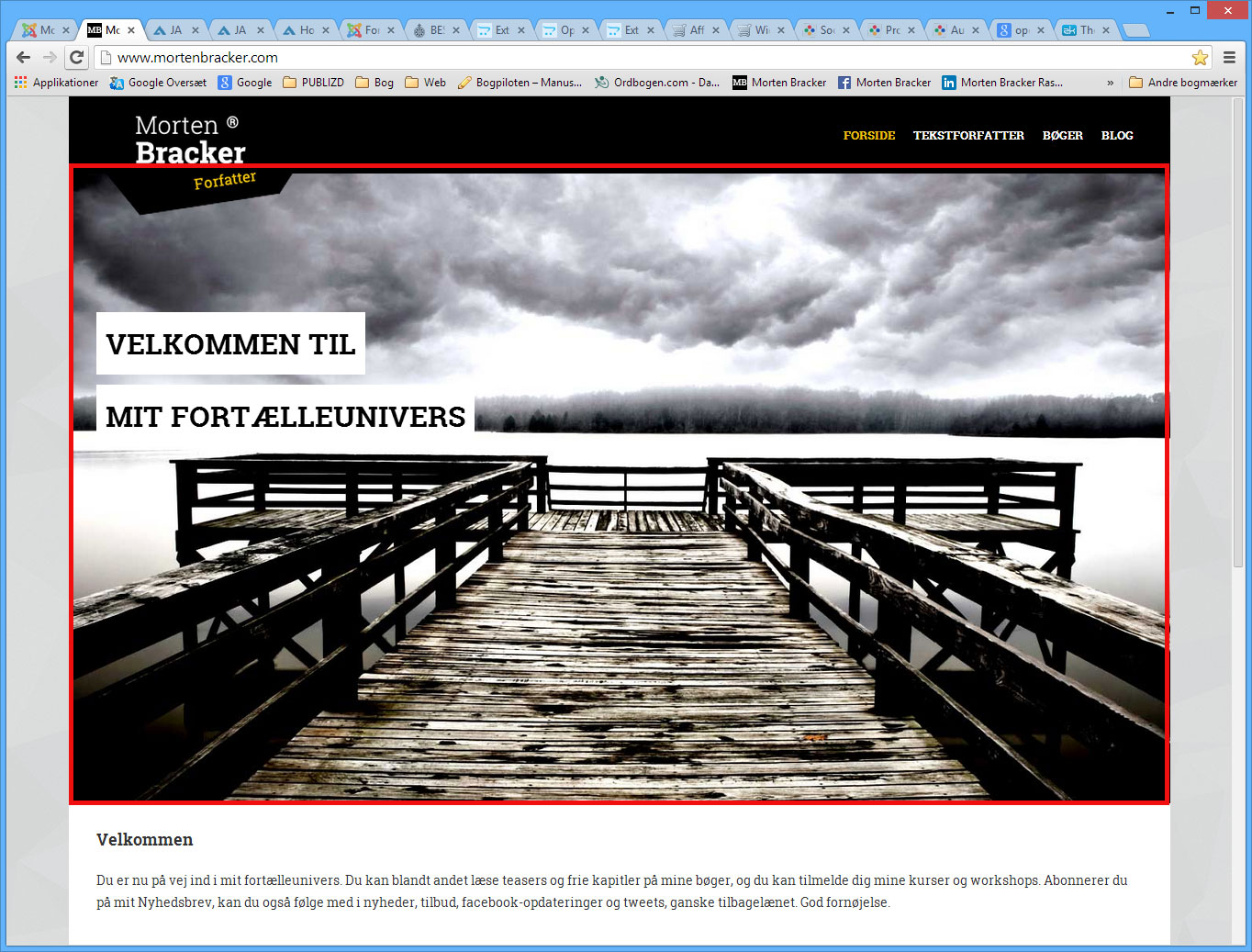
April 8, 2014 at 9:00 am #196559Hi,
I have setup a slideshow on the frontpage (http://www.mortenbracker.dk). And just like your demo, it has a nice image effect when on large screens. See attached image. BUT when on medium screens and less it goes to a “normal” look with a square image (see attached image).
How can I keep the look from the large screen when on medium screens too?
Thanks and best regards, Morten

Css Magician Friend
Css Magician
- Join date:
- October 2014
- Posts:
- 741
- Downloads:
- 43
- Uploads:
- 53
- Thanks:
- 114
- Thanked:
- 366 times in 263 posts
April 8, 2014 at 9:51 am #529967@mortenrasmussen, in large screen, you can see two vertical spaces at far left and right on both side of main-container. These areas make the effect visible. Whereas, medium or smaller screen no longer has such space. If we add space as in large screen, the main-container will become too big which forces the site width exceed the screen width.
mortenrasmussen
- Join date:
- October 2010
- Posts:
- 78
- Downloads:
- 0
- Uploads:
- 19
- Thanks:
- 11
- Thanked:
- 5 times in 1 posts
April 8, 2014 at 10:12 am #529972Yes I can see that. But it has a breakpoint already at 1400px. There is room down too at least 1200px as I can see it. So would it be possible to change this breakpoint?
Css Magician
- Join date:
- October 2014
- Posts:
- 741
- Downloads:
- 43
- Uploads:
- 53
- Thanks:
- 114
- Thanked:
- 366 times in 263 posts
April 8, 2014 at 10:34 am #529982@mortenrasmussen, if you want to change this breakpoint, please open the templatesja_decorlessvariables.less file and edit this line:
@screen-lg: 1400px
and edit this line@container-large-desktop: ((1400px + @grid-gutter-width));
Then compile css in template manager.1 user says Thank You to Css Magician for this useful post
mortenrasmussen
- Join date:
- October 2010
- Posts:
- 78
- Downloads:
- 0
- Uploads:
- 19
- Thanks:
- 11
- Thanked:
- 5 times in 1 posts
April 8, 2014 at 12:44 pm #530002Okay, what I did change in the templatesja_decorlessvariables.less was:
this:
// Large screen / wide desktop

@container-large-desktop:      ((1400px + @grid-gutter-width));

@container-lg:                 @container-large-desktop;

@container-lg-max:             @container-lg - 1;
to this:
// Large screen / wide desktop

@container-large-desktop:      ((1200px + @grid-gutter-width));

@container-lg:                 @container-large-desktop;

@container-lg-max:             @container-lg - 1;
And this:
// Medium screen / desktop

@container-desktop:            ((1200px + @grid-gutter-width));

@container-md:                 @container-desktop;

@container-md-max:             @container-md - 1;
to this:
// Medium screen / desktop

@container-desktop:            ((1216px + @grid-gutter-width));

@container-md:                 @container-desktop;

@container-md-max:             @container-md - 1;
And this:
// Large screen / wide desktop

// Note: Deprecated @screen-lg and @screen-lg-desktop as of v3.0.1

@screen-lg:                  1400px;

@screen-lg-min:              @screen-lg;

@screen-lg-desktop:          @screen-lg-min;
to this:
// Large screen / wide desktop

// Note: Deprecated @screen-lg and @screen-lg-desktop as of v3.0.1

@screen-lg:                  1215px;

@screen-lg-min:              @screen-lg;

@screen-lg-desktop:          @screen-lg-min;
Now the main area is 1200px wide and breaks at screen size 1215px (the 15 is because of the width of the scrollbar).
I know this is dependend on individual taste and needs. So the excact numbers are of course to be set indivudually.
sunlons Friend
sunlons
- Join date:
- February 2013
- Posts:
- 41
- Downloads:
- 0
- Uploads:
- 39
- Thanks:
- 4
- Thanked:
- 1 times in 1 posts
August 12, 2014 at 3:57 am #545580I have the same quesiton.
 Ninja Lead
Moderator
Ninja Lead
Moderator
Ninja Lead
- Join date:
- November 2014
- Posts:
- 16064
- Downloads:
- 310
- Uploads:
- 2864
- Thanks:
- 341
- Thanked:
- 3854 times in 3563 posts
August 13, 2014 at 7:31 am #545796@mortenrasmussen and @sunlons: Please try to configure the variables.less file as follows:
+ Re-define: @grid-gutter-width
Change
// Padding, to be divided by two and applied to the left and right of all columns
@grid-gutter-width: 0px;To
// Padding, to be divided by two and applied to the left and right of all columns
@grid-gutter-width: 80px;+ Re-define small screen / tablet, medium screen / desktop and large screen / wide desktop
Change
// Small screen / tablet

@container-tablet:             ((720px + @grid-gutter-width));

@container-sm:                 @container-tablet;
// Medium screen / desktop
@container-desktop: ((1200px + @grid-gutter-width));
@container-md: @container-desktop;
@container-md-max: @container-md - 1;// Large screen / wide desktop
@container-large-desktop: ((1400px + @grid-gutter-width));
@container-lg: @container-large-desktop;
@container-lg-max: @container-lg - 1;To
// Small screen / tablet

@container-tablet:             ((680px + @grid-gutter-width));

@container-sm:                 @container-tablet;
// Medium screen / desktop
@container-desktop: ((940px + @grid-gutter-width));
@container-md: @container-desktop;
@container-md-max: @container-md - 1;// Large screen / wide desktop
@container-large-desktop: ((1140px + @grid-gutter-width));
@container-lg: @container-large-desktop;
@container-lg-max: @container-lg - 1;Once done, access JA Decor template admin and click Compile LESS to CSS button.
-
AuthorPosts
Viewing 7 posts - 1 through 7 (of 7 total)This topic contains 7 replies, has 4 voices, and was last updated by
Ninja Lead 10 years, 5 months ago.We moved to new unified forum. Please post all new support queries in our New Forum
Jump to forum
melih

