-
AuthorPosts
-
puntje Friend
puntje
- Join date:
- April 2014
- Posts:
- 239
- Downloads:
- 29
- Uploads:
- 119
- Thanks:
- 48
- Thanked:
- 4 times in 3 posts
June 16, 2015 at 11:30 pm #207474How can i put the home-feature in the mobile. It does not work.
Also a question about the head it has two different colors in the menu and search. How can i change it in one color
How can i update the template it does not work.
 Pankaj Sharma
Moderator
Pankaj Sharma
Moderator
Pankaj Sharma
- Join date:
- February 2015
- Posts:
- 24589
- Downloads:
- 144
- Uploads:
- 202
- Thanks:
- 127
- Thanked:
- 4196 times in 4019 posts
June 17, 2015 at 2:06 am #574327Hello
Home feature Block is Hidden by default in small layouts due to the design purpose its not look good .
If you want to show it add the below code in custom.css file.home-feature {display:block!important;}
If you want to change the top tool bar color same like menu
add below code in custom.css
.wrap.toolbar {
background: #005952!important;
}
Change the color code as per needs .
Hope it helps you.Pankaj Sharma
Moderator
Pankaj Sharma
- Join date:
- February 2015
- Posts:
- 24589
- Downloads:
- 144
- Uploads:
- 202
- Thanks:
- 127
- Thanked:
- 4196 times in 4019 posts
June 17, 2015 at 2:06 am #640666Hello
Home feature Block is Hidden by default in small layouts due to the design purpose its not look good .
If you want to show it add the below code in custom.css file.home-feature {display:block!important;}
If you want to change the top tool bar color same like menu
add below code in custom.css
.wrap.toolbar {
background: #005952!important;
}
Change the color code as per needs .
Hope it helps you.Pankaj Sharma
Moderator
Pankaj Sharma
- Join date:
- February 2015
- Posts:
- 24589
- Downloads:
- 144
- Uploads:
- 202
- Thanks:
- 127
- Thanked:
- 4196 times in 4019 posts
June 17, 2015 at 2:06 am #739336Hello
Home feature Block is Hidden by default in small layouts due to the design purpose its not look good .
If you want to show it add the below code in custom.css file.home-feature {display:block!important;}
If you want to change the top tool bar color same like menu
add below code in custom.css
.wrap.toolbar {
background: #005952!important;
}
Change the color code as per needs .
Hope it helps you.puntje
- Join date:
- April 2014
- Posts:
- 239
- Downloads:
- 29
- Uploads:
- 119
- Thanks:
- 48
- Thanked:
- 4 times in 3 posts
June 17, 2015 at 7:34 am #574389I did that, but home-feature is not showing on my mobile.
It is showing on tablet, computer, but not in the mobile, also in On.
I have made a custom.css and it work with css styles
.home-feature {display:block!important;}
.home-feature > .container {
background: none repeat scroll 0 0 #34ad65
padding: 5px;
}(still not showing on mobile)
And the search and and navigation hamburger (off canvas) @media screen and (max-width: 767px) {
.t3-module {
background: #34ad65
color: inherit;}
.t3-mainnav .nav-collapse .nav > li > a:hover {
background-color: #005952
background-image: none;
color: #fff
letter-spacing: 1px;
filter: progid: DXImageTransform.Microsoft.gradient(enabled = false);
}.t3-mainnav .nav-collapse .nav > li.active > a {
color: #e73628
background: #fff
}.t3-mainnav .nav-collapse .nav > li > a, .t3-mainnav .nav-collapse .dropdown-menu a {
border-bottom: 1px solid #35cd34
padding: 9px 18px;
color:#000;
letter-spacing: 1px;
background: #fff000
font-weight: bold;
text-shadow: none;
text-transform: uppercase;
-webkit-border-radius: 0;
-moz-border-radius: 0;
border-radius: 0;
}
.t3-mainnav .nav-collapse .nav > li > a:hover {
background-color: none;
background-image: none;
color: #e73628
letter-spacing: 1px;
filter: progid: DXImageTransform.Microsoft.gradient(enabled = false);
}.t3-mainnav {
background: #75ef3f
margin-top: 51px;
border-bottom: 1px solid #e73628
}.wrap.toolbar {
background: #00aeef
}#head-search-block form .search {
background: #00aeef
color:#000;
border-top:#fff000 solid 1px;}
}
Because in the computer – tablet width, it is another color. Only on mobile is see it.
I looked for the css in Safari en Firefox and i find the code easy
Pankaj Sharma
Moderator
Pankaj Sharma
- Join date:
- February 2015
- Posts:
- 24589
- Downloads:
- 144
- Uploads:
- 202
- Thanks:
- 127
- Thanked:
- 4196 times in 4019 posts
June 17, 2015 at 7:55 am #574394Hello
Template options also have an option to hide the module position according to the device .
you can show home-feature module postion from template manager >> Domein Webdesign>>options >> Layout>> Responsive layout >> Mobile >> http://prntscr.com/7hx8om
you can there are options for mobile,desktop tablet to hide or show the position .
Click on Eye icon if you want to hide , and click on module name block to show it again .
Hope it helps.puntje
- Join date:
- April 2014
- Posts:
- 239
- Downloads:
- 29
- Uploads:
- 119
- Thanks:
- 48
- Thanked:
- 4 times in 3 posts
June 17, 2015 at 12:55 pm #574418Hi, i did that. And it does not work. I do not see it in the mobile version
Pankaj Sharma
Moderator
Pankaj Sharma
- Join date:
- February 2015
- Posts:
- 24589
- Downloads:
- 144
- Uploads:
- 202
- Thanks:
- 127
- Thanked:
- 4196 times in 4019 posts
June 17, 2015 at 3:56 pm #574442<em>@puntje 478634 wrote:</em><blockquote>Hi, i did that. And it does not work. I do not see it in the mobile version</blockquote>
Hello
its really strange because i checked and replied it for you .
I checked on admin panel you have not published (http://prntscr.com/7i1ydz)the module position for mobile layout as i suggested .
so just publish it for you .
you can check the site now its showing home feature on mobile fine .1 user says Thank You to Pankaj Sharma for this useful post
puntje
- Join date:
- April 2014
- Posts:
- 239
- Downloads:
- 29
- Uploads:
- 119
- Thanks:
- 48
- Thanked:
- 4 times in 3 posts
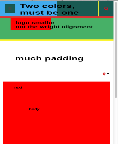
June 17, 2015 at 4:23 pm #574452Strange, I tried and tried and it did not work. Found many css.
There is much padding between home feature and the content (this is still a problem)
Also the logo is very small and not good aligned, can i change that. That is on mobile
I can change the width. I try to change it with the code below, and it worked
.row .span50, .row-fluid .span50 {
width: 140%;
float:none;
alignment-baseline: middle;
margin-top:18px;
margin-bottom:-28px;
}
I have two colors in the head of the mobile. One is the navigation and one is the search. I tried to change that in a media css query. So it also look fun and nice. But to much padding and the logo that i find a problem. How can i change that
See attachment and picture
Pankaj Sharma
Moderator
Pankaj Sharma
- Join date:
- February 2015
- Posts:
- 24589
- Downloads:
- 144
- Uploads:
- 202
- Thanks:
- 127
- Thanked:
- 4196 times in 4019 posts
June 17, 2015 at 4:35 pm #574454Hi
You have a lot of customization on your site that make effect to other settings .
for padding issue please refresh the page and check your custom.css file you have a lot of changes there for home=feature .
For the change in the color of the search (toolbar ) provided the code to add in custom,css file in #2 post .here is code that you need to add
.wrap.toolbar {
background:
#00aeef!important;}
so both have same color .
Hope it helps1 user says Thank You to Pankaj Sharma for this useful post
puntje
- Join date:
- April 2014
- Posts:
- 239
- Downloads:
- 29
- Uploads:
- 119
- Thanks:
- 48
- Thanked:
- 4 times in 3 posts
June 17, 2015 at 4:41 pm #574456That worked. Put it in the media query
Know the padding is still a problem between body-content and home-feature
I know i changed much, but i want to make my own layout. So it are my colors.
Also put this in the query
.t3-mainbody {
padding-bottom: 36px;
padding-top: 0;
}On the computer it works. Know i’m going to test it on my my mobile
puntje
- Join date:
- April 2014
- Posts:
- 239
- Downloads:
- 29
- Uploads:
- 119
- Thanks:
- 48
- Thanked:
- 4 times in 3 posts
June 17, 2015 at 4:51 pm #574459.row .span50, .row-fluid .span50 {
width: 100%;
float:none;
alignment-baseline: middle;
margin-top:18px;
margin-bottom:-15px;
}I changed in 100% width. The image is also larger know. I still see the scroll-bars on mobile and computer on the smallest screen. How can i remove that
That is the only problem i think. I must test some more
Do you know the problem of the block, the more space
It seems to look fine on tablet and computer. So the only problem for this template is the scrolbar on the mobile
I think the footer is too large.
Pankaj Sharma
Moderator
Pankaj Sharma
- Join date:
- February 2015
- Posts:
- 24589
- Downloads:
- 144
- Uploads:
- 202
- Thanks:
- 127
- Thanked:
- 4196 times in 4019 posts
June 18, 2015 at 12:04 am #574505Dear sir
For a different topic . I request you to a open a new thread and add all the details related your issue in new thread .
Thanks .Pankaj Sharma
Moderator
Pankaj Sharma
- Join date:
- February 2015
- Posts:
- 24589
- Downloads:
- 144
- Uploads:
- 202
- Thanks:
- 127
- Thanked:
- 4196 times in 4019 posts
June 18, 2015 at 12:04 am #640850Dear sir
For a different topic . I request you to a open a new thread and add all the details related your issue in new thread .
Thanks .Pankaj Sharma
Moderator
Pankaj Sharma
- Join date:
- February 2015
- Posts:
- 24589
- Downloads:
- 144
- Uploads:
- 202
- Thanks:
- 127
- Thanked:
- 4196 times in 4019 posts
June 18, 2015 at 12:04 am #739514Dear sir
For a different topic . I request you to a open a new thread and add all the details related your issue in new thread .
Thanks .AuthorPostsViewing 15 posts - 1 through 15 (of 15 total)This topic contains 15 replies, has 2 voices, and was last updated by
Pankaj Sharma 8 years, 10 months ago.We moved to new unified forum. Please post all new support queries in our New Forum
Jump to forum