-
AuthorPosts
-
 stazzy
Friend
stazzy
Friend
stazzy
- Join date:
- September 2014
- Posts:
- 375
- Downloads:
- 34
- Uploads:
- 65
- Thanks:
- 36
- Thanked:
- 3 times in 1 posts
May 3, 2016 at 8:36 pm #926181Good day admin. I have reduced my leading title and article title size through custon css by inspecting the element, but it has refused to reflect. And my article full images are so so so big even if i resize to 60 by 60px befor uploading it comes out so large in articles and becomes blur. Pls i need help. view images. THANKS

 Pankaj Sharma
Moderator
Pankaj Sharma
Moderator
Pankaj Sharma
- Join date:
- February 2015
- Posts:
- 24589
- Downloads:
- 144
- Uploads:
- 202
- Thanks:
- 127
- Thanked:
- 4196 times in 4019 posts
May 4, 2016 at 1:30 am #926242Hi
Kindly Turn OFF the CSS compression from template options and Post your site url here .stazzy
Friend
stazzy
- Join date:
- September 2014
- Posts:
- 375
- Downloads:
- 34
- Uploads:
- 65
- Thanks:
- 36
- Thanked:
- 3 times in 1 posts
May 4, 2016 at 3:06 am #926299turned off.
url is absradiotv.comPankaj Sharma
Moderator
Pankaj Sharma
- Join date:
- February 2015
- Posts:
- 24589
- Downloads:
- 144
- Uploads:
- 202
- Thanks:
- 127
- Thanked:
- 4196 times in 4019 posts
May 4, 2016 at 3:22 am #926304Hi
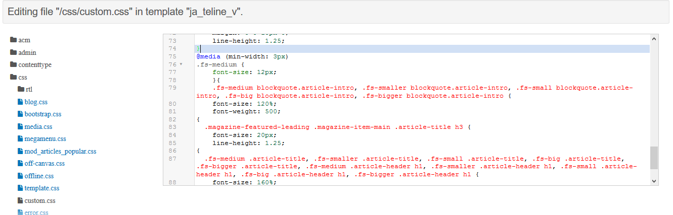
Images use 100% width of the container , because size its responsive and it resize the image as 100% width . I suggest you to use big size images so it fit better .For the font size css you are using Media query . it should be like this
@media (min-width: 3px) { .fs-medium .article-title, .fs-smaller .article-title, .fs-small .article-title, .fs-big .article-title, .fs-bigger .article-title, .fs-medium .article-header h1, .fs-smaller .article-header h1, .fs-small .article-header h1, .fs-big .article-header h1, .fs-bigger .article-header h1 { font-size: 160%; } }two braces needed in the code like above .
In the start @media (min-width: 3px) {
and close this at end of code .Hope it helps
stazzy
Friend
stazzy
- Join date:
- September 2014
- Posts:
- 375
- Downloads:
- 34
- Uploads:
- 65
- Thanks:
- 36
- Thanked:
- 3 times in 1 posts
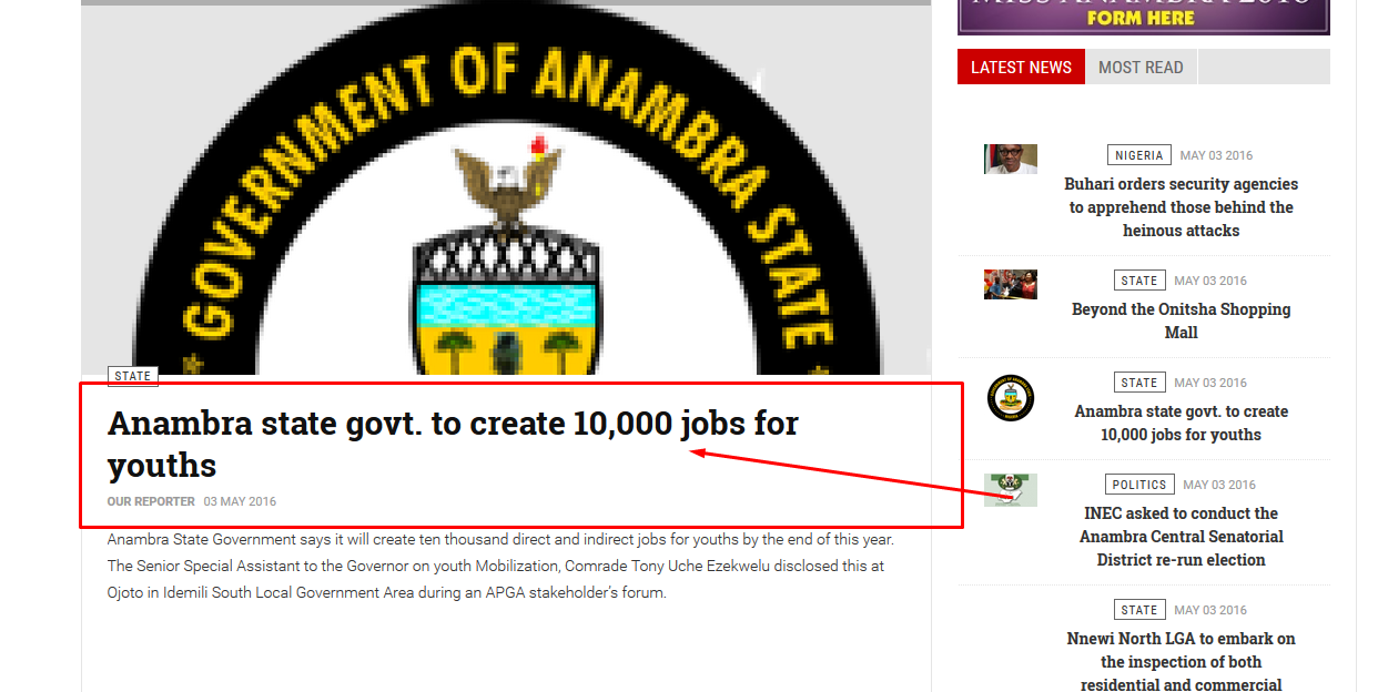
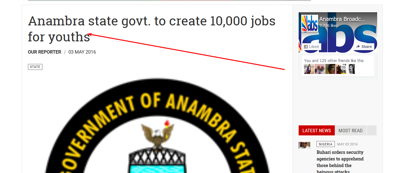
May 4, 2016 at 3:36 am #926308Ok sir. I have made some changes. view image
Pankaj Sharma
Moderator
Pankaj Sharma
- Join date:
- February 2015
- Posts:
- 24589
- Downloads:
- 144
- Uploads:
- 202
- Thanks:
- 127
- Thanked:
- 4196 times in 4019 posts
May 4, 2016 at 3:50 am #926312Hi
Please check my last post again and check the sample code .
You still missing the braces .
while you are applying the style when min width is 3px so you have not need to use media query in this case as you are applying the style for all size devices .
Media query needs when u apply changes for specific screen size devices .
There is no devices which use 3px width .stazzy
Friend
stazzy
- Join date:
- September 2014
- Posts:
- 375
- Downloads:
- 34
- Uploads:
- 65
- Thanks:
- 36
- Thanked:
- 3 times in 1 posts
May 5, 2016 at 9:09 pm #927312Pls what do i do. Make all corrections but no solution. Thanks
Pankaj Sharma
Moderator
Pankaj Sharma
- Join date:
- February 2015
- Posts:
- 24589
- Downloads:
- 144
- Uploads:
- 202
- Thanks:
- 127
- Thanked:
- 4196 times in 4019 posts
May 6, 2016 at 12:22 am #927327Hi Kindly take backup of custom.css file on local system . Then replace custom.css with below code
 .header-right .header-right-inner .col { display: table-cell !important; vertical-align: top; }
.img-intro-none, .img-intro-left, .img-intro-right, .img-fulltext-none, .img-fulltext-left, .img-fulltext-right, .img_caption { position: static; } .pull-left.item-image { position: relative; } .img_caption p.img_caption { bottom: 0; position: absolute; } .img_caption p.img_caption { text-align: center; } .view-category.layout-blog .img_caption p.img_caption { display: none; } .com_content.view-article .article-main .img_caption p.img_caption { color: #fff; background: red; }
@media screen and (max-width: 992px) {# t3-mainbody .t3-sidebar { display: block; } }
.article-intro-media .item-image { max-height: 100%!important;}
.article-intro .item-image { max-height: 100%!important; }
.magazine-featured-leading .magazine-item-media .item-image { max-height:initial!important;
.style-2.magazine-list .magazine-leading .item-image { max-height:initial!important; } .magazine-links .col-content .article-title h3 { margin: 0; font-size: 12px !important; } .magazine-links .col-content .article-title h3 { margin: 0; font-size: 12px !important; } .magazine-item .article-title h3 { margin: 0; font-size: 14px; } @media (min-width: 3px) {.fs-medium .article-title, .fs-smaller .article-title, .fs-small .article-title, .fs-big .article-title, .fs-bigger .article-title, .fs-medium .article-header h1, .fs-smaller .article-header h1, .fs-small .article-header h1, .fs-big .article-header h1, .fs-bigger .article-header h1 { font-size: 160%;} }
.article-header h1 { font-size: 45px; font-weight: 700; margin: 0 0 10px 0; line-height: 1.25; }
.fs-medium { font-size: 12px; }
.fs-medium blockquote.article-intro, .fs-smaller blockquote.article-intro, .fs-small blockquote.article-intro,
.fs-big blockquote.article-intro, .fs-bigger blockquote.article-intro {
font-size: 120%;
font-weight: 500;}
.magazine-featured-leading .magazine-item-main .article-title h3 { font-size: 20px; line-height: 1.25;}
.fs-medium .article-title, .fs-smaller .article-title, .fs-small .article-title, .fs-big .article-title, .fs-bigger .article-title, .fs-medium .article-header h1, .fs-smaller .article-header h1, .fs-small .article-header h1, .fs-big .article-header h1, .fs-bigger .article-header h1 { font-size: 160%;} { .article-header h1, .fs-smaller .article-header h1, .fs-small .article-header h1, .fs-big .article-header h1, .fs-bigger .article-header h1 { font-size: 160%;}
Now add below code in custom.css file to change the font size .
.magazine-featured-leading .magazine-item-main .article-title h3 { font-size: 30px!important;

}
This way you can find the correct style via inspect element : http://prntscr.com/b0s9g1
1 user says Thank You to Pankaj Sharma for this useful post
AuthorPostsViewing 8 posts - 1 through 8 (of 8 total)This topic contains 7 replies, has 2 voices, and was last updated by
Pankaj Sharma 7 years, 12 months ago.We moved to new unified forum. Please post all new support queries in our New Forum
Jump to forum